


ggplot is a very powerful graphics package. The construction of the graphs is quite different to base graphics. "It uses the grammar of graphics" particularly layers.
Dr Dean Hammond has written this script that illustrates how ggplot can be used to draw multiple enzymatic data plots with colours. Part II will draw six separate plots.
Using ggplot sometimes requires some reshaping of the data (data munging or data wrangling) which is shown in the script below. This uses the melt() function.
The points are plotted alone first creating a layer with geom_point():
geom_point(aes(color = Exp, shape = Exp)).
aes() refers to the aesthetics of the plot.
The line fitting is done within ggplot using geom_smooth():
geom_smooth(method = "nls", formula = y ~ Vmax * x / (Km + x), start = list(Vmax = 50, Km = 2),
I particularly like the ease with which the plot can be saved using ggsave():
ggsave("All_points_plus_fits.pdf")
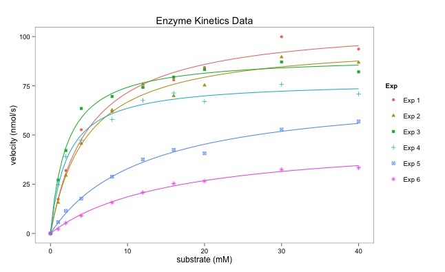
The final graph is here:
# Following on from my code to multiplot 6 enzymology data-sets using base R in a for loop,
# here's how to create a single plot with all fitted curves on it too
# I have used ggplot and faceting.
# Some manipulation of the data is required, essentially to melt it from 'wide' to 'long' (reshape2)
# I personally don't like the standard ggplot look, so
# I also load package ggthemes and think Stephen Few's theme is the nicest (hence, theme_few())
# You may need to do this once: install.packages("ggplot2", "reshape2", "ggthemes")
library(reshape2) # allows us to use the packages
library(ggplot2)
library(ggthemes)
# lets read the data in:
enzdata <- matrix(c(0, 17.36667, 31.97143, 52.68889, 61.95385, 74.2, 77.97143, 84.28, 99.91429, 93.66667,
0, 15.7, 29.42286, 45.64, 62.60615, 75.78118, 69.88, 75.256, 89.59429, 86.84,
0, 27.10667, 42.12, 63.48, 69.56, 74.26857, 79.44444, 83.29091, 87.1, 82.08571,
0, 24.72, 39.07, 47.4, 57.928, 67.6, 71.35556, 67, 75.79375, 70.86667,
0, 5.723636, 11.48, 17.697143, 28.813333, 37.567273, 42.483077, 40.68, 52.81, 56.92,
0, 2.190476, 5.254545, 8.95, 15.628571, 20.8, 25.355556, 26.55, 32.44, 33.333333),
nrow = 10, ncol = 6)
no.Exp <- c("Exp 1", "Exp 2", "Exp 3", "Exp 4", "Exp 5", "Exp 6")
Sub <- c(0, 1, 2, 4, 8, 12, 16, 20, 30, 40)
# convert it to a data.frame for melting:
enzdata <- as.data.frame(enzdata)
# add column names:
colnames(enzdata) <- no.Exp
# add the Sunstrate data as an additional column to the data.frame:
enzdata <- cbind(Sub, enzdata)
# melt the data from wide to long:
melted_data <- melt(enzdata, id.vars = "Sub", value.name = "v", variable.name = "Exp")
# an examination of the two data files shows what has happened.
View(enzdata)
View(melted_data)
 |
| Data before "melting" |
 |
| Some of the data after melting |
# The way ggplot draws colours depends on the required number of colours.
# The way it does it is just with equally spaced hues around the color wheel, starting from 15:
gg_color_hue <- function(n){
hues = seq(15, 375, length = n + 1)
hcl(h = hues, l = 65, c = 100)[1:n]
}
# we have 6 experiments (so we want to create our own 6 colour "mini-palette")
cols <- gg_color_hue(6)
# this gets the default ggplot colours when we want to plot 6 different variables.
# Let's plot:
ggplot(melted_data, aes(x = Sub, y = v)) +
ylab("velocity (nmol/s)") + xlab("substrate (mM)") +
theme_few() +
# let's plot the data simply as points, shaped and colour-coded by expt. of origin:
geom_point(aes(color = Exp, shape = Exp)) +
 |
| Just the points - no fitted lines yet. |
# then add each best-fit line from our Michaelis Menten nls equation (according to Expt), colouring based-on our colour palette to match ggplots own colour-coding:
geom_smooth(method = "nls", formula = y ~ Vmax * x / (Km + x), start = list(Vmax = 50, Km = 2),
se = F, colour = cols[1], size = 0.5, data = filter(melted_data, Exp == "Exp 1")) +
geom_smooth(method = "nls", formula = y ~ Vmax * x / (Km + x), start = list(Vmax = 50, Km = 2),
se = F, colour = cols[2], size = 0.5, data = filter(melted_data, Exp == "Exp 2")) +
geom_smooth(method = "nls", formula = y ~ Vmax * x / (Km + x), start = list(Vmax = 50, Km = 2),
se = F, colour = cols[3], size = 0.5, data = filter(melted_data, Exp == "Exp 3")) +
geom_smooth(method = "nls", formula = y ~ Vmax * x / (Km + x), start = list(Vmax = 50, Km = 2),
se = F, colour = cols[4], size = 0.5, data = filter(melted_data, Exp == "Exp 4")) +
geom_smooth(method = "nls", formula = y ~ Vmax * x / (Km + x), start = list(Vmax = 50, Km = 2),
se = F, colour = cols[5], size = 0.5, data = filter(melted_data, Exp == "Exp 5")) +
geom_smooth(method = "nls", formula = y ~ Vmax * x / (Km + x), start = list(Vmax = 50, Km = 2),
se = F, colour = cols[6], size = 0.5, data = filter(melted_data, Exp == "Exp 6")) +
# Let's add a title to the plot
ggtitle("Enzyme Kinetics Data") +
# and save it as a .pdf (optional, obviously)
ggsave("All_points_plus_fits.pdf")
No comments:
Post a Comment
Comments and suggestions are welcome.