Added March 2016:
The latest version of ggplot2 required a change in this script which has been added below.
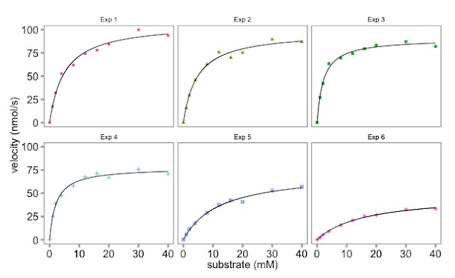
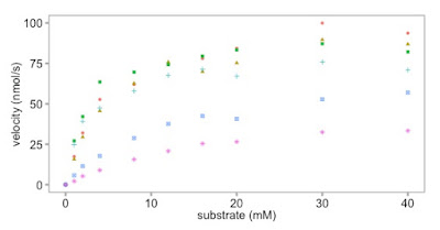
The plot with six separate enzymology lines on it looked a bit busy and difficult to appreciate. We made previous used base graphics to make six individual plots. Here Dean has used ggplot to make a nicer plot.
First, we make an object containing the combined graph. It's a list. To learn more about data structures, please check out our earlier blog article.
Then we use faceting to split the object into six separate graphs.
Finally, we use the geom_smooth()function with the argument method = "nls" to add the lines.
Here is the graph:
 |
| Multi-panel enzymology data plotted with ggplot |
Is the ggplot graphic nicer than the base graphics plot? It's personal choice in large part.
 | |
|
Here is the script to make the multi panel plot with ggplot.
# The plot with the six lines is a bit busy.
# Let's make a ggplot equivalent to the base R multiplot.
# Here we do it using faceting.
# To make the script free standing the reshaping code is included.
library(reshape2)
library(ggplot2)
library (ggthemes)
# the data:
enzdata <- matrix(c(0, 17.36667, 31.97143, 52.68889, 61.95385, 74.2, 77.97143, 84.28, 99.91429, 93.66667,
0, 15.7, 29.42286, 45.64, 62.60615, 75.78118, 69.88, 75.256, 89.59429, 86.84,
0, 27.10667, 42.12, 63.48, 69.56, 74.26857, 79.44444, 83.29091, 87.1, 82.08571,
0, 24.72, 39.07, 47.4, 57.928, 67.6, 71.35556, 67, 75.79375, 70.86667,
0, 5.723636, 11.48, 17.697143, 28.813333, 37.567273, 42.483077, 40.68, 52.81, 56.92,
0, 2.190476, 5.254545, 8.95, 15.628571, 20.8, 25.355556, 26.55, 32.44, 33.333333),
nrow = 10, ncol = 6)
no.Exp <- c("Exp 1", "Exp 2", "Exp 3", "Exp 4", "Exp 5", "Exp 6")
Sub <- c(0, 1, 2, 4, 8, 12, 16, 20, 30, 40)
enzdata <- as.data.frame(enzdata) # converted to a data.frame
colnames(enzdata) <- no.Exp # add column names
enzdata <- cbind(Sub, enzdata) # add the Substrate data
# melt the data from wide to long:
melted_data <- melt(enzdata, id.vars = "Sub", value.name = "v", variable.name = "Exp")
# the way ggplot draws colours depends on the required number of colours. The way it does it is just with equally spaced hues around the color wheel, starting from 15:
gg_color_hue <- function(n){
hues = seq(15, 375, length = n + 1)
hcl(h = hues, l = 65, c = 100)[1:n]
}
# we have 6 experiments (so we want to create our own 6 colour "mini-palette")
cols <- gg_color_hue(6)
# this gets the default ggplot colours when we want to plot 6 different variables.
# 1st, create an object with the ggplot
# It has all the data simply as points, shaped and colour-coded by expt. of origin (as above).
# We store it in an object called 'x':
x <- ggplot(data = melted_data, aes(x = Sub, y = v)) +
geom_point(aes(colour = Exp, shape = Exp)) +
theme_few() +
ylab("velocity (nmol/s)") + xlab("substrate (mM)") +
theme(axis.title.x = element_text(size = 15),
axis.title.y = element_text(size = 15),
axis.text.x = element_text(size = 15),
axis.text.y = element_text(size = 15),
plot.title = element_blank(), # we don't want individual plot titles as the facet "strip" will give us this
legend.position = "none", # we don't want a legend either
panel.border = element_rect(fill = NA, color = "darkgrey", size = 1.25, linetype = "solid"),
axis.ticks = element_line(colour = 'darkgrey', size = 1.25, linetype = 'solid')) # here, I just alter to colour and thickness of the plot outline and tick marks. You generally have to do this when faceting, as well as alter the text sizes (= element_text() in theme also)
 |
| This is what we have made so far |
# Next, let's modify 'x' by faceting based on the Experiment Name,
# We also specify that we want a panel 3 plots wide x 2 plots high.
# You can change this, obviously. Can also 'facet_grid' too:
x <- x + facet_wrap( ~ Exp, ncol = 3)
 |
| The facet_wrap() function turns it into this |
x <- x + geom_smooth(method = "nls",
method.args = list(formula = y ~ Vmax * x / (Km + x),
start = list(Vmax = 50, Km = 2)),
se = F, colour = 'black', size = 0.5)
# Finally, just call 'x' to show the plots:
x
# if you want to save it as a .pdf, just add + ggsave("GGPLOT_FACET_EnzKin.pdf"), when you call 'x'
x + ggsave("GGPLOT_FACET_EnzKin.pdf")


No comments:
Post a Comment
Comments and suggestions are welcome.