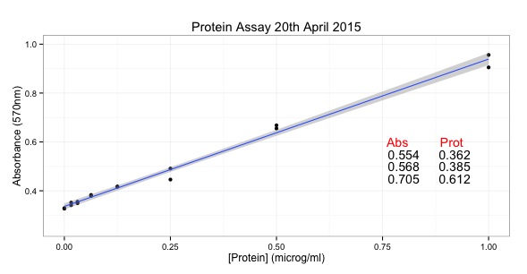
# START of SCRIPT
library(ggplot2)
# Protein Concentrations
prot <- c(0.000, 0.016, 0.031, 0.063, 0.125, 0.250, 0.500, 1.000,
0.000, 0.016, 0.031, 0.063, 0.125, 0.250, 0.500, 1.000)
# Absorbance from my protein assay
abs <- c(0.329, 0.352, 0.349, 0.379, 0.417, 0.491, 0.668, 0.956,
0.327, 0.341, 0.355, 0.383, 0.417, 0.446, 0.655, 0.905)
# Convert into data.frame to plot with ggplot
data <- as.data.frame(prot)
data$abs <- abs
#Calculate the line using the linear model function
line <- lm(abs~prot)
#Equation of a line y = mx + c
#In our case abs = slope * prot + intercept
# ukn.prot = (abs - intercept)/slope
int <- summary(line)$coefficients[1]
slope <- summary(line)$coefficients[2]
#now calculate some unknown protein concs from absorbances
#put the unknowns into a vector
abs.ukns <- c(0.554, 0.568, 0.705)
#rearrange the equation of the line to ukn.prot = (abs - intercept)/slope
prot.ukns <- (abs.ukns - int)/slope
# create the object with the graph in it.
p <- ggplot(data=data, # specify the data frame with data
aes(x=prot, y=abs)) + # specify the x and y for the graph
geom_point() + # make a scatter plot
stat_smooth(method = "lm") + # add a linear model line
xlab("[Protein] (microg/ml)") + # label x-axis
ylab("Absorbance (570nm)") + # label y-axis
ggtitle("Protein Assay 20th April 2015") + # add a title
theme_bw() + # a simple theme
expand_limits(y=c(0.25,1)) + # customise the y-axis
annotate(geom="text", x=0.85, y= 0.6, label="Abs Prot", color="red")
#put the answers on the graph
for (i in 1:length(abs.ukns)){
p <- p + annotate(geom="text", x = 0.8, y = (0.6 - i/20), label=abs.ukns[i])
p <- p + annotate(geom="text", x = 0.92, y = (0.6 - i/20), label=round(prot.ukns[i], 3))
}
p # show us the graph...
# END OF SCRIPT


I’m really amazed with your posting skills as well as with the layout on your blog site. Very informative and well written post! Quite interesting and nice topic chosen for the post Nice Post keep it up.Excellent post.
ReplyDeleteexample of assay