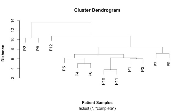
The reviewer particularly recommended hierarchial clustering. Fortunately, I had been learning how to use R, so I was able to learn how to do this relatively easy. This was why I had chosen to learn R.
"The idea of a cluster diagrams is to build a hierarchy of clusters, showing relations between the individual members and merging clusters of data based on similarity." I learned this from a website that seems to have disappeared now.
Cluster diagrams can be used to investigate the quality of your data and identify outliers in sets of data. They can also show patterns and identify groups of samples.
A key concept is a "distance metric" which is a measure of similarity. There are different measures of correlation. Two common ones are the Euclidean and the Pearson correlations. Euclidean distance looks at just the numbers while the Pearson correlation looks more at trends. This can give very different patterns. Other measures of distance include: maximum, Manhattan, Canberra, binary and Minkowski.
The first step is calculate a distance matrix using the dist() function.
Then you can use this matrix to do the clustering using the hclust() function.
This is my first cluster diagram:
Here is the script that generates it:
SCRIPT
# import the data
link <- ("https://raw.githubusercontent.com/brennanpincardiff/RforBiochemists/master/data/iTRAQPatientforCluster.csv")
data2 <- read.csv(link, header=TRUE)
head(data2) # look at the top of the file.
# first step is to calculate the distances using the dist() function.
# various methods are possible - default is Euclidean.
distances2 <- dist(rbind(P1, P2, P3, P4, P5, P6, P7, P8, P9, P10, P11, P12))
distances2
summary(distances2)
# make the cluster dendrogram object using the hclust() function
hc <- hclust(distances2)
# plot the cluster dendrogram object using base graphics
plot(hc, xlab =expression(bold("Patient Samples")), ylab = expression(bold("Distance")))
detach(data2) # good practice to detach data after we're finished.


No comments:
Post a Comment
Comments and suggestions are welcome.