ggplot2 is a powerful graphing package in R. It was created by Hadley Wickham, an expert in R. Books and websites are dedicated to ggplot2.
Most of my work has used base graphics but I'm trying to learn how to use ggplot2 and the syntax involved in controlling it.
Here is a script and some of the graphs made with ggplot2. I have used enzyme data supplied by Charlie Bennett from University of Bath who is attending the R for Biochemists Training Day.
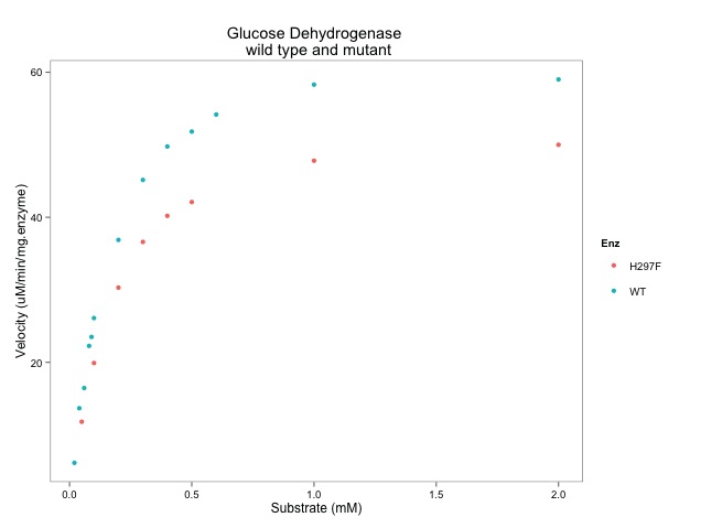
This script is show with various graphs intermingled. The idea is show how the various parts of the script change the graphs.
I hope it's useful. I have learned a little more about ggplot preparing it.
# SCRIPT STARTS
library(ggplot2)
library(ggthemes)
# data from Dr C Bennett, University of Bath
# Link to published data: http://www.jbc.org/content/285/44/33701.full
# and her thesis: http://opus.bath.ac.uk/27220/
# This is the data
Enz <- c("WT","WT","WT","WT","WT",
"WT","WT","WT","WT","WT",
"WT","WT","WT",
"H297F","H297F","H297F",
"H297F","H297F","H297F",
"H297F","H297F")
sub <- c(2.00, 1.00, 0.60, 0.50, 0.40,
0.30, 0.20, 0.10, 0.09, 0.08,
0.06, 0.04, 0.02,
0.05, 0.10, 0.20,
0.30, 0.40, 0.50,
1.00, 2.00)
vel <- c(59.01, 58.29, 54.17, 51.82, 49.76,
45.15, 36.88, 26.10, 23.50, 22.26,
16.45, 13.67, 6.14,
11.8, 19.9, 30.3,
36.6, 40.2, 42.1,
47.8, 50.0)
# assemble the data into a data.frame
enzdata <- as.data.frame(Enz)
enzdata$sub <- sub
enzdata$vel <- vel
# plot the data with ggplot
# most of the syntax seems relatively easy to understand...
ggplot(data=enzdata, # give the ggplot() function the data
aes(x=sub, # data.frame col with values for x-axis
y=vel, # and the y-axis
colour = Enz)) + # colour by WT or H297F **NOTE the "+"
geom_point() + # key function that show points
xlab("Substrate (mM)") + # label x-axis
ylab("Velocity (uM/min/mg.enzyme)") + # label y-axis
ggtitle("Glucose Dehydrogenase \n wild type and mutant")
# so far, so good.
# we can create an object with the plot in it...
enz.plot <- ggplot(data=enzdata,
aes(x=sub,
y=vel,
colour = Enz)) +
geom_point() +
xlab("Substrate (mM)") +
ylab("Velocity (uM/min/mg.enzyme)") +
ggtitle("Glucose Dehydrogenase \n wild type and mutant")
# then we can apply a different theme to change the style of the plot.
enz.plot + theme_bw()
# or
enz.plot + theme_few()
# or change arguments in the geom_point() function to make the points larger
enz.plot + geom_point(size=5)
# finally, we can add the enzyme kinetic lines using the geom_smooth() function
enz.plot + geom_smooth(method = "nls",
method.args = list(formula = y ~ Vmax * x / (Km + x),
start = list(Vmax = 50, Km = 0.2)),
se = F, size = 0.5,
data = subset(enzdata, Enz=="WT")) +
geom_smooth(method = "nls",
method.args = list(formula = y ~ Vmax * x / (Km + x),
start = list(Vmax = 50, Km = 0.2)),
se = F, size = 0.5,
data = subset(enzdata, Enz=="H297F")) +
theme_few()
# SCRIPT ENDS
The following sources were also useful:


No comments:
Post a Comment
Comments and suggestions are welcome.