Showing posts with label Dean H. Show all posts

Wednesday, 3 June 2015

Draw six enzymology graphs with ggplot...


Added March 2016:
The latest version of ggplot2 required a change in this script which has been added below. 

The plot with six separate enzymology lines on it looked a bit busy and difficult to appreciate. We made previous used base graphics to make six individual plots. Here Dean has used ggplot to make a nicer plot. 
First, we make an object containing the combined graph. It's a list. To learn more about data structures, please check out our earlier blog article

Then we use faceting to split the object into six separate graphs. 

Finally, we use the geom_smooth()function with the argument method = "nls" to add the lines. 

Here is the graph: 
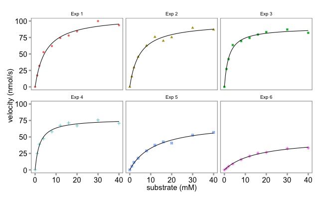
Multi-panel enzymology data plotted with ggplot 

Is the ggplot graphic nicer than the base graphics plot? It's personal choice in large part.


Multi-panel enzymology data plotted with base graphics


Here is the script to make the multi panel plot with ggplot.

# The plot with the six lines is a bit busy. 
# Let's make a ggplot equivalent to the base R multiplot.
# Here we do it using faceting.
# To make the script free standing the reshaping code is included. 

library(reshape2)
library(ggplot2)
library (ggthemes)

# the data:
enzdata <- matrix(c(0, 17.36667, 31.97143, 52.68889, 61.95385, 74.2, 77.97143, 84.28, 99.91429, 93.66667, 
                    0, 15.7, 29.42286, 45.64, 62.60615, 75.78118, 69.88, 75.256, 89.59429, 86.84, 
                    0, 27.10667, 42.12, 63.48, 69.56, 74.26857, 79.44444, 83.29091, 87.1, 82.08571, 
                    0, 24.72, 39.07, 47.4, 57.928, 67.6, 71.35556, 67, 75.79375, 70.86667, 
                    0, 5.723636, 11.48, 17.697143, 28.813333, 37.567273, 42.483077, 40.68, 52.81, 56.92, 
                    0, 2.190476, 5.254545, 8.95, 15.628571, 20.8, 25.355556, 26.55, 32.44, 33.333333),
                  nrow = 10, ncol = 6)
no.Exp <- c("Exp 1", "Exp 2", "Exp 3", "Exp 4", "Exp 5", "Exp 6")
Sub <- c(0, 1, 2, 4, 8, 12, 16, 20, 30, 40)

enzdata <- as.data.frame(enzdata) # converted to a data.frame
colnames(enzdata) <- no.Exp # add column names
enzdata <- cbind(Sub, enzdata) # add the Substrate data
# melt the data from wide to long:
melted_data <- melt(enzdata, id.vars = "Sub", value.name = "v", variable.name = "Exp")

# the way ggplot draws colours depends on the required number of colours. The way it does it is just with equally spaced hues around the color wheel, starting from 15:
gg_color_hue <- function(n){
  hues = seq(15, 375, length = n + 1)
  hcl(h = hues, l = 65, c = 100)[1:n]
  }
  
# we have 6 experiments (so we want to create our own 6 colour "mini-palette")
cols <- gg_color_hue(6)  
# this gets the default ggplot colours when we want to plot 6 different variables.


# 1st, create an object with the ggplot 
# It has all the data simply as points, shaped and colour-coded by expt. of origin (as above). 
# We store it in an object called 'x':
x <- ggplot(data = melted_data, aes(x = Sub, y = v)) +
  geom_point(aes(colour = Exp, shape = Exp)) +
  theme_few() +
  ylab("velocity (nmol/s)") + xlab("substrate (mM)") +
  theme(axis.title.x = element_text(size = 15),
        axis.title.y = element_text(size = 15),
        axis.text.x = element_text(size = 15),
        axis.text.y = element_text(size = 15),
        plot.title = element_blank(),            # we don't want individual plot titles as the facet "strip" will give us this
        legend.position = "none",                # we don't want a legend either
        panel.border = element_rect(fill = NA, color = "darkgrey", size = 1.25, linetype = "solid"),
        axis.ticks = element_line(colour = 'darkgrey', size = 1.25, linetype = 'solid'))     # here, I just alter to colour and thickness of the plot outline and tick marks. You generally have to do this when faceting, as well as alter the text sizes (= element_text() in theme also)


This is what we have made so far

# Next, let's modify 'x' by faceting based on the Experiment Name, 
# We also specify that we want a panel 3 plots wide x 2 plots high.
# You can change this, obviously. Can also 'facet_grid' too:
x <- x + facet_wrap( ~ Exp, ncol = 3)


The facet_wrap() function turns it into this
# Finally, let's apply the Michaelis Menten fitting to our faceted data, adding the best fit line in each case:
x <- x + geom_smooth(method = "nls",                 
         method.args = list(formula = y ~ Vmax * x / (Km + x), 
                            start = list(Vmax = 50, Km = 2)),
                     se = F, colour = 'black', size = 0.5)  

# Finally, just call 'x' to show the plots:
x

# if you want to save it as a .pdf, just add + ggsave("GGPLOT_FACET_EnzKin.pdf"), when you call 'x'
x + ggsave("GGPLOT_FACET_EnzKin.pdf")



Tuesday, 2 June 2015

Plotting enzyme data with ggplot - Part I

ggplot is a very powerful graphics package.  The construction of the graphs is quite different to base graphics. "It uses the grammar of graphics" particularly layers. 

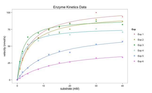
Dr Dean Hammond has written this script that illustrates how ggplot can be used to draw multiple enzymatic data plots with colours. Part II will draw six separate plots. 

Using ggplot sometimes requires some reshaping of the data (data munging or data wrangling) which is shown in the script below. This uses the melt() function.

The points are plotted alone first creating a layer with geom_point():
geom_point(aes(color = Exp, shape = Exp)).
aes() refers to the aesthetics of the plot.  

The line fitting is done within ggplot using geom_smooth():
geom_smooth(method = "nls", formula = y ~ Vmax * x / (Km + x), start = list(Vmax = 50, Km = 2),

I particularly like the ease with which the plot can be saved using ggsave():
ggsave("All_points_plus_fits.pdf")

The final graph is here:


# Following on from my code to multiplot 6 enzymology data-sets using base R in a for loop,
# here's how to create a single plot with all fitted curves on it too
# I have used ggplot and faceting.

# Some manipulation of the data is required, essentially to melt it from 'wide' to 'long' (reshape2)

# I personally don't like the standard ggplot look, so
# I also load package ggthemes and think Stephen Few's theme is the nicest (hence, theme_few())

# You may need to do this once: install.packages("ggplot2", "reshape2", "ggthemes")

library(reshape2)  # allows us to use the packages
library(ggplot2)
library(ggthemes)

# lets read the data in:
enzdata <- matrix(c(0, 17.36667, 31.97143, 52.68889, 61.95385, 74.2, 77.97143, 84.28, 99.91429, 93.66667, 
                    0, 15.7, 29.42286, 45.64, 62.60615, 75.78118, 69.88, 75.256, 89.59429, 86.84, 
                    0, 27.10667, 42.12, 63.48, 69.56, 74.26857, 79.44444, 83.29091, 87.1, 82.08571, 
                    0, 24.72, 39.07, 47.4, 57.928, 67.6, 71.35556, 67, 75.79375, 70.86667, 
                    0, 5.723636, 11.48, 17.697143, 28.813333, 37.567273, 42.483077, 40.68, 52.81, 56.92, 
                    0, 2.190476, 5.254545, 8.95, 15.628571, 20.8, 25.355556, 26.55, 32.44, 33.333333),
                  nrow = 10, ncol = 6)
no.Exp <- c("Exp 1", "Exp 2", "Exp 3", "Exp 4", "Exp 5", "Exp 6")
Sub <- c(0, 1, 2, 4, 8, 12, 16, 20, 30, 40)
 
# convert it to a data.frame for melting:
enzdata <- as.data.frame(enzdata)

# add column names:
colnames(enzdata) <- no.Exp

# add the Sunstrate data as an additional column to the data.frame:
enzdata <- cbind(Sub, enzdata)

# melt the data from wide to long:
melted_data <- melt(enzdata, id.vars = "Sub", value.name = "v", variable.name = "Exp")

# an examination of the two data files shows what has happened. 
View(enzdata)
View(melted_data)


Data before "melting"

Some of the data after melting


# The way ggplot draws colours depends on the required number of colours. 
# The way it does it is just with equally spaced hues around the color wheel, starting from 15:
gg_color_hue <- function(n){
  hues = seq(15, 375, length = n + 1)
  hcl(h = hues, l = 65, c = 100)[1:n]
  }
  
# we have 6 experiments (so we want to create our own 6 colour "mini-palette")
cols <- gg_color_hue(6)  
# this gets the default ggplot colours when we want to plot 6 different variables.

# Let's plot:
ggplot(melted_data, aes(x = Sub, y = v)) +
  ylab("velocity (nmol/s)") + xlab("substrate (mM)") +
  theme_few() +
  # let's plot the data simply as points, shaped and colour-coded by expt. of origin:
  geom_point(aes(color = Exp, shape = Exp)) +


Just the points - no fitted lines yet. 

  # then add each best-fit line from our Michaelis Menten nls equation (according to Expt), colouring based-on our colour palette to match ggplots own colour-coding:
  geom_smooth(method = "nls", formula = y ~ Vmax * x / (Km + x), start = list(Vmax = 50, Km = 2),
              se = F, colour = cols[1], size = 0.5, data = filter(melted_data, Exp == "Exp 1")) +
  geom_smooth(method = "nls", formula = y ~ Vmax * x / (Km + x), start = list(Vmax = 50, Km = 2),
              se = F, colour = cols[2], size = 0.5, data = filter(melted_data, Exp == "Exp 2")) +
  geom_smooth(method = "nls", formula = y ~ Vmax * x / (Km + x), start = list(Vmax = 50, Km = 2),
              se = F, colour = cols[3], size = 0.5, data = filter(melted_data, Exp == "Exp 3")) +
  geom_smooth(method = "nls", formula = y ~ Vmax * x / (Km + x), start = list(Vmax = 50, Km = 2),
              se = F, colour = cols[4], size = 0.5, data = filter(melted_data, Exp == "Exp 4")) +
  geom_smooth(method = "nls", formula = y ~ Vmax * x / (Km + x), start = list(Vmax = 50, Km = 2),
              se = F, colour = cols[5], size = 0.5, data = filter(melted_data, Exp == "Exp 5")) +
  geom_smooth(method = "nls", formula = y ~ Vmax * x / (Km + x), start = list(Vmax = 50, Km = 2),
              se = F, colour = cols[6], size = 0.5, data = filter(melted_data, Exp == "Exp 6")) +
  # Let's add a title to the plot
  ggtitle("Enzyme Kinetics Data") +
  # and save it as a .pdf (optional, obviously)
  ggsave("All_points_plus_fits.pdf")

Thursday, 28 May 2015

Using a for loop to compare data from multiple experiments

One of the key benefits of computer programming is allowing the programme to repeat steps (so you don't have to).
Dr Dean Hammond has written this script that illustrates how to use a for loop to plot data from six separate enzyme kinetic experiments to allow a comparison. It builds on the previous example of plotting enzymatic data.

The data is all contained in a matrix, a type of two dimensional data structure where all the data is of the same type.

Here is the output that is produced:


Here is the script that makes it:

# Following on from Prof. Beynon's example with enzymatic data... 
# For multiplotting 6 enzymology data-sets, using base R 
# Data from six experiments

no.Exp <- c("Exp 1","Exp 2", "Exp 3", "Exp 4","Exp 5", "Exp 6")

# Substrate concentrations:
Sub <- c(0, 1, 2, 4, 8, 12, 16, 20, 30, 40)

# Data in a matrix - 2D object with data of the same class (numeric)
enzdata <- matrix(c(0, 17.36667, 31.97143, 52.68889, 61.95385, 74.2, 77.97143, 84.28, 99.91429, 93.66667, 
                    0, 15.7, 29.42286, 45.64, 62.60615, 75.78118, 69.88, 75.256, 89.59429, 86.84, 
                    0, 27.10667, 42.12, 63.48, 69.56, 74.26857, 79.44444, 83.29091, 87.1, 82.08571, 
                    0, 24.72, 39.07, 47.4, 57.928, 67.6, 71.35556, 67, 75.79375, 70.86667, 
                    0, 5.723636, 11.48, 17.697143, 28.813333, 37.567273, 42.483077, 40.68, 52.81, 56.92, 
                    0, 2.190476, 5.254545, 8.95, 15.628571, 20.8, 25.355556, 26.55, 32.44, 33.333333),
                  nrow=10,
                  ncol=6)

# specify plotting parameters for our multiplot page:
par(mfrow = c(3, 2),  # 6 plots in a 2 column x 3 row format
    oma = c(1,1,1,1), # oma = outer margin in lines, of each plots (bottom, left, top, right)
    mar = c(3,3,2,1),  # mar = no. of lines to be specified on the four sides of each plot
    cex.main = 0.9,    # main text size
    las = 1)           # all axis labels horizontal


# here's a for loop 
# to plot the data for each enzymatic reaction (Expt), 
# get the values of Km and Vmax from the theoretical formula. 
# Then, build a theoretical line defining the best fit curve.
for(i in 1:length(no.Exp)){    # for every experiment - one col
    v <- enzdata[, i]          # get the velocity ('v') data
    data <- cbind(Sub, v)      # create a data-set for each expt  
    fit <- nls(v ~ Vmax * (Sub / (Km + Sub)),
               start = list(Vmax = 50, Km = 2))
    
    # write a title for each peptide plot, based on colnames: 
    title = paste(no.Exp[i])    # use exp name as a plot title
    
    SconcRange <- seq(0, 50, 0.1)
    theorLine <- predict(fit, list(Sub = SconcRange))
    
    # draw each plot, with points, 
    #applying the correct title adjusting font sizes accordingly:
    plot(Sub, v, main = title,
         col = 'red', pch = 16,
         cex.lab = 0.6, cex.axis = 0.8,
         xlab = NA, ylab = NA)      # omit drawing axis labels
    
    # add the theoretical lines: 
    lines(SconcRange, theorLine, lwd = 1.5, col = 'blue')
  }  # this curly bracket is the end of the for loop. 

# use mtext to add single x- and y-axis labels for all plots, close to the margin:
mtext("Velocity (nmol/s)", side = 2, las = 0, outer = TRUE, line = -1)
mtext("Substrate (mM)", side = 1, outer = TRUE, line = -0.5)