Showing posts with label melt. Show all posts

Tuesday, 31 October 2017

Chance of dying for males and females using the UK Life Tables

I am currently answering comments to R for Biochemists 101 - online training that I've created for the Biochemical Society. One of the participants asked about overlaying the different chances of dying for male and females inspired by the blog piece Exploring the chance of dying using the UK Life Tables.

As is often the case in R, there is a quick and simple answer which works ok if the data is very self explanatory. However, it's difficult to draw a legend.

There is also a better way that builds on the strengths of ggplot2 but it requires reformatting the data. I've used the melt() function from the reshape package.

Here is the graph made with the better answer:


The code below also shows the quick way...

START
library(readxl)
library(ggplot2)

# The UK National Life Tables
# these are available through the Office of National Statistics
# as an excel file from this page:
# https://www.ons.gov.uk/peoplepopulationandcommunity/birthsdeathsandmarriages/lifeexpectancies/datasets/nationallifetablesunitedkingdomreferencetables
# the can be downloaded from here:
ons_url <- c("https://www.ons.gov.uk/file?uri=/peoplepopulationandcommunity/birthsdeathsandmarriages/lifeexpectancies/datasets/nationallifetablesunitedkingdomreferencetables/current/nltuk1315reg.xls")
# to guarantee undistrubed access, I've put the file on github
github_url <- "https://raw.githubusercontent.com/brennanpincardiff/RforBiochemists/master/data/nltuk1315reg.xls"

# the download.file() function downloads and saves the file with the name given
download.file(url=ons_url,destfile="file.xls", mode="wb")
# if this doesn't work try replacing the url with the github_url
# then we can open the file and extract the data using the read_excel() function.
data<- read_excel("file.xls", sheet = 5, skip = 6)

# need to remove four bottom rows - these are all blank.
data <- data[1:101,]

colnames(data)

# x = age in years
# first set is males and second set is females
# mx is the central rate of mortality, defined as the number of deaths at age x last birthday in the three year period to which the National Life Table
# relates divided by the average population at that age over the same period.

# qx is the mortality rate between age x and (x +1), that is the probability that a person aged x exact will die before reaching age (x +1).

# to allow us to separate the male and female data, I am relabelling the column names

colnames(data) <- c("age",
                    "m.mx", "m.qx", "m.lx", "m.dx", "m.ex",
                    "f.mx", "f.qx", "f.lx", "f.dx", "f.ex")


# the life table allow us to draw some interesting curves
# the first one I want to explore is my chance of dying this year.

# qx is the key value.
# the chance of my dying before my next birthday.

# the ending point from the previous graph
# from http://rforbiochemists.blogspot.co.uk/2017/03/exploring-chance-of-dying-using-uk-life.html

p <- ggplot(data = data,
       aes(x = age, y = m.qx)) +
  geom_line(colour = "red") +
  geom_point(colour = "red", size = 0.75) +
  ylab("Chance of dying") +
  xlab("Current Age") +
  ggtitle("Chance of Men Dying before next Birthday") +
  scale_y_log10(
    breaks = c(0.0001, 0.001, 0.01, 0.1, 0.5),  # where to put labels
    labels = c("1/10,000", "1/1000", "1/100", "1/10", "1/2")) +  # the labels
  theme_bw()

# show the object
p


# quick way
# add geom_line() and geom_point() with more data
p +
  geom_line(data = data,
                aes(x = age, y = f.qx),
                colour = "blue") +
  geom_point(data = data,
             aes(x = age, y = f.qx),
             colour = "blue", size = 0.75) +
  # and change title
ggtitle("Chance of Dying before next Birthday")


# However, it's really difficult to add a proper legend

# Longer way - reformat the data into 'long' format
# using melt() function from reshape() package

library(reshape2)
# subset the columns we want - just three
data_s <- data.frame(cbind(data$age, data$m.qx, data$f.qx))
# rename columns
colnames(data_s) <- c("age", "male", "female")

# create new object with melt in long format
data_long <- melt(data_s, id.vars = "age")
# rename columns...
colnames(data_long) <- c("age", "gender", "chance_die")

# now draw the object
# using the colour aesthetics
# you get a legend automatically.
ggplot(data = data_long,
       aes(x = age,
           y = chance_die,
           colour = gender)) +
  geom_line() +
  geom_point() +
  ylab("Chance of dying") +
  xlab("Current Age") +
  ggtitle("Chance of Dying before next Birthday") +
  scale_y_log10(
    breaks = c(0.0001, 0.001, 0.01, 0.1, 0.5),
    labels = c("1/10,000", "1/1000", "1/100", "1/10", "1/2")) + 
  theme_bw()

END of SCRIPT

Resources

Tuesday, 2 June 2015

Plotting enzyme data with ggplot - Part I

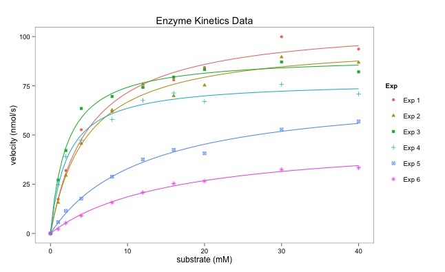
ggplot is a very powerful graphics package.  The construction of the graphs is quite different to base graphics. "It uses the grammar of graphics" particularly layers. 

Dr Dean Hammond has written this script that illustrates how ggplot can be used to draw multiple enzymatic data plots with colours. Part II will draw six separate plots. 

Using ggplot sometimes requires some reshaping of the data (data munging or data wrangling) which is shown in the script below. This uses the melt() function.

The points are plotted alone first creating a layer with geom_point():
geom_point(aes(color = Exp, shape = Exp)).
aes() refers to the aesthetics of the plot.  

The line fitting is done within ggplot using geom_smooth():
geom_smooth(method = "nls", formula = y ~ Vmax * x / (Km + x), start = list(Vmax = 50, Km = 2),

I particularly like the ease with which the plot can be saved using ggsave():
ggsave("All_points_plus_fits.pdf")

The final graph is here:


# Following on from my code to multiplot 6 enzymology data-sets using base R in a for loop,
# here's how to create a single plot with all fitted curves on it too
# I have used ggplot and faceting.

# Some manipulation of the data is required, essentially to melt it from 'wide' to 'long' (reshape2)

# I personally don't like the standard ggplot look, so
# I also load package ggthemes and think Stephen Few's theme is the nicest (hence, theme_few())

# You may need to do this once: install.packages("ggplot2", "reshape2", "ggthemes")

library(reshape2)  # allows us to use the packages
library(ggplot2)
library(ggthemes)

# lets read the data in:
enzdata <- matrix(c(0, 17.36667, 31.97143, 52.68889, 61.95385, 74.2, 77.97143, 84.28, 99.91429, 93.66667, 
                    0, 15.7, 29.42286, 45.64, 62.60615, 75.78118, 69.88, 75.256, 89.59429, 86.84, 
                    0, 27.10667, 42.12, 63.48, 69.56, 74.26857, 79.44444, 83.29091, 87.1, 82.08571, 
                    0, 24.72, 39.07, 47.4, 57.928, 67.6, 71.35556, 67, 75.79375, 70.86667, 
                    0, 5.723636, 11.48, 17.697143, 28.813333, 37.567273, 42.483077, 40.68, 52.81, 56.92, 
                    0, 2.190476, 5.254545, 8.95, 15.628571, 20.8, 25.355556, 26.55, 32.44, 33.333333),
                  nrow = 10, ncol = 6)
no.Exp <- c("Exp 1", "Exp 2", "Exp 3", "Exp 4", "Exp 5", "Exp 6")
Sub <- c(0, 1, 2, 4, 8, 12, 16, 20, 30, 40)
 
# convert it to a data.frame for melting:
enzdata <- as.data.frame(enzdata)

# add column names:
colnames(enzdata) <- no.Exp

# add the Sunstrate data as an additional column to the data.frame:
enzdata <- cbind(Sub, enzdata)

# melt the data from wide to long:
melted_data <- melt(enzdata, id.vars = "Sub", value.name = "v", variable.name = "Exp")

# an examination of the two data files shows what has happened. 
View(enzdata)
View(melted_data)


Data before "melting"

Some of the data after melting


# The way ggplot draws colours depends on the required number of colours. 
# The way it does it is just with equally spaced hues around the color wheel, starting from 15:
gg_color_hue <- function(n){
  hues = seq(15, 375, length = n + 1)
  hcl(h = hues, l = 65, c = 100)[1:n]
  }
  
# we have 6 experiments (so we want to create our own 6 colour "mini-palette")
cols <- gg_color_hue(6)  
# this gets the default ggplot colours when we want to plot 6 different variables.

# Let's plot:
ggplot(melted_data, aes(x = Sub, y = v)) +
  ylab("velocity (nmol/s)") + xlab("substrate (mM)") +
  theme_few() +
  # let's plot the data simply as points, shaped and colour-coded by expt. of origin:
  geom_point(aes(color = Exp, shape = Exp)) +


Just the points - no fitted lines yet. 

  # then add each best-fit line from our Michaelis Menten nls equation (according to Expt), colouring based-on our colour palette to match ggplots own colour-coding:
  geom_smooth(method = "nls", formula = y ~ Vmax * x / (Km + x), start = list(Vmax = 50, Km = 2),
              se = F, colour = cols[1], size = 0.5, data = filter(melted_data, Exp == "Exp 1")) +
  geom_smooth(method = "nls", formula = y ~ Vmax * x / (Km + x), start = list(Vmax = 50, Km = 2),
              se = F, colour = cols[2], size = 0.5, data = filter(melted_data, Exp == "Exp 2")) +
  geom_smooth(method = "nls", formula = y ~ Vmax * x / (Km + x), start = list(Vmax = 50, Km = 2),
              se = F, colour = cols[3], size = 0.5, data = filter(melted_data, Exp == "Exp 3")) +
  geom_smooth(method = "nls", formula = y ~ Vmax * x / (Km + x), start = list(Vmax = 50, Km = 2),
              se = F, colour = cols[4], size = 0.5, data = filter(melted_data, Exp == "Exp 4")) +
  geom_smooth(method = "nls", formula = y ~ Vmax * x / (Km + x), start = list(Vmax = 50, Km = 2),
              se = F, colour = cols[5], size = 0.5, data = filter(melted_data, Exp == "Exp 5")) +
  geom_smooth(method = "nls", formula = y ~ Vmax * x / (Km + x), start = list(Vmax = 50, Km = 2),
              se = F, colour = cols[6], size = 0.5, data = filter(melted_data, Exp == "Exp 6")) +
  # Let's add a title to the plot
  ggtitle("Enzyme Kinetics Data") +
  # and save it as a .pdf (optional, obviously)
  ggsave("All_points_plus_fits.pdf")