Showing posts with label Paul B. Show all posts

Wednesday, 16 December 2015

Counting cell nuclei in an image

I have been working with a colleague, Dr Joaquin de Navascues from the European Cancer Stem Cell Research Institute, to develop a workshop entitled an "Introduction to Biological Image Analysis". We plan to discuss the fundamentals of digital images and how to work with them in FIJI (Image J) and R, two open source data analysis tools. We aim to deliver this workshop during March or April next year at Cardiff University.

Joaquin is taking the lead on working with FIJI and I am developing the R material. For biological image analysis there is a useful package called EBImage. This has a nice introduction available and a detailed handbook - (version: 4.13.5).

I have been using this package to count cell nuclei in an image. The image is a microscope picture of a Drosophila gut. Counting nuclei involves mathematical transformations of the digital data. A digital image is a matrix of numbers.

In non-technical language the key steps are:
  • blur the image 
  • apply a threshold to turn nuclei into 'blobs'
  • count the 'blobs'
The output from this script is:

Number of nuclei in this image = 92

The script below downloads an image from Github, opens the image, displays it, transforms it and then counts the nuclei. Because I plan to count nuclei from more than one image, I have made a function and then applied it to the downloaded file. Using user defined functions to automate your workflow is a very good use of R. 

SCRIPT:

# to install use this:
# source("http://bioconductor.org/biocLite.R")
# biocLite("EBImage")


library(EBImage)  # you might need to install - see above

# the image is on Github 
# it is from a set of cells that are stained to detect the nuclei
# this is the link to the data

link <- "https://raw.githubusercontent.com/brennanpincardiff/RforBiochemists/master/data/seq/seq_z015_c003.tif"

# the download.file() function downloads and saves the file
download.file(url=link, destfile="file.tif", mode="wb")

# EBImage uses the readImage() function to load the file. 
img1 <- readImage("file.tif")

display(img1, method = "raster")  # shows the image within R. 


display(img1*4, method = "raster") # multiply the image to make brighter 


# I have written a function to count nuclei
# includes blurring the image, applying a threshold and counting....
# it displays the image as it is changed. 
# it's not perfect and overestimates the number of nuclei. 
# it's an example that can be done. 
# improving and customizing the various options is very feasible. 

countNuclei <- function(img1){   
  # blur the image
  w = makeBrush(size = 11, shape = 'gaussian', sigma = 5)  # makes the blurring brush
  img_flo = filter2(img1*2, w) # apply the blurring filter
  display(img_flo * 4, method = "raster") # display the blurred image - brighter for display only. 


  # apply a threshold 
  nmaskt = thresh(img_flo *2, w=10, h=10, offset=0.05) 
  display(nmaskt, method = "raster")


  # the bwlabel() function 'counts' the blobs
  nucNo <- max(bwlabel(nmaskt))

  # this outputs the count to us
  cat('Number of nuclei in this image =', max(bwlabel(nmaskt)),'\n')
  return(nucNo)
}

# this applies the function to the image
nucNo <- countNuclei(img1)

END OF SCRIPT


Tuesday, 13 October 2015

Mapping SQL Relay locations using ggplot...

I may have planned to talk about too much in a one hour talk at SQL Relay. In terms of what I planned to show, I wanted to show a little bit of geomapping using ggplot.

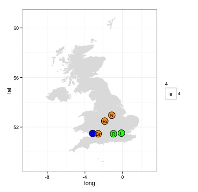
Here is the visualisation of the SQL Relay locations drawn with ggplot:


This script illustrates a few interesting things about ggplot:
  • you can plot polygons using the geom_polygon() function - complex shapes like maps
  • you can use different data.frames for different 'layers' in a plot
  • you can sequentially add extra detail to your visualisation - this script uses:


SCRIPT START

# draw a map of the UK with R. 
# https://www.students.ncl.ac.uk/keith.newman/r/maps-in-r

# install packages if necessary

library(maps)       # Provides functions that let us plot the maps
library(mapdata)    # Contains the hi-resolution maps.
library(ggmap)      # finds longitude and latitude values
library(ggplot2)    # high quality graphing

locs <- c("Nottingham England", "Reading England", "London England", "Bristol England", "Cardiff Wales", "Birmingham England")
locI <- c("N", "R", "L", "Br", "C", "Bi")
locCol <- c("darkgoldenrod1", "yellowgreen", "yellowgreen", "darkgoldenrod1", "blue", "tomato")
lonlat <- geocode(locs)

# draw a simple map of the United Kingdom
map('worldHires',
    c('UK'),
    xlim=c(-10,2), ylim=c(50,60))
# plot SQL Relay Locations info using base graphics
points(lonlat$lon,
       lonlat$lat,
       col= locCol,
       pch=19,
       cex = 1)
Map made with map() and base graphics


# we can also do this in ggplot better...
# make a data.frame 
data2 <- as.data.frame(locs)

# bind in longitude, latitude, colours and initials
data2 <- cbind(data2, lonlat, locCol, locI)


# use map_data() function to create a data.frame containing the map of the UK
uk<-map_data("worldHires", region = "UK")

# create the object m with the map using geom_polygon() function 
# we can make the map different colours
# see here for more about colours in R
# http://www.stat.columbia.edu/~tzheng/files/Rcolor.pdf
m <- ggplot() +
            geom_polygon(data=uk, 
                  aes(x=long, y=lat, group=group),
                  fill="gray88") +   # more about colours
            scale_x_continuous(limits = c(-10,3)) +
            scale_y_continuous(limits =c(49,60.9))


# add the points on the plot telling us where the longitude and latitude of various places
# N.B. the data is coming from a different data.frame to the map
# first add some black dots
m <- m +  geom_point(data=data2, 
                     aes(x=lon, y=lat), 
                     colour="black",
                     size = 7) 

# then some smaller coloured dots
m <- m +  geom_point(data=data2, 
                aes(x=lon, y=lat), 
                colour=locCol,
                size = 6)


# add the letters inside the circles  
m <- m + geom_text(data = data2, 
                   aes(x=lon, y=lat, label = locI, size = 4))


# change the theme to make the map nicer
m <- m + theme_bw()


# add a title
m <- m + ggtitle("SQL Relay Locations") +
         theme(legend.position="none") # get rid of the legend

m # show the object


Final map was exported as an A5 PDF which looked nice.

Resources:

Friday, 2 October 2015

Understanding and visualizing a distance matrix

My PhD student has just received the data from a set of RNA samples analysed using a gene array. We discussed what should be done first to analyse these experiments. A good first step is to look at the distance between the samples and do unsupervised hierarchical clustering of all the samples to see how the biological replicates gather together. This represents an unbiased way to do some quality control for your experiments. Rather than just trying to identify different genes, we use all the data to determine if replicates gather together, if we have any outliers and to find patterns in the data. 

The first step is the generation of a distance matrix. A distance matrix tells us the difference between lists of numbers. If we put together a group of samples, then the distance matrix compares all of the samples. We discussed the purpose of the data matrix and visualising the matrix. I've written the following R script that tries to explain the concept. Mel helped me develop the script to visualise it using a script from this very informative Stack Overload post

Here is the a visualisation of a distance matrix using published data (Webber et al, 2014): 


Visualisation of distance matrix using data from Webber et al, 2014 

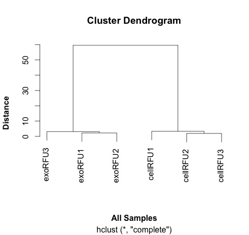
This distance matrix is used to do the hierarchical clustering that is plotted out here and shown here: 


Clustering samples using data from Webber et al, 2014.


# Trying to explain the concept of distance
# simple example 1: one digit different by 2 between two samples
samp1 <- c(0, 1, 2, 3, 4, 5, 6, 7, 8)
samp2 <- c(0, 1, 2, 3, 4, 5, 6, 7, 10)
dist(rbind(samp1, samp2))
# the dist() function compares each of the numbers in order along the two rows of the matrix. 
# answer is in this case is 2, as one number in the list is different by 2 to another. 

# simple example 2: one digit different by 72 between two samples
samp1 <- c(0, 1, 2, 3, 4, 5, 6, 7, 8)
samp2 <- c(0, 1, 2, 3, 4, 5, 6, 7, 80)
dist(rbind(samp1, samp2))
# answer is 72

# a little more complicated: two digits different
samp1 <- c(0, 1, 2, 3, 4, 5, 6, 7, 8)
samp2 <- c(0, 10, 2, 3, 4, 5, 6, 7, 80)
dist(rbind(samp1, samp2))
# now the answer is 72.56
# why? 
# well because of the equation used by the default method. 
# the default for the dist() function is euclidean 
# the equation for this is dist = sqrt(sum(x_i - y_i)^2)
# in this case, this calculates as sqrt(9^2 + 72^2)
# why the sqrt and the sum - in part so that the negatives and the positive differences don't cancel each other out.

# you can use other methods of calculating distance
help(dist)

# another is the "maximum" which just gives us the largest difference between the two arrays
# "Maximum distance between two components of x and y"
samp1 <- c(0, 1, 2, 3, 4, 5, 6, 7, 8)
samp2 <- c(0, 10, 2, 30, 4, 5, 6, 7, 80)
dist(rbind(samp1, samp2), method="maximum")
# in this case 72

# a third is the "manhattan" which sum of the absolute distances between the vectors
# "Absolute distance between the two vectors"
samp1 <- c(0, 1, 2, 3, 4, 5, 6, 7, 8)
samp2 <- c(0, 10, 2, 3, 4, 5, 6, 7, 80)
dist(rbind(samp1, samp2), method="manhattan")
# the answer now is 81

# now just envisage a more complicated situation when there are lots more numbers
# more than two samples and numbers that are higher and lower. 

# let's take a couple of examples from some data we analysed previously:

# http://www.mcponline.org/content/13/4/1050.full
# supplementary data is here: http://www.mcponline.org/content/suppl/2014/02/06/M113.032136.DC1/mcp.M113.032136-5.xlsx
# install if necessary:
# install.packages("readxl")
library(readxl)

# this is the link to the data
link <- "http://www.mcponline.org/content/suppl/2014/02/06/M113.032136.DC1/mcp.M113.032136-6.xlsx"

# the download.file() function downloads and saves the file with the name given
download.file(url=link,destfile="file.xlsx", mode="wb")

# then we can open the file and extract the data using the read_excel() function. 
data<- read_excel("file.xlsx")

View(data)

# the data has 762 observations. 

# we can only calculate distances in a matrix where all the values are the same mode - e.g numbers
# convert data frame (data) into a matrix 
# only want a subset of the data - the data from the samples. 
data.m <- as.matrix(data[2:7])
# transpose the data because a distance matrix works in rows
data.m.t <- t(data.m)

# calculate the distances and put the calculations into an object called distances
distances <- dist(data.m.t)

# convert this distances object into a matrix. 
distances.m <- data.matrix(distances)

# you can look at this object.
View(distances.m)

# we can extract the size of the object and the titles
dim <- ncol(distances.m)
names <- row.names(distances.m)

# now to create the visualisation of the difference matrix. 
# first the coloured boxes
image(1:dim, 1:dim, distances.m, axes = FALSE, xlab = "", ylab = "")

# now label the axis
axis(3, 1:dim, names, cex.axis = 0.8, las=3)
axis(2, dim:1, names, cex.axis = 0.8, las=1)

# add the values of the differences
text(expand.grid(1:6, 6:1), sprintf("%0.1f", distances.m), cex=1)

# this example lacks subltety
# the exo samples are very close together and the cell samples are quite far apart.
# it explains why the cluster analysis is so dramatic. 

# export this image as a tiff file with width of 1000 seems to work well. 
# some of the other formats don't work as well. 

# to make the cluster dendrogram object using the hclust() function
hc <- hclust(distances) 
# plot the cluster diagram
# some interesting groups in the data
plot(hc, 
     xlab =expression(bold("All Samples")), 
     ylab = expression(bold("Distance")))
# replicates cluster together well. 


The visualisation was inspired by this:


If you have feedback on this script, please leave a comment. 


Wednesday, 5 August 2015

Opening an image of a leukemia cell in R

Updated 16th May 2016: The image is now on Github so link points there.

I have been exploring the possibility of using R to open and analyse some images. This was first prompted by a delegate that attended our R for Biochemists Training Day organised through the Biochemical Society.

Our search revealed the Bioconductor package, EBImage which allows the opening of .jpg files using R. This allowed me to extract the fluorescence values that I had from this image which I prepared with a colleague, Dr Elisabeth Walsby. Beth stained the cell and I did the confocal microscopy. Here is the nice picture of a chronic lymphocytic leukaemia cell stained for a protein (red colour) and for DNA (blue).


I can open this image with R using the readImage() function that comes as part of the EBImage package. When I display the image using the display() command, it opens a new browser window. It has various functionality to explore the image shown here:


The most useful aspect of this approach is the ability to extract the fluorescence values to use to make nice plots in R. This uses the imageData() function which works like this:

  • imageData(img)[, 512, 3]  - access a vector with all the x values across one y value (pixel number 512) and extracts the third colour for the image. 
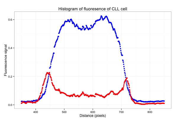
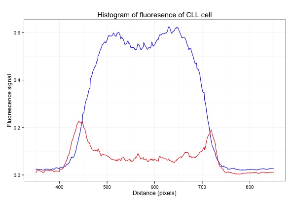
I've used EBImage to extract values and to generate this graph which shows the fluorescence of the pixels across the middle of the cell:


Here is the script with some plots that I generated along the way:

# EBImage - a Bioconductor package for analysing images
source("http://bioconductor.org/biocLite.R")
biocLite("EBImage")
library("EBImage")
library(ggplot2)

# the image is on Github
img <- readImage("https://raw.githubusercontent.com/brennanpincardiff/RforBiochemists/master/data/images/cllCell.jpg")
# the object created is a Large Image (24 Mb in this case!)

display(img)
# opens a window in a web browser and allows you to look at the image

print(img)
# shows some of the structure of the Large Image object.

dim(img)
# [1] 1024 1024    3   
# corresponds to x and y pixels of the image and then the number of colours for each pixel

# why do we want to do this?
# so that we can extract data out of the image and draw nice graphs. 
# to extract a value out of the Large Image use the imageData() function

# if you place the mouse over the image in the web browser, you see the name of the pixel. 

# we can extract the fluorescence value and plot the data
x <- imageData(img)[, 512, 3]

# this gives the values for colour 3 for the whole x line at the value of y = 512. 
# this is a list of 1024 numbers which can be plotted
plot(x)  

# the index at the bottom refers to the x values across the whole image. 


# using the web browser, I can choose the line across the middle of the cell
# extract a row of 100 pixels wide from left to right of the middle of the image.
# I chose to extract values from y pixel 425 to 545 which correspond to the middle of the cell

# colour 1
x10.col1 <- as.data.frame(imageData(img)[ ,425:525, 1])
plot(x10.col1$V5)  # plot one of the values
Plot one of the values (V5)

x10.col1$mean <- rowMeans(x10.col1[1:100])
plot(x10.col1$mean) # plot the mean
Plot the mean of 100 pixels
# colour 3
x10.col3 <- as.data.frame(imageData(img)[ ,425:525, 3])
x10.col3$mean <- rowMeans(x10.col3[1:100])
plot(x10.col3$mean, col = "blue")
lines(x10.col1$mean, col = "red")
Plot both colours using Base R

# assemble a data frame to allow us to use ggplot to plot the data..
m <- as.data.frame(x10.col1$mean)
m$col3 <- x10.col3$mean

# change the column names in the data frame
colnames(m) <- c("col1", "col3")

# make the basic ggplot object
p <- ggplot(data=m, aes(x=seq(1, length(col3)))) + 
     geom_line(aes(y = col3), colour = "blue") + 
     geom_line(aes(y = col1), colour = "red")
p  # show the plot
Plot both colours in ggplot2

# focus on just the cell
p <- ggplot(data=m, aes(x=seq(1, length(col3)))) + 
     geom_line(aes(y = col3), colour = "blue") + 
     geom_line(aes(y = col1), colour = "red") + 
     xlim(350,850) # focus on just the cell
p  # have a look
# gives Warning messages but these can be ignored.
Focus on the cell by limiting the x-axis.

# add some titles and a easy theme 
p <- p +  xlab("Distance (pixels)") +   #label x-axis
          ylab("Fluorescence signal") +    #label y-axis
          ggtitle("Histogram of fluoresence of CLL cell") +  #title
          theme_bw()     # a simple theme

p   # show the plot
Add titles and change the theme.
# plot points instead of lines...
q <- ggplot(data=m, aes(x=seq(1, length(col3)))) + 
  geom_point(aes(y = col3), colour = "blue") + 
  geom_point(aes(y = col1), colour = "red") + 
  xlim(350,850) +  
  xlab("Distance (pixels)") +   # label x-axis
  ylab("Fluorescence signal") +    # label y-axis
  ggtitle("Histogram of fluoresence of CLL cell") +  # add a title
  theme_bw()     # a simple theme
q   # show the plot

You have the plot at the top of the page....


Resources: 

Wednesday, 29 July 2015

Analysing some citation data in R....

Last week, I showed a graph that detailed the number of publications in my field of study: chronic lymphocytic leukemia - over 17,000 publications with over 4,000 between 2010 and 2014. This inspired me to ask the question of what papers, from 2010 to 2014 were the most cited papers in the field. What were the MUST READ papers?

To do this required me to download citation data and do some analysis. Downloading citation data is not difficult but it does take up a bit of internet time. You don't need to do it yourself to appreciate the graph that I have made or the list of papers that it generated. 

Here is the graph:


Here is the script to draw this graph:
START
# This data file has a list of the PubMed IDs, the year and the citation data 
data <- read.csv("http://science2therapy.com/data/cllCitation2010to2014_20150722.csv", header=T)

str(data)
cit <- data$cit

# not very useful but good practice to plot the data first...
plot(density(cit))
plot(density(cit), log='x')
hist(cit)

# not very useful in ggplot either
p <- ggplot(data=data,          # specify the data frame with data
            aes(x=cit)) +       # specify the x and y for the graph
  geom_bar(binwidth = 10)    # it's a bar plot

p   # show the plot

# so lots of the publications with relatively few citations. 

# Do some subsetting to identify highly cited papers. 
# http://www.statmethods.net/management/subset.html

# calculate the mean number of citations 
mean.cit <- mean(data$cit)   # 4.1 for this data set. 

# data frame of publications with no citations
newdata.zero <- subset(data, cit == 0)

# data frame of publications with one citation
newdata.one <- subset(data, cit == 1)

# make a data frame of publications with more than one citations upto the mean 
newdata.greater1 <- subset(data, cit > 1)
newdata.mean <- subset(newdata.greater1, cit < mean.cit)

# make a data frame of publications with more than the mean citations
# up to the mean squared
newdata.greatermean <- subset(data, cit > mean.cit)
newdata.meanSq <- subset(newdata.greatermean, cit < (mean.cit^2))

# make a data frame of publications with more than the mean squared citations
# up to the mean cubed
newdata.greatermeanSq <- subset(data, cit > (mean.cit^2))
newdata.SqtoCube <- subset(newdata.greatermeanSq, cit < (mean.cit^3)) 

# make a data frame of publications with more than the mean cubed citations
newdata.greaterCube <- subset(data, cit > (mean.cit^3))

# assemble these numbers into a vector
count<-c(nrow(newdata.zero), nrow(newdata.one), nrow(newdata.mean), 
         nrow(newdata.meanSq), nrow(newdata.SqtoCube), nrow(newdata.greaterCube))

# simple barplot
barplot(count)

# create a list of labels
lab=c("0","1","2-4","5-16","17-64", ">64")

# assemble a new data frame to plot with ggplot
df <- as.data.frame(count)
df$label <- lab
df$labfac <- factor(df$label, as.character(df$label))


# do a nice histogram of citation frequency in ggplot
p <- ggplot(data=df, aes(y=count)) + 
  geom_bar(aes(x=labfac), data=df, stat="identity") + 
  xlab("Number of citations") +   # label x-axis
  ylab("Number of Papers") +    # label y-axis
  ggtitle("Chronic Lymphocytic Leukemia Papers published 2010 to 2014") +  # add a title
  theme_bw() +      # a simple theme
  expand_limits(y=c(0,2000)) +   # customise the y-axis
  theme(axis.title.y = element_text(size = 14 )) + 
  theme(axis.title.x = element_text(size = 14 )) + 
  theme(axis.text = element_text(size = 12))

p    #show us the plot

END


Thoughts on the citation analysis


The average number of citations per paper was just over 4. 
Only 24 papers were cited more than 64 times. 

Here is a list of the 5 most highly cited papers from 2010 to 2014:

  1. Porter, et al 2011 N Engl J Med “Chimeric antigen receptor-modified T cells in chronic lymphoid leukemia.” Cited: 414 times 
  2. Stephens et al 2011 Cell “Massive genomic rearrangement acquired in a single catastrophic event during cancer development.” Cited: 333 times 
  3. Kalos et al 2011 Sci Transl Med “T cells with chimeric antigen receptors have potent antitumor effects and can establish memory in patients with advanced leukemia.” Cited: 287 times 
  4. Puente et al 2011 Nature “Whole-genome sequencing identifies recurrent mutations in chronic lymphocytic leukaemia.” Cited: 228 times 
  5. Grupp et al 2013 N Engl J Med “Chimeric antigen receptor-modified T cells for acute lymphoid leukemia.” Cited: 205 times 


Full list of the 24 papers is available as a PDF here


Tuesday, 21 July 2015

How many publications in your area of research?

The amount of scientific literature is daunting. There are over 17,000 papers published in my research area which is chronic lymphocytic leukemia. I wanted to graph this so here is what I did:

I did a PubMed search using "chronic lymphocytic leukaemia" or "chronic lymphocytic leukemia" or "CLL". When the search is made, there is a nice graph on the left hand side of the browser window - see the circle in the picture below. You can download a csv file of this data by pressing on "Download CSV".


If you import this CSV file into R, it looks a bit strange. The str(data) command gives you the following output:

> str(data)
'data.frame': 64 obs. of  1 variable:
 $ pubmed...chronic.lymphocytic.leukaemia.or.chronic.lymphocytic.leukemia.or.CLL: Factor w/ 57 levels "1","10","1001",..: 57 51 3 56 53 52 55 50 48 47 ...

This is because it has a line at the top of the file that R can't interpret properly. You need to open the file and delete the first line - a little bit of data wrangling. I did this in Excel.
I also did a search with (("chronic lymphocytic leukaemia" or "chronic lymphocytic leukemia" or "CLL")) AND REVIEW[Publication Type] which gave me 2,236 articles. I combined these two bits of data in Excel. I saved this as a csv file.

When I import this new file, the str(data) command gives this:

> str(data)
'data.frame': 63 obs. of  3 variables:
 $ year    : int  2015 2014 2013 2012 2011 2010 2009 2008 2007 2006 ...
 $ articles: int  725 1001 930 787 776 819 695 618 608 594 ...
 $ reviews : int  38 147 185 124 112 135 97 74 126 112 ...

This looks much more useful.

Here is the graph that I have made:


Here is the script for this:


# activate the required packages
library(ggplot2)
library(reshape2)
library(ggthemes)

# do search in pubmed on the web
# pubmed - "chronic lymphocytic leukaemia" or "chronic lymphocytic leukemia" or "CLL"
# get an option to download a csv file
# open the file and remove the top line to prevent an error 
# add other data if you want and change the column titles to something useful
setwd("/Users/paulbrennan/Documents/Work Documents/Staff & Collaborations/RforBiochemists/RforBiochemists/data")
data <- read.csv("cllPublicationsformatted.csv")

# reshape the data from wide to long format
data.melt <- melt(data, id.vars = "year", value.name = "pubs", variable.name = "pub.type")

# draw the graph
p <- ggplot(data.melt, aes(x=year, 
                           y= pubs, 
                           colour = factor(pub.type, labels = c("Articles", "Reviews")))) + 
# colour = factor and the labels allows us to customize the legend
    geom_line(size=1) +
    labs(color = "Publication Type") + # customizes the legend title
    scale_colour_manual(values=c("black","red")) +
    ylab("Number Publications") + # y-label
    xlab("Year") + # x-label
    ggtitle("Chronic Lymphocytic Leukaemia Publications by Year") +
    scale_x_continuous(breaks=c(1960,1970,1980,1990, 2000, 2010)) +
    theme_bw()

p <- p + theme(legend.position=c(0,1), # move to the top left
               legend.justification=c(0,1), # move it in a bit
               legend.text=element_text(size = 12), # increase size of text
               legend.title=element_text(size = 12)) # and the title
               
p <- p + theme(axis.title.y = element_text(size = 14 )) + 
         theme(axis.text = element_text(size = 12))

p # show the graph


N.B. You do get a warning:
Warning message:
In loop_apply(n, do.ply) :
  Removed 17 rows containing missing values (geom_path).

This is because there is more data for the articles than the reviews. Nothing to worry about. 

This resource helped me: https://rpubs.com/hughes/10012