Showing posts with label cluster. Show all posts

Thursday, 2 March 2017

Using 'pipes' in R for easier reading code

The magrittr package allows us to write code using 'pipes'. The code is a little easier to read. Easier code to read is easier to share, document and use which appeals to me. I think it makes it more open and I'm a big fan of open science.

Using pipes avoids us piling up our functions on single lines and encourages me to layout my code in a more organised way.
Pipes allows space for documentation, explanations and comments.
I have used pipes to create this cluster diagram to illustrate the point:


Consider adding the use of pipes to your code to make it easier for others.


Here's is the script:

# START 
# download the data from github
library(RCurl)
x <- getURL("https://raw.githubusercontent.com/brennanpincardiff/RforBiochemists/master/data/microArrayData.tsv")
data <- read.table(text = x, header = TRUE, sep = "\t")

# when we have a workflow that we like there is a tendency to pile up our functions

# here is an example:
plot(hclust(dist(t(data[2:15]))))

# the introduction of the magrittr piping function into R..x
# allows us to do this in a way that make a work flow easier to view and easier to comment

# install.packages("magrittr") # if required
library(magrittr)
# https://cran.r-project.org/web/packages/magrittr/vignettes/magrittr.html

data[2:15] %>%   # subset the object (columns 2:15 of the dataframe)
  t() %>%        # transform it so that columns are rows
  dist() %>%     # calculate distance
  hclust() %>%   # do a hierarchical cluster
  plot()         # then plot the result. 

# this approach really makes life easier when we have arguments in our functions
# we can change the method for the dist() function
# and we can add a title and some colour with the plot() function
# using pipes, this looks like this:

data[2:15] %>%          # create a subset of object data (cols 2:15)
  t() %>%               # transform it so that columns are rows
  dist(method = "manhattan") %>%    # calc dist with manhattan meth
  hclust() %>%                      # do a hierarchial cluster
  plot(main="Cluster Diagram of Drug Treatments\n(2 Mar 2017)",     # add a title
       lwd=2, col="blue", cex = 1.1) # thick line & change colours  


# this code the other way looks like this:
plot(hclust(dist(t(data[2:15]), method = "manhattan")),
     main="Cluster Diagram of Drug Treatments\n(2 Mar 2017)", # add a title
     lwd=2, col="blue", cex = 1.1)

# it's a little bit difficult to separate the functions, objects and arguments in my opinion

# N.B. three key points to remember about using pipes:
# (1) brackets remain to allow us to identify functions()
# (2) the arguments go within the brackets - not the objects
# (3) objects are now 'piped' into the functions using %>%
# END

There are lots of blog posts about pipes and magrittr. Just search....

Hat tip to Steph Locke and Dave from the Cardiff R User group for encouraging me to use pipes. 

Friday, 24 June 2016

Principal Component Analysis with published CLL gene expression data (Herishanu et al, Blood 2011)

Over the last few years, my understanding of chronic lymphocytic leukaemia has developed. Leukaemic cell proliferation has been shown to be a key element of the disease. The site of CLL cell proliferation was an important question. A gene expression analysis published in Blood by Herishanu et al in 2011 showed a proliferative gene expression pattern in the leukeamic cells from the lymph nodes as distinct from other sites of the body (peripheral blood or bone marrow).

I've been exploring the gene expression data using R. As a first step, I've explored the principal component analysis similar to that shown in Figure 1A of the paper.


The PCA is convincing because the three groups of samples cluster among themselves.  The 3D plot is useful because the three components separate the groups while two dimensions do not.


There are other ways of visualising PCA plots...  Sources are indicated as part of the script. 


Here is the script that I used to analyse this:

SCRIPT START
# install.packages("RCurl", "scatterplot3d")

library(RCurl)
library(scatterplot3d)

# A few year's ago a gene expression profile paper was published in Blood by Herishanu et al
# that gave us a new insight into chronic lymphocytic leukamia. 
# http://www.bloodjournal.org/content/117/2/563.long
# I have written this script to explore the data 
# and to reproduce the principal component analysis. 

# I have downloaded the original CEL files from GEO
# they were placed in a folder and the expression values extracted 
# what's produced is Affymetrix IDs and log2 expression values 

# I have created two data sets
# we can reproduce the PCA workflow with a subset of the data is required (5000 genes selected randomly). 
# this will be faster to download and visualise. 
# get the data - needs connection to the internet
# to use remove the hashtag "#"
# x <- getURL("https://raw.githubusercontent.com/brennanpincardiff/RforBiochemists/master/data/herishanuMicroArrayDataSubset.tsv")

# here is a link for all the data (>50000 probes) 
x <- getURL("https://raw.githubusercontent.com/brennanpincardiff/RforBiochemists/master/data/herishanuMicroArrayData.tsv")

# turn the data into a useful data.frame
data <- read.table(text = x, header = TRUE, sep = "\t")

# read in a file with names of samples
# created this from cut and paste of web page combined with manipulation in Word & Excel
sampID <- read.csv("https://raw.githubusercontent.com/brennanpincardiff/RforBiochemists/master/data/Herishanu_Samp_ID.csv", header = FALSE)

str(sampID)
sampID$V1 <- as.character(sampID$V1)

# is order of column names same as list in sampID?
data.col.name <- colnames(data)
data.col.name <- gsub(".CEL", "", data.col.name)
sampID.name <- sampID$V1
all.equal(data.col.name, sampID.name)
# TRUE so that is useful. 


# change column names from chip to PB, BM and LN
# for peripheral blood, bone marrow and lymph node respectively
sampID$Name <- paste0(as.character(sampID$V3), as.character(sampID$V5))
colnames(data) <- sampID$Name

# how do the sample cluster?
# I first need to find the "distances" between the arrays
# and show those distances in the hierarchical cluster plot
# I can pile up all the commands in one
# for more of a step by step approach, see these scripts:

plot(hclust(dist(t(data))))


# this is interesting because all the patient samples cluter together!
# with bone marrow and peripheral blood closer together than LN in all cases. 
# this is what it says in the paper and is shown in the supplementary data. 

# What's needed is a way to normalise by patient - HOW??
# Quote from the paper:
# "In the 12 patients in whom all 3 compartments had been arrayed, 
# the patient effect on gene expression was subtracted 
# by mean centering the expression value of each gene across the 3 compartments 
# for each patient separately."

# the twelve with all 3 compartments: #1, #2, #3, #4, #8, #9, #10, #11, #12, #13, #25, #26

# so if I understand this correctly, I need to extract a patient sample
# then mean centre all three samples, 
# and repeat for all 12 samples

# let's explore this concept with just two samples to see if it works
# pick out data for patient #26
samp26 <- data[,grep("#26", sampID$Name)]

# pick out data for patient #25
samp25 <- data[,grep("#25", sampID$Name)]

# put them together
twosamp <- cbind(samp26, samp25)


# visualise with a box plot - look normalised
boxplot(twosamp)


plot(hclust(dist(t(twosamp))))


# cluster by patient

# I think I understand what they have done.
# mean centred for each gene.... i.e. by row in the data
# For us this is really each probeset
# http://gastonsanchez.com/how-to/2014/01/15/Center-data-in-R/

# for each of the values substract the rowMeans
samp25.s <- samp25 - rowMeans(samp25)
samp26.s <- samp26 - rowMeans(samp26)
twosamp.s <- cbind(samp26.s, samp25.s)

plot(hclust(dist(t(twosamp.s))))


# This seems to work and gives a different cluster diagram
# with LN coming together nicely.

# apply this to the whole data set.
# extract each patient cohort
# these twelve were: #1, #2, #3, #4, #8, #9, #10, #11, #12, #13, #25, #26
# do #1 and # 2 first then do the other automatically...

# pat # 1
colnames(data)
pat_1 <- cbind(data[,1], data[,27], data[,46])
colnames(pat_1) <- c("PB#1", "BM#1", "LN#1")
pat_1.s <- pat_1 - rowMeans(pat_1)
# pat # 2
pat_2 <- cbind(data[,2], data[,28], data[,47])
colnames(pat_2) <- c("PB#2", "BM#2", "LN#2")
pat_2.s <- pat_2 - rowMeans(pat_2)

data.n <- cbind(pat_1.s, pat_2.s)

data.reqd <- c("#3", "#4", "#8", "#9", "#10", "#11", "#12", "#13", "#25", "#26")
for(i in 1:length(data.reqd)){
  samp <- data[,grep(data.reqd[i], sampID$Name)]
  samp <- samp - rowMeans(samp)
  data.n <- cbind(data.n, samp)
}

# now have a file called dat.exp.n - normalised within patients.
colnames(data.n)
plot(hclust(dist(t(data.n))))


# nice cluster by region with good separation of LN samples
# some overlap within PB and LN


# extract cell site to use for colours in PCA plots
names <- colnames(data.n)
colourby <- gsub("#\\d+", "", colnames(data.n))
colourby <- gsub("\\.", "", colourby)
colourby <- gsub("\\d+", "", colourby)

# this does cluster the LN samples distinctly but there is still some overlap 
# of Peripheral Blood and Bone Marrow. 
# PCA from the paper looks nice and convincing
# http://www.r-bloggers.com/computing-and-visualizing-pca-in-r/
# uses function princomp()

exp.pca <- princomp(data.n)  # this function does the PCA
print(exp.pca)
plot(exp.pca, type = "l")

Plot of variance by component for CLL gene expression patterns


plot(princomp(data.n)$loadings)
A simple 2D plot of component 1 vs component 2


p <- princomp(data.n)
loadings <- p$loadings[]
p.variance.explained <- p$sdev^2 / sum(p$sdev^2)

# plot percentage of variance explained for each principal component    
barplot(100*p.variance.explained, las=2, xlab='', ylab='% Variance Explained')


Looking at the effects of each component as a bar plot.


#*****************************************************************
# 2-D Plot
#******************************************************************         
x <- loadings[,1]
y <- loadings[,2]
z <- loadings[,3]
cols <- as.factor(colourby)
cols <- gsub("PB", "green", cols)
cols <- gsub("BM", "red", cols)
cols <- gsub("LN", "blue", cols)

# pch = 24: triangle point-up
# pch = 22: square
# pch = 21: circle
symbols <- as.factor(colourby)
symbols <- gsub("PB", 24, symbols)
symbols <- gsub("BM", 21, symbols)
symbols <- gsub("LN", 22, symbols)
symbols <- as.numeric(symbols)


# plot loadings on the first and second principal components 
# identify sample by body location
plot(x, y, type='p', 
     pch=symbols, 
     xlab='Comp.1', ylab='Comp.2', 
     col = cols, main = "Principal Component Analysis - CLL cell gene expression")

A simple 2D plot of component 1 vs component 2
 Each sample is coloured by location
# add a legend to the top of the plot
legend("top",      # location
       bty="n",              # suppress legend box, shrink text 50%
       title="Body Location of sample",
       c("PB", "BM", "LN"), 
       pch=symbols, col = cols, horiz=TRUE)
# label up the points
text(x, y, colnames(data.n), col=cols, cex=.5, pos=4)

# Comment: lymph node samples separate nicely from other samples
# some overlap between bone marrow and peripheral blood 

#*****************************************************************
# 3-D Plot, for good examples of 3D plots
#******************************************************************                 
# plot all companies loadings on the first, second, and third principal components and highlight points according to the sector they belong
s3d = scatterplot3d(x, y, z, 
                    xlab='Comp.1', ylab='Comp.2', zlab='Comp.3', 
                    color=cols, pch = symbols,
                    main = "Principal Component Analysis in 3D \n CLL cell gene expression")
A 3D graph separates the different groups of samples. 
s3d.coords = s3d$xyz.convert(x, y, z)
text(s3d.coords$x, s3d.coords$y, 
     labels=colnames(data.n), col=cols, cex=.8, pos=4)

Labels can be added but I'm not sure they help in this example. 

# change the order and the angle to make it look a bit more like the figure
s3d = scatterplot3d(y, x, z, 
                    xlab='PC2', ylab='PC1', zlab='PC3',             
                    color=cols, pch = symbols,
                    angle=-25,
                    grid = FALSE,
                    main = "Principal Component Analysis in 3D \n CLL cell gene expression")

par(xpd=TRUE)    # allows legend outside the graph

# add legend
legend(10, -4.5,     # location
       bty="n",              # suppress legend box
       title="Site of sample",
       c("PB", "BM", "LN"), 
       pch=symbols, col = cols, horiz=TRUE)

# add source as text
text(4, -6.5, cex =0.7,
     "Source: Herishanu et al, Blood 2011 117:563-574; doi:10.1182/blood-2010-05-284984")


SCRIPT END

Monday, 7 March 2016

Gene Expression Analysis and Visualization for VizBi 2016 (Pt 1)

UPDATE: During the VizBi2016 tutorial session, the participants noticed a couple of errors in the script. I think these have now been corrected.
Also, Christian Hauer suggested that we visualise the distance matrix using the heatmap packages. He suggested pheatmap, in particular. Thanks Christian.

I have spent some time creating two quite long scripts that generate a selection of visualisation of some gene expression data generated recently by Mel Boyd at the Cardiff CLL Research Group. The script illustrates a workflow that results in a selection of interesting and useful visualisations that allow us to compare the different drug treatments used.

The data was generated from an Affymetrix HTA 2.0 chip. The data has been normalised and mapped using the oligo package. I have focussed on the protein coding transcripts and I have generated a random selection of 5000 of these genes.

This part of the experiment uses the data from four different experimental 'drugs' which target different pathways and have different cellular effects. This analysis and the associated visualisations are used to allow us to compare the drug treatments and look at the data as a whole set.

I am happiest with the visualisation that is generated by the loadings of the principal component analysis but there are some other good visualisations generated by the scripts too.
The cluster at the top right is from the drug that causes the most changes. The other drugs cause few changes and so map closer to the untreated samples.

Next script shows volcano plots and a heatmap.


Here is the script:
# START 
# download the data from github
library(RCurl)
x <- getURL("https://raw.githubusercontent.com/brennanpincardiff/RforBiochemists/master/data/microArrayData.tsv")
data <- read.table(text = x, header = TRUE, sep = "\t")

# basic commands for looking at the data
head(data)      # view first six rows
str(data)       # shows it's a dataframe
colnames(data)  # column names
View(data)      # this works in R-Studio

# for first part of analysis
# subset of the data with just the numbers.
new.data <- data[2:16]
# these are log2 values 
# The data has been normalized


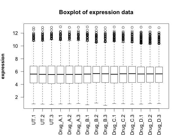
## FIRST visualisation of the data: a simple box plot
boxplot(new.data, 
        las =2, # las = 2 turns the text around to show sample names
        ylab = expression(bold("expression")),
        main="Boxplot of expression data")  


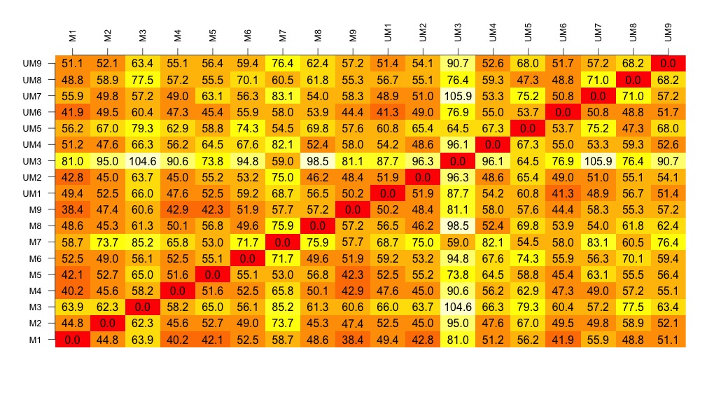
## SECOND visualisation(s): calculate and visualise distances
# turn into a matrix 
data.m <- as.matrix(new.data)
# transpose the data because a distance matrix works in rows
data.m.t <- t(data.m)
# calculate the distances and put the calculations into an object called distances
distances <- dist(data.m.t)
# convert this distances object into a matrix. 
distances.m <- data.matrix(distances)
# you can look at this object.
View(distances.m)
# we can extract the size of the object and the titles
dim <- ncol(distances.m)
names <- row.names(distances.m)
# now to create the visualisation of the difference matrix. 
# first the coloured boxes
image(1:dim, 1:dim, distances.m, axes = FALSE, xlab = "", ylab = "")
# now label the axis
axis(3, 1:dim, names, cex.axis = 0.8, las=3)
axis(2, 1:dim, names, cex.axis = 0.8, las=1)
# add the values of the differences
text(expand.grid(1:dim, 1:dim), sprintf("%0.1f", distances.m), cex=1)


# heatmaps ccan also be used to visualise the distance matrix. 
# samples can be clustered or you can stop this. Thanks Christian Hauer
heatmap(distances.m)


heatmap3(distances.m)


pheatmap(distances.m)


## THIRD visualisation: use the distance matrix to do some clustering
plot(hclust(distances))


# three clusters - based on the distance matrix and shows the same thing really.

## FOURTH visualisation: principal component analysis
# Do a Principal Component Analysis  
# and widely-used technique for viewing patterns of gross variation
# in datasets
# We can see whether an array is substantially different to the others
pca <- princomp(data.m)  # function that does the PCA
summary(pca)  # one component accounts for 99% of the variance
plot(pca, type = "l")  


names <- factor(gsub("\\.\\d", "", names)) # change names into factor
plot(pca$loadings, col = names, pch = 19)
text(pca$loadings, cex = 0.7, label = colnames(new.data), pos =3)


# some of the treatment cluster well together (e.g. Drug D) others not so much


# can be interesting to look at a subset of the data...
pca <- princomp(data.m[,1:12])
plot(pca$loadings, col = names, pch = 19, 
     main = "Just three drug treatments")
text(pca$loadings, cex = 0.7, label = colnames(new.data)[1:12], pos =3)

# basically happy with our data generally. 
# next step in next script is to look at differentially expressed transcripts.

Monday, 8 February 2016

Visualising some CLL proteomic data for VizBi2016... Part 1...

I am preparing scripts for VisBi2016. I've decided to use a chronic lymphocytic leukaemia proteomic data set from a research group in Liverpool. It's the largest CLL proteomic dataset and it's published.

The key steps are:

  1. Get the data into R using read_excel() function from the readxl package
  2. Draw the first visualisation - a simple box plot

  3. Calculate the distances between the samples
  4. Draw a visualisation of the distance matrix
  5. Cluster the samples and then draw a visualisation of the sample cluster
  6. Finally, using the data from the paper, I have drawn a volcano plot. 

Here is the script to do that....

START OF SCRIPT
# writing my first script for VizBi
# download and visualising the MCP CLL proteomics data

library(ggplot2)
library(readxl)


# I've decided that I would like to make CLL proteomics the first data set for the VizBi tutorials
# I've done some myself but the largest data set currently publically available is from the Liverpool group
# Reference: http://www.mcponline.org/content/14/4/933.full
# http://www.mcponline.org/content/suppl/2015/02/02/M114.044479.DC1/mcp.M114.044479-2.xls
link <- "http://www.mcponline.org/content/suppl/2015/02/02/M114.044479.DC1/mcp.M114.044479-2.xls"

# the download.file() function downloads and saves the file with the name given
download.file(url=link,destfile="file.xls", mode="wb")

# then we can open the file and extract the data using the read_excel() function. 
data <- read_excel("file.xls")

# so the data is in R now in an object called "data'. 
# The object "data" consists of 3521 observations of 24 variables. 

# we can look at the data 
View(data)
# it's made up of protein names, accession numbers, 18 samples and some statistics

# we can check the structure 
str(data)
# this tells us about the types of data that make up each column. 

# the fist thing we are going to do is make and visualise a distance matrix. 

# columns 3 to 21 are the data.  
# we can check this:
head(data[3:20])  # shows the first six rows of data
colnames(data[3:20]) # shows the column names. 
# this seems correct. 

# plot the data - always an important first step!
boxplot(data[3:20], 
        las =2, # las = 2 turns the text around to show sample names
        ylab = expression(bold("expression")),
        main="Boxplot of expression data")  


# we can only calculate distances in a matrix where all the values are the same mode - e.g numbers
# convert data frame (data) into a matrix 
# only want a subset of the data - the data from the samples. 
data.m <- as.matrix(data[3:20])
# transpose the data because a distance matrix works in rows
data.m.t <- t(data.m)

# calculate the distances and put the calculations into an object called distances
distances <- dist(data.m.t)

# convert this distances object into a matrix. 
distances.m <- data.matrix(distances)

# you can look at this object.
View(distances.m)

# we can extract the size of the object and the titles
dim <- ncol(distances.m)
names <- row.names(distances.m)

# now to create the visualisation of the difference matrix. 
# first the coloured boxes
image(1:dim, 1:dim, distances.m, axes = FALSE, xlab = "", ylab = "")

# now label the axis
axis(3, 1:dim, names, cex.axis = 0.8, las=3)
axis(2, 1:dim, names, cex.axis = 0.8, las=1)

# add the values of the differences
text(expand.grid(1:18, 1:18), sprintf("%0.1f", distances.m), cex=1)

# look at this there is lots of variation between the samples....

# export this image as a tiff file with width of 1000 seems to work well. 
# some of the other formats don't work as well. 

# to make the cluster dendrogram object using the hclust() function
hc <- hclust(distances) 
# plot the cluster diagram
# some interesting groups in the data
plot(hc, 
     xlab =expression(bold("All Samples")), 
     ylab = expression(bold("Distance")))
# interestingly the mutated and unmutated samples don't group together
# there are smaller clusters within the data
# this indicates that there is variation in the data set that is not explained by that grouping. 

# we can draw a volcano plat because they have calculated the log 2 fold change and the p-value
colnames(data) <- make.names(colnames(data))  # gets rid of the spaces in the column names.
data$threshold = as.factor(data$P.Value < 0.05)

##Construct the plot object
g <- ggplot(data=data, 
            aes(x=Log2.Fold.Change, y =-log10(P.Value), 
                colour=threshold)) +
  geom_point(alpha=0.4, size=1.75) +
  xlim(c(-6, 6)) +
  xlab("log2 fold change") + ylab("-log10 p-value") +
  theme_bw() +
  theme(legend.position="none")

g  # shows us the object - the graph

END OF SCRIPT