Showing posts with label distance. Show all posts

Monday, 7 March 2016

Gene Expression Analysis and Visualization for VizBi 2016 (Pt 1)

UPDATE: During the VizBi2016 tutorial session, the participants noticed a couple of errors in the script. I think these have now been corrected.
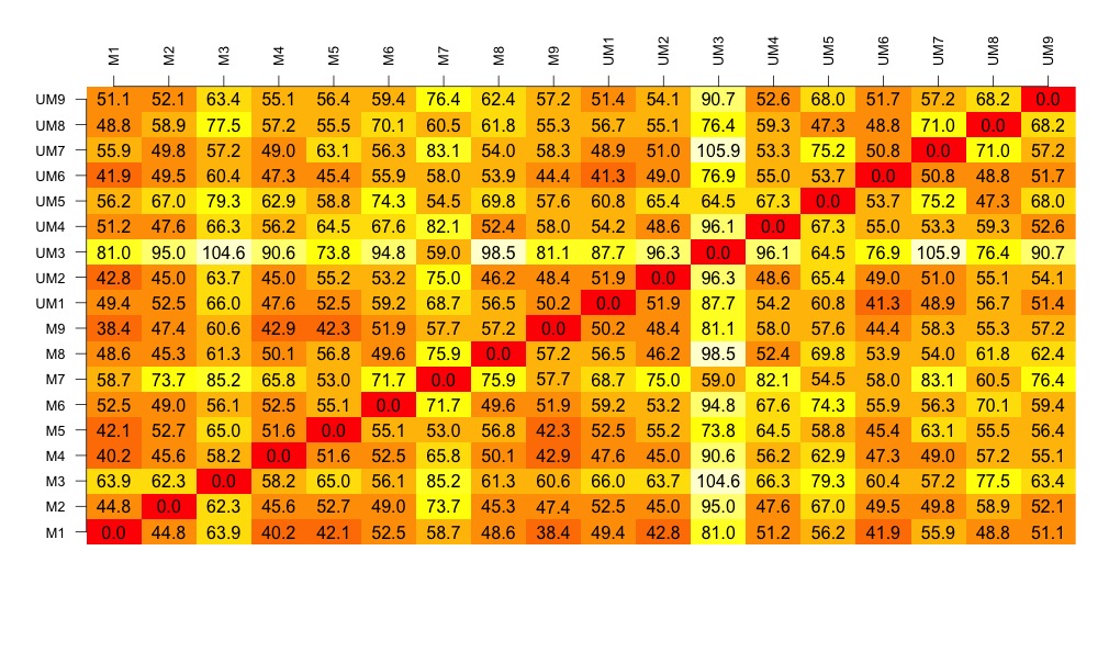
Also, Christian Hauer suggested that we visualise the distance matrix using the heatmap packages. He suggested pheatmap, in particular. Thanks Christian.

I have spent some time creating two quite long scripts that generate a selection of visualisation of some gene expression data generated recently by Mel Boyd at the Cardiff CLL Research Group. The script illustrates a workflow that results in a selection of interesting and useful visualisations that allow us to compare the different drug treatments used.

The data was generated from an Affymetrix HTA 2.0 chip. The data has been normalised and mapped using the oligo package. I have focussed on the protein coding transcripts and I have generated a random selection of 5000 of these genes.

This part of the experiment uses the data from four different experimental 'drugs' which target different pathways and have different cellular effects. This analysis and the associated visualisations are used to allow us to compare the drug treatments and look at the data as a whole set.

I am happiest with the visualisation that is generated by the loadings of the principal component analysis but there are some other good visualisations generated by the scripts too.
The cluster at the top right is from the drug that causes the most changes. The other drugs cause few changes and so map closer to the untreated samples.

Next script shows volcano plots and a heatmap.


Here is the script:
# START 
# download the data from github
library(RCurl)
x <- getURL("https://raw.githubusercontent.com/brennanpincardiff/RforBiochemists/master/data/microArrayData.tsv")
data <- read.table(text = x, header = TRUE, sep = "\t")

# basic commands for looking at the data
head(data)      # view first six rows
str(data)       # shows it's a dataframe
colnames(data)  # column names
View(data)      # this works in R-Studio

# for first part of analysis
# subset of the data with just the numbers.
new.data <- data[2:16]
# these are log2 values 
# The data has been normalized


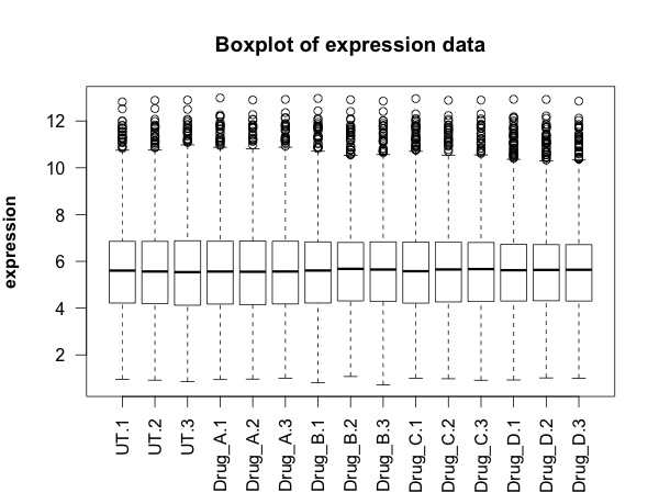
## FIRST visualisation of the data: a simple box plot
boxplot(new.data, 
        las =2, # las = 2 turns the text around to show sample names
        ylab = expression(bold("expression")),
        main="Boxplot of expression data")  


## SECOND visualisation(s): calculate and visualise distances
# turn into a matrix 
data.m <- as.matrix(new.data)
# transpose the data because a distance matrix works in rows
data.m.t <- t(data.m)
# calculate the distances and put the calculations into an object called distances
distances <- dist(data.m.t)
# convert this distances object into a matrix. 
distances.m <- data.matrix(distances)
# you can look at this object.
View(distances.m)
# we can extract the size of the object and the titles
dim <- ncol(distances.m)
names <- row.names(distances.m)
# now to create the visualisation of the difference matrix. 
# first the coloured boxes
image(1:dim, 1:dim, distances.m, axes = FALSE, xlab = "", ylab = "")
# now label the axis
axis(3, 1:dim, names, cex.axis = 0.8, las=3)
axis(2, 1:dim, names, cex.axis = 0.8, las=1)
# add the values of the differences
text(expand.grid(1:dim, 1:dim), sprintf("%0.1f", distances.m), cex=1)


# heatmaps ccan also be used to visualise the distance matrix. 
# samples can be clustered or you can stop this. Thanks Christian Hauer
heatmap(distances.m)


heatmap3(distances.m)


pheatmap(distances.m)


## THIRD visualisation: use the distance matrix to do some clustering
plot(hclust(distances))


# three clusters - based on the distance matrix and shows the same thing really.

## FOURTH visualisation: principal component analysis
# Do a Principal Component Analysis  
# and widely-used technique for viewing patterns of gross variation
# in datasets
# We can see whether an array is substantially different to the others
pca <- princomp(data.m)  # function that does the PCA
summary(pca)  # one component accounts for 99% of the variance
plot(pca, type = "l")  


names <- factor(gsub("\\.\\d", "", names)) # change names into factor
plot(pca$loadings, col = names, pch = 19)
text(pca$loadings, cex = 0.7, label = colnames(new.data), pos =3)


# some of the treatment cluster well together (e.g. Drug D) others not so much


# can be interesting to look at a subset of the data...
pca <- princomp(data.m[,1:12])
plot(pca$loadings, col = names, pch = 19, 
     main = "Just three drug treatments")
text(pca$loadings, cex = 0.7, label = colnames(new.data)[1:12], pos =3)

# basically happy with our data generally. 
# next step in next script is to look at differentially expressed transcripts.

Monday, 8 February 2016

Visualising some CLL proteomic data for VizBi2016... Part 1...

I am preparing scripts for VisBi2016. I've decided to use a chronic lymphocytic leukaemia proteomic data set from a research group in Liverpool. It's the largest CLL proteomic dataset and it's published.

The key steps are:

  1. Get the data into R using read_excel() function from the readxl package
  2. Draw the first visualisation - a simple box plot

  3. Calculate the distances between the samples
  4. Draw a visualisation of the distance matrix
  5. Cluster the samples and then draw a visualisation of the sample cluster
  6. Finally, using the data from the paper, I have drawn a volcano plot. 

Here is the script to do that....

START OF SCRIPT
# writing my first script for VizBi
# download and visualising the MCP CLL proteomics data

library(ggplot2)
library(readxl)


# I've decided that I would like to make CLL proteomics the first data set for the VizBi tutorials
# I've done some myself but the largest data set currently publically available is from the Liverpool group
# Reference: http://www.mcponline.org/content/14/4/933.full
# http://www.mcponline.org/content/suppl/2015/02/02/M114.044479.DC1/mcp.M114.044479-2.xls
link <- "http://www.mcponline.org/content/suppl/2015/02/02/M114.044479.DC1/mcp.M114.044479-2.xls"

# the download.file() function downloads and saves the file with the name given
download.file(url=link,destfile="file.xls", mode="wb")

# then we can open the file and extract the data using the read_excel() function. 
data <- read_excel("file.xls")

# so the data is in R now in an object called "data'. 
# The object "data" consists of 3521 observations of 24 variables. 

# we can look at the data 
View(data)
# it's made up of protein names, accession numbers, 18 samples and some statistics

# we can check the structure 
str(data)
# this tells us about the types of data that make up each column. 

# the fist thing we are going to do is make and visualise a distance matrix. 

# columns 3 to 21 are the data.  
# we can check this:
head(data[3:20])  # shows the first six rows of data
colnames(data[3:20]) # shows the column names. 
# this seems correct. 

# plot the data - always an important first step!
boxplot(data[3:20], 
        las =2, # las = 2 turns the text around to show sample names
        ylab = expression(bold("expression")),
        main="Boxplot of expression data")  


# we can only calculate distances in a matrix where all the values are the same mode - e.g numbers
# convert data frame (data) into a matrix 
# only want a subset of the data - the data from the samples. 
data.m <- as.matrix(data[3:20])
# transpose the data because a distance matrix works in rows
data.m.t <- t(data.m)

# calculate the distances and put the calculations into an object called distances
distances <- dist(data.m.t)

# convert this distances object into a matrix. 
distances.m <- data.matrix(distances)

# you can look at this object.
View(distances.m)

# we can extract the size of the object and the titles
dim <- ncol(distances.m)
names <- row.names(distances.m)

# now to create the visualisation of the difference matrix. 
# first the coloured boxes
image(1:dim, 1:dim, distances.m, axes = FALSE, xlab = "", ylab = "")

# now label the axis
axis(3, 1:dim, names, cex.axis = 0.8, las=3)
axis(2, 1:dim, names, cex.axis = 0.8, las=1)

# add the values of the differences
text(expand.grid(1:18, 1:18), sprintf("%0.1f", distances.m), cex=1)

# look at this there is lots of variation between the samples....

# export this image as a tiff file with width of 1000 seems to work well. 
# some of the other formats don't work as well. 

# to make the cluster dendrogram object using the hclust() function
hc <- hclust(distances) 
# plot the cluster diagram
# some interesting groups in the data
plot(hc, 
     xlab =expression(bold("All Samples")), 
     ylab = expression(bold("Distance")))
# interestingly the mutated and unmutated samples don't group together
# there are smaller clusters within the data
# this indicates that there is variation in the data set that is not explained by that grouping. 

# we can draw a volcano plat because they have calculated the log 2 fold change and the p-value
colnames(data) <- make.names(colnames(data))  # gets rid of the spaces in the column names.
data$threshold = as.factor(data$P.Value < 0.05)

##Construct the plot object
g <- ggplot(data=data, 
            aes(x=Log2.Fold.Change, y =-log10(P.Value), 
                colour=threshold)) +
  geom_point(alpha=0.4, size=1.75) +
  xlim(c(-6, 6)) +
  xlab("log2 fold change") + ylab("-log10 p-value") +
  theme_bw() +
  theme(legend.position="none")

g  # shows us the object - the graph

END OF SCRIPT

Friday, 2 October 2015

Understanding and visualizing a distance matrix

My PhD student has just received the data from a set of RNA samples analysed using a gene array. We discussed what should be done first to analyse these experiments. A good first step is to look at the distance between the samples and do unsupervised hierarchical clustering of all the samples to see how the biological replicates gather together. This represents an unbiased way to do some quality control for your experiments. Rather than just trying to identify different genes, we use all the data to determine if replicates gather together, if we have any outliers and to find patterns in the data. 

The first step is the generation of a distance matrix. A distance matrix tells us the difference between lists of numbers. If we put together a group of samples, then the distance matrix compares all of the samples. We discussed the purpose of the data matrix and visualising the matrix. I've written the following R script that tries to explain the concept. Mel helped me develop the script to visualise it using a script from this very informative Stack Overload post

Here is the a visualisation of a distance matrix using published data (Webber et al, 2014): 


Visualisation of distance matrix using data from Webber et al, 2014 

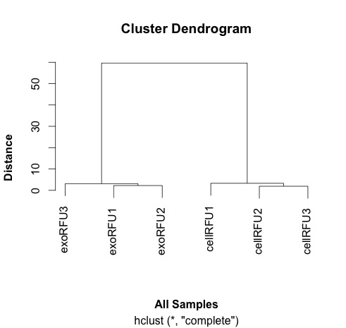
This distance matrix is used to do the hierarchical clustering that is plotted out here and shown here: 


Clustering samples using data from Webber et al, 2014.


# Trying to explain the concept of distance
# simple example 1: one digit different by 2 between two samples
samp1 <- c(0, 1, 2, 3, 4, 5, 6, 7, 8)
samp2 <- c(0, 1, 2, 3, 4, 5, 6, 7, 10)
dist(rbind(samp1, samp2))
# the dist() function compares each of the numbers in order along the two rows of the matrix. 
# answer is in this case is 2, as one number in the list is different by 2 to another. 

# simple example 2: one digit different by 72 between two samples
samp1 <- c(0, 1, 2, 3, 4, 5, 6, 7, 8)
samp2 <- c(0, 1, 2, 3, 4, 5, 6, 7, 80)
dist(rbind(samp1, samp2))
# answer is 72

# a little more complicated: two digits different
samp1 <- c(0, 1, 2, 3, 4, 5, 6, 7, 8)
samp2 <- c(0, 10, 2, 3, 4, 5, 6, 7, 80)
dist(rbind(samp1, samp2))
# now the answer is 72.56
# why? 
# well because of the equation used by the default method. 
# the default for the dist() function is euclidean 
# the equation for this is dist = sqrt(sum(x_i - y_i)^2)
# in this case, this calculates as sqrt(9^2 + 72^2)
# why the sqrt and the sum - in part so that the negatives and the positive differences don't cancel each other out.

# you can use other methods of calculating distance
help(dist)

# another is the "maximum" which just gives us the largest difference between the two arrays
# "Maximum distance between two components of x and y"
samp1 <- c(0, 1, 2, 3, 4, 5, 6, 7, 8)
samp2 <- c(0, 10, 2, 30, 4, 5, 6, 7, 80)
dist(rbind(samp1, samp2), method="maximum")
# in this case 72

# a third is the "manhattan" which sum of the absolute distances between the vectors
# "Absolute distance between the two vectors"
samp1 <- c(0, 1, 2, 3, 4, 5, 6, 7, 8)
samp2 <- c(0, 10, 2, 3, 4, 5, 6, 7, 80)
dist(rbind(samp1, samp2), method="manhattan")
# the answer now is 81

# now just envisage a more complicated situation when there are lots more numbers
# more than two samples and numbers that are higher and lower. 

# let's take a couple of examples from some data we analysed previously:

# http://www.mcponline.org/content/13/4/1050.full
# supplementary data is here: http://www.mcponline.org/content/suppl/2014/02/06/M113.032136.DC1/mcp.M113.032136-5.xlsx
# install if necessary:
# install.packages("readxl")
library(readxl)

# this is the link to the data
link <- "http://www.mcponline.org/content/suppl/2014/02/06/M113.032136.DC1/mcp.M113.032136-6.xlsx"

# the download.file() function downloads and saves the file with the name given
download.file(url=link,destfile="file.xlsx", mode="wb")

# then we can open the file and extract the data using the read_excel() function. 
data<- read_excel("file.xlsx")

View(data)

# the data has 762 observations. 

# we can only calculate distances in a matrix where all the values are the same mode - e.g numbers
# convert data frame (data) into a matrix 
# only want a subset of the data - the data from the samples. 
data.m <- as.matrix(data[2:7])
# transpose the data because a distance matrix works in rows
data.m.t <- t(data.m)

# calculate the distances and put the calculations into an object called distances
distances <- dist(data.m.t)

# convert this distances object into a matrix. 
distances.m <- data.matrix(distances)

# you can look at this object.
View(distances.m)

# we can extract the size of the object and the titles
dim <- ncol(distances.m)
names <- row.names(distances.m)

# now to create the visualisation of the difference matrix. 
# first the coloured boxes
image(1:dim, 1:dim, distances.m, axes = FALSE, xlab = "", ylab = "")

# now label the axis
axis(3, 1:dim, names, cex.axis = 0.8, las=3)
axis(2, dim:1, names, cex.axis = 0.8, las=1)

# add the values of the differences
text(expand.grid(1:6, 6:1), sprintf("%0.1f", distances.m), cex=1)

# this example lacks subltety
# the exo samples are very close together and the cell samples are quite far apart.
# it explains why the cluster analysis is so dramatic. 

# export this image as a tiff file with width of 1000 seems to work well. 
# some of the other formats don't work as well. 

# to make the cluster dendrogram object using the hclust() function
hc <- hclust(distances) 
# plot the cluster diagram
# some interesting groups in the data
plot(hc, 
     xlab =expression(bold("All Samples")), 
     ylab = expression(bold("Distance")))
# replicates cluster together well. 


The visualisation was inspired by this:


If you have feedback on this script, please leave a comment.