Showing posts with label VizBi. Show all posts

Tuesday, 8 March 2016

Plan for VizBi Tutorial

Updated: I have updated this after the tutorial

Today we went through three scripts rather than the full five, I had planned.
For participants, I wrote this script because of people who were interested in ggplot2. It talks about faceting which is an important part of ggplot2.
This other script is a proteomic example that talks about clustering and write a volcano plot.  
In response to questions, I have a couple of scripts that do relatively simple image analysis:

ggplot script for VizBi 2016

I have updated the ggplot script for VizBi.

It's based on Dean Hammond's previous script and includes a loop - often seen as bad practice in R but it seems to work here.

It makes this:


# START
# The plot with the six lines is a bit busy. 
# Let's make a ggplot equivalent to the base R multiplot.
# Here we do it using faceting.
# To make the script free standing the reshaping code is included. 

setwd("/Users/paulbrennan/Documents/RforBiochemistsScripts/VizBiMar2016")

library(reshape2)
library(ggplot2)
library(ggthemes)

# some data:
enzdata <- matrix(c(0, 17.36667, 31.97143, 52.68889, 61.95385, 74.2, 77.97143, 84.28, 99.91429, 93.66667, 
                    0, 15.7, 29.42286, 45.64, 62.60615, 75.78118, 69.88, 75.256, 89.59429, 86.84, 
                    0, 27.10667, 42.12, 63.48, 69.56, 74.26857, 79.44444, 83.29091, 87.1, 82.08571, 
                    0, 24.72, 39.07, 47.4, 57.928, 67.6, 71.35556, 67, 75.79375, 70.86667, 
                    0, 5.723636, 11.48, 17.697143, 28.813333, 37.567273, 42.483077, 40.68, 52.81, 56.92, 
                    0, 2.190476, 5.254545, 8.95, 15.628571, 20.8, 25.355556, 26.55, 32.44, 33.333333),
                  nrow = 10, ncol = 6)
no.Exp <- c("Exp.1", "Exp.2", "Exp.3", "Exp.4", "Exp.5", "Exp.6")
Sub <- c(0, 1, 2, 4, 8, 12, 16, 20, 30, 40)

enzdata <- as.data.frame(enzdata) # converted to a data.frame for plotting
colnames(enzdata) <- rep("Exp", times=6)  # add a column name
enzdata <- cbind(Sub, enzdata) # add the Substrate data

# so we have a data.frame and we want to draw some graphs. 
# as is always the case with R, there are many ways to do this. 

# using our dataframe we can draw the graphs one by one...

p <-  ggplot(data = enzdata, aes(x = Sub, y = Exp)) +
  geom_point() +
  theme_few() +
  ylab("velocity (nmol/s)") + xlab("substrate (mM)") +
  ggtitle("Experiment 1")
p

# one of the useful feature of ggplot is that you can force new data into an old plot
# we have the data from Exp 6 in an object. 
# if we make the same shaped dataframe with another set of data we can force that in.
new.data <- data.frame(enzdata$Sub, enzdata[,3])
colnames(new.data) <- c("Sub", "Exp")  # col names must be the same
p <- p %+% new.data   # this %+% is what forces in the new data...
p <- p + ggtitle("Experiment 2")
p


# we can use this feature and put making and saving the graphs inside a loop
for(i in 1:6) {  
  new.data <- data.frame(enzdata$Sub, enzdata[,i+1])
  colnames(new.data) <- c("Sub", "Exp")  # col names must be the same
  p <- p %+% new.data
  p <- p + ggtitle(paste("Experiment", i))
  filename <- paste0("Experiment_", i, ".pdf")
  p + ggsave(filename)
}
# it would probably be better style to write a function and vectorise it!


## there is also an 'even better' way to do it using facets - a useful feature of ggplot
# requires us to change the structure of the dataframe
# melt the data from wide to long:
colnames(enzdata) <- c("Sub", "Exp.1", "Exp.2", "Exp.3", "Exp.4", "Exp.5", "Exp.6")

melted_data <- melt(enzdata, id.vars = "Sub", value.name = "v", variable.name = "Exp")

# Check out the differences between these two files:
view(enzdata)
view(melted_data)

# the way ggplot draws colours depends on the required number of colours. The way it does it is just with equally spaced hues around the color wheel, starting from 15:
gg_color_hue <- function(n){
  hues = seq(15, 375, length = n + 1)
  hcl(h = hues, l = 65, c = 100)[1:n]
  }
  
# we have 6 experiments (so we want to create our own 6 colour "mini-palette")
cols <- gg_color_hue(6)  
# this gets the default ggplot colours when we want to plot 6 different variables.


# 1st, create an object with the ggplot 
# It has all the data simply as points, shaped and colour-coded by expt. of origin (as above). 
# We store it in an object called 'x':
x <- ggplot(data = melted_data, aes(x = Sub, y = v)) +
  geom_point(aes(colour = Exp, shape = Exp)) +
  theme_few() +
  ylab("velocity (nmol/s)") + xlab("substrate (mM)") +
  theme(axis.title.x = element_text(size = 15),
        axis.title.y = element_text(size = 15),
        axis.text.x = element_text(size = 15),
        axis.text.y = element_text(size = 15),
        plot.title = element_blank(),            # we don't want individual plot titles as the facet "strip" will give us this
        legend.position = "none",                # we don't want a legend either
        panel.border = element_rect(fill = NA, color = "darkgrey", size = 1.25, linetype = "solid"),
        axis.ticks = element_line(colour = 'darkgrey', size = 1.25, linetype = 'solid'))     # here, I just alter to colour and thickness of the plot outline and tick marks. You generally have to do this when faceting, as well as alter the text sizes (= element_text() in theme also)

# have a quick look at x
x
# see all the data in different colours

# Next, let's modify 'x' by faceting based on the Experiment Name, 
# We also specify that we want a panel 3 plots wide x 2 plots high.
# You can change this, obviously. Can also 'facet_grid' too:
x <- x + facet_wrap( ~ Exp, ncol = 3)

# Finally, let's apply the Michaelis Menten fitting to our faceted data, adding the best fit line in each case:
x <- x + geom_smooth(method = "nls",                 
                     method.args = list(formula = y ~ Vmax * x / (Km + x), 
                                        start = list(Vmax = 50, Km = 2)),
                     se = F, colour = 'black', size = 0.5)

# Finally, just call 'x' to show the plots:
x

# if you want to save it as a .pdf, just add
ggsave("GGPLOT_FACET_EnzKin.pdf"), when you call 'x'
x + ggsave("GGPLOT_FACET_EnzKin.pdf")


Monday, 7 March 2016

Gene Expression Analysis and Visualization for VizBi 2016 (Pt 2)

Updated: I have updated this script after the VisBi Tutorial. I have added some comments which I hope explain things better.

This second part of the gene analysis script generates list of genes that are differentially expressed following drug treatment. The data set is the same as used in first part of the analysis script. It's on github and can be downloaded within R. I like the volcano plots which facilitate a nice understanding of the scale of changes caused by the different drugs.


# START
library(RCurl)
library(ggplot2)
library(heatmap3)

# this script uses the limma pacakge from Bioconductor
# these first two lines install it. 
# for more information about the package, go here:
# https://bioconductor.org/packages/release/bioc/html/limma.html
# it was created to apply linear modelling to microarray data 
# but it can be used for any sets of numbers where you have multiple groups
source("https://bioconductor.org/biocLite.R")
biocLite("limma")
library(limma)


x <- getURL("https://raw.githubusercontent.com/brennanpincardiff/RforBiochemists/master/data/microArrayData.tsv")
data <- read.table(text = x, header = TRUE, sep = "\t")

new.data <- data[2:16]
# these are log2 values 
# The data has been normalized and summarized

# turn into a matrix 
data.m <- as.matrix(new.data)

## calculate the significant differences limma!
names <- colnames(data.m)
names <- factor(gsub("\\.\\d", "", names)) # change names into factor

design <- model.matrix(~ 0 + names)
design
# this looks about right - each treatment has three samples
# no overlap between the samples. 

# Fit linear model for each gene given a series of arrays
fit <- lmFit(object = data.m, design = design)
fit

# set up the experiment using makeContrasts
# makeContrasts
contrast <- makeContrasts(
  Drug_A = namesUT - namesDrug_A,
  Drug_B = namesUT - namesDrug_B,
  Drug_C = namesUT - namesDrug_C,
  Drug_D = namesUT - namesDrug_D,
  levels = design)
contrast

fit <- contrasts.fit(fit, contrast)

# Given a microarray linear model fit, compute moderated t-statistics, 
# moderated F-statistic, and log-odds of differential expression by 
# empirical Bayes moderation of the standard errors towards a common value.
fit.bayes <- eBayes(fit)
fit.bayes

# using topTable to extract gene lists
# this method adjusts for multiple testing using the Benjamini and Hochberg method
# for information on this see the limma documentation
# https://bioconductor.org/packages/release/bioc/html/limma.html or
# there is lots of information on the internet
# e.g.: https://en.wikipedia.org/wiki/False_discovery_rate
Drug_A.diff <- topTable(fit.bayes, n=5000, adjust.method = "BH", coef=1)
Drug_B.diff <- topTable(fit.bayes, n=5000, adjust.method = "BH", coef=2)
Drug_C.diff <- topTable(fit.bayes, n=5000, adjust.method = "BH", coef=3)
Drug_D.diff <- topTable(fit.bayes, n=5000, adjust.method = "BH", coef=4)

# rownames of these are the row names of data...
colnames(Drug_D.diff)
str(Drug_D.diff)  # it's a data.frame

# VOLCANO PLOT VISUALISATIONS

# we can draw a volcano plat because we have calculated the log 2 fold change and the p-value
Drug_A.diff$threshold = as.factor(Drug_A.diff$adj.P.Val < 0.01)
Drug_B.diff$threshold = as.factor(Drug_B.diff$adj.P.Val < 0.01)
Drug_C.diff$threshold = as.factor(Drug_C.diff$adj.P.Val < 0.01)
Drug_D.diff$threshold = as.factor(Drug_D.diff$adj.P.Val < 0.01)

##Construct the plot object
gA <- ggplot(data=Drug_A.diff, 
            aes(x=logFC, y =-log10(adj.P.Val), 
                colour=threshold)) +
  geom_point(alpha=0.4, size=1.75) +
  xlab("log2 fold change") + ylab("-log10 p-value") +
  theme_bw() +
  theme(legend.position="none")

gA <- gA + ggtitle("Drug A")
gA     # shows us the object - the graph

# this %+% allows us to push a different dataset into an existing 
# ggplot object. It overwrites the data
# it must contain the same column names otherwise it won't work.
gB <- gA %+% Drug_B.diff

# then we need to give it a new title
gB <- gB + ggtitle("Drug B")

# do the same for the other Drugs
gC <- gA %+% Drug_C.diff
gC <- gC + ggtitle("Drug C")
gD <- gA %+% Drug_D.diff
gD <- gD + ggtitle("Drug D")

# These visualisations work.
# no significant differences with Drug A, more with Drug B and C
# lots of differences with Drug D.

# run code below to make multiplot function first!
multiplot(gA, gB, gC, gD, cols=2)


## ANOTHER VISUALISATION: a heatmap

# merge Drug_D adjusted P value and LogFC with expression values...
Drug_D.diff$probeset_id <- rownames(Drug_D.diff)
merged.data <- merge(data, Drug_D.diff, by="probeset_id")

# subset merged data for significantly altered genes
data.2.heatmap <- subset(merged.data, adj.P.Val < 0.001)
dim(data.2.heatmap)

# get the numbers and turn into a matrix
data.2.heatmap.num <- data.2.heatmap[2:16]  # just the numbers
data.2.heatmap.m <- as.matrix(data.2.heatmap.num)

# if you make your plot window big, this will work
heatmap3(data.2.heatmap.m,
         RowSideLabs = FALSE, 
         showRowDendro=FALSE,
         showColDendro=FALSE,
         main = "Heatmap of Drug Effects")

# otherwise print it to a PDF file. 
pdf("mygraph.pdf")
heatmap3(data.2.heatmap.m,
         RowSideLabs = FALSE, 
         showRowDendro=FALSE,
         showColDendro=FALSE,
         main = "Heatmap of Drug Effects")
dev.off()


# It's not perfect but it's the best I can do at the moment.


# from: http://www.cookbook-r.com/Graphs/Multiple_graphs_on_one_page_(ggplot2)/
# Multiple plot function
#
# ggplot objects can be passed in ..., or to plotlist (as a list of ggplot objects)
# - cols:   Number of columns in layout
# - layout: A matrix specifying the layout. If present, 'cols' is ignored.
#
# If the layout is something like matrix(c(1,2,3,3), nrow=2, byrow=TRUE),
# then plot 1 will go in the upper left, 2 will go in the upper right, and
# 3 will go all the way across the bottom.
#
multiplot <- function(..., plotlist=NULL, file, cols=1, layout=NULL) {
  library(grid)
  
  # Make a list from the ... arguments and plotlist
  plots <- c(list(...), plotlist)
  
  numPlots = length(plots)
  
  # If layout is NULL, then use 'cols' to determine layout
  if (is.null(layout)) {
    # Make the panel
    # ncol: Number of columns of plots
    # nrow: Number of rows needed, calculated from # of cols
    layout <- matrix(seq(1, cols * ceiling(numPlots/cols)),
                     ncol = cols, nrow = ceiling(numPlots/cols))
  }
  
  if (numPlots==1) {
    print(plots[[1]])
    
  } else {
    # Set up the page
    grid.newpage()
    pushViewport(viewport(layout = grid.layout(nrow(layout), ncol(layout))))
    
    # Make each plot, in the correct location
    for (i in 1:numPlots) {
      # Get the i,j matrix positions of the regions that contain this subplot
      matchidx <- as.data.frame(which(layout == i, arr.ind = TRUE))
      
      print(plots[[i]], vp = viewport(layout.pos.row = matchidx$row,
                                      layout.pos.col = matchidx$col))
    }
  }
}

Gene Expression Analysis and Visualization for VizBi 2016 (Pt 1)

UPDATE: During the VizBi2016 tutorial session, the participants noticed a couple of errors in the script. I think these have now been corrected.
Also, Christian Hauer suggested that we visualise the distance matrix using the heatmap packages. He suggested pheatmap, in particular. Thanks Christian.

I have spent some time creating two quite long scripts that generate a selection of visualisation of some gene expression data generated recently by Mel Boyd at the Cardiff CLL Research Group. The script illustrates a workflow that results in a selection of interesting and useful visualisations that allow us to compare the different drug treatments used.

The data was generated from an Affymetrix HTA 2.0 chip. The data has been normalised and mapped using the oligo package. I have focussed on the protein coding transcripts and I have generated a random selection of 5000 of these genes.

This part of the experiment uses the data from four different experimental 'drugs' which target different pathways and have different cellular effects. This analysis and the associated visualisations are used to allow us to compare the drug treatments and look at the data as a whole set.

I am happiest with the visualisation that is generated by the loadings of the principal component analysis but there are some other good visualisations generated by the scripts too.
The cluster at the top right is from the drug that causes the most changes. The other drugs cause few changes and so map closer to the untreated samples.

Next script shows volcano plots and a heatmap.


Here is the script:
# START 
# download the data from github
library(RCurl)
x <- getURL("https://raw.githubusercontent.com/brennanpincardiff/RforBiochemists/master/data/microArrayData.tsv")
data <- read.table(text = x, header = TRUE, sep = "\t")

# basic commands for looking at the data
head(data)      # view first six rows
str(data)       # shows it's a dataframe
colnames(data)  # column names
View(data)      # this works in R-Studio

# for first part of analysis
# subset of the data with just the numbers.
new.data <- data[2:16]
# these are log2 values 
# The data has been normalized


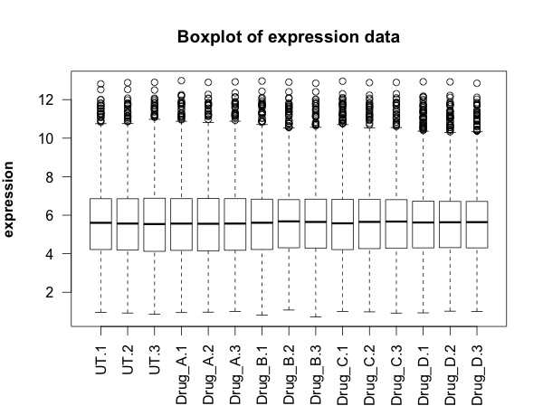
## FIRST visualisation of the data: a simple box plot
boxplot(new.data, 
        las =2, # las = 2 turns the text around to show sample names
        ylab = expression(bold("expression")),
        main="Boxplot of expression data")  


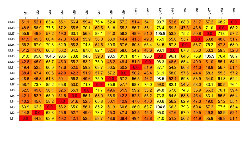
## SECOND visualisation(s): calculate and visualise distances
# turn into a matrix 
data.m <- as.matrix(new.data)
# transpose the data because a distance matrix works in rows
data.m.t <- t(data.m)
# calculate the distances and put the calculations into an object called distances
distances <- dist(data.m.t)
# convert this distances object into a matrix. 
distances.m <- data.matrix(distances)
# you can look at this object.
View(distances.m)
# we can extract the size of the object and the titles
dim <- ncol(distances.m)
names <- row.names(distances.m)
# now to create the visualisation of the difference matrix. 
# first the coloured boxes
image(1:dim, 1:dim, distances.m, axes = FALSE, xlab = "", ylab = "")
# now label the axis
axis(3, 1:dim, names, cex.axis = 0.8, las=3)
axis(2, 1:dim, names, cex.axis = 0.8, las=1)
# add the values of the differences
text(expand.grid(1:dim, 1:dim), sprintf("%0.1f", distances.m), cex=1)


# heatmaps ccan also be used to visualise the distance matrix. 
# samples can be clustered or you can stop this. Thanks Christian Hauer
heatmap(distances.m)


heatmap3(distances.m)


pheatmap(distances.m)


## THIRD visualisation: use the distance matrix to do some clustering
plot(hclust(distances))


# three clusters - based on the distance matrix and shows the same thing really.

## FOURTH visualisation: principal component analysis
# Do a Principal Component Analysis  
# and widely-used technique for viewing patterns of gross variation
# in datasets
# We can see whether an array is substantially different to the others
pca <- princomp(data.m)  # function that does the PCA
summary(pca)  # one component accounts for 99% of the variance
plot(pca, type = "l")  


names <- factor(gsub("\\.\\d", "", names)) # change names into factor
plot(pca$loadings, col = names, pch = 19)
text(pca$loadings, cex = 0.7, label = colnames(new.data), pos =3)


# some of the treatment cluster well together (e.g. Drug D) others not so much


# can be interesting to look at a subset of the data...
pca <- princomp(data.m[,1:12])
plot(pca$loadings, col = names, pch = 19, 
     main = "Just three drug treatments")
text(pca$loadings, cex = 0.7, label = colnames(new.data)[1:12], pos =3)

# basically happy with our data generally. 
# next step in next script is to look at differentially expressed transcripts.

Illustrating some R Fundamentals for VizBi 2016

I have surveyed the participants for my R tutorial at VizBi2016. The range of experience is a bit of a challenge. Some participants that have used R once or twice and others with plenty of experience. It's going to be a bit difficult to make the morning useful for everybody but I will try....

For the beginners, I'm going to start with this script which is designed to illustrate three of the fundamentals of R:

  • functions
  • objects
  • packages

It's an expansion of the script to draw a graph of a protein assay with ggplot:


Here is the script:
# First script for VizBi2016
# written to illustrate the Fundamentals of R

## first 'Fundamental' is ** functions **
# functions do things!
# you know it's a function because it contains brackets

# c() is a function - sometimes called combine

## second 'Fundamental' is ** objects **
# objects contain data
# we make them with functions

# example:
# using the c() function to create the object prot
# Protein Concentrations
prot <- c(0.000, 0.016, 0.031, 0.063, 0.125, 0.250, 0.500, 1.000, 
          0.000, 0.016, 0.031, 0.063, 0.125, 0.250, 0.500, 1.000) 

# a function has arguments - always inside the brackets

# Absorbance from my protein assay
abs <- c(0.329, 0.352, 0.349, 0.379, 0.417, 0.491, 0.668, 0.956, 
         0.327, 0.341, 0.355, 0.383, 0.417, 0.446, 0.655, 0.905)

# these objects are called 'vectors' - key term

## now we are going ot play with some of these objects to 

#Calculate the line using the linear model function lm()
line <- lm(abs~prot)

# creates another kind of object - a list
# multiple parts with different type of data in each part

# too look at the object type line
line
summary(line)

# access particular parts of the object line
# using the $ dollar sign
# Equation of a line y = mx + c
# In our case abs = slope * prot + intercept
# ukn.prot = (abs - intercept)/slope
int <- summary(line)$coefficients[1]
slope <- summary(line)$coefficients[2]

# now calculate some unknown protein concs from absorbances
# put the unknowns into a vector
abs.ukns <- c(0.554, 0.568, 0.705)

# rearrange the equation of the line to ukn.prot = (abs - intercept)/slope
prot.ukns <- (abs.ukns - int)/slope

# CONCEPT ALERT - functions work on a vector of numbers


## graphing

# quick graph using base R
plot(prot, abs)
abline(line)

## BUT there is a better way!!

## third 'Fundamental' is ** packages **
# these are collections of functions that have been written by others
# these can be installed 
# install.packages("ggplot2")
# and then activated
library(ggplot2)

# Convert from one type of object to another
# another kind of object is a data.frame
# a bit like an Excel spreadsheet
# often when we import data we get a data frame
data <- as.data.frame(prot)
data$abs <- abs


# make a simple graph with ggplot
# step one - add the data and then the 'aesthetics' 
# key asthetics in this case x and y
p <- ggplot(data=data,          # specify the data frame with data
            aes(x=prot, y=abs)) # specify x and y for the graph

# creates a list and a blank plot

# add a type of graph 
p <- p + geom_point()

# show the graph
p

# add a line
p + stat_smooth(method = "lm")

# more detailed plot: 
p <- ggplot(data=data,          # specify the data frame with data
            aes(x=prot, y=abs)) +   # specify x and y for the graph
  geom_point() +          # make a scatter plot
  stat_smooth(method = "lm") +  # add a linear model line
  xlab("[Protein] (microg/ml)") +   # label x-axis
  ylab("Absorbance (570nm)") +    # label y-axis
  ggtitle("Protein Assay") +  # add a title
  theme_bw() +      # a simple theme
  expand_limits(y=c(0,1)) +    # customise the y-axis
  annotate(geom="text", x=0.85, y= 0.6, label="Abs         Prot",  color="red")

# put the answers on the graph
for (i in 1:length(abs.ukns)){
  p <- p + annotate(geom="text", x = 0.8, y = (0.6 - i/20), label=abs.ukns[i])
  p <- p + annotate(geom="text", x = 0.92, y = (0.6 - i/20), label=round(prot.ukns[i], 3))
}

p # show us the graph...

## To Learn from this script:
# run this script line by line yourself and see what happens.
# watch what happens

# make the plot object again and try some things...
p <- ggplot(data=data,          # specify the data frame with data
            aes(x=prot, y=abs)) # specify x and y for the graph

# try to change the colour of the points
p + geom_point(colour = "blue")

# try to change the size of the points
p + geom_point(size = 5, colour = "red")

# look at the documentation for geom_point
# http://docs.ggplot2.org/current/geom_point.html
# try some of the functions and see if you can make sense of them


Monday, 8 February 2016

Visualising some CLL proteomic data for VizBi2016... Part 1...

I am preparing scripts for VisBi2016. I've decided to use a chronic lymphocytic leukaemia proteomic data set from a research group in Liverpool. It's the largest CLL proteomic dataset and it's published.

The key steps are:

  1. Get the data into R using read_excel() function from the readxl package
  2. Draw the first visualisation - a simple box plot

  3. Calculate the distances between the samples
  4. Draw a visualisation of the distance matrix
  5. Cluster the samples and then draw a visualisation of the sample cluster
  6. Finally, using the data from the paper, I have drawn a volcano plot. 

Here is the script to do that....

START OF SCRIPT
# writing my first script for VizBi
# download and visualising the MCP CLL proteomics data

library(ggplot2)
library(readxl)


# I've decided that I would like to make CLL proteomics the first data set for the VizBi tutorials
# I've done some myself but the largest data set currently publically available is from the Liverpool group
# Reference: http://www.mcponline.org/content/14/4/933.full
# http://www.mcponline.org/content/suppl/2015/02/02/M114.044479.DC1/mcp.M114.044479-2.xls
link <- "http://www.mcponline.org/content/suppl/2015/02/02/M114.044479.DC1/mcp.M114.044479-2.xls"

# the download.file() function downloads and saves the file with the name given
download.file(url=link,destfile="file.xls", mode="wb")

# then we can open the file and extract the data using the read_excel() function. 
data <- read_excel("file.xls")

# so the data is in R now in an object called "data'. 
# The object "data" consists of 3521 observations of 24 variables. 

# we can look at the data 
View(data)
# it's made up of protein names, accession numbers, 18 samples and some statistics

# we can check the structure 
str(data)
# this tells us about the types of data that make up each column. 

# the fist thing we are going to do is make and visualise a distance matrix. 

# columns 3 to 21 are the data.  
# we can check this:
head(data[3:20])  # shows the first six rows of data
colnames(data[3:20]) # shows the column names. 
# this seems correct. 

# plot the data - always an important first step!
boxplot(data[3:20], 
        las =2, # las = 2 turns the text around to show sample names
        ylab = expression(bold("expression")),
        main="Boxplot of expression data")  


# we can only calculate distances in a matrix where all the values are the same mode - e.g numbers
# convert data frame (data) into a matrix 
# only want a subset of the data - the data from the samples. 
data.m <- as.matrix(data[3:20])
# transpose the data because a distance matrix works in rows
data.m.t <- t(data.m)

# calculate the distances and put the calculations into an object called distances
distances <- dist(data.m.t)

# convert this distances object into a matrix. 
distances.m <- data.matrix(distances)

# you can look at this object.
View(distances.m)

# we can extract the size of the object and the titles
dim <- ncol(distances.m)
names <- row.names(distances.m)

# now to create the visualisation of the difference matrix. 
# first the coloured boxes
image(1:dim, 1:dim, distances.m, axes = FALSE, xlab = "", ylab = "")

# now label the axis
axis(3, 1:dim, names, cex.axis = 0.8, las=3)
axis(2, 1:dim, names, cex.axis = 0.8, las=1)

# add the values of the differences
text(expand.grid(1:18, 1:18), sprintf("%0.1f", distances.m), cex=1)

# look at this there is lots of variation between the samples....

# export this image as a tiff file with width of 1000 seems to work well. 
# some of the other formats don't work as well. 

# to make the cluster dendrogram object using the hclust() function
hc <- hclust(distances) 
# plot the cluster diagram
# some interesting groups in the data
plot(hc, 
     xlab =expression(bold("All Samples")), 
     ylab = expression(bold("Distance")))
# interestingly the mutated and unmutated samples don't group together
# there are smaller clusters within the data
# this indicates that there is variation in the data set that is not explained by that grouping. 

# we can draw a volcano plat because they have calculated the log 2 fold change and the p-value
colnames(data) <- make.names(colnames(data))  # gets rid of the spaces in the column names.
data$threshold = as.factor(data$P.Value < 0.05)

##Construct the plot object
g <- ggplot(data=data, 
            aes(x=Log2.Fold.Change, y =-log10(P.Value), 
                colour=threshold)) +
  geom_point(alpha=0.4, size=1.75) +
  xlim(c(-6, 6)) +
  xlab("log2 fold change") + ylab("-log10 p-value") +
  theme_bw() +
  theme(legend.position="none")

g  # shows us the object - the graph

END OF SCRIPT