Showing posts with label faceting. Show all posts

Monday, 20 August 2018

Exploring more immunization data...

Last week, inspired by Factfulness, I made a graph showing the BCG immunization coverage for children at 1 year. The Factfulness graph didn't mention any specific immunization programme and World Health Organisation data monitors immunization coverage for other vaccines. For that reason, I thought it would be good to download and graph more of the available global immunization data.

This allowed me to generate this graph which shows immunization coverage across the world for nine different vaccines. The various dates that monitoring starts shows that new immunization programs are being rolled out on a regular basis - good to see.


Below is the code for downloading the data and making the graph...
If you would rather just make the graph with some cleaner data, the data from Aug 20, 2018 is available on github and can be downloaded using the read_csv() code shown about half way down the script.

## START
##  download the data  
library(tidyverse)
# install.packages("WHO")
library(WHO)

# check out the codes of the WHO data...
codes <- get_codes()
# get codes for immunizations
immun_codes <- codes[grepl("[Ii]mmuniz", codes$display), ]
immun_codes$label

# go through each of the 18 to find global data...
# Number 1 has global data

# download number 1
# requires internet access
immun_data <- as.tibble(get_data(immun_codes$label[1]))

# filter for global data
immun_data <- filter(immun_data, region == "(WHO) Global")

# repeat download for next 2 to 18 WHO codes  
# had to do this as a loop as couldn't get it to work using lapply...
# start off with second value as first is above..
# requires internet access and patience...
for(i in 2:length(immun_codes$label)){
    # download the data
    data <- as.tibble(get_data(immun_codes$label[i])) 
    
    #tell you that it has downloaded...
    print(paste("Dataset",immun_codes$label[i], "downloaded."))
    
    # filter the data for Global values
    data <- filter(data, region == "(WHO) Global")
    
    # if there is some data bind_rows()
    if(nrow(data)>1){
        # bind_rows() function from dplyr
        immun_data <- bind_rows(immun_data, data)
    }else{   
        # if not just tell us....
        print("No global data in this set")
    }
}


# reduce columns using select() function  
immun_data <- select(immun_data, gho, region, year, value )

# to avoid having to download every time... save a local copy
file_name <- paste0("global_immun_data", Sys.Date())
write_csv(immun_data, file_name)

## ----read_back if you have saved to continue from here
# immun_data <- read_csv(file_name)

# read in data from github using read_csv() function

# immun_data <- read_csv("https://raw.githubusercontent.com/brennanpincardiff/RforBiochemists/master/data/global_immun_data2018-08-20")


# Let's make our plot...
plot <- ggplot(immun_data, aes(x = year, y = value, 
    colour = gho)) +
  geom_line(size = 1)+ 
  theme(legend.position="none")

plot

# separate the plots with facet wrap
plotf <- plot + facet_wrap(~gho)
plotf


## The individual graph titles are difficult to read
# Shorten them by removing text using gsub() = global substitution
immun_data$gho_s <- gsub("immunization coverage among 1-year-olds",
                            "", immun_data$gho)
immun_data$gho_s <- gsub("immunization coverage by the nationally recommended age",
                        "", immun_data$gho_s)

# make the plot again
plot <- ggplot(immun_data, aes(x = year, y = value, 
    colour = gho_s)) +
  geom_line(size = 1) + 
  theme(legend.position="none")

# separate plots with facet_wrap
plotf <- plot + facet_wrap(~gho_s)
plotf <- plotf + theme_bw() + theme(legend.position="none")
plotf

# improve plot with y limits, titles & source
source <- paste("Source: World Health Organisation, accessed:", Sys.Date())
plotf <- plotf + ylim(0,100)
plotf <- plotf + labs(x = NULL, y = "Immunization Rate",
      title = "Global immunization rates", 
    subtitle = source)
plotf


## END

Some Resources:


Tuesday, 8 March 2016

ggplot script for VizBi 2016

I have updated the ggplot script for VizBi.

It's based on Dean Hammond's previous script and includes a loop - often seen as bad practice in R but it seems to work here.

It makes this:


# START
# The plot with the six lines is a bit busy. 
# Let's make a ggplot equivalent to the base R multiplot.
# Here we do it using faceting.
# To make the script free standing the reshaping code is included. 

setwd("/Users/paulbrennan/Documents/RforBiochemistsScripts/VizBiMar2016")

library(reshape2)
library(ggplot2)
library(ggthemes)

# some data:
enzdata <- matrix(c(0, 17.36667, 31.97143, 52.68889, 61.95385, 74.2, 77.97143, 84.28, 99.91429, 93.66667, 
                    0, 15.7, 29.42286, 45.64, 62.60615, 75.78118, 69.88, 75.256, 89.59429, 86.84, 
                    0, 27.10667, 42.12, 63.48, 69.56, 74.26857, 79.44444, 83.29091, 87.1, 82.08571, 
                    0, 24.72, 39.07, 47.4, 57.928, 67.6, 71.35556, 67, 75.79375, 70.86667, 
                    0, 5.723636, 11.48, 17.697143, 28.813333, 37.567273, 42.483077, 40.68, 52.81, 56.92, 
                    0, 2.190476, 5.254545, 8.95, 15.628571, 20.8, 25.355556, 26.55, 32.44, 33.333333),
                  nrow = 10, ncol = 6)
no.Exp <- c("Exp.1", "Exp.2", "Exp.3", "Exp.4", "Exp.5", "Exp.6")
Sub <- c(0, 1, 2, 4, 8, 12, 16, 20, 30, 40)

enzdata <- as.data.frame(enzdata) # converted to a data.frame for plotting
colnames(enzdata) <- rep("Exp", times=6)  # add a column name
enzdata <- cbind(Sub, enzdata) # add the Substrate data

# so we have a data.frame and we want to draw some graphs. 
# as is always the case with R, there are many ways to do this. 

# using our dataframe we can draw the graphs one by one...

p <-  ggplot(data = enzdata, aes(x = Sub, y = Exp)) +
  geom_point() +
  theme_few() +
  ylab("velocity (nmol/s)") + xlab("substrate (mM)") +
  ggtitle("Experiment 1")
p

# one of the useful feature of ggplot is that you can force new data into an old plot
# we have the data from Exp 6 in an object. 
# if we make the same shaped dataframe with another set of data we can force that in.
new.data <- data.frame(enzdata$Sub, enzdata[,3])
colnames(new.data) <- c("Sub", "Exp")  # col names must be the same
p <- p %+% new.data   # this %+% is what forces in the new data...
p <- p + ggtitle("Experiment 2")
p


# we can use this feature and put making and saving the graphs inside a loop
for(i in 1:6) {  
  new.data <- data.frame(enzdata$Sub, enzdata[,i+1])
  colnames(new.data) <- c("Sub", "Exp")  # col names must be the same
  p <- p %+% new.data
  p <- p + ggtitle(paste("Experiment", i))
  filename <- paste0("Experiment_", i, ".pdf")
  p + ggsave(filename)
}
# it would probably be better style to write a function and vectorise it!


## there is also an 'even better' way to do it using facets - a useful feature of ggplot
# requires us to change the structure of the dataframe
# melt the data from wide to long:
colnames(enzdata) <- c("Sub", "Exp.1", "Exp.2", "Exp.3", "Exp.4", "Exp.5", "Exp.6")

melted_data <- melt(enzdata, id.vars = "Sub", value.name = "v", variable.name = "Exp")

# Check out the differences between these two files:
view(enzdata)
view(melted_data)

# the way ggplot draws colours depends on the required number of colours. The way it does it is just with equally spaced hues around the color wheel, starting from 15:
gg_color_hue <- function(n){
  hues = seq(15, 375, length = n + 1)
  hcl(h = hues, l = 65, c = 100)[1:n]
  }
  
# we have 6 experiments (so we want to create our own 6 colour "mini-palette")
cols <- gg_color_hue(6)  
# this gets the default ggplot colours when we want to plot 6 different variables.


# 1st, create an object with the ggplot 
# It has all the data simply as points, shaped and colour-coded by expt. of origin (as above). 
# We store it in an object called 'x':
x <- ggplot(data = melted_data, aes(x = Sub, y = v)) +
  geom_point(aes(colour = Exp, shape = Exp)) +
  theme_few() +
  ylab("velocity (nmol/s)") + xlab("substrate (mM)") +
  theme(axis.title.x = element_text(size = 15),
        axis.title.y = element_text(size = 15),
        axis.text.x = element_text(size = 15),
        axis.text.y = element_text(size = 15),
        plot.title = element_blank(),            # we don't want individual plot titles as the facet "strip" will give us this
        legend.position = "none",                # we don't want a legend either
        panel.border = element_rect(fill = NA, color = "darkgrey", size = 1.25, linetype = "solid"),
        axis.ticks = element_line(colour = 'darkgrey', size = 1.25, linetype = 'solid'))     # here, I just alter to colour and thickness of the plot outline and tick marks. You generally have to do this when faceting, as well as alter the text sizes (= element_text() in theme also)

# have a quick look at x
x
# see all the data in different colours

# Next, let's modify 'x' by faceting based on the Experiment Name, 
# We also specify that we want a panel 3 plots wide x 2 plots high.
# You can change this, obviously. Can also 'facet_grid' too:
x <- x + facet_wrap( ~ Exp, ncol = 3)

# Finally, let's apply the Michaelis Menten fitting to our faceted data, adding the best fit line in each case:
x <- x + geom_smooth(method = "nls",                 
                     method.args = list(formula = y ~ Vmax * x / (Km + x), 
                                        start = list(Vmax = 50, Km = 2)),
                     se = F, colour = 'black', size = 0.5)

# Finally, just call 'x' to show the plots:
x

# if you want to save it as a .pdf, just add
ggsave("GGPLOT_FACET_EnzKin.pdf"), when you call 'x'
x + ggsave("GGPLOT_FACET_EnzKin.pdf")


Friday, 9 October 2015

Exploring diseases in Wales for SQL Relay...


I have prepared a script that I am going to use on the day. The script explores some data from the StatsWales website. One data file describes the percentage of people with various illnesses in Wales and another describes lifestyles.

I have downloaded the files as Excel files. These can be directly imported into R but I found it easier to change them in Excel first.
 In this case, I changed the data in the following ways:
  • by combining the two data sets
  • by removing the gender breakdown
  • by simplifying the column names
  • by simplifying the year names for the combined years

This kind of data munging can be done in R as well but I’m quicker doing it in Excel.

I have put the resulting Excel file ontoGithub so that it can be downloaded and imported into R.

As part of this script I make various graphs using R. The final part of the script makes these graphs:


The script I'll be using for my talk is below. I have included copies of some of graphs that are made along the way.
If you are attending my talk in SQL Relay, it's worth getting the script and trying it out on or before the day. You can cut and paste it from below. You can also get it from Github.

SCRIPT START

## This script is designed to illustrate some 'simple graphs' 
# Packages required
# install.packages("readxl", "ggplot2", "reshape2", "gridExtra") 

library(readxl)     # Excel file importer
library(ggplot2)    # high quality graph package
library(reshape2)   # for melting data frames
library(gridExtra)  # for laying out objects on a page

# this is the link to the data
link <- "https://raw.githubusercontent.com/brennanpincardiff/RforBiochemists/master/data/illnssLifeStyleGenderYeardReNames20151006.xlsx"

# the download.file() function downloads and saves the file with the name given
download.file(url=link, destfile="file.xlsx", mode="wb")

# then we can open the file and extract the data using the read_excel() function. 
data<- read_excel("file.xlsx")

# look how it turns up in the Global Environment

# have a look at the data
View(data)
# check the object
str(data)   # the structure of the object
# look at the column names
colnames(data)

# the titles
# [1] "year"                  "highBP"                "heartcondexBP"        "respIll"              
# [5] "mentIll"               "arthritis"             "diabetes"              "currTreated"          
# [9] "healthFairRpoor"       "smoker"                "alcoholConsAboveGuide" "alcoholConsBinge"     
# [13] "fruitVegGuide"         "activeon5"             "activeZero"            "overwgtObese"         
# [17] "obese" 


## Using the basic plot() function
# refer to the data within the data.frame
plot(data$year, data$mentIll)
plot(data$year, data$arthritis)
plot(data$year, data$smoker)

## improve one of the plots a little
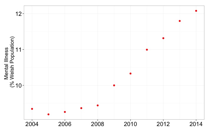
plot(data$year, data$mentIll,
     xlab = "Year",
     ylab = "Mental Illness (% of Welsh Population)",
     pch = 15)

## pair() function useful to plot scatterplot matrices
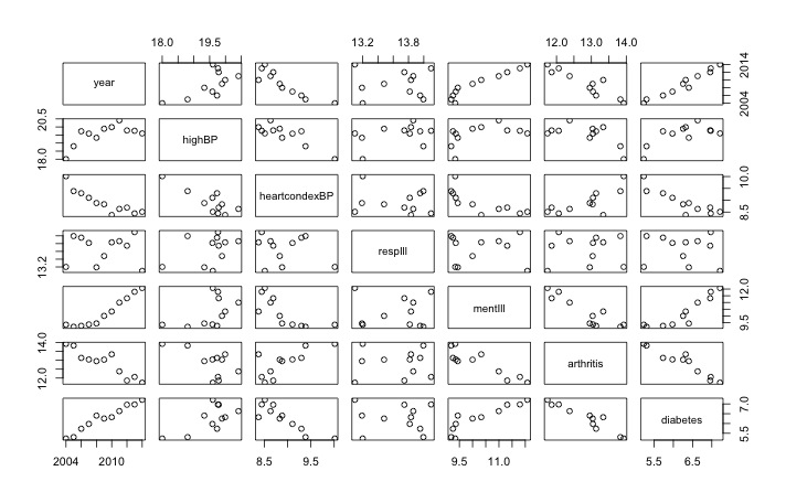
pairs(data[,1:7]) # shows the rate of change over 10 years
Useful visualisation using pairs() function


## I recommend the ggplot2 library 
p <- ggplot(data,                      # a data.frame with the data
            aes(x=year, y=mentIll)) +  # columns of the data.frame
            geom_point(colour = "red", size = 3) # type of plot 

# this creates an object called p
p # show the object


# modify the object to add a title and change the theme
p <- p + ylab("Mental Illness \n (% Welsh Population)") +
         xlab(" ") +
         theme_bw()
p # show the object again


# the options of how to customise this graph very varied
# there is some recognised good style but also a lot of preference
p <- p + theme(axis.title.y = element_text(size = 18 )) + 
         theme(axis.text = element_text(size = 20))
p # show the object again


## Let's make a bar chart
ggplot(data, aes(x=year, y=mentIll)) +
  geom_bar(stat="identity") +
  ylab("Mental Illness \n (% Welsh Population)")


# check out the bottom axis
# Looks very strange with the "2007.5"
# Why?
str(data$year)
# num [1:11] 2004 2005 2006 2007 2008 ...
mode(data$year)
# [1] "numeric"
# Because R has imported year as a number, adding 0.5 is allowed
# change to a character 
data$year <- as.character(data$year)

ggplot(data, aes(x=year, y=mentIll)) +  # data.frame & the data
  geom_bar(stat="identity") +           # different type of plot
  ylab("Mental Illness \n (% Welsh Population)")


A better graph with all the numbers included


## Look at a possible correlation
ggplot(data, 
       aes(x=diabetes, y=obese, label = year)) +
       geom_point(colour = "red", size = 5)
             
ggplot(data, 
       aes(x=diabetes, y=obese, label = year)) +
       geom_point(colour = "red", size = 5) +
       geom_text(size = 5, hjust=1, vjust=-0.5)

p <- ggplot(data, 
            aes(x=diabetes, y=obese, label = year)) +
            geom_point(colour = "red", size = 5) +
            geom_text(size = 5, hjust=1, vjust=-0.5) +
            ylab("Obesity (% of Welsh Pop") +
            xlab("Diabetes (% of Welsh Pop)") +
            theme_bw()

p <- p + theme(axis.title.y = element_text(size = 18 )) +
         theme(axis.title.x = element_text(size = 18 )) +
         theme(axis.text = element_text(size = 20))

p


# introducing facet
# draw six graphs of diseases over time...

# take a subset of data
data.sub <- data[1:7]

# rename the columns
colnames(data.sub) <- c("Year", "High BP", "Heart Conditions", "Respiratory Illness", "Mental Illness", "Arthritis", "Diabetes")

# melt the data from wide to long:
melted.data.sub <- melt(data.sub, id.var = "Year")
colnames(melted.data.sub) <- c("Year", "Illness", "Percent")

# make a plot
x <- ggplot(data = melted.data.sub, 
            aes(x=Year, y=Percent)) +
            geom_point(aes(colour = Illness, shape= Illness, size = 5)) +
            theme_bw() +
            theme(legend.position = "none") +
            ggtitle("Disease Burden in Wales over 10 years")
x    # look at the plot

Not very useful!


# break into facets
x <- x + facet_wrap(~ Illness, scales = "free", ncol=2) +
     ylab("Percent of Welsh Pop")

x  # show the plot
Nice set of graphs, I think. 

# save the plot
x + ggsave("DiseaseBurdenWales10years.pdf")


## Extra info on arranging plots on a single page
# make a new graph in the object g1
g1 <- ggplot(data,                      # a data.frame with the data
            aes(x=year, y=obese)) +     # columns of the data.frame
            geom_point(colour = "black", size = 5) + # type of plot
            ylab("Obesity (% of Welsh Pop") +
            xlab("") +
            theme_bw()
g1 <- g1 + theme(axis.title.y = element_text(size = 18 )) +
        theme(axis.title.x = element_text(size = 16 )) +
        theme(axis.text = element_text(size = 20))

# make another graph in the object g2
g2 <- ggplot(data,
            aes(x=year, y=diabetes)) +
            geom_point(colour = "blue", size = 5) +
            ylab("Diabetes (% of Welsh Pop") +
            xlab("") +
            theme_bw()
g2 <- g2 + theme(axis.title.y = element_text(size = 18 )) +
  theme(axis.title.x = element_text(size = 16 )) +
  theme(axis.text = element_text(size = 20))

# using a function from the gridExtra package...
# put the three graphs on the same graphical output. 
grid.arrange(g1, g2 ,p)
# makes the plot at the top of the blog

SCRIPT END

Useful resources: