Showing posts with label heatmap. Show all posts

Tuesday, 29 November 2016

Extracting an NFkappaB gene expression profile from published CLL gene expression data (Herishanu et al, Blood 2011)

Update: 18th October 2017 - Bioconductor is the place to get the Affymetrix annotation file.

This post is about exploring gene expression signatures. It was natural, for me, to start with the transcription factor, NFkappaB. On this blog, I have previously explored the principal component analysis of gene expression patterns from chronic lymphocytic leukaemia (CLL) cells published in Blood by Herishanu et al in 2011 - a key paper in this field.

In their paper, in Figure 5A, Herishanu et al focussed on a set of genes to investigate the gene signature for the transcription factor, NFkappaB. I found what they did very interesting and I wanted to reproduce their analysis using R and illustrate it here.

Here is my version of the heatmap, they showed in Figure 5A. My version has a little more information about the samples and the genes. The figures shows that the CLL cells from the lymph node (LN) have a higher NFkappaB gene signature is higher than the peripheral blood (PB) and the bone marrow (BM).

Heatmap showing the expression of selected NFkappaB regulated genes (listed on right) from CLL cells from peripheral blood (PB), bone marrow (BM) or lymph node (LN). Sample details on the bottom.
Here is the script I used to generate the data. To reproduce this, just cut and paste the script into R (or ideally R-Studio) and you should be able to generate the same figures.

START
# if required install packages
# install.packages("RCurl", "plyr", "heatmap3")

# the Affymetrix annotation file is located on Bioconductor
source("https://bioconductor.org/biocLite.R")
biocLite("hgu133plus2.db")   #installs the package
                   
# activate packages   
library(RCurl)     # to download data from internet
library(hgu133plus2.db)   # to link AffyIDs to gene names
library(plyr)   # to make a dataframe from a function
library(heatmap3) # one of many heatmap packages

# I want to extract the NF-kappaB gene profile and draw the first part of Figure 5. 
# I want to extract the values for a gene expression pattern
# need to extract it from the normalised data set.
# change colours to look more like the publication. 


# here is a link for all the normalised data from the paper (>50000 probes) 
x <- getURL("https://raw.githubusercontent.com/brennanpincardiff/RforBiochemists/master/data/herishanuMicroArrayDataNormalised.tsv")

# turn the data into a useful data.frame
data <- read.table(text = x, header = TRUE, sep = "\t")

# need to create a map that links AffyIDs to gene names
# http://bioconductor.org/packages/release/bioc/html/mygene.html
# U133 plus 2.0
# hgu133plus2.db

# https://www.bioconductor.org/help/workflows/annotation-data/
keytypes(hgu133plus2.db)

# SYMBOL is what we need

# map Affy IDs to Symbol
mapAffy_Symbol <- select(hgu133plus2.db, rownames(data), c("SYMBOL"))

# from Figure 5 there is a list of gene names
nfkb_genes <- c("RGS1", "CCND2", "NFKBIE", "CCL4", "CXCL13", "LTA", "CCL3", "BMEF1", "TNF", "CD83", "CXCL9", "BCL2A1", "DUSP2", "HEATR1", "CXCL10", "JUNB", "EBI2", "IL12B", "GADD45B", "EBI3", "ID2")

# test to see if we can find PROBEIDs which correspond to RGS1
mapAffy_Symbol[ which(mapAffy_Symbol$SYMBOL == "RGS1"),]
# works although there are more than one Affy ID per gene

# make a function to pull out probeID for a symbol
pullOutProbeID <- function(x){
  mapAffy_Symbol[ which(mapAffy_Symbol$SYMBOL == x),]
}

# use lapply to apply the function across the list of NFkB genes
lapply(nfkb_genes, pullOutProbeID)
# generates a list. 
# two of the list return nothing. 
# gene names have changed - I had to check the internet (GeneCards)
pullOutProbeID("NAMPT")  # BMEF1
pullOutProbeID("GPR183") # EBI2

# new list of NFkB genes with the two genes renamed. 
nfkb_genes2 <- c("RGS1", "CCND2", "NFKBIE", "CCL4", "CXCL13", "LTA", "CCL3", "NAMPT", "TNF", "CD83", "CXCL9", "BCL2A1", "DUSP2", "HEATR1", "CXCL10", "JUNB", "GPR183", "IL12B", "GADD45B", "EBI3", "ID2")


# this function from the package plyr

ldply will return a data frame
genesAsAffyID <- ldply(nfkb_genes2, pullOutProbeID)


# make a function to pull out GeneExpvalues for AffyID
pullOutGeneExpVal <- function(x){
  subset(data, rownames(data) == x)
}

# test the function
pullOutGeneExpVal("202988_s_at")
# works

# extract the expression values
expVals <- ldply(genesAsAffyID$PROBEID, pullOutGeneExpVal)
View(expVals)
# good, I have extracted the values. 

# turn data.frame into a matrix so that we can draw a heatmap
expVals.m <- as.matrix(expVals)
# give it useful row names
rownames(expVals.m) <- genesAsAffyID$SYMBOL

# lets draw a heatmap using default settings from base R
heatmap(expVals.m)
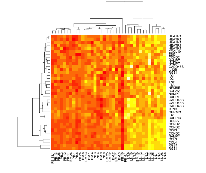


# LN (lymph node) segregates well but
# PB (periperal blood) and BM (bone marrow) are mixed up

# we would like this order of the columns
sampl.order <- c("PB.1", "PB.2", "PB.3", "PB.4", "PB.4.1", "PB.8", "PB.9", 
  "PB.10", "PB.11", "PB.12", "PB.13", "PB.13.1",  "PB.25", "PB.26",
  "BM.1", "BM.2", "BM.3", "BM.4", "BM.8", "BM.9", 
  "BM.10", "BM.11", "BM.12", "BM.13",  "BM.25", "BM.26",
  "LN.1", "LN.2", "LN.3", "LN.4", "LN.8", "LN.9", 
  "LN.10", "LN.11", "LN.12", "LN.13",  "LN.25", "LN.26")

# reorder the matrix
expVals.m.o <- expVals.m[ , sampl.order]

heatmap(expVals.m.o,
        Colv = NA)     # don't reorder columns


# heatmap3 can look quite good. 
heatmap3(expVals.m.o,
         Colv = NA, # don't reorder columns
         Rowv = NA) # don't reorder rows either


# add some useful titles to the heatmap
title( main = "NFkappaB Gene Signature \n Figure 5A",
       sub  = "Source: Herishanu et al, \n Blood 2011 117:563-574; doi:10.1182/blood-2010-05-284984",
       cex.main = 1.5,
       cex.sub = 0.75, font.sub = 3, col.sub = "red")

# add text to top to label PB, BM and LN
# https://stat.ethz.ch/R-manual/R-devel/library/graphics/html/text.html
add.expr=text(x = 10, y = 118, "PB", cex = 1.5)
add.expr=text(x = 15, y = 118, "BM", cex = 1.5)
add.expr=text(x = 20, y = 118, "LN", cex = 1.5)

# add lines to the top - called segments
# https://stat.ethz.ch/R-manual/R-devel/library/graphics/html/segments.html
segments(6.8, 113, 12.3, 113, col = "green", lwd = 4)
segments(12.7, 113, 17.3, 113, col = "red", lwd = 4)
segments(17.7, 113, 22.2, 113, col = "blue", lwd = 4)

# this looks quite nice and seems similar to Figure 5A
# and a very good point to stop on for today. 

END


These resources were useful:


Monday, 7 March 2016

Gene Expression Analysis and Visualization for VizBi 2016 (Pt 2)

Updated: I have updated this script after the VisBi Tutorial. I have added some comments which I hope explain things better.

This second part of the gene analysis script generates list of genes that are differentially expressed following drug treatment. The data set is the same as used in first part of the analysis script. It's on github and can be downloaded within R. I like the volcano plots which facilitate a nice understanding of the scale of changes caused by the different drugs.


# START
library(RCurl)
library(ggplot2)
library(heatmap3)

# this script uses the limma pacakge from Bioconductor
# these first two lines install it. 
# for more information about the package, go here:
# https://bioconductor.org/packages/release/bioc/html/limma.html
# it was created to apply linear modelling to microarray data 
# but it can be used for any sets of numbers where you have multiple groups
source("https://bioconductor.org/biocLite.R")
biocLite("limma")
library(limma)


x <- getURL("https://raw.githubusercontent.com/brennanpincardiff/RforBiochemists/master/data/microArrayData.tsv")
data <- read.table(text = x, header = TRUE, sep = "\t")

new.data <- data[2:16]
# these are log2 values 
# The data has been normalized and summarized

# turn into a matrix 
data.m <- as.matrix(new.data)

## calculate the significant differences limma!
names <- colnames(data.m)
names <- factor(gsub("\\.\\d", "", names)) # change names into factor

design <- model.matrix(~ 0 + names)
design
# this looks about right - each treatment has three samples
# no overlap between the samples. 

# Fit linear model for each gene given a series of arrays
fit <- lmFit(object = data.m, design = design)
fit

# set up the experiment using makeContrasts
# makeContrasts
contrast <- makeContrasts(
  Drug_A = namesUT - namesDrug_A,
  Drug_B = namesUT - namesDrug_B,
  Drug_C = namesUT - namesDrug_C,
  Drug_D = namesUT - namesDrug_D,
  levels = design)
contrast

fit <- contrasts.fit(fit, contrast)

# Given a microarray linear model fit, compute moderated t-statistics, 
# moderated F-statistic, and log-odds of differential expression by 
# empirical Bayes moderation of the standard errors towards a common value.
fit.bayes <- eBayes(fit)
fit.bayes

# using topTable to extract gene lists
# this method adjusts for multiple testing using the Benjamini and Hochberg method
# for information on this see the limma documentation
# https://bioconductor.org/packages/release/bioc/html/limma.html or
# there is lots of information on the internet
# e.g.: https://en.wikipedia.org/wiki/False_discovery_rate
Drug_A.diff <- topTable(fit.bayes, n=5000, adjust.method = "BH", coef=1)
Drug_B.diff <- topTable(fit.bayes, n=5000, adjust.method = "BH", coef=2)
Drug_C.diff <- topTable(fit.bayes, n=5000, adjust.method = "BH", coef=3)
Drug_D.diff <- topTable(fit.bayes, n=5000, adjust.method = "BH", coef=4)

# rownames of these are the row names of data...
colnames(Drug_D.diff)
str(Drug_D.diff)  # it's a data.frame

# VOLCANO PLOT VISUALISATIONS

# we can draw a volcano plat because we have calculated the log 2 fold change and the p-value
Drug_A.diff$threshold = as.factor(Drug_A.diff$adj.P.Val < 0.01)
Drug_B.diff$threshold = as.factor(Drug_B.diff$adj.P.Val < 0.01)
Drug_C.diff$threshold = as.factor(Drug_C.diff$adj.P.Val < 0.01)
Drug_D.diff$threshold = as.factor(Drug_D.diff$adj.P.Val < 0.01)

##Construct the plot object
gA <- ggplot(data=Drug_A.diff, 
            aes(x=logFC, y =-log10(adj.P.Val), 
                colour=threshold)) +
  geom_point(alpha=0.4, size=1.75) +
  xlab("log2 fold change") + ylab("-log10 p-value") +
  theme_bw() +
  theme(legend.position="none")

gA <- gA + ggtitle("Drug A")
gA     # shows us the object - the graph

# this %+% allows us to push a different dataset into an existing 
# ggplot object. It overwrites the data
# it must contain the same column names otherwise it won't work.
gB <- gA %+% Drug_B.diff

# then we need to give it a new title
gB <- gB + ggtitle("Drug B")

# do the same for the other Drugs
gC <- gA %+% Drug_C.diff
gC <- gC + ggtitle("Drug C")
gD <- gA %+% Drug_D.diff
gD <- gD + ggtitle("Drug D")

# These visualisations work.
# no significant differences with Drug A, more with Drug B and C
# lots of differences with Drug D.

# run code below to make multiplot function first!
multiplot(gA, gB, gC, gD, cols=2)


## ANOTHER VISUALISATION: a heatmap

# merge Drug_D adjusted P value and LogFC with expression values...
Drug_D.diff$probeset_id <- rownames(Drug_D.diff)
merged.data <- merge(data, Drug_D.diff, by="probeset_id")

# subset merged data for significantly altered genes
data.2.heatmap <- subset(merged.data, adj.P.Val < 0.001)
dim(data.2.heatmap)

# get the numbers and turn into a matrix
data.2.heatmap.num <- data.2.heatmap[2:16]  # just the numbers
data.2.heatmap.m <- as.matrix(data.2.heatmap.num)

# if you make your plot window big, this will work
heatmap3(data.2.heatmap.m,
         RowSideLabs = FALSE, 
         showRowDendro=FALSE,
         showColDendro=FALSE,
         main = "Heatmap of Drug Effects")

# otherwise print it to a PDF file. 
pdf("mygraph.pdf")
heatmap3(data.2.heatmap.m,
         RowSideLabs = FALSE, 
         showRowDendro=FALSE,
         showColDendro=FALSE,
         main = "Heatmap of Drug Effects")
dev.off()


# It's not perfect but it's the best I can do at the moment.


# from: http://www.cookbook-r.com/Graphs/Multiple_graphs_on_one_page_(ggplot2)/
# Multiple plot function
#
# ggplot objects can be passed in ..., or to plotlist (as a list of ggplot objects)
# - cols:   Number of columns in layout
# - layout: A matrix specifying the layout. If present, 'cols' is ignored.
#
# If the layout is something like matrix(c(1,2,3,3), nrow=2, byrow=TRUE),
# then plot 1 will go in the upper left, 2 will go in the upper right, and
# 3 will go all the way across the bottom.
#
multiplot <- function(..., plotlist=NULL, file, cols=1, layout=NULL) {
  library(grid)
  
  # Make a list from the ... arguments and plotlist
  plots <- c(list(...), plotlist)
  
  numPlots = length(plots)
  
  # If layout is NULL, then use 'cols' to determine layout
  if (is.null(layout)) {
    # Make the panel
    # ncol: Number of columns of plots
    # nrow: Number of rows needed, calculated from # of cols
    layout <- matrix(seq(1, cols * ceiling(numPlots/cols)),
                     ncol = cols, nrow = ceiling(numPlots/cols))
  }
  
  if (numPlots==1) {
    print(plots[[1]])
    
  } else {
    # Set up the page
    grid.newpage()
    pushViewport(viewport(layout = grid.layout(nrow(layout), ncol(layout))))
    
    # Make each plot, in the correct location
    for (i in 1:numPlots) {
      # Get the i,j matrix positions of the regions that contain this subplot
      matchidx <- as.data.frame(which(layout == i, arr.ind = TRUE))
      
      print(plots[[i]], vp = viewport(layout.pos.row = matchidx$row,
                                      layout.pos.col = matchidx$col))
    }
  }
}

Tuesday, 23 June 2015

The chemical logic of glycolysis

Dr Sergio Martínez Cuesta from the EMBL-EBI has prepared the script below which he will demonstrate and discuss during our Training Day tomorrow. 

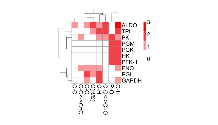
The script analyses the functional differences between glycolytic enzymes using principal component analysis (PCA) and hierarchical clustering. It generates some very nice heat maps. 

Here's one of the plots, produced with the pheatmap package


Analysing enzymes in terms of bond cleavage


SCRIPT
### Title: The chemical logic of glycolysis
### Author: Sergio Martínez Cuesta, EMBL-EBI, Hinxton, UK
### Aim: To visualise chemical similarities between enzymes reactions in glycolysis using latent variable models (PCA and CA) and clustering techniques

## Data input: load bond change data into R
data <- read.csv("http://science2therapy.com/data/bc.csv", header=TRUE, row.names=1, sep="\t", check.names=FALSE)

# bc.csv contains the frequency counts of chemical bond changes of the 10 glycolytic reactions as obtained from EC-BLAST
# header=TRUE and row.names=1 allow the first row and column to be considered the column and row names, sep="\t" indicates that bc.csv is tab-separated and check.names=FALSE disables the check of variable names


## Explore data
data
class(data)
dim(data)
colnames(data) # types of bond changes (formed and cleaved)
rownames(data) # enzyme ids, see data/glycolysis_enzymes.csv


## Barplots
# Which glycolytic enzyme catalyses more bond changes?
freqs_bc<-sort(rowSums(data), decreasing=TRUE)
freqs_bc
barplot(freqs_bc, col="white", ylab="Frequency of bond changes", xlab="Enzyme name")


# Which bond changes are more common in glycolysis?
freqs_enz<-sort(colSums(data), decreasing=TRUE)
freqs_enz
barplot(freqs_enz, col="white", ylab="Frequency of bond changes", xlab="Type of bond change")


# Average number of bond changes by glycolytic reaction
mean(rowSums(data))


## Principal component analysis (PCA)
fit <- princomp(data)
summary(fit)
biplot(fit, main="PCA")
loadings(fit)
fit$scores


# Additional packages: FactoMineR
install.packages("FactoMineR") # this only needs to be done once
library(FactoMineR)
fit <- PCA(data, scale.unit = FALSE)


## Correspondence analysis (CA)
install.packages("ca")  # this only needs to be done once
library(ca)
fit <- ca(data)
summary(fit)
plot(fit)

# using library(FactoMineR)
# fit<-CA(data)


## Calculate bond change distances between glycolytic reactions
?dist
d <- dist(data, method = "manhattan")


## Hierarchical clustering
fit <- hclust(d, method="ward")
plot(fit, main="Hierarchical clustering")
groups <- cutree(fit, k=4)
rect.hclust(fit, k=4, border="red") 


## Heatmaps
heatmap(as.matrix(data))


heatmap(as.matrix(d))


## Pretty heatmaps
install.packages("pheatmap")  # this only needs to be done once
library(pheatmap)
pheatmap(data, 
         fontsize=13, 
         cellwidth = 15, 
         cellheight = 15, 
         color = colorRampPalette(c("white", "red"))(4),
         clustering_distance_rows=d,
         legend_breaks=c(0,1,2,3))


## How to save pdf images:
pdf("mygraph.pdf")
pheatmap(data)
dev.off()


# References:
# 1- Quick-R: http://www.statmethods.net/

# 2- Crawley, M. J. (2007). The R Book. Chichester, UK: John Wiley & Sons, Ltd. doi:10.1002/9780470515075

# 3- Rahman, S. A., Martínez Cuesta, S., Furnham, N., Holliday, G. L., & Thornton, J. M. (2014). EC-BLAST: a tool to automatically search and compare enzyme reactions. Nature methods, 11(2), 171–174. doi:10.1038/nmeth.2803. url: http://www.ebi.ac.uk/thornton-srv/software/rbl/

# 4- Husson, F., Lê, S., and Pagès, J. (2011) Exploratory multivariate analysis by example using R, [online] http://books.google.com/books?hl=en&lr=&id=EDnNBQAAQBAJ&oi=fnd&pg=PP1&dq=Exploratory+Multivariate+Analysis+by+Example+Using+R&ots=I4bnnmgPJw&sig=ENW39pnO00fOOSO_F01cQ_Iv-UA (Accessed February 6, 2015).

# 5- Keller, M. A., Turchyn, A. V., & Ralser, M. (2014). Non-enzymatic glycolysis and pentose phosphate pathway-like reactions in a plausible Archean ocean. Molecular systems biology, 10, 725. Retrieved from http://www.ncbi.nlm.nih.gov/pubmed/24771084