Showing posts with label cll. Show all posts

Tuesday, 29 November 2016

Extracting an NFkappaB gene expression profile from published CLL gene expression data (Herishanu et al, Blood 2011)

Update: 18th October 2017 - Bioconductor is the place to get the Affymetrix annotation file.

This post is about exploring gene expression signatures. It was natural, for me, to start with the transcription factor, NFkappaB. On this blog, I have previously explored the principal component analysis of gene expression patterns from chronic lymphocytic leukaemia (CLL) cells published in Blood by Herishanu et al in 2011 - a key paper in this field.

In their paper, in Figure 5A, Herishanu et al focussed on a set of genes to investigate the gene signature for the transcription factor, NFkappaB. I found what they did very interesting and I wanted to reproduce their analysis using R and illustrate it here.

Here is my version of the heatmap, they showed in Figure 5A. My version has a little more information about the samples and the genes. The figures shows that the CLL cells from the lymph node (LN) have a higher NFkappaB gene signature is higher than the peripheral blood (PB) and the bone marrow (BM).

Heatmap showing the expression of selected NFkappaB regulated genes (listed on right) from CLL cells from peripheral blood (PB), bone marrow (BM) or lymph node (LN). Sample details on the bottom.
Here is the script I used to generate the data. To reproduce this, just cut and paste the script into R (or ideally R-Studio) and you should be able to generate the same figures.

START
# if required install packages
# install.packages("RCurl", "plyr", "heatmap3")

# the Affymetrix annotation file is located on Bioconductor
source("https://bioconductor.org/biocLite.R")
biocLite("hgu133plus2.db")   #installs the package
                   
# activate packages   
library(RCurl)     # to download data from internet
library(hgu133plus2.db)   # to link AffyIDs to gene names
library(plyr)   # to make a dataframe from a function
library(heatmap3) # one of many heatmap packages

# I want to extract the NF-kappaB gene profile and draw the first part of Figure 5. 
# I want to extract the values for a gene expression pattern
# need to extract it from the normalised data set.
# change colours to look more like the publication. 


# here is a link for all the normalised data from the paper (>50000 probes) 
x <- getURL("https://raw.githubusercontent.com/brennanpincardiff/RforBiochemists/master/data/herishanuMicroArrayDataNormalised.tsv")

# turn the data into a useful data.frame
data <- read.table(text = x, header = TRUE, sep = "\t")

# need to create a map that links AffyIDs to gene names
# http://bioconductor.org/packages/release/bioc/html/mygene.html
# U133 plus 2.0
# hgu133plus2.db

# https://www.bioconductor.org/help/workflows/annotation-data/
keytypes(hgu133plus2.db)

# SYMBOL is what we need

# map Affy IDs to Symbol
mapAffy_Symbol <- select(hgu133plus2.db, rownames(data), c("SYMBOL"))

# from Figure 5 there is a list of gene names
nfkb_genes <- c("RGS1", "CCND2", "NFKBIE", "CCL4", "CXCL13", "LTA", "CCL3", "BMEF1", "TNF", "CD83", "CXCL9", "BCL2A1", "DUSP2", "HEATR1", "CXCL10", "JUNB", "EBI2", "IL12B", "GADD45B", "EBI3", "ID2")

# test to see if we can find PROBEIDs which correspond to RGS1
mapAffy_Symbol[ which(mapAffy_Symbol$SYMBOL == "RGS1"),]
# works although there are more than one Affy ID per gene

# make a function to pull out probeID for a symbol
pullOutProbeID <- function(x){
  mapAffy_Symbol[ which(mapAffy_Symbol$SYMBOL == x),]
}

# use lapply to apply the function across the list of NFkB genes
lapply(nfkb_genes, pullOutProbeID)
# generates a list. 
# two of the list return nothing. 
# gene names have changed - I had to check the internet (GeneCards)
pullOutProbeID("NAMPT")  # BMEF1
pullOutProbeID("GPR183") # EBI2

# new list of NFkB genes with the two genes renamed. 
nfkb_genes2 <- c("RGS1", "CCND2", "NFKBIE", "CCL4", "CXCL13", "LTA", "CCL3", "NAMPT", "TNF", "CD83", "CXCL9", "BCL2A1", "DUSP2", "HEATR1", "CXCL10", "JUNB", "GPR183", "IL12B", "GADD45B", "EBI3", "ID2")


# this function from the package plyr

ldply will return a data frame
genesAsAffyID <- ldply(nfkb_genes2, pullOutProbeID)


# make a function to pull out GeneExpvalues for AffyID
pullOutGeneExpVal <- function(x){
  subset(data, rownames(data) == x)
}

# test the function
pullOutGeneExpVal("202988_s_at")
# works

# extract the expression values
expVals <- ldply(genesAsAffyID$PROBEID, pullOutGeneExpVal)
View(expVals)
# good, I have extracted the values. 

# turn data.frame into a matrix so that we can draw a heatmap
expVals.m <- as.matrix(expVals)
# give it useful row names
rownames(expVals.m) <- genesAsAffyID$SYMBOL

# lets draw a heatmap using default settings from base R
heatmap(expVals.m)
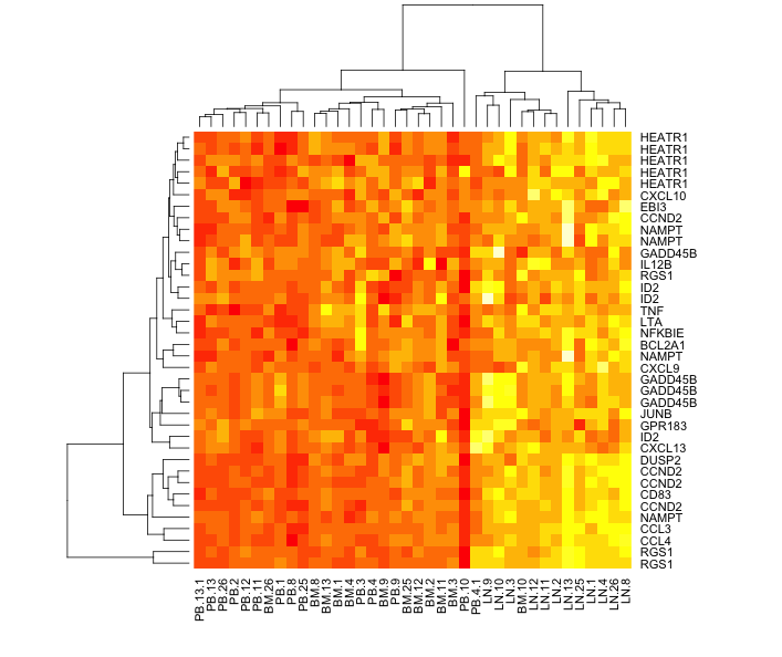


# LN (lymph node) segregates well but
# PB (periperal blood) and BM (bone marrow) are mixed up

# we would like this order of the columns
sampl.order <- c("PB.1", "PB.2", "PB.3", "PB.4", "PB.4.1", "PB.8", "PB.9", 
  "PB.10", "PB.11", "PB.12", "PB.13", "PB.13.1",  "PB.25", "PB.26",
  "BM.1", "BM.2", "BM.3", "BM.4", "BM.8", "BM.9", 
  "BM.10", "BM.11", "BM.12", "BM.13",  "BM.25", "BM.26",
  "LN.1", "LN.2", "LN.3", "LN.4", "LN.8", "LN.9", 
  "LN.10", "LN.11", "LN.12", "LN.13",  "LN.25", "LN.26")

# reorder the matrix
expVals.m.o <- expVals.m[ , sampl.order]

heatmap(expVals.m.o,
        Colv = NA)     # don't reorder columns


# heatmap3 can look quite good. 
heatmap3(expVals.m.o,
         Colv = NA, # don't reorder columns
         Rowv = NA) # don't reorder rows either


# add some useful titles to the heatmap
title( main = "NFkappaB Gene Signature \n Figure 5A",
       sub  = "Source: Herishanu et al, \n Blood 2011 117:563-574; doi:10.1182/blood-2010-05-284984",
       cex.main = 1.5,
       cex.sub = 0.75, font.sub = 3, col.sub = "red")

# add text to top to label PB, BM and LN
# https://stat.ethz.ch/R-manual/R-devel/library/graphics/html/text.html
add.expr=text(x = 10, y = 118, "PB", cex = 1.5)
add.expr=text(x = 15, y = 118, "BM", cex = 1.5)
add.expr=text(x = 20, y = 118, "LN", cex = 1.5)

# add lines to the top - called segments
# https://stat.ethz.ch/R-manual/R-devel/library/graphics/html/segments.html
segments(6.8, 113, 12.3, 113, col = "green", lwd = 4)
segments(12.7, 113, 17.3, 113, col = "red", lwd = 4)
segments(17.7, 113, 22.2, 113, col = "blue", lwd = 4)

# this looks quite nice and seems similar to Figure 5A
# and a very good point to stop on for today. 

END


These resources were useful:


Friday, 24 June 2016

Principal Component Analysis with published CLL gene expression data (Herishanu et al, Blood 2011)

Over the last few years, my understanding of chronic lymphocytic leukaemia has developed. Leukaemic cell proliferation has been shown to be a key element of the disease. The site of CLL cell proliferation was an important question. A gene expression analysis published in Blood by Herishanu et al in 2011 showed a proliferative gene expression pattern in the leukeamic cells from the lymph nodes as distinct from other sites of the body (peripheral blood or bone marrow).

I've been exploring the gene expression data using R. As a first step, I've explored the principal component analysis similar to that shown in Figure 1A of the paper.


The PCA is convincing because the three groups of samples cluster among themselves.  The 3D plot is useful because the three components separate the groups while two dimensions do not.


There are other ways of visualising PCA plots...  Sources are indicated as part of the script. 


Here is the script that I used to analyse this:

SCRIPT START
# install.packages("RCurl", "scatterplot3d")

library(RCurl)
library(scatterplot3d)

# A few year's ago a gene expression profile paper was published in Blood by Herishanu et al
# that gave us a new insight into chronic lymphocytic leukamia. 
# http://www.bloodjournal.org/content/117/2/563.long
# I have written this script to explore the data 
# and to reproduce the principal component analysis. 

# I have downloaded the original CEL files from GEO
# they were placed in a folder and the expression values extracted 
# what's produced is Affymetrix IDs and log2 expression values 

# I have created two data sets
# we can reproduce the PCA workflow with a subset of the data is required (5000 genes selected randomly). 
# this will be faster to download and visualise. 
# get the data - needs connection to the internet
# to use remove the hashtag "#"
# x <- getURL("https://raw.githubusercontent.com/brennanpincardiff/RforBiochemists/master/data/herishanuMicroArrayDataSubset.tsv")

# here is a link for all the data (>50000 probes) 
x <- getURL("https://raw.githubusercontent.com/brennanpincardiff/RforBiochemists/master/data/herishanuMicroArrayData.tsv")

# turn the data into a useful data.frame
data <- read.table(text = x, header = TRUE, sep = "\t")

# read in a file with names of samples
# created this from cut and paste of web page combined with manipulation in Word & Excel
sampID <- read.csv("https://raw.githubusercontent.com/brennanpincardiff/RforBiochemists/master/data/Herishanu_Samp_ID.csv", header = FALSE)

str(sampID)
sampID$V1 <- as.character(sampID$V1)

# is order of column names same as list in sampID?
data.col.name <- colnames(data)
data.col.name <- gsub(".CEL", "", data.col.name)
sampID.name <- sampID$V1
all.equal(data.col.name, sampID.name)
# TRUE so that is useful. 


# change column names from chip to PB, BM and LN
# for peripheral blood, bone marrow and lymph node respectively
sampID$Name <- paste0(as.character(sampID$V3), as.character(sampID$V5))
colnames(data) <- sampID$Name

# how do the sample cluster?
# I first need to find the "distances" between the arrays
# and show those distances in the hierarchical cluster plot
# I can pile up all the commands in one
# for more of a step by step approach, see these scripts:

plot(hclust(dist(t(data))))


# this is interesting because all the patient samples cluter together!
# with bone marrow and peripheral blood closer together than LN in all cases. 
# this is what it says in the paper and is shown in the supplementary data. 

# What's needed is a way to normalise by patient - HOW??
# Quote from the paper:
# "In the 12 patients in whom all 3 compartments had been arrayed, 
# the patient effect on gene expression was subtracted 
# by mean centering the expression value of each gene across the 3 compartments 
# for each patient separately."

# the twelve with all 3 compartments: #1, #2, #3, #4, #8, #9, #10, #11, #12, #13, #25, #26

# so if I understand this correctly, I need to extract a patient sample
# then mean centre all three samples, 
# and repeat for all 12 samples

# let's explore this concept with just two samples to see if it works
# pick out data for patient #26
samp26 <- data[,grep("#26", sampID$Name)]

# pick out data for patient #25
samp25 <- data[,grep("#25", sampID$Name)]

# put them together
twosamp <- cbind(samp26, samp25)


# visualise with a box plot - look normalised
boxplot(twosamp)


plot(hclust(dist(t(twosamp))))


# cluster by patient

# I think I understand what they have done.
# mean centred for each gene.... i.e. by row in the data
# For us this is really each probeset
# http://gastonsanchez.com/how-to/2014/01/15/Center-data-in-R/

# for each of the values substract the rowMeans
samp25.s <- samp25 - rowMeans(samp25)
samp26.s <- samp26 - rowMeans(samp26)
twosamp.s <- cbind(samp26.s, samp25.s)

plot(hclust(dist(t(twosamp.s))))


# This seems to work and gives a different cluster diagram
# with LN coming together nicely.

# apply this to the whole data set.
# extract each patient cohort
# these twelve were: #1, #2, #3, #4, #8, #9, #10, #11, #12, #13, #25, #26
# do #1 and # 2 first then do the other automatically...

# pat # 1
colnames(data)
pat_1 <- cbind(data[,1], data[,27], data[,46])
colnames(pat_1) <- c("PB#1", "BM#1", "LN#1")
pat_1.s <- pat_1 - rowMeans(pat_1)
# pat # 2
pat_2 <- cbind(data[,2], data[,28], data[,47])
colnames(pat_2) <- c("PB#2", "BM#2", "LN#2")
pat_2.s <- pat_2 - rowMeans(pat_2)

data.n <- cbind(pat_1.s, pat_2.s)

data.reqd <- c("#3", "#4", "#8", "#9", "#10", "#11", "#12", "#13", "#25", "#26")
for(i in 1:length(data.reqd)){
  samp <- data[,grep(data.reqd[i], sampID$Name)]
  samp <- samp - rowMeans(samp)
  data.n <- cbind(data.n, samp)
}

# now have a file called dat.exp.n - normalised within patients.
colnames(data.n)
plot(hclust(dist(t(data.n))))


# nice cluster by region with good separation of LN samples
# some overlap within PB and LN


# extract cell site to use for colours in PCA plots
names <- colnames(data.n)
colourby <- gsub("#\\d+", "", colnames(data.n))
colourby <- gsub("\\.", "", colourby)
colourby <- gsub("\\d+", "", colourby)

# this does cluster the LN samples distinctly but there is still some overlap 
# of Peripheral Blood and Bone Marrow. 
# PCA from the paper looks nice and convincing
# http://www.r-bloggers.com/computing-and-visualizing-pca-in-r/
# uses function princomp()

exp.pca <- princomp(data.n)  # this function does the PCA
print(exp.pca)
plot(exp.pca, type = "l")

Plot of variance by component for CLL gene expression patterns


plot(princomp(data.n)$loadings)
A simple 2D plot of component 1 vs component 2


p <- princomp(data.n)
loadings <- p$loadings[]
p.variance.explained <- p$sdev^2 / sum(p$sdev^2)

# plot percentage of variance explained for each principal component    
barplot(100*p.variance.explained, las=2, xlab='', ylab='% Variance Explained')


Looking at the effects of each component as a bar plot.


#*****************************************************************
# 2-D Plot
#******************************************************************         
x <- loadings[,1]
y <- loadings[,2]
z <- loadings[,3]
cols <- as.factor(colourby)
cols <- gsub("PB", "green", cols)
cols <- gsub("BM", "red", cols)
cols <- gsub("LN", "blue", cols)

# pch = 24: triangle point-up
# pch = 22: square
# pch = 21: circle
symbols <- as.factor(colourby)
symbols <- gsub("PB", 24, symbols)
symbols <- gsub("BM", 21, symbols)
symbols <- gsub("LN", 22, symbols)
symbols <- as.numeric(symbols)


# plot loadings on the first and second principal components 
# identify sample by body location
plot(x, y, type='p', 
     pch=symbols, 
     xlab='Comp.1', ylab='Comp.2', 
     col = cols, main = "Principal Component Analysis - CLL cell gene expression")

A simple 2D plot of component 1 vs component 2
 Each sample is coloured by location
# add a legend to the top of the plot
legend("top",      # location
       bty="n",              # suppress legend box, shrink text 50%
       title="Body Location of sample",
       c("PB", "BM", "LN"), 
       pch=symbols, col = cols, horiz=TRUE)
# label up the points
text(x, y, colnames(data.n), col=cols, cex=.5, pos=4)

# Comment: lymph node samples separate nicely from other samples
# some overlap between bone marrow and peripheral blood 

#*****************************************************************
# 3-D Plot, for good examples of 3D plots
#******************************************************************                 
# plot all companies loadings on the first, second, and third principal components and highlight points according to the sector they belong
s3d = scatterplot3d(x, y, z, 
                    xlab='Comp.1', ylab='Comp.2', zlab='Comp.3', 
                    color=cols, pch = symbols,
                    main = "Principal Component Analysis in 3D \n CLL cell gene expression")
A 3D graph separates the different groups of samples. 
s3d.coords = s3d$xyz.convert(x, y, z)
text(s3d.coords$x, s3d.coords$y, 
     labels=colnames(data.n), col=cols, cex=.8, pos=4)

Labels can be added but I'm not sure they help in this example. 

# change the order and the angle to make it look a bit more like the figure
s3d = scatterplot3d(y, x, z, 
                    xlab='PC2', ylab='PC1', zlab='PC3',             
                    color=cols, pch = symbols,
                    angle=-25,
                    grid = FALSE,
                    main = "Principal Component Analysis in 3D \n CLL cell gene expression")

par(xpd=TRUE)    # allows legend outside the graph

# add legend
legend(10, -4.5,     # location
       bty="n",              # suppress legend box
       title="Site of sample",
       c("PB", "BM", "LN"), 
       pch=symbols, col = cols, horiz=TRUE)

# add source as text
text(4, -6.5, cex =0.7,
     "Source: Herishanu et al, Blood 2011 117:563-574; doi:10.1182/blood-2010-05-284984")


SCRIPT END

Tuesday, 21 July 2015

How many publications in your area of research?

The amount of scientific literature is daunting. There are over 17,000 papers published in my research area which is chronic lymphocytic leukemia. I wanted to graph this so here is what I did:

I did a PubMed search using "chronic lymphocytic leukaemia" or "chronic lymphocytic leukemia" or "CLL". When the search is made, there is a nice graph on the left hand side of the browser window - see the circle in the picture below. You can download a csv file of this data by pressing on "Download CSV".


If you import this CSV file into R, it looks a bit strange. The str(data) command gives you the following output:

> str(data)
'data.frame': 64 obs. of  1 variable:
 $ pubmed...chronic.lymphocytic.leukaemia.or.chronic.lymphocytic.leukemia.or.CLL: Factor w/ 57 levels "1","10","1001",..: 57 51 3 56 53 52 55 50 48 47 ...

This is because it has a line at the top of the file that R can't interpret properly. You need to open the file and delete the first line - a little bit of data wrangling. I did this in Excel.
I also did a search with (("chronic lymphocytic leukaemia" or "chronic lymphocytic leukemia" or "CLL")) AND REVIEW[Publication Type] which gave me 2,236 articles. I combined these two bits of data in Excel. I saved this as a csv file.

When I import this new file, the str(data) command gives this:

> str(data)
'data.frame': 63 obs. of  3 variables:
 $ year    : int  2015 2014 2013 2012 2011 2010 2009 2008 2007 2006 ...
 $ articles: int  725 1001 930 787 776 819 695 618 608 594 ...
 $ reviews : int  38 147 185 124 112 135 97 74 126 112 ...

This looks much more useful.

Here is the graph that I have made:


Here is the script for this:


# activate the required packages
library(ggplot2)
library(reshape2)
library(ggthemes)

# do search in pubmed on the web
# pubmed - "chronic lymphocytic leukaemia" or "chronic lymphocytic leukemia" or "CLL"
# get an option to download a csv file
# open the file and remove the top line to prevent an error 
# add other data if you want and change the column titles to something useful
setwd("/Users/paulbrennan/Documents/Work Documents/Staff & Collaborations/RforBiochemists/RforBiochemists/data")
data <- read.csv("cllPublicationsformatted.csv")

# reshape the data from wide to long format
data.melt <- melt(data, id.vars = "year", value.name = "pubs", variable.name = "pub.type")

# draw the graph
p <- ggplot(data.melt, aes(x=year, 
                           y= pubs, 
                           colour = factor(pub.type, labels = c("Articles", "Reviews")))) + 
# colour = factor and the labels allows us to customize the legend
    geom_line(size=1) +
    labs(color = "Publication Type") + # customizes the legend title
    scale_colour_manual(values=c("black","red")) +
    ylab("Number Publications") + # y-label
    xlab("Year") + # x-label
    ggtitle("Chronic Lymphocytic Leukaemia Publications by Year") +
    scale_x_continuous(breaks=c(1960,1970,1980,1990, 2000, 2010)) +
    theme_bw()

p <- p + theme(legend.position=c(0,1), # move to the top left
               legend.justification=c(0,1), # move it in a bit
               legend.text=element_text(size = 12), # increase size of text
               legend.title=element_text(size = 12)) # and the title
               
p <- p + theme(axis.title.y = element_text(size = 14 )) + 
         theme(axis.text = element_text(size = 12))

p # show the graph


N.B. You do get a warning:
Warning message:
In loop_apply(n, do.ply) :
  Removed 17 rows containing missing values (geom_path).

This is because there is more data for the articles than the reviews. Nothing to worry about. 

This resource helped me: https://rpubs.com/hughes/10012