Showing posts with label publications. Show all posts

Friday, 6 January 2017

Visualizing the kinome in R - a 'simple' tree...

A paper by Manning et al in Science in 2002 showed an phylogenetic tree of the kinases in the human genome. With the help of a beautiful poster and web resources by Cell Signaling Technologies, this visualisation has become a classic among researchers working on protein kinases.

It has been used in many ways and the paper itself has be very extensively cited.
Examples include:
This blog post uses the sequences available on the protein kinase website (kinase.com) to create a tree using R. My hope is that this will be the first of few posts that will develop into being able to reproduce the visualisation from the Science and to render a similar image to that created by Cell Signaling Technology. This is really a key objective for me as I want to use this visualisation for my teaching.

If you are interested, please test the code and make comments. This is an ongoing project and I welcome feedback.

So here is the first version of the kinome phylogenetic tree:


I have made a more simple phylogenetic tree of the human proteins with the rel homology domain here which talks about the complexity of making trees.


Here is the script that makes this:
SCRIPT START

library(seqinr)  
library(msa)
library(ape)

# first version of generating a the kinome visualisation in R
# data is here: http://kinase.com/kinbase/FastaFiles/Human_kinase_domain.fasta
# in fasta format...
# need to extract the data into R... 
# need Biostrings package - downloaded as part of seqinr package

file <- c("http://kinase.com/kinbase/FastaFiles/Human_kinase_domain.fasta")

# step 1 is read in the FASTA files. 
kinases <- readAAStringSet(file, format = "fasta")
# that seems to work. 
kinases
# 516 sequences. 
# good.  

# step 2 do the multiple sequence alignment
kinaseAlign <- msa(kinases)  
# takes a bit of time!  - about 3.5 min on my computer...
# currently using default substitution matrix and CLUSTALW 
# creates an object with Formal class 'MsaAAMultipleAlignment' [package "msa"] with 6 slots

# step 3: convert Msa Alignment object into alignment for seqinr 
kinaseAlign2 <- msaConvert(kinaseAlign, type="seqinr::alignment")
class(kinaseAlign2) # it's an alignment
# worked 
# List of 4

# step 4: compute distance matrix - dist.alignment() function from the seqinr package:
d <- dist.alignment(kinaseAlign2, "identity")
# Class 'dist'

kinaseTree <- nj(d)  # from ape package, I think...
class(kinaseTree)
# class "phylo"
# List of 4

# good idea to save the tree locally... remove comment symbol
# write.tree(kinaseTree, file = "kinaseTree")
# to read back in:
# kinaseTree <- read.tree(file = "kinaseTree")

plot(kinaseTree, 
     main="Phylogenetic Tree of kinases")
# too difficult to read so remove the tip.labels which are the kinase names.

plot(kinaseTree, 
     main= "Phylogenetic Tree of kinases", 
     show.tip.label = FALSE)

plot(kinaseTree, 
     type = "unrooted", 
     main= "Phylogenetic Tree of kinases", 
     show.tip.label = FALSE)


# looks quite stylish a a little similar to visualisation in the Science paper
plot(kinaseTree, "u", 
     use.edge.length = FALSE,
     show.tip.label = FALSE)


# need to add colour
# argument is edge.color
plot(kinaseTree, "u", 
     use.edge.length = FALSE,
     show.tip.label = FALSE,
     edge.color = "red")


# want to add selected labels to give some orientation 
# extract tip.labels
tipLabels <- kinaseTree$tip.label

# add some labels we like to orient ourselves:
kinaseLabels <- c("IKKa","JAK3","ErbB2", 
                  "NEK11", "MLK1", "PKCb", 
                  "CDK9", "FRAP")

# find these in the alignment - they will be tip labels
labelNo <- NULL
for(i in 1:length(kinaseLabels)){
  labelNo <- c(labelNo, grep(kinaseLabels[i], kinaseTree$tip.label))
}
# generates a vector of 9 numbers. Some labels in two names. 

# make a vector of blank tiplabels
tipLabels_2 <-  rep('', length(kinaseTree$tip.label))

# add the labels we want to the vector...
for(i in 1:length(labelNo)){
  tipLabels_2[labelNo[i]] <- tipLabels[labelNo[i]]
}

# make a new tree
kinaseTree_fewLabels <- kinaseTree

# replace the tip labels with the shorter list.
kinaseTree_fewLabels$tip.label <- tipLabels_2

# make the plot with these
plot(kinaseTree_fewLabels, "u", 
     use.edge.length = FALSE,
     show.tip.label = TRUE,
     edge.color = "red",
     cex = 0.7)


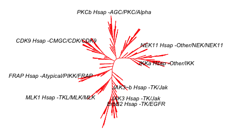
# remove "Hsap" using gsub() function 
tipLabels_2 <- gsub("Hsap", "", tipLabels_2)
kinaseTree_fewLabels$tip.label <- tipLabels_2
plot(kinaseTree_fewLabels, "u", 
     use.edge.length = FALSE,
     show.tip.label = TRUE,
     edge.color = "red",
     cex = 0.7)


# add a title and source and you have the image at the top...
plot(kinaseTree_fewLabels, "u",
     main="Phylogenetic tree of human kinase domains",
     sub="source: www.kinase.com & Manning et al Science (2002) 398:1912-1934",
     use.edge.length = FALSE,
     show.tip.label = TRUE,
     edge.color = "red",
     cex = 0.7)

# this looks quite good and is enough for today. 


Tuesday, 21 July 2015

How many publications in your area of research?

The amount of scientific literature is daunting. There are over 17,000 papers published in my research area which is chronic lymphocytic leukemia. I wanted to graph this so here is what I did:

I did a PubMed search using "chronic lymphocytic leukaemia" or "chronic lymphocytic leukemia" or "CLL". When the search is made, there is a nice graph on the left hand side of the browser window - see the circle in the picture below. You can download a csv file of this data by pressing on "Download CSV".


If you import this CSV file into R, it looks a bit strange. The str(data) command gives you the following output:

> str(data)
'data.frame': 64 obs. of  1 variable:
 $ pubmed...chronic.lymphocytic.leukaemia.or.chronic.lymphocytic.leukemia.or.CLL: Factor w/ 57 levels "1","10","1001",..: 57 51 3 56 53 52 55 50 48 47 ...

This is because it has a line at the top of the file that R can't interpret properly. You need to open the file and delete the first line - a little bit of data wrangling. I did this in Excel.
I also did a search with (("chronic lymphocytic leukaemia" or "chronic lymphocytic leukemia" or "CLL")) AND REVIEW[Publication Type] which gave me 2,236 articles. I combined these two bits of data in Excel. I saved this as a csv file.

When I import this new file, the str(data) command gives this:

> str(data)
'data.frame': 63 obs. of  3 variables:
 $ year    : int  2015 2014 2013 2012 2011 2010 2009 2008 2007 2006 ...
 $ articles: int  725 1001 930 787 776 819 695 618 608 594 ...
 $ reviews : int  38 147 185 124 112 135 97 74 126 112 ...

This looks much more useful.

Here is the graph that I have made:


Here is the script for this:


# activate the required packages
library(ggplot2)
library(reshape2)
library(ggthemes)

# do search in pubmed on the web
# pubmed - "chronic lymphocytic leukaemia" or "chronic lymphocytic leukemia" or "CLL"
# get an option to download a csv file
# open the file and remove the top line to prevent an error 
# add other data if you want and change the column titles to something useful
setwd("/Users/paulbrennan/Documents/Work Documents/Staff & Collaborations/RforBiochemists/RforBiochemists/data")
data <- read.csv("cllPublicationsformatted.csv")

# reshape the data from wide to long format
data.melt <- melt(data, id.vars = "year", value.name = "pubs", variable.name = "pub.type")

# draw the graph
p <- ggplot(data.melt, aes(x=year, 
                           y= pubs, 
                           colour = factor(pub.type, labels = c("Articles", "Reviews")))) + 
# colour = factor and the labels allows us to customize the legend
    geom_line(size=1) +
    labs(color = "Publication Type") + # customizes the legend title
    scale_colour_manual(values=c("black","red")) +
    ylab("Number Publications") + # y-label
    xlab("Year") + # x-label
    ggtitle("Chronic Lymphocytic Leukaemia Publications by Year") +
    scale_x_continuous(breaks=c(1960,1970,1980,1990, 2000, 2010)) +
    theme_bw()

p <- p + theme(legend.position=c(0,1), # move to the top left
               legend.justification=c(0,1), # move it in a bit
               legend.text=element_text(size = 12), # increase size of text
               legend.title=element_text(size = 12)) # and the title
               
p <- p + theme(axis.title.y = element_text(size = 14 )) + 
         theme(axis.text = element_text(size = 12))

p # show the graph


N.B. You do get a warning:
Warning message:
In loop_apply(n, do.ply) :
  Removed 17 rows containing missing values (geom_path).

This is because there is more data for the articles than the reviews. Nothing to worry about. 

This resource helped me: https://rpubs.com/hughes/10012