There are many ways to get data into R. I want to illustrate a method of downloading published data within R, opening the data (an Excel file) and then doing visualisations and manipulations.
I drew some graphs as I explored and manipulated the data. These are interspersed with the script below. The visualisations included boxplots and a cluster diagram.
I wanted to draw a volcano plot which expresses the fold change against the significant of the change (p-value). I couldn't do that with the data supplied so I had to reverse the transformation and calculate the fold change again.
The plot indicates that there are more proteins over-expressed in cells (on the left) compared to exosomes (on the right).
# pull down a file from the internet, do some analysis and draw a graph...
# choose Jason Webber's MCP Paper...
# the data can be downloaded using this link with give zip file.
# It isn't necessary to do that for this script.
# install if necessary:
# install.packages(c("ggplot2", "readxl"))
library(ggplot2)
library(readxl)
# this is the link to the data
link <- "https://github.com/brennanpincardiff/RforBiochemists/raw/master/R_for_Biochemists_101/data/mcp.M113.032136-6.xlsx"
# the download.file() function downloads and saves the file with the name given
download.file(url=link,destfile="file.xlsx", mode="wb")
# then we can open the file and extract the data using the read_excel() function.
data<- read_excel("file.xlsx")
View(data)
# plot the data - always an important first step!
boxplot(data[2:7],
las =2, # las = 2 turns the text around to show sample names
ylab = expression(bold("expression")),
main="Boxplot of expression data")
 |
| Two types of sample - exosomes (n=3) and cells (n=3). |
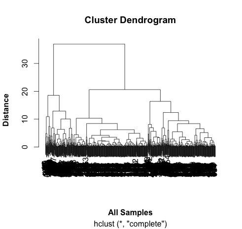
# do a cluster analysis to quality control the different groups
# convert to matrix first
data.m <- as.matrix(data[2:7])
dim(data.m) # gives the dimensions of the matrix
# ans: 762 6
# calculate the distances using the dist() function.
# various methods are possible - default is Euclidean.
distances <- dist(data.m)
summary(distances) # have a look at the object
# make the cluster dendrogram object using the hclust() function
hc <- hclust(distances)
# plot the cluster diagram
# some interesting groups in the data
plot(hc,
xlab =expression(bold("All Samples")),
ylab = expression(bold("Distance")))
# ah, not what I intended.
# it clustered the proteins NOT the samples.
# transpose the data and try again...
data.m.t <- t(data.m)
dim(data.m.t)
# ans = 6 762 - so that has worked.
# repeat cluter analysis
# calculate the distances using the dist() function.
# various methods are possible - default is Euclidean.
distances <- dist(data.m.t)
summary(distances)
# make the cluster dendrogram object using the hclust() function
hc <- hclust(distances)
# plot the cluster diagram
# some interesting groups in the data
plot(hc,
xlab =expression(bold("All Samples")),
ylab = expression(bold("Distance")))
# replicates cluster together well.
# the adjusted P value are in a column entiteld: BH - P.value
# this is a little awkward so rename this and Fold Change column:
colnames(data)[9] <- "P.Value"
colnames(data)[10] <- "Fold.Change"
plot(data$P.Value ~ data$Fold.Change)
# this works but we would like to turn it into a volcano plot
# with log2 at the bottom and -p-value.
# we can't log fold changes as half of them are negative numbers
# we need to re-calculate the raw data
# reverse the log2 transformation.
# mean the values & calculate fold change in decimal format (no +/-)
data$exo1 <- 2^data$exoRFU1
data$exo2 <- 2^data$exoRFU2
data$exo3 <- 2^data$exoRFU3
data$cell1 <- 2^data$cellRFU1
data$cell2 <- 2^data$cellRFU2
data$cell3 <- 2^data$cellRFU3
# calculate means of the replicates
data$exoMean <- rowMeans(data[,13:15])
data$cellMean <- rowMeans(data[,16:18])
# always good to visualise the data:
plot(log2(data$exoMean)~log2(data$cellMean))
# calculate fold change exo/cell
data$FoldChange <- data$exoMean/data$cellMean
plot(log2(data$FoldChange)) # transform for plotting
# make column in data.frame with transformed data
data$Log2.Fold.Change <- log2(data$FoldChange)
## Identify the genes that have a p-value < 0.05
data$threshold = as.factor(data$P.Value < 0.05)
## Construct the volcano plot object using ggplot
g <- ggplot(data=data,
aes(x=Log2.Fold.Change, y =-log10(P.Value),
colour=threshold)) +
geom_point(alpha=0.4, size=1.75) +
xlim(c(-6, 6)) +
xlab("log2 fold change") + ylab("-log10 p-value") +
theme_bw() +
theme(legend.position="none") +
ggtitle("Volcano Plot comparing protein expression in exosomes vs cells ") # add a title
g # show the plot
END of script
So I think that the threshold of p<0.05 is too low for this volcano plot. It's relatively easy to change and would make a good exercise. Perhaps a threshold of p<0.00001 would be better.
Useful resources (updated 1 July 2025)