Showing posts with label wrangling. Show all posts

Tuesday, 21 July 2015

How many publications in your area of research?

The amount of scientific literature is daunting. There are over 17,000 papers published in my research area which is chronic lymphocytic leukemia. I wanted to graph this so here is what I did:

I did a PubMed search using "chronic lymphocytic leukaemia" or "chronic lymphocytic leukemia" or "CLL". When the search is made, there is a nice graph on the left hand side of the browser window - see the circle in the picture below. You can download a csv file of this data by pressing on "Download CSV".


If you import this CSV file into R, it looks a bit strange. The str(data) command gives you the following output:

> str(data)
'data.frame': 64 obs. of  1 variable:
 $ pubmed...chronic.lymphocytic.leukaemia.or.chronic.lymphocytic.leukemia.or.CLL: Factor w/ 57 levels "1","10","1001",..: 57 51 3 56 53 52 55 50 48 47 ...

This is because it has a line at the top of the file that R can't interpret properly. You need to open the file and delete the first line - a little bit of data wrangling. I did this in Excel.
I also did a search with (("chronic lymphocytic leukaemia" or "chronic lymphocytic leukemia" or "CLL")) AND REVIEW[Publication Type] which gave me 2,236 articles. I combined these two bits of data in Excel. I saved this as a csv file.

When I import this new file, the str(data) command gives this:

> str(data)
'data.frame': 63 obs. of  3 variables:
 $ year    : int  2015 2014 2013 2012 2011 2010 2009 2008 2007 2006 ...
 $ articles: int  725 1001 930 787 776 819 695 618 608 594 ...
 $ reviews : int  38 147 185 124 112 135 97 74 126 112 ...

This looks much more useful.

Here is the graph that I have made:


Here is the script for this:


# activate the required packages
library(ggplot2)
library(reshape2)
library(ggthemes)

# do search in pubmed on the web
# pubmed - "chronic lymphocytic leukaemia" or "chronic lymphocytic leukemia" or "CLL"
# get an option to download a csv file
# open the file and remove the top line to prevent an error 
# add other data if you want and change the column titles to something useful
setwd("/Users/paulbrennan/Documents/Work Documents/Staff & Collaborations/RforBiochemists/RforBiochemists/data")
data <- read.csv("cllPublicationsformatted.csv")

# reshape the data from wide to long format
data.melt <- melt(data, id.vars = "year", value.name = "pubs", variable.name = "pub.type")

# draw the graph
p <- ggplot(data.melt, aes(x=year, 
                           y= pubs, 
                           colour = factor(pub.type, labels = c("Articles", "Reviews")))) + 
# colour = factor and the labels allows us to customize the legend
    geom_line(size=1) +
    labs(color = "Publication Type") + # customizes the legend title
    scale_colour_manual(values=c("black","red")) +
    ylab("Number Publications") + # y-label
    xlab("Year") + # x-label
    ggtitle("Chronic Lymphocytic Leukaemia Publications by Year") +
    scale_x_continuous(breaks=c(1960,1970,1980,1990, 2000, 2010)) +
    theme_bw()

p <- p + theme(legend.position=c(0,1), # move to the top left
               legend.justification=c(0,1), # move it in a bit
               legend.text=element_text(size = 12), # increase size of text
               legend.title=element_text(size = 12)) # and the title
               
p <- p + theme(axis.title.y = element_text(size = 14 )) + 
         theme(axis.text = element_text(size = 12))

p # show the graph


N.B. You do get a warning:
Warning message:
In loop_apply(n, do.ply) :
  Removed 17 rows containing missing values (geom_path).

This is because there is more data for the articles than the reviews. Nothing to worry about. 

This resource helped me: https://rpubs.com/hughes/10012

Wednesday, 24 June 2015

Data wrangling in Excel

I do some of my data wrangling Excel because this allows me to cut and paste and get my data into a format that I understand. 

To illustrate this process, I will show a starting Excel file and a much better example. 

The before file is one that we published last year (Proteomics-Based Strategies To Identify Proteins Relevant to Chronic Lymphocytic Leukemia (Alsagaby et al, J. Proteome Res., 2014, 13 (11), pp 5051–5062).  Please download and open our  list of 728 proteins which is available from the JPR website as an Excel file.

Here is a photo of the file:


To use this in R:

  • Delete everything you don't want.
  • Get the titles into one line
  • Shorten the titles to something useful
  • Save as a csv file (comma separated values)
  • Try the read.csv() function to get it into R. 
Here is a nicer look file:


There is a way to clean up your data in R too. I used the readxl package. 
For an example see this script:

Tuesday, 2 June 2015

Plotting enzyme data with ggplot - Part I

ggplot is a very powerful graphics package.  The construction of the graphs is quite different to base graphics. "It uses the grammar of graphics" particularly layers. 

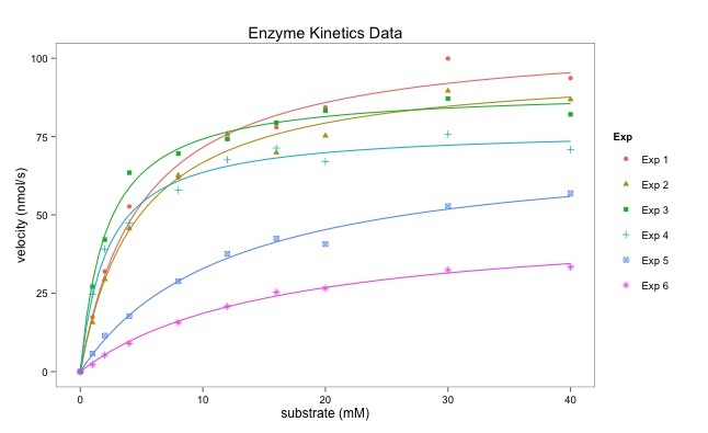
Dr Dean Hammond has written this script that illustrates how ggplot can be used to draw multiple enzymatic data plots with colours. Part II will draw six separate plots. 

Using ggplot sometimes requires some reshaping of the data (data munging or data wrangling) which is shown in the script below. This uses the melt() function.

The points are plotted alone first creating a layer with geom_point():
geom_point(aes(color = Exp, shape = Exp)).
aes() refers to the aesthetics of the plot.  

The line fitting is done within ggplot using geom_smooth():
geom_smooth(method = "nls", formula = y ~ Vmax * x / (Km + x), start = list(Vmax = 50, Km = 2),

I particularly like the ease with which the plot can be saved using ggsave():
ggsave("All_points_plus_fits.pdf")

The final graph is here:


# Following on from my code to multiplot 6 enzymology data-sets using base R in a for loop,
# here's how to create a single plot with all fitted curves on it too
# I have used ggplot and faceting.

# Some manipulation of the data is required, essentially to melt it from 'wide' to 'long' (reshape2)

# I personally don't like the standard ggplot look, so
# I also load package ggthemes and think Stephen Few's theme is the nicest (hence, theme_few())

# You may need to do this once: install.packages("ggplot2", "reshape2", "ggthemes")

library(reshape2)  # allows us to use the packages
library(ggplot2)
library(ggthemes)

# lets read the data in:
enzdata <- matrix(c(0, 17.36667, 31.97143, 52.68889, 61.95385, 74.2, 77.97143, 84.28, 99.91429, 93.66667, 
                    0, 15.7, 29.42286, 45.64, 62.60615, 75.78118, 69.88, 75.256, 89.59429, 86.84, 
                    0, 27.10667, 42.12, 63.48, 69.56, 74.26857, 79.44444, 83.29091, 87.1, 82.08571, 
                    0, 24.72, 39.07, 47.4, 57.928, 67.6, 71.35556, 67, 75.79375, 70.86667, 
                    0, 5.723636, 11.48, 17.697143, 28.813333, 37.567273, 42.483077, 40.68, 52.81, 56.92, 
                    0, 2.190476, 5.254545, 8.95, 15.628571, 20.8, 25.355556, 26.55, 32.44, 33.333333),
                  nrow = 10, ncol = 6)
no.Exp <- c("Exp 1", "Exp 2", "Exp 3", "Exp 4", "Exp 5", "Exp 6")
Sub <- c(0, 1, 2, 4, 8, 12, 16, 20, 30, 40)
 
# convert it to a data.frame for melting:
enzdata <- as.data.frame(enzdata)

# add column names:
colnames(enzdata) <- no.Exp

# add the Sunstrate data as an additional column to the data.frame:
enzdata <- cbind(Sub, enzdata)

# melt the data from wide to long:
melted_data <- melt(enzdata, id.vars = "Sub", value.name = "v", variable.name = "Exp")

# an examination of the two data files shows what has happened. 
View(enzdata)
View(melted_data)


Data before "melting"

Some of the data after melting


# The way ggplot draws colours depends on the required number of colours. 
# The way it does it is just with equally spaced hues around the color wheel, starting from 15:
gg_color_hue <- function(n){
  hues = seq(15, 375, length = n + 1)
  hcl(h = hues, l = 65, c = 100)[1:n]
  }
  
# we have 6 experiments (so we want to create our own 6 colour "mini-palette")
cols <- gg_color_hue(6)  
# this gets the default ggplot colours when we want to plot 6 different variables.

# Let's plot:
ggplot(melted_data, aes(x = Sub, y = v)) +
  ylab("velocity (nmol/s)") + xlab("substrate (mM)") +
  theme_few() +
  # let's plot the data simply as points, shaped and colour-coded by expt. of origin:
  geom_point(aes(color = Exp, shape = Exp)) +


Just the points - no fitted lines yet. 

  # then add each best-fit line from our Michaelis Menten nls equation (according to Expt), colouring based-on our colour palette to match ggplots own colour-coding:
  geom_smooth(method = "nls", formula = y ~ Vmax * x / (Km + x), start = list(Vmax = 50, Km = 2),
              se = F, colour = cols[1], size = 0.5, data = filter(melted_data, Exp == "Exp 1")) +
  geom_smooth(method = "nls", formula = y ~ Vmax * x / (Km + x), start = list(Vmax = 50, Km = 2),
              se = F, colour = cols[2], size = 0.5, data = filter(melted_data, Exp == "Exp 2")) +
  geom_smooth(method = "nls", formula = y ~ Vmax * x / (Km + x), start = list(Vmax = 50, Km = 2),
              se = F, colour = cols[3], size = 0.5, data = filter(melted_data, Exp == "Exp 3")) +
  geom_smooth(method = "nls", formula = y ~ Vmax * x / (Km + x), start = list(Vmax = 50, Km = 2),
              se = F, colour = cols[4], size = 0.5, data = filter(melted_data, Exp == "Exp 4")) +
  geom_smooth(method = "nls", formula = y ~ Vmax * x / (Km + x), start = list(Vmax = 50, Km = 2),
              se = F, colour = cols[5], size = 0.5, data = filter(melted_data, Exp == "Exp 5")) +
  geom_smooth(method = "nls", formula = y ~ Vmax * x / (Km + x), start = list(Vmax = 50, Km = 2),
              se = F, colour = cols[6], size = 0.5, data = filter(melted_data, Exp == "Exp 6")) +
  # Let's add a title to the plot
  ggtitle("Enzyme Kinetics Data") +
  # and save it as a .pdf (optional, obviously)
  ggsave("All_points_plus_fits.pdf")