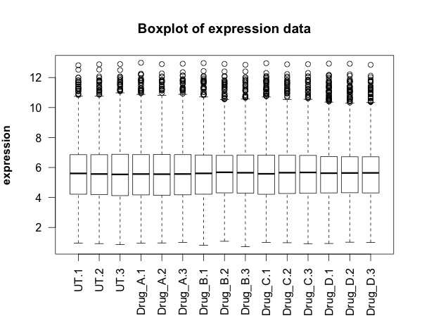
This second part of the gene analysis script generates list of genes that are differentially expressed following drug treatment. The data set is the same as used in first part of the analysis script. It's on github and can be downloaded within R. I like the volcano plots which facilitate a nice understanding of the scale of changes caused by the different drugs.

# START
library(RCurl)
library(ggplot2)
library(heatmap3)
# this script uses the limma pacakge from Bioconductor
# these first two lines install it.
# for more information about the package, go here:
# https://bioconductor.org/packages/release/bioc/html/limma.html
# it was created to apply linear modelling to microarray data
# but it can be used for any sets of numbers where you have multiple groups
source("https://bioconductor.org/biocLite.R")
biocLite("limma")
library(limma)
x <- getURL("https://raw.githubusercontent.com/brennanpincardiff/RforBiochemists/master/data/microArrayData.tsv")
data <- read.table(text = x, header = TRUE, sep = "\t")
new.data <- data[2:16]
# these are log2 values
# The data has been normalized and summarized
# turn into a matrix
data.m <- as.matrix(new.data)
## calculate the significant differences limma!
names <- colnames(data.m)
names <- factor(gsub("\\.\\d", "", names)) # change names into factor
design <- model.matrix(~ 0 + names)
design
# this looks about right - each treatment has three samples
# no overlap between the samples.
# Fit linear model for each gene given a series of arrays
fit <- lmFit(object = data.m, design = design)
fit
# set up the experiment using makeContrasts
# makeContrasts
contrast <- makeContrasts(
Drug_A = namesUT - namesDrug_A,
Drug_B = namesUT - namesDrug_B,
Drug_C = namesUT - namesDrug_C,
Drug_D = namesUT - namesDrug_D,
levels = design)
contrast
fit <- contrasts.fit(fit, contrast)
# Given a microarray linear model fit, compute moderated t-statistics,
# moderated F-statistic, and log-odds of differential expression by
# empirical Bayes moderation of the standard errors towards a common value.
fit.bayes <- eBayes(fit)
fit.bayes
# using topTable to extract gene lists
# this method adjusts for multiple testing using the Benjamini and Hochberg method
# for information on this see the limma documentation
# https://bioconductor.org/packages/release/bioc/html/limma.html or
# there is lots of information on the internet
# e.g.: https://en.wikipedia.org/wiki/False_discovery_rate
Drug_A.diff <- topTable(fit.bayes, n=5000, adjust.method = "BH", coef=1)
Drug_B.diff <- topTable(fit.bayes, n=5000, adjust.method = "BH", coef=2)
Drug_C.diff <- topTable(fit.bayes, n=5000, adjust.method = "BH", coef=3)
Drug_D.diff <- topTable(fit.bayes, n=5000, adjust.method = "BH", coef=4)
# rownames of these are the row names of data...
colnames(Drug_D.diff)
str(Drug_D.diff) # it's a data.frame
# VOLCANO PLOT VISUALISATIONS
# we can draw a volcano plat because we have calculated the log 2 fold change and the p-value
Drug_A.diff$threshold = as.factor(Drug_A.diff$adj.P.Val < 0.01)
Drug_B.diff$threshold = as.factor(Drug_B.diff$adj.P.Val < 0.01)
Drug_C.diff$threshold = as.factor(Drug_C.diff$adj.P.Val < 0.01)
Drug_D.diff$threshold = as.factor(Drug_D.diff$adj.P.Val < 0.01)
##Construct the plot object
gA <- ggplot(data=Drug_A.diff,
aes(x=logFC, y =-log10(adj.P.Val),
colour=threshold)) +
geom_point(alpha=0.4, size=1.75) +
xlab("log2 fold change") + ylab("-log10 p-value") +
theme_bw() +
theme(legend.position="none")
gA <- gA + ggtitle("Drug A")
gA # shows us the object - the graph
# this %+% allows us to push a different dataset into an existing
# ggplot object. It overwrites the data
# it must contain the same column names otherwise it won't work.
gB <- gA %+% Drug_B.diff
# then we need to give it a new title
gB <- gB + ggtitle("Drug B")
# do the same for the other Drugs
gC <- gA %+% Drug_C.diff
gC <- gC + ggtitle("Drug C")
gD <- gA %+% Drug_D.diff
gD <- gD + ggtitle("Drug D")
# These visualisations work.
# no significant differences with Drug A, more with Drug B and C
# lots of differences with Drug D.
# run code below to make multiplot function first!
multiplot(gA, gB, gC, gD, cols=2)
## ANOTHER VISUALISATION: a heatmap
# merge Drug_D adjusted P value and LogFC with expression values...
Drug_D.diff$probeset_id <- rownames(Drug_D.diff)
merged.data <- merge(data, Drug_D.diff, by="probeset_id")
# subset merged data for significantly altered genes
data.2.heatmap <- subset(merged.data, adj.P.Val < 0.001)
dim(data.2.heatmap)
# get the numbers and turn into a matrix
data.2.heatmap.num <- data.2.heatmap[2:16] # just the numbers
data.2.heatmap.m <- as.matrix(data.2.heatmap.num)
# if you make your plot window big, this will work
heatmap3(data.2.heatmap.m,
RowSideLabs = FALSE,
showRowDendro=FALSE,
showColDendro=FALSE,
main = "Heatmap of Drug Effects")
# otherwise print it to a PDF file.
pdf("mygraph.pdf")
heatmap3(data.2.heatmap.m,
RowSideLabs = FALSE,
showRowDendro=FALSE,
showColDendro=FALSE,
main = "Heatmap of Drug Effects")
dev.off()
# It's not perfect but it's the best I can do at the moment.

# from: http://www.cookbook-r.com/Graphs/Multiple_graphs_on_one_page_(ggplot2)/
# Multiple plot function
#
# ggplot objects can be passed in ..., or to plotlist (as a list of ggplot objects)
# - cols: Number of columns in layout
# - layout: A matrix specifying the layout. If present, 'cols' is ignored.
#
# If the layout is something like matrix(c(1,2,3,3), nrow=2, byrow=TRUE),
# then plot 1 will go in the upper left, 2 will go in the upper right, and
# 3 will go all the way across the bottom.
#
multiplot <- function(..., plotlist=NULL, file, cols=1, layout=NULL) {
library(grid)
# Make a list from the ... arguments and plotlist
plots <- c(list(...), plotlist)
numPlots = length(plots)
# If layout is NULL, then use 'cols' to determine layout
if (is.null(layout)) {
# Make the panel
# ncol: Number of columns of plots
# nrow: Number of rows needed, calculated from # of cols
layout <- matrix(seq(1, cols * ceiling(numPlots/cols)),
ncol = cols, nrow = ceiling(numPlots/cols))
}
if (numPlots==1) {
print(plots[[1]])
} else {
# Set up the page
grid.newpage()
pushViewport(viewport(layout = grid.layout(nrow(layout), ncol(layout))))
# Make each plot, in the correct location
for (i in 1:numPlots) {
# Get the i,j matrix positions of the regions that contain this subplot
matchidx <- as.data.frame(which(layout == i, arr.ind = TRUE))
print(plots[[i]], vp = viewport(layout.pos.row = matchidx$row,
layout.pos.col = matchidx$col))
}
}
}