Showing posts with label enzymes. Show all posts

Monday, 6 November 2017

Making a chromatography plot with an axis on the right hand side...

While working through our online course, R for Biochemists 101 from the Biochemical Society, Diane Hatziioanou made the following comment:
Could you point me in the direction of help to make a plot with different axes? For example for a character series “fractions” make one plot with two sets of data, one plotted against the right and one against the left y axes where the two y axes could be something like absorbance and activity. Thanks!

This inspired me to create this visualisation:

If you more information, leave a comment below.

Here is the script:
START
#https://stackoverflow.com/questions/43942002/geom-line-with-different-y-axis-scale


library(magrittr)
library(tidyr)

sample_data <- data.frame(fracs = rep(1:20),
  Absorbance = c(0.1, 0.1, 0.1, 0.2, 0.4, 0.1, 0.1, 0.5, 1.0, 0.1,
    0.1, 0.1, 0.5, 0.1, 0.1, 0.2, 0.3, 0.5, 1.0, 0.1),
  Activity = c(32, 33, 35, 150, 287, 39, 35, 40, 42, 32,
    30, 31, 32, 45, 57, 32, 33, 40, 41, 40))

# reformat the data into long format to allow plotting
data <- sample_data %>% gather(y, value, Absorbance:Activity)
data$fracs <- as.integer(data$fracs)

# trial plot for Activity (enzyme activity)
ggplot(data, aes(fracs, value, colour=y)) + 
  geom_line(data=data %>% filter(y=="Activity")) 


# trial plot for Absorbance
ggplot(data, aes(fracs, value, colour=y)) + 
  geom_line(data=data %>% filter(y=="Absorbance"))


# plot the two lines together
ggplot(data, aes(fracs, value, colour=y)) + 
  geom_line(data=data %>% filter(y=="Absorbance")) + 
  geom_line(data=data %>% filter(y=="Activity"))
# but different values makes Absorbance line flat. 


# change the scale for second line
max(sample_data$Absorbance)
max(sample_data$Activity)
scaleby = max(sample_data$Activity)/max(sample_data$Absorbance)

ggplot(data, aes(colour=y)) + 
  geom_line(data=data %>% filter(y=="Activity"),
    aes(x = fracs, y = value)) + 
  geom_line(data=data %>% filter(y=="Absorbance"),
    aes(x = fracs, y=value*scaleby))
# this looks better...


# putting it together with labels etc... 
p <- ggplot() + 
  geom_line(data=data %>% filter(y=="Activity"),
    aes(x = fracs, y = value, colour=y)) + 
  geom_line(data=data %>% filter(y=="Absorbance"),
    aes(x = fracs, y=value*scaleby, colour=y))

# limit for y axis
p <- p + ylim(0,300)

# adding our second scale on the right hand side of the plot
p <- p + scale_y_continuous(sec.axis = sec_axis(~./scaleby, 
    name="Absorbance (570nM)"))
  
# label the x and y axis...
p <- p + ylab("Enzyme activity (units)")
p <- p + xlab("Chromatography fractions")


# This is salt chromatography so adding a line showing 
# the NaCl concentration. 
salt_conc <- data.frame(fracs = rep(1:20),
  conc = c(c(10), seq(from = 10, to = 250, by= 13)))

# salt curve labels
salt_label <- data.frame(x = c(1,20), 
  y = c(10, 250), 
  text = c("[10nM]\nNaCl", "[250nM]\nNaCl"))

# check out the line
ggplot(salt_conc, aes(fracs, conc)) + 
  geom_line() + 
  geom_text(data = salt_label,
    aes(x = x,
      y = y,
      label = text))


# linetype=2 gives a dashed line
p <- p + geom_line(data = salt_conc, aes(fracs, conc),
  linetype = 2)
# add some labels to show the starting and ending concentrations
p <- p + geom_text(data = salt_label,
              aes(x = x,
                y = y,
                label = text),
                size = 2.5)

p <- p + theme_bw()
p <- p + ggtitle("Chromatography plot")
p <- p + theme(legend.position="top", legend.direction="horizontal")
p <- p + theme(legend.title=element_blank())
p


END

Tuesday, 23 June 2015

The chemical logic of glycolysis

Dr Sergio Martínez Cuesta from the EMBL-EBI has prepared the script below which he will demonstrate and discuss during our Training Day tomorrow. 

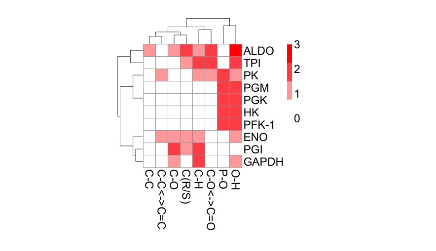
The script analyses the functional differences between glycolytic enzymes using principal component analysis (PCA) and hierarchical clustering. It generates some very nice heat maps. 

Here's one of the plots, produced with the pheatmap package


Analysing enzymes in terms of bond cleavage


SCRIPT
### Title: The chemical logic of glycolysis
### Author: Sergio Martínez Cuesta, EMBL-EBI, Hinxton, UK
### Aim: To visualise chemical similarities between enzymes reactions in glycolysis using latent variable models (PCA and CA) and clustering techniques

## Data input: load bond change data into R
data <- read.csv("http://science2therapy.com/data/bc.csv", header=TRUE, row.names=1, sep="\t", check.names=FALSE)

# bc.csv contains the frequency counts of chemical bond changes of the 10 glycolytic reactions as obtained from EC-BLAST
# header=TRUE and row.names=1 allow the first row and column to be considered the column and row names, sep="\t" indicates that bc.csv is tab-separated and check.names=FALSE disables the check of variable names


## Explore data
data
class(data)
dim(data)
colnames(data) # types of bond changes (formed and cleaved)
rownames(data) # enzyme ids, see data/glycolysis_enzymes.csv


## Barplots
# Which glycolytic enzyme catalyses more bond changes?
freqs_bc<-sort(rowSums(data), decreasing=TRUE)
freqs_bc
barplot(freqs_bc, col="white", ylab="Frequency of bond changes", xlab="Enzyme name")


# Which bond changes are more common in glycolysis?
freqs_enz<-sort(colSums(data), decreasing=TRUE)
freqs_enz
barplot(freqs_enz, col="white", ylab="Frequency of bond changes", xlab="Type of bond change")


# Average number of bond changes by glycolytic reaction
mean(rowSums(data))


## Principal component analysis (PCA)
fit <- princomp(data)
summary(fit)
biplot(fit, main="PCA")
loadings(fit)
fit$scores


# Additional packages: FactoMineR
install.packages("FactoMineR") # this only needs to be done once
library(FactoMineR)
fit <- PCA(data, scale.unit = FALSE)


## Correspondence analysis (CA)
install.packages("ca")  # this only needs to be done once
library(ca)
fit <- ca(data)
summary(fit)
plot(fit)

# using library(FactoMineR)
# fit<-CA(data)


## Calculate bond change distances between glycolytic reactions
?dist
d <- dist(data, method = "manhattan")


## Hierarchical clustering
fit <- hclust(d, method="ward")
plot(fit, main="Hierarchical clustering")
groups <- cutree(fit, k=4)
rect.hclust(fit, k=4, border="red") 


## Heatmaps
heatmap(as.matrix(data))


heatmap(as.matrix(d))


## Pretty heatmaps
install.packages("pheatmap")  # this only needs to be done once
library(pheatmap)
pheatmap(data, 
         fontsize=13, 
         cellwidth = 15, 
         cellheight = 15, 
         color = colorRampPalette(c("white", "red"))(4),
         clustering_distance_rows=d,
         legend_breaks=c(0,1,2,3))


## How to save pdf images:
pdf("mygraph.pdf")
pheatmap(data)
dev.off()


# References:
# 1- Quick-R: http://www.statmethods.net/

# 2- Crawley, M. J. (2007). The R Book. Chichester, UK: John Wiley & Sons, Ltd. doi:10.1002/9780470515075

# 3- Rahman, S. A., Martínez Cuesta, S., Furnham, N., Holliday, G. L., & Thornton, J. M. (2014). EC-BLAST: a tool to automatically search and compare enzyme reactions. Nature methods, 11(2), 171–174. doi:10.1038/nmeth.2803. url: http://www.ebi.ac.uk/thornton-srv/software/rbl/

# 4- Husson, F., Lê, S., and Pagès, J. (2011) Exploratory multivariate analysis by example using R, [online] http://books.google.com/books?hl=en&lr=&id=EDnNBQAAQBAJ&oi=fnd&pg=PP1&dq=Exploratory+Multivariate+Analysis+by+Example+Using+R&ots=I4bnnmgPJw&sig=ENW39pnO00fOOSO_F01cQ_Iv-UA (Accessed February 6, 2015).

# 5- Keller, M. A., Turchyn, A. V., & Ralser, M. (2014). Non-enzymatic glycolysis and pentose phosphate pathway-like reactions in a plausible Archean ocean. Molecular systems biology, 10, 725. Retrieved from http://www.ncbi.nlm.nih.gov/pubmed/24771084