Friday, 9 October 2015

Exploring diseases in Wales for SQL Relay...


I have prepared a script that I am going to use on the day. The script explores some data from the StatsWales website. One data file describes the percentage of people with various illnesses in Wales and another describes lifestyles.

I have downloaded the files as Excel files. These can be directly imported into R but I found it easier to change them in Excel first.
 In this case, I changed the data in the following ways:
  • by combining the two data sets
  • by removing the gender breakdown
  • by simplifying the column names
  • by simplifying the year names for the combined years

This kind of data munging can be done in R as well but I’m quicker doing it in Excel.

I have put the resulting Excel file ontoGithub so that it can be downloaded and imported into R.

As part of this script I make various graphs using R. The final part of the script makes these graphs:


The script I'll be using for my talk is below. I have included copies of some of graphs that are made along the way.
If you are attending my talk in SQL Relay, it's worth getting the script and trying it out on or before the day. You can cut and paste it from below. You can also get it from Github.

SCRIPT START

## This script is designed to illustrate some 'simple graphs' 
# Packages required
# install.packages("readxl", "ggplot2", "reshape2", "gridExtra") 

library(readxl)     # Excel file importer
library(ggplot2)    # high quality graph package
library(reshape2)   # for melting data frames
library(gridExtra)  # for laying out objects on a page

# this is the link to the data
link <- "https://raw.githubusercontent.com/brennanpincardiff/RforBiochemists/master/data/illnssLifeStyleGenderYeardReNames20151006.xlsx"

# the download.file() function downloads and saves the file with the name given
download.file(url=link, destfile="file.xlsx", mode="wb")

# then we can open the file and extract the data using the read_excel() function. 
data<- read_excel("file.xlsx")

# look how it turns up in the Global Environment

# have a look at the data
View(data)
# check the object
str(data)   # the structure of the object
# look at the column names
colnames(data)

# the titles
# [1] "year"                  "highBP"                "heartcondexBP"        "respIll"              
# [5] "mentIll"               "arthritis"             "diabetes"              "currTreated"          
# [9] "healthFairRpoor"       "smoker"                "alcoholConsAboveGuide" "alcoholConsBinge"     
# [13] "fruitVegGuide"         "activeon5"             "activeZero"            "overwgtObese"         
# [17] "obese" 


## Using the basic plot() function
# refer to the data within the data.frame
plot(data$year, data$mentIll)
plot(data$year, data$arthritis)
plot(data$year, data$smoker)

## improve one of the plots a little
plot(data$year, data$mentIll,
     xlab = "Year",
     ylab = "Mental Illness (% of Welsh Population)",
     pch = 15)

## pair() function useful to plot scatterplot matrices
pairs(data[,1:7]) # shows the rate of change over 10 years
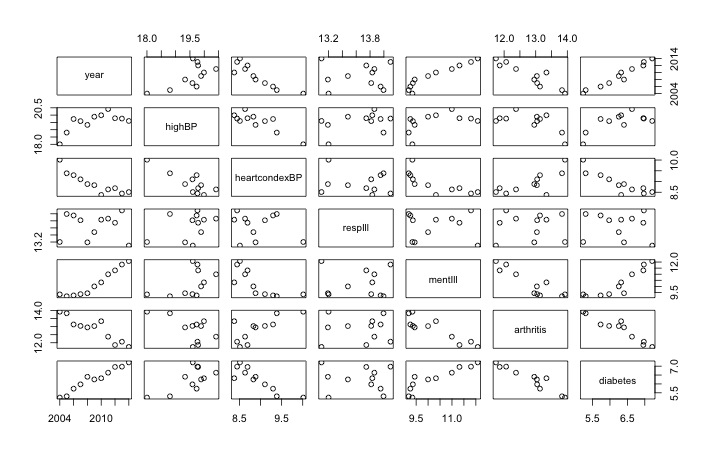
Useful visualisation using pairs() function


## I recommend the ggplot2 library 
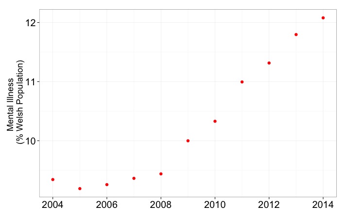
p <- ggplot(data,                      # a data.frame with the data
            aes(x=year, y=mentIll)) +  # columns of the data.frame
            geom_point(colour = "red", size = 3) # type of plot 

# this creates an object called p
p # show the object


# modify the object to add a title and change the theme
p <- p + ylab("Mental Illness \n (% Welsh Population)") +
         xlab(" ") +
         theme_bw()
p # show the object again


# the options of how to customise this graph very varied
# there is some recognised good style but also a lot of preference
p <- p + theme(axis.title.y = element_text(size = 18 )) + 
         theme(axis.text = element_text(size = 20))
p # show the object again


## Let's make a bar chart
ggplot(data, aes(x=year, y=mentIll)) +
  geom_bar(stat="identity") +
  ylab("Mental Illness \n (% Welsh Population)")


# check out the bottom axis
# Looks very strange with the "2007.5"
# Why?
str(data$year)
# num [1:11] 2004 2005 2006 2007 2008 ...
mode(data$year)
# [1] "numeric"
# Because R has imported year as a number, adding 0.5 is allowed
# change to a character 
data$year <- as.character(data$year)

ggplot(data, aes(x=year, y=mentIll)) +  # data.frame & the data
  geom_bar(stat="identity") +           # different type of plot
  ylab("Mental Illness \n (% Welsh Population)")


A better graph with all the numbers included


## Look at a possible correlation
ggplot(data, 
       aes(x=diabetes, y=obese, label = year)) +
       geom_point(colour = "red", size = 5)
             
ggplot(data, 
       aes(x=diabetes, y=obese, label = year)) +
       geom_point(colour = "red", size = 5) +
       geom_text(size = 5, hjust=1, vjust=-0.5)

p <- ggplot(data, 
            aes(x=diabetes, y=obese, label = year)) +
            geom_point(colour = "red", size = 5) +
            geom_text(size = 5, hjust=1, vjust=-0.5) +
            ylab("Obesity (% of Welsh Pop") +
            xlab("Diabetes (% of Welsh Pop)") +
            theme_bw()

p <- p + theme(axis.title.y = element_text(size = 18 )) +
         theme(axis.title.x = element_text(size = 18 )) +
         theme(axis.text = element_text(size = 20))

p


# introducing facet
# draw six graphs of diseases over time...

# take a subset of data
data.sub <- data[1:7]

# rename the columns
colnames(data.sub) <- c("Year", "High BP", "Heart Conditions", "Respiratory Illness", "Mental Illness", "Arthritis", "Diabetes")

# melt the data from wide to long:
melted.data.sub <- melt(data.sub, id.var = "Year")
colnames(melted.data.sub) <- c("Year", "Illness", "Percent")

# make a plot
x <- ggplot(data = melted.data.sub, 
            aes(x=Year, y=Percent)) +
            geom_point(aes(colour = Illness, shape= Illness, size = 5)) +
            theme_bw() +
            theme(legend.position = "none") +
            ggtitle("Disease Burden in Wales over 10 years")
x    # look at the plot

Not very useful!


# break into facets
x <- x + facet_wrap(~ Illness, scales = "free", ncol=2) +
     ylab("Percent of Welsh Pop")

x  # show the plot
Nice set of graphs, I think. 

# save the plot
x + ggsave("DiseaseBurdenWales10years.pdf")


## Extra info on arranging plots on a single page
# make a new graph in the object g1
g1 <- ggplot(data,                      # a data.frame with the data
            aes(x=year, y=obese)) +     # columns of the data.frame
            geom_point(colour = "black", size = 5) + # type of plot
            ylab("Obesity (% of Welsh Pop") +
            xlab("") +
            theme_bw()
g1 <- g1 + theme(axis.title.y = element_text(size = 18 )) +
        theme(axis.title.x = element_text(size = 16 )) +
        theme(axis.text = element_text(size = 20))

# make another graph in the object g2
g2 <- ggplot(data,
            aes(x=year, y=diabetes)) +
            geom_point(colour = "blue", size = 5) +
            ylab("Diabetes (% of Welsh Pop") +
            xlab("") +
            theme_bw()
g2 <- g2 + theme(axis.title.y = element_text(size = 18 )) +
  theme(axis.title.x = element_text(size = 16 )) +
  theme(axis.text = element_text(size = 20))

# using a function from the gridExtra package...
# put the three graphs on the same graphical output. 
grid.arrange(g1, g2 ,p)
# makes the plot at the top of the blog

SCRIPT END

Useful resources:


Friday, 2 October 2015

Understanding and visualizing a distance matrix

My PhD student has just received the data from a set of RNA samples analysed using a gene array. We discussed what should be done first to analyse these experiments. A good first step is to look at the distance between the samples and do unsupervised hierarchical clustering of all the samples to see how the biological replicates gather together. This represents an unbiased way to do some quality control for your experiments. Rather than just trying to identify different genes, we use all the data to determine if replicates gather together, if we have any outliers and to find patterns in the data. 

The first step is the generation of a distance matrix. A distance matrix tells us the difference between lists of numbers. If we put together a group of samples, then the distance matrix compares all of the samples. We discussed the purpose of the data matrix and visualising the matrix. I've written the following R script that tries to explain the concept. Mel helped me develop the script to visualise it using a script from this very informative Stack Overload post

Here is the a visualisation of a distance matrix using published data (Webber et al, 2014): 


Visualisation of distance matrix using data from Webber et al, 2014 

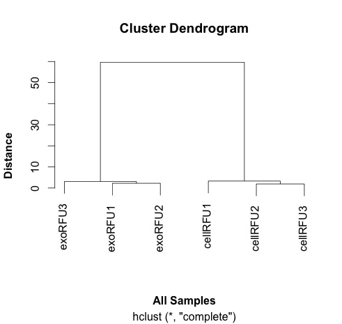
This distance matrix is used to do the hierarchical clustering that is plotted out here and shown here: 


Clustering samples using data from Webber et al, 2014.


# Trying to explain the concept of distance
# simple example 1: one digit different by 2 between two samples
samp1 <- c(0, 1, 2, 3, 4, 5, 6, 7, 8)
samp2 <- c(0, 1, 2, 3, 4, 5, 6, 7, 10)
dist(rbind(samp1, samp2))
# the dist() function compares each of the numbers in order along the two rows of the matrix. 
# answer is in this case is 2, as one number in the list is different by 2 to another. 

# simple example 2: one digit different by 72 between two samples
samp1 <- c(0, 1, 2, 3, 4, 5, 6, 7, 8)
samp2 <- c(0, 1, 2, 3, 4, 5, 6, 7, 80)
dist(rbind(samp1, samp2))
# answer is 72

# a little more complicated: two digits different
samp1 <- c(0, 1, 2, 3, 4, 5, 6, 7, 8)
samp2 <- c(0, 10, 2, 3, 4, 5, 6, 7, 80)
dist(rbind(samp1, samp2))
# now the answer is 72.56
# why? 
# well because of the equation used by the default method. 
# the default for the dist() function is euclidean 
# the equation for this is dist = sqrt(sum(x_i - y_i)^2)
# in this case, this calculates as sqrt(9^2 + 72^2)
# why the sqrt and the sum - in part so that the negatives and the positive differences don't cancel each other out.

# you can use other methods of calculating distance
help(dist)

# another is the "maximum" which just gives us the largest difference between the two arrays
# "Maximum distance between two components of x and y"
samp1 <- c(0, 1, 2, 3, 4, 5, 6, 7, 8)
samp2 <- c(0, 10, 2, 30, 4, 5, 6, 7, 80)
dist(rbind(samp1, samp2), method="maximum")
# in this case 72

# a third is the "manhattan" which sum of the absolute distances between the vectors
# "Absolute distance between the two vectors"
samp1 <- c(0, 1, 2, 3, 4, 5, 6, 7, 8)
samp2 <- c(0, 10, 2, 3, 4, 5, 6, 7, 80)
dist(rbind(samp1, samp2), method="manhattan")
# the answer now is 81

# now just envisage a more complicated situation when there are lots more numbers
# more than two samples and numbers that are higher and lower. 

# let's take a couple of examples from some data we analysed previously:

# http://www.mcponline.org/content/13/4/1050.full
# supplementary data is here: http://www.mcponline.org/content/suppl/2014/02/06/M113.032136.DC1/mcp.M113.032136-5.xlsx
# install if necessary:
# install.packages("readxl")
library(readxl)

# this is the link to the data
link <- "http://www.mcponline.org/content/suppl/2014/02/06/M113.032136.DC1/mcp.M113.032136-6.xlsx"

# the download.file() function downloads and saves the file with the name given
download.file(url=link,destfile="file.xlsx", mode="wb")

# then we can open the file and extract the data using the read_excel() function. 
data<- read_excel("file.xlsx")

View(data)

# the data has 762 observations. 

# we can only calculate distances in a matrix where all the values are the same mode - e.g numbers
# convert data frame (data) into a matrix 
# only want a subset of the data - the data from the samples. 
data.m <- as.matrix(data[2:7])
# transpose the data because a distance matrix works in rows
data.m.t <- t(data.m)

# calculate the distances and put the calculations into an object called distances
distances <- dist(data.m.t)

# convert this distances object into a matrix. 
distances.m <- data.matrix(distances)

# you can look at this object.
View(distances.m)

# we can extract the size of the object and the titles
dim <- ncol(distances.m)
names <- row.names(distances.m)

# now to create the visualisation of the difference matrix. 
# first the coloured boxes
image(1:dim, 1:dim, distances.m, axes = FALSE, xlab = "", ylab = "")

# now label the axis
axis(3, 1:dim, names, cex.axis = 0.8, las=3)
axis(2, dim:1, names, cex.axis = 0.8, las=1)

# add the values of the differences
text(expand.grid(1:6, 6:1), sprintf("%0.1f", distances.m), cex=1)

# this example lacks subltety
# the exo samples are very close together and the cell samples are quite far apart.
# it explains why the cluster analysis is so dramatic. 

# export this image as a tiff file with width of 1000 seems to work well. 
# some of the other formats don't work as well. 

# to make the cluster dendrogram object using the hclust() function
hc <- hclust(distances) 
# plot the cluster diagram
# some interesting groups in the data
plot(hc, 
     xlab =expression(bold("All Samples")), 
     ylab = expression(bold("Distance")))
# replicates cluster together well. 


The visualisation was inspired by this:


If you have feedback on this script, please leave a comment. 


Friday, 11 September 2015

Downloading and manipulating published proteomic data...

Update: 1 July 2025 - so a lot has happened in 10 years. This includes people moving jobs, promotions and the reorganisation of data on published website. 

Aled was promoted to Professor at Cardiff University 

----

There are many ways to get data into R. I want to illustrate a method of downloading published data within R, opening the data (an Excel file) and then doing visualisations and manipulations. 

I have chosen a paper from Molecular and Cellular Proteomics which uses aptamers to detect multiple proteins in exosomes and cells. 

The data was generated by colleagues that were working in the School of Medicine at Cardiff University including the first author - Dr Jason Webber, a Prostate Cancer UK funded Research Fellow and senior author, Professor Aled Clayton, a Senior Lecturer in Cancer & Genetics at Velindre Hospital. Dr Tim Stone was key to the data analysis. The protein detection method is from a company called SomaLogic

The first step was downloading the file from the Molecular and Cellular Proteomics website. I used the download.file() function. This saves the file into your current directory. This was opened using the readxl package (by Hadley Wickham) using the read_excel() function. 

I drew some graphs as I explored and manipulated the data. These are interspersed with the script below.  The visualisations included boxplots and a cluster diagram. 

I wanted to draw a volcano plot which expresses the fold change against the significant of the change (p-value). I couldn't do that with the data supplied so I had to reverse the transformation and calculate the fold change again. 

Here is the volcano plot:
Comparison of changes in exosomes compared cells. Proteins over-expressed in exosomes are on the right. Proteins over-expressed in cells are on the left. 

The plot indicates that there are more proteins over-expressed in cells (on the left) compared to exosomes (on the right). 

Update: 1 July 2025 - orignally, I was able to download the data directly from the Molecular and Cellular Proteomics website. However, at some point, they reorganised their site and put all the data into a zip file. This means that downloading it requires multiple steps outside of R. To make this analysis more stand alone, I have down loaded the data from this zip file and uploaded the spreadsheet onto my Github site. This means that the script will download and analyse the data. 

Here is the script with some other plots along the way:

START
# pull down a file from the internet, do some analysis and draw a graph...
# choose Jason Webber's MCP Paper...
# the data can be downloaded using this link with give zip file. 
# It isn't necessary to do that for this script. 
# install if necessary:
# install.packages(c("ggplot2", "readxl")) 
library(ggplot2)
library(readxl)


# this is the link to the data
link <- "https://github.com/brennanpincardiff/RforBiochemists/raw/master/R_for_Biochemists_101/data/mcp.M113.032136-6.xlsx"

# the download.file() function downloads and saves the file with the name given
download.file(url=link,destfile="file.xlsx", mode="wb")

# then we can open the file and extract the data using the read_excel() function. 
data<- read_excel("file.xlsx")

View(data)

# plot the data - always an important first step!
boxplot(data[2:7], 
        las =2, # las = 2 turns the text around to show sample names
        ylab = expression(bold("expression")),
        main="Boxplot of expression data")  


Two types of sample - exosomes (n=3) and cells (n=3).

# do a cluster analysis to quality control the different groups
# convert to matrix first
data.m <- as.matrix(data[2:7])
dim(data.m)   # gives the dimensions of the matrix
# ans: 762   6

# calculate the distances using the dist() function. 
# various methods are possible - default is Euclidean. 
distances <- dist(data.m)
summary(distances) # have a look at the object

# make the cluster dendrogram object using the hclust() function
hc <- hclust(distances) 
# plot the cluster diagram
# some interesting groups in the data
plot(hc, 
     xlab =expression(bold("All Samples")), 
     ylab = expression(bold("Distance")))


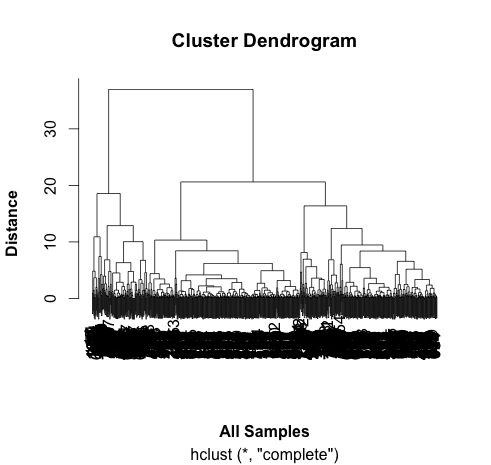
# ah, not what I intended. 
# it clustered the proteins NOT the samples. 

# transpose the data and try again...
data.m.t <- t(data.m)
dim(data.m.t)
# ans = 6  762 - so that has worked. 
# repeat cluter analysis

# calculate the distances using the dist() function. 
# various methods are possible - default is Euclidean. 
distances <- dist(data.m.t)
summary(distances)

# make the cluster dendrogram object using the hclust() function
hc <- hclust(distances) 
# plot the cluster diagram
# some interesting groups in the data
plot(hc, 
     xlab =expression(bold("All Samples")), 
     ylab = expression(bold("Distance")))
# replicates cluster together well. 


# the adjusted P value are in a column entiteld: BH - P.value
# this is a little awkward so rename this and Fold Change column:
colnames(data)[9] <- "P.Value"
colnames(data)[10] <- "Fold.Change"
plot(data$P.Value ~ data$Fold.Change)


# this works but we would like to turn it into a volcano plot 
# with log2 at the bottom and -p-value. 
# we can't log fold changes as half of them are negative numbers 
# we need to re-calculate the raw data
# reverse the log2 transformation. 
# mean the values & calculate fold change in decimal format (no +/-)
data$exo1 <- 2^data$exoRFU1
data$exo2 <- 2^data$exoRFU2
data$exo3 <- 2^data$exoRFU3
data$cell1 <- 2^data$cellRFU1
data$cell2 <- 2^data$cellRFU2
data$cell3 <- 2^data$cellRFU3

# calculate means of the replicates
data$exoMean <- rowMeans(data[,13:15])
data$cellMean <- rowMeans(data[,16:18])

# always good to visualise the data:
plot(log2(data$exoMean)~log2(data$cellMean))


# calculate fold change exo/cell
data$FoldChange <- data$exoMean/data$cellMean
plot(log2(data$FoldChange)) # transform for plotting


# make column in data.frame with transformed data
data$Log2.Fold.Change <- log2(data$FoldChange)

## Identify the genes that have a p-value < 0.05
data$threshold = as.factor(data$P.Value < 0.05)


## Construct the volcano plot object using ggplot
g <- ggplot(data=data, 
            aes(x=Log2.Fold.Change, y =-log10(P.Value), 
                colour=threshold)) +
  geom_point(alpha=0.4, size=1.75) +
  xlim(c(-6, 6)) +
  xlab("log2 fold change") + ylab("-log10 p-value") +
  theme_bw() +
  theme(legend.position="none") + 
  ggtitle("Volcano Plot comparing protein expression in exosomes vs cells ")  # add a title
  
g # show the plot 

END of script

So I think that the threshold of p<0.05 is too low for this volcano plot. It's relatively easy to change and would make a good exercise. Perhaps a threshold of p<0.00001 would be better. 


Useful resources (updated 1 July 2025)

Wednesday, 26 August 2015

Temperature time course

Tracking changes over time is a very useful way of understanding and analysing your system. This applies whether your system is biological or otherwise. As part of my hobby of baking bread, I have built a brick oven in my garden. I have installed thermocouples that allow me to measure the temperature at the top and the bottom of my oven. To investigate the performance of my oven, I have recorded temperatures when I fired the oven in May, June and August of this year.

The data for this is available on github and is downloaded as part of the script.

I have written a script to download, manipulate and graph the data. 

The manipulations required were:
  • turning my date and time into a date an time object that R could understand
  • subtracting the start time to calculate the elapsed time
  • the elapsed time was seconds which was converted to hours
  • the time was then converted to a number to allow for graphing by ggplot
  • the data was melted into a format for ggplot
Within the script needs to be applied separately to each of the three months of data. This can be done easily by changing the read.table() function to the appropriate file. 

By doing this, I graph and analyse the data in the same way making the graphs easier to compare. Here are the three graphs:


Here is the script for generating these graphs:

library(reshape2)
library(ggplot2)
library(RCurl) # allows us to download data through urls 

# URL for May data:
May <- getURL("https://raw.githubusercontent.com/brennanpincardiff/RforBiochemists/master/data/ovenTempMay.tsv")

# URL for Jun data:
Jun <- getURL("https://raw.githubusercontent.com/brennanpincardiff/RforBiochemists/master/data/ovenTempJun.tsv")

# URL for Aug data: 
Aug <- getURL("https://raw.githubusercontent.com/brennanpincardiff/RforBiochemists/master/data/ovenTempAug.tsv")

# put the URLs together in a vector
urls <- c(May, Jun, Aug)
months <- c("May", "Jun", "Aug")

# do it in a loop to apply to each of the three data sets
for(i in 1:3){

# read in the data for the relevant month - it's a tab separated file 
    data <- read.table(text = urls[i], stringsAsFactors=FALSE, sep = "\t", header = TRUE)
    
    
# convert the data and time into a format that R will understand. make it into a POSIXct object. 
# so as not to mess with the original data put it in a new column called time.P 
# because my dates are separted by slashes "/", I need to tell R about the format. 
    data$time.P <- as.POSIXct(data$time, format = "%d/%m/%Y %H:%M")
    
# the first value is the start.time for this temperature profile. 
    start.time <- data$time.P[1]
    
# calculate the elapsed time 
# substract the start time from each value. 
# This returns the time in seconds
    data$e.time.sec <- data$time.P - start.time
# convert this into an hour time and change back into a number for graphing purposes. 
    data$e.time.hour.num <- as.numeric(data$e.time.sec/3600)
    
    
 # take out the data we need for the plot
    data.subset <- as.data.frame(data$e.time.hour.num)
    colnames(data.subset)[1] <- "e.time.hour.num"
    data.subset$top <- data$top
    data.subset$bot <- data$bot
    
# melt it into a format for ggplot using melt() function
   data.subset.melt <- melt(data.subset, 
                           id.vars = "e.time.hour.num")

# put in nice column names
  colnames(data.subset.melt) <- c("elapsed.time", "place", "temp")
  
# make the graph object
  p <- ggplot(data.subset.melt, aes(x=elapsed.time, 
                                    y= temp, 
                                    colour = factor(place, labels = c("Top", "Bottom")))) + 

# colour = factor and the labels allows us to customize the legend
        geom_line(size=1) +
        geom_point() +
        labs(color = "Place") + # customizes the legend title
        scale_colour_manual(values=c("black","red")) +
        ylab("Temperature") + # y-label
        xlab("Elapsed time (hours)") + # x-label
        ylim(0,400) +
        scale_x_continuous(limits=c(0, 48), 
                           breaks=c(0,1,4,8,12, 24, 48)) +
        theme_bw()

# position the legend  
    p <- p + theme(legend.position=c(1,1), # move to the top right
                   legend.justification=c(1,1), # move it in a bit
                   legend.text=element_text(size = 12), # increase size of text
                   legend.title=element_text(size = 12)) # and the title
    
    p <- p + theme(axis.title.y = element_text(size = 14 )) + 
      theme(axis.text = element_text(size = 12))
    
# add the appropriate title
    p <- p + ggtitle(paste0("Oven Temp (", months[i], " Firing)")) 

# print the object - you have to do this because of the loop
    print(p)
}

Helpful resources, I used to prepare this script: