Showing posts with label simple example. Show all posts

Tuesday, 23 June 2015

My first cluster diagram

For our CLL proteomic manuscript we were asked to do some more statistical analysis (Proteomics-Based Strategies To Identify Proteins Relevant to Chronic Lymphocytic Leukemia Alsagaby et al, J. Proteome Res., 2014, 13 (11), pp 5051–5062).

The reviewer particularly recommended hierarchial clusteringFortunately, I had been learning how to use R, so I was able to learn how to do this relatively easy. This was why I had chosen to learn R.  

"The idea of a cluster diagrams is to build a hierarchy of clusters, showing relations between the individual members and merging clusters of data based on similarity." I learned this from a website that seems to have disappeared now.

Cluster diagrams can be used to investigate the quality of your data and identify outliers in sets of data. They can also show patterns and identify groups of samples.

A key concept is a "distance metric" which is a measure of similarity. There are different measures of correlation. Two common ones are the Euclidean and the Pearson correlations. Euclidean distance looks at just the numbers while the Pearson correlation looks more at trends. This can give very different patterns. Other measures of distance include: maximum, Manhattan, Canberra, binary and Minkowski.

The first step is calculate a distance matrix using the dist() function.

Then you can use this matrix to do the clustering using the hclust() function.

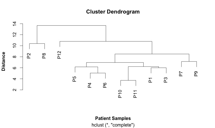
Finally, you plots this: plot(hc).

This is my first cluster diagram:


Here is the script that generates it:

SCRIPT
# import the data
link <- ("https://raw.githubusercontent.com/brennanpincardiff/RforBiochemists/master/data/iTRAQPatientforCluster.csv")

data2 <- read.csv(link, header=TRUE)

attach(data2)  # attaching a data.frame means we can use the headings directly. 
head(data2)  # look at the top of the file. 

# first step is to calculate the distances using the dist() function. 
# various methods are possible - default is Euclidean. 
distances2 <- dist(rbind(P1, P2, P3, P4, P5, P6, P7, P8, P9, P10, P11, P12))
distances2
summary(distances2)

# make the cluster dendrogram object using the hclust() function
hc <- hclust(distances2)  

# plot the cluster dendrogram object using base graphics
plot(hc, xlab =expression(bold("Patient Samples")), ylab = expression(bold("Distance")))

detach(data2) # good practice to detach data after we're finished.


Tuesday, 16 June 2015

Drawing the protein assay with ggplot

I have been persuaded by Steph Locke during todays meeting of the Cardiff R Users Group that I should use ggplot for all the plots during our R for Biochemist Training Day. For that reason, I have written the script below which uses ggplot to graph the protein assay:

# START of SCRIPT
library(ggplot2)

# Protein Concentrations
prot <- c(0.000, 0.016, 0.031, 0.063, 0.125, 0.250, 0.500, 1.000, 
          0.000, 0.016, 0.031, 0.063, 0.125, 0.250, 0.500, 1.000) 

# Absorbance from my protein assay
abs <- c(0.329, 0.352, 0.349, 0.379, 0.417, 0.491, 0.668, 0.956, 
         0.327, 0.341, 0.355, 0.383, 0.417, 0.446, 0.655, 0.905)

# Convert into data.frame to plot with ggplot
data <- as.data.frame(prot)
data$abs <- abs

#Calculate the line using the linear model function
line <- lm(abs~prot)

#Equation of a line y = mx + c
#In our case abs = slope * prot + intercept
# ukn.prot = (abs - intercept)/slope
int <- summary(line)$coefficients[1]
slope <- summary(line)$coefficients[2]

#now calculate some unknown protein concs from absorbances
#put the unknowns into a vector
abs.ukns <- c(0.554, 0.568, 0.705)

#rearrange the equation of the line to ukn.prot = (abs - intercept)/slope
prot.ukns <- (abs.ukns - int)/slope

# create the object with the graph in it. 
p <- ggplot(data=data,          # specify the data frame with data
        aes(x=prot, y=abs)) +   # specify the x and y for the graph
        geom_point() +          # make a scatter plot
        stat_smooth(method = "lm") +  # add a linear model line
        xlab("[Protein] (microg/ml)") +   # label x-axis
        ylab("Absorbance (570nm)") +    # label y-axis
        ggtitle("Protein Assay 20th April 2015") +  # add a title
        theme_bw() +      # a simple theme
        expand_limits(y=c(0.25,1)) +    # customise the y-axis
        annotate(geom="text", x=0.85, y= 0.6, label="Abs         Prot",  color="red")

#put the answers on the graph
for (i in 1:length(abs.ukns)){
  p <- p + annotate(geom="text", x = 0.8, y = (0.6 - i/20), label=abs.ukns[i])
  p <- p + annotate(geom="text", x = 0.92, y = (0.6 - i/20), label=round(prot.ukns[i], 3))
}

p # show us the graph...

# END OF SCRIPT

Tuesday, 26 May 2015

Starting simply...

Then, here are three possible starting points for biochemists:
Here are the plots that are produced:

A protein assay

Some enzymatic data

A cell death curve

Plotting and fitting enzymology data...

Professor Rob Beynon put together this example using some enzymology data. The script creates a plot, fits the data and calculates Vmax and Km for the enzyme.

Wikipedia has some useful information if you want to know more about enzyme kinetics. The plots are named after the scientists that described them: Michaelis Menten, Lineweaver-BurkEadie-Hostee

Here's the plot:


Here is the script:

# As a biochemist, one of the first data types we play with is enzymology data. 
# Here is an example of some enzyme simple kinetic data
# Eight values for substrate concentration with corresponding enzyme velocities. 
# The goals are to plot the data, in different formats, and also, find the best fit values of Km and Vmax
# all of this is complete in base R, so no packages should be needed

# Entered as vectors 
S <- c(0,1,2,5,8,12,30,50)
v <- c(0,11.1,25.4,44.8,54.5,58.2,72.0,60.1)

# simple plot, rather ugly
plot (S,v)

#  A better plot: Michaelis Menten hyperbola
plot (S,v, 
      xlab="Subtrate (mM)", 
      ylab="Velocity (nmol/s)", 
      main="Michaelis-Menten", 
      pch=17, col="red")

# Tranform the data to plot a Lineweaver-Burk plot (1/v as a function of 1/S)
# This plot is not recommended becuase it distorts the error structure of the data
plot (1/S,1/v, 
      xlab="Subtrate (mM)", 
      ylab="Velocity (nmol/s)", 
      main="Lineweaver-Burk", 
      pch=17, col="blue", cex=1.5)

# Tranform the data to plot a Eadie-Hostee plot (v as a function of v/S)
plot (v,v/S, 
      xlab="velocity/Subtrate(nmol.s-1/mM)", 
      ylab="Velocity (nmol.s-1)", 
      main="Eadie-Hofstee", 
      pch=17, col="blue", cex=1.5)

# We can also build a simple data frame from (S,v) data
kinData <- data.frame(S,v)

# simple plot of the dataframe
plot (kinData)

# Store some colours as variables for later
c1 <- "red"
c2 <- "blue"

# More complex plot, adding axis labels, changing symbol and colour
# Simple Michaelis-Menten plot
plot (kinData, 
      xlab="Subtrate (mM)", 
      ylab="Velocity (nmol/s)", 
      pch=17, col=c1, cex=2)

# And this shows how simple it is to plot a Lineweaver-Burk plot 
# (1/v as a function of 1/S)
plot (1/kinData, 
      xlab="1/Subtrate (mM)", 
      ylab="1/Velocity (nmol/s)", 
      pch=17, col=c1, cex=2)

# Next step - how do we get the values of Km and Vmax?

# This is the theoretical formula
# "velocity = Vmax times S divided by (Km plus S)", stored in MMcurve
MMcurve<-formula(v~Vmax*S/(Km+S))

# nls is non-linear least squares optimiser.
# If you're not sure why a Michael-Menten equation is non-linear, ask
# (Hint: it is not because it is a curve when plotted!)

# start sets the initial guess - do not have to be very good
# should be possible to make reasonable guesses 
# from a quick inspection - this is why we visualise the data first
bestfit <- nls(MMcurve, kinData, start=list(Vmax=50,Km=2))

# Build a theoretical line defining the best fit curve
# First, make a finely detailed set of points between 0 and 50, at 0.1 intervals
# These will be the substrate concentrations that are used to calculate 
# the predicted velocities
SconcRange <- seq(0,50,0.1)

# Then, calculate the predicted velocities using the predict function
theorLine <- predict(bestfit,list(S=SconcRange))

# Best fit values of Km and Vmax obtained by coef function, stored in bestFitVals
bestFitVals <- coef(bestfit)

# Now plot the data, the best fit line, and put the best fit coefficients in the plot
plot (kinData, 
      xlab="Subtrate (mM)", 
      ylab="Velocity (nmol/s)", 
      title(main="Fitted MM data"), 
      pch=17, col=c2, cex=2)

# Draw the line
# lines() function adds to the existing plot as does points()
# here, we want a line of best fit, not points, so we use lines()
lines(SconcRange,theorLine,col=c1)

# Add text with the calculated values
# This is a fudge, there must be better ways, also adding errors on parameter values.

text(30,30, "Vmax=")
text(35,30,round(bestFitVals[1],2))
text(30,27, "Km=")
text(35,27,round(bestFitVals[2],2))

# END OF SCRIPT


Wednesday, 22 April 2015

Drawing a cell death curve and calculating an LD50

I'm going to show you the this analysis before the script.
We do a lot of drug testing in our laboratory at Cardiff and it's a valuable thing for biochemists and pharmacologists. To do the analysis, most of the lab usually use a different (expensive) statistical package but I like R.
The experimental set up, done by a student in the lab, is as follows:
  • using some cells and add various concentrations of a novel drug
  • leave for 48 hours
  • then measure how many cells are dead
  • the experiment was done four times with the doses improved each time
Here is the graph and calculated LD50 - a measure of how good the drug is:


Here is the script I used to generate this graph:

### START of SCRIPT 

###  this is the data   ###
# data from four experiments
conc <- c(5.00E-07, 1.00E-06, 1.00E-05, 
          5.00E-07, 1.00E-06, 5.00E-06, 1.00E-05, 2.00E-05, 
          5.00E-07, 1.00E-06, 2.50E-06, 5.00E-06, 1.00E-05, 
          5.00E-07, 1.00E-06, 2.50E-06, 5.00E-06, 1.00E-05)
dead.cells <- c(34.6, 47.7, 81.7, 
                37.6, 55.7, 89.1, 84.3, 85.2, 
                34.4, 46.1, 76.2, 84.3, 84.1, 
                24.5, 26.1, 60.6, 82.7, 87)

# transform the data to make it postive and put into a data frame for fitting 
data <- as.data.frame(conc)   # create the data frame
data$dead.cells <- dead.cells
data$nM <- data$conc * 1000000000
data$log.nM <- log10(data$nM) 

###  fit the data  ###
# make sure logconc remains positive, otherwise multiply to keep positive values
# (such as in this example where the conc is multiplied by 1000000

fit <- nls(dead.cells ~ bot+(top-bot)/(1+(log.nM/LD50)^slope),
             data = data,
             start=list(bot=20, top=95, LD50=3, slope=-12))

###  Plot the results  ###
#this lets you graph your calculated equations nice and pretty

x <- seq(0,6, length=100)
y <- (coef(fit)["bot"]+(coef(fit)["top"]-coef(fit)["bot"])/(1+(x/coef(fit)["LD50"])^coef(fit)["slope"]))
m <- coef(fit)

# plot the points first
plot(data$nM, data$dead.cells, 
     log="x", 
     main="Drug Dose Response and LD50", 
     xlab="Drug concentration (microM)", 
     ylab="Dead cells (% of cells)",
     xlim= c(500, 10000),
     ylim= c(20,100),
     xaxt = "n")   # suppresses the labels on the x-axis

# adds the x-axis labels they way I want it to look
axis(1, at=c(500, 1000, 2500, 5000, 10000),  lab=c("0.5","1","2.5","5","10"))

# adds the fitted non-linear line 
lines(10^x,y, lty="dotted", col="red", lwd =2)

# add the LD50 in the legend which allows nice positioning. 
rp = vector('expression',1)
rp[1] = substitute(expression(LD50(microM) == MYVALUE), 
                   list(MYVALUE = format((10^m[3])/1000,dig=3)))[2]
legend('topleft', legend = rp, bty = 'n')

# END OF SCRIPT

To prepare this script, I used the following sources:
Thanks to Mel for the data. 

Monday, 20 April 2015

Let's analyse a protein assay....

Hopefully, you've already downloaded R and R-Studio. R-Studio is not essential.

Here is a script to do a protein assay:

# Protein Concentrations
prot <- c(0.000, 0.016, 0.031, 0.063, 0.125, 0.250, 0.500, 1.000, 0.000, 0.016, 0.031, 0.063, 0.125, 0.250, 0.500, 1.000) 

# Absorbance from my protein assay
abs <- c(0.329, 0.352, 0.349, 0.379, 0.417, 0.491, 0.668, 0.956, 0.327, 0.341, 0.355, 0.383, 0.417, 0.446, 0.655, 0.905)

#Plot the data simply
plot(abs~prot)

#Calculate the line using the linear model function
line <- lm(abs~prot)

#Draw the line
abline(line)

#Improve the graph:
plot(abs~prot, 
     xlab = "[Protein] (microg/ml)",
     ylab = "Absorbance (570nm)",
     main = "Protein Assay 20th April 2015")
abline(line)

r2 <- round(summary(line)$r.squared, 3)
mylabel = bquote(italic(R)^2 == .(format(r2, digits = 3)))
text(x = 0.2, y = 0.9, labels = mylabel)


#Equation of a line y = mx + c
#In our case abs = slope * prot + intercept
# ukn.prot = (abs - intercept)/slope
int <- summary(line)$coefficients[1]
slope <- summary(line)$coefficients[2]
mylabel = bquote(y == .(format(slope, digits = 3))*x + .(format(int, digits = 3)))
text(x = 0.2, y = 0.8, labels = mylabel)

#now calculate some unknown protein concs from absorbances
#put the unknowns into a vector
abs.unknowns <- c(0.554, 0.568, 0.705)
#rearrange the equation of the line to ukn.prot = (abs - intercept)/slope
prot.unknowns <- (abs.unknowns - int)/slope

#put the answers on the graph
text(x = 0.8, y = (0.6), "Abs")
text(x = 0.92, y = (0.6), "Prot")
for (i in 1:length(abs.unknowns)){
  text(x = 0.8, y = (0.6 - i/20), abs.unknowns[i])
  text(x = 0.92, y = (0.6 - i/20), round(prot.unknowns[i], 3))
}

# END OF SCRIPT


This can be copy and pasted into the script window of R-Studio. 


Then each line can be run one by one by pressing the Run button:


This will generate the following output: