Showing posts with label graph. Show all posts

Friday, 15 May 2015

Plotting a 96 well plate data set...

UPDATE: 24th October 2020
I've changed the data source so this plots works now. 
The data is available through Github. 

====

One of the great things about R is the vast array of packages that are available. There are extra packages for statistical analysis, for graphical analysis and for lots of other things.

Two of the most widely used packages for graphical analysis are lattice and ggplot.

Today, I have written a script using both these packages to analyse data from a 96 well plate experiment. Graphing data allows data exploration. The data was supplied by Jim Caunt at the University of Bath. I worked with Jim when he was the Chair of the Signalling Theme Panel of the Biochemical Society. Sadly he is no longer with us. Thanks for the data Jim.

The experiment is performed with high content fluorescence microscopy and allows the measurement of different fluorochromes in the same wells (and cells). The fluorochromes used in this experiment correspond to expression of a viral transgene with a HA tag, a measurement of phospho-Erk and a measurement of cell entry into S-phase.

Here is three of the plots the script generates. The script is below.

I like this first plot which shows all the numbers against each other. It's nice to see the data together and look at patterns. This is drawn with the base graphics in R.


This plot is drawn with lattice. It shows the effect of FBS. Each dot represents an individual well. FCS causes an observable increase in cell proliferation in all cases as measured by the number of cells in S-phase (making DNA). The script below draws two other similar graphs coloured by PPase status of the host cell and the presence of the viruses.


This plot was drawn with ggplot. It shows the effect of the two viruses used in the experiment. Both viruses increase Erk phosphorylation to different extents. However, they don't seem to increase the number of cells in S-phase very much. ggplot allows linear modelling and confidence intervals as part of the plots which is nice.


Here is the script (on Github too): 

# Import the data
data <- read.csv("https://raw.githubusercontent.com/brennanpincardiff/RforBiochemists/master/data/wellsDataSimp.csv")

# Have a quick look at it
View(data)

# Simple plot
plot(data[5:7])

# Install and enable two graphics packages
install.packages("lattice")
install.packages("ggplot2")
library("lattice")
library("ggplot2")


# Plot the data in the lattice package first. 

#plot ppErk against Number of S-phase cells. 
# Colour the plots by presence of FBS (0 or 10%)
xyplot(data$S.phase.cnt ~ data$P.Erk,
       group=data$FBS,
       main="Number of S-phase cells Vs pErk staining",
       xlab ="Phospho-Erk",
       ylab = "S-phase cell count",
       auto.key=list(space="top", columns=2, 
                     title="FBS", cex.title=1))

# Colour the plots by presence of PPase in host cell
xyplot(data$S.phase.cnt ~ data$P.Erk,
       group=data$Host.cell,
       main="Number of S-phase cells Vs pErk staining",
       xlab ="Phospho-Erk",
       ylab = "S-phase cell count",
       auto.key=list(space="top", columns=2, 
                     title="Host Cell", cex.title=1))

# Colour the plots by presence of the virus (no virus = Ctl, Q61 = ras mutant, V600F = raf mutant)
xyplot(data$S.phase.cnt ~ data$P.Erk,
       group=data$Virus,
       main="Number of S-phase cells Vs pErk staining",
       xlab ="Phospho-Erk",
       ylab = "S-phase cell count",
       auto.key=list(space="top", columns=3, 
                     title="Virus", cex.title=1))


# plot wells data with ggplot
qplot(P.Erk, S.phase.cnt, data=data, geom=c("point", "smooth"), 
      method="lm", formula=y~x, color=Virus, 
      main="Number of S-phase cells Vs pErk staining", 
      xlab="ppErk", ylab="Number of S-phase cells")


Tuesday, 5 May 2015

Controlling our graphs...

The styles of graphs in journals vary a lot and can be quite different from the default style encoded by R or by most data analysis packages. An essential part of learning to control a piece of analysis software is expressing the graphs in the format that your discipline and your journals like.

One of the things that varies a lot is whether your graph has a box or not. Boxes are presented by default in R and many other programmes. Removing the boxes leave floating axis which is not in the style of the journal either.

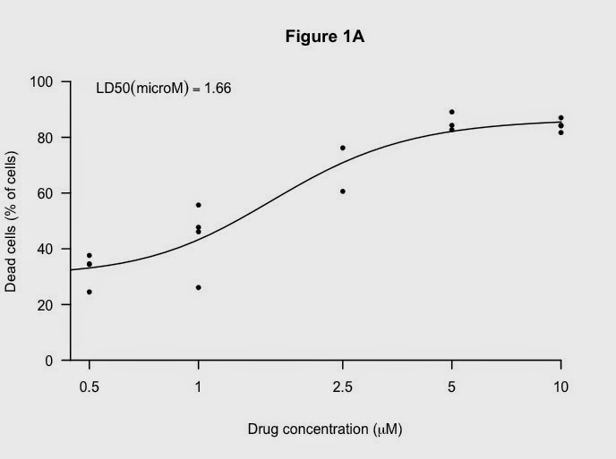
Working through some of these things using the data from the LD50 graph previously:

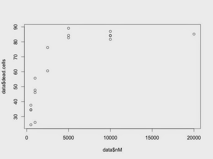
Here is the default graph:


From the default code:

plot(data$nM, data$dead.cells, 
    )

Make the x-axis log tranformed, add limits and change symbols:


Here is the code:

# Add log axis, x and y limits and change the symbols
plot(data$nM, data$dead.cells, 
     log="x", # makes it a log plot
     pch=20, # gives small black dots instead of empty circles
     xlim= c(500, 10000),
     ylim= c(0,100),
    ) 

Key next step is to suppress everything except the points. It looks a very odd:
Here is the code:
plot(data$nM, data$dead.cells, 
     log="x", 
     pch=20,
     xlim= c(500, 10000),
     ylim= c(0,100),
     axes=FALSE, # suppresses the titles on the axes
     ann=FALSE, suppresses the axes and the box  
  ) 


Now,  add back axis first:

Code:
axis(1, at=c(200, 500, 1000, 2500, 5000, 10000), # x-axis 
     lab=c("","0.5","1","2.5","5","10"), 
     lwd=2, # thicker lines
     pos=0)  # puts the x-axis at zero rather than floating 
axis(2, at=c(0, 20, 40, 60, 80,100), # y-axis
     lab=c("0", "20", "40", "60", "80", "100"), 
     lwd=2, 
     las=1) # turns the numbers so easier to read

Next, add titles (I like the Greek symbol in the x-axis):


Code:
title("Figure 1A", 
      xlab= expression(paste("Drug concentration (", mu, "M)")), 
      # not the word "micro"
      ylab= "Dead cells (% of cells)")

And a nice black fitted line:


Code:
# adds the fitted non-linear line 
lines(10^x,y, lty=1, lwd =2)

Finally, add the LD50 again:


using this code:
# add the LD50 in the legend which allows nice positioning. 
rp = vector('expression',1)
rp[1] = substitute(expression(LD50(microM) == MYVALUE), 
                   list(MYVALUE = format((10^m[3])/1000,dig=3)))[2]
legend('topleft', legend = rp, bty = 'n')


The full code for this script and the others mentioned in this blog are available on Github.

I used these resources to develop this script:

Graphical Output from R-Studio...

After generating my nice graphs, I want to share them with people. It's easy to do this with R-Studio: you can just Export the graphs. The key button is just above the graph and you have options of exporting as an Image or as PDF.

Here is the location of the button:

Very useful for sharing with bosses and collaborators. PDF files can be imported into other programmes like Adobe Illustrator for improving the layout, font, etc....


Wednesday, 29 April 2015

Comparing two drugs side by side

You might prefer to show your graphs independently rather than overlay them.
One way to do this is to use the par() function to divide your plotting area into two pieces.
par() is discussed here in the R Function of the Day archive and is mentioned here on the Quick R pages.
As with all functions, the syntax is important.
To plot two graphs, side by side this is the code: par(mfrow=c(1,2))
To plot four graphs, arranged in 2 rows and 2 columns, this is the code: par(mfrow=c(2,2))
It's good to know how to reset the layout: par(mfrow=c(1,1)) # back to one graph
So here's the output:


Here is the script (again with repetition for understanding):

###  I have detailed lots of things separately so that it's obvious what I'm doing. 
### The code could be made shorter and less repetitive.
###  This is the data   ###
# Data from multiple experiments

conc <- c(1.00E-08, 1.00E-07, 5.00E-07, 1.00E-06, 1.00E-05, 
          1.00E-08, 1.00E-07, 5.00E-07, 1.00E-06, 1.00E-05, 
          1.00E-08, 1.00E-07, 5.00E-07, 1.00E-06, 1.00E-05, 
          1.00E-07, 5.00E-07, 1.00E-06, 5.00E-06, 1.00E-05, 2.00E-05, 
          1.00E-07, 5.00E-07, 1.00E-06, 5.00E-06, 1.00E-05, 2.00E-05, 
          1.00E-07, 5.00E-07, 1.00E-06, 5.00E-06, 1.00E-05, 2.00E-05, 
          1.00E-07, 5.00E-07, 1.00E-06, 2.50E-06, 5.00E-06, 1.00E-05, 
          1.00E-07, 5.00E-07, 1.00E-06, 2.50E-06, 5.00E-06, 1.00E-05, 
          1.00E-07, 5.00E-07, 1.00E-06, 2.50E-06, 5.00E-06, 1.00E-05, 
          1.00E-07, 5.00E-07, 1.00E-06, 2.50E-06, 5.00E-06, 1.00E-05) 

# First drug is called Drug 49
dead.cells49 <- c(28.6, 30.1, 34.6, 47.7, 81.7, 
                  27.1, 27.2, 35, 47.9, 80.6, 
                  27.8, 27.9, 34.2, 47.9, 82.4, 
                  31.1, 37.6, 55.7, 89.1, 84.3, 85.2, 
                  30.8, 35.6, 55.9, 90.5, 85.2, 86.3, 
                  32.6, 34.7, 54.1, 89.8, 84.2, 87.1, 
                  32.2, 34.4, 46.1, 76.2, 84.3, 84.1, 
                  31.4, 37.4, 50.5, 75, 85.3, 84.8, 
                  27.6, 37.3, 46.3, 74.1, 81.6, 82.7, 
                  26.7, 28.4, 27.9, 59.6, 87, 86.1)

# Second Drug is called Drug 11
dead.cells11 <- c(28.4, 28.9, 28.6, 30.1, 90, 
                  27.8, 28.5, 29.2, 29.3, 89.9, 
                  28.6, 26.6, 27.3, 29, 89.7, 
                  25.8, 28.7, 31, 80.7, 85, 85.2, 
                  25.3, 28.2, 30, 81.4, 83.5, 87.2, 
                  25.9, 25.4, 28.4, 81.2, 81.4, 85.6, 
                  36.4, 36.2, 33.4, 52.3, 87.2, 97, 
                  33.9, 29.5, 32, 44.8, 84.9, 97.2, 
                  30.1, 30.1, 31, 46.5, 83.5, 96.1, 
                  22.8, 23.7, 25.8, 37.9, 73.8, 86.7) 

# Put the data into a data frame and transform the data to make it postive for fitting
data49 <- data.frame(conc,dead.cells49)
data49$nM <- data49$conc * 1000000000
data49$log.nM <- log10(data49$nM) 

data11 <- data.frame(conc,dead.cells11)
data11$nM <- data11$conc * 1000000000
data11$log.nM <- log10(data11$nM) 

##################  fit the data  ##################
# make sure logconc remains positive, otherwise multiply to keep positive values
# (such as in this example where the iconc is multiplied by 1000

fit49 <- nls(dead.cells49 ~ bot+(top-bot)/(1+(log.nM/LD50)^slope),
           data = data49,
           start=list(bot=20, top=95, LD50=4, slope=-12))

fit11 <- nls(dead.cells11 ~ bot+(top-bot)/(1+(log.nM/LD50)^slope),
             data = data11,
             start=list(bot=20, top=95, LD50=4, slope=-12))


##################  Plot the results  ##################
#this lets you graph your calculated equations nice and pretty
x <- seq(0,6, length=100)

y49 <- (coef(fit49)["bot"]+(coef(fit49)["top"]-coef(fit49)["bot"])/(1+(x/coef(fit49)["LD50"])^coef(fit49)["slope"]))
m49 <- coef(fit49)

y11 <- (coef(fit11)["bot"]+(coef(fit11)["top"]-coef(fit11)["bot"])/(1+(x/coef(fit11)["LD50"])^coef(fit11)["slope"]))
m11 <- coef(fit11)

# This is the key bit of code that divides the plot area in two
par(mfrow=c(1,2))

# plot the first graph - goes on the left side
plot(data49$nM, data49$dead.cells49, 
     log="x", 
     main="Drug 49", 
     xlab="Drug concentration (microM)", 
     ylab="Dead cells (% of cells)",
     xlim= c(500, 10000),
     ylim= c(20,100),
     xaxt = "n")   # suppresses the labels on the x-axis

# order here is important
# you have to complete the plot before you start the next one
# adds the axis they way we want it to look
axis(1, at=c(500, 1000, 2500, 5000, 10000),  lab=c("0.5","1","2.5","5","10"))

# adds the non-linear fitted line to the first graph
lines(10^x,y49, lty="dotted", col="blue")

# add the LD50s in the legend which allows nice positioning. 
rp = vector('expression',1)
rp[1] = substitute(expression(LD50(microM) == MYVALUE), 
                   list(MYVALUE = format((10^m49[3])/1000,dig=3)))[2]
legend("topleft", legend = rp, bty = 'n', cex = 0.75)


# plot the second graph - goes on the right side
plot(data11$nM, data11$dead.cells11, 
     log="x", 
     main="Drug 11", 
     xlab="Drug concentration (microM)", 
     ylab="Dead cells (% of cells)",
     xlim= c(500, 10000),
     ylim= c(20,100),
     xaxt = "n")   # suppresses the labels on the x-axis

# adds the axis they way we want it to look
axis(1, at=c(500, 1000, 2500, 5000, 10000),  lab=c("0.5","1","2.5","5","10"))

# adds the non-linear fitted line to the second graph
lines(10^x,y11, lty="dotted", col="blue")

# add the LD50s in the legend which allows nice positioning. 
rp = vector('expression',1)
rp[1] = substitute(expression(LD50(microM) == MYVALUE), 
                   list(MYVALUE = format((10^m11[3])/1000,dig=3)))[2]
legend("topleft", legend = rp, bty = 'n', cex = 0.75)


Comparing two drugs on the same plot

I really like the range of options for visualisation that are available in R. Today, I want to describe one of the options to compare two drugs.

The experimental set up is the same as we used previously, with the exception that we now have data from two drugs not one:
  • add various concentrations of a two novels drug to the cells in culture
  • leave for 48 hours
  • then measure how many cells are dead
  • the experiment was done multiple times with the doses improved as it progresses
The objective today is to draw a graph and calculate LD50s that allow us to compare the two drugs.  

Here is an illustration of a graph that contains the data from both drugs:


Here is the script I used to generate this graph:

###  I have detailed the code separately for each set of data
###  to make it more obvious what I'm doing. 
### The code could be made shorter and less repetitive.

###  This is the data   ###
# Data from multiple experiments

conc <- c(1.00E-08, 1.00E-07, 5.00E-07, 1.00E-06, 1.00E-05, 
          1.00E-08, 1.00E-07, 5.00E-07, 1.00E-06, 1.00E-05, 
          1.00E-08, 1.00E-07, 5.00E-07, 1.00E-06, 1.00E-05, 
          1.00E-07, 5.00E-07, 1.00E-06, 5.00E-06, 1.00E-05, 2.00E-05, 
          1.00E-07, 5.00E-07, 1.00E-06, 5.00E-06, 1.00E-05, 2.00E-05, 
          1.00E-07, 5.00E-07, 1.00E-06, 5.00E-06, 1.00E-05, 2.00E-05, 
          1.00E-07, 5.00E-07, 1.00E-06, 2.50E-06, 5.00E-06, 1.00E-05, 
          1.00E-07, 5.00E-07, 1.00E-06, 2.50E-06, 5.00E-06, 1.00E-05, 
          1.00E-07, 5.00E-07, 1.00E-06, 2.50E-06, 5.00E-06, 1.00E-05, 
          1.00E-07, 5.00E-07, 1.00E-06, 2.50E-06, 5.00E-06, 1.00E-05) 

# First drug is called Drug 49
dead.cells49 <- c(28.6, 30.1, 34.6, 47.7, 81.7, 
                  27.1, 27.2, 35, 47.9, 80.6, 
                  27.8, 27.9, 34.2, 47.9, 82.4, 
                  31.1, 37.6, 55.7, 89.1, 84.3, 85.2, 
                  30.8, 35.6, 55.9, 90.5, 85.2, 86.3, 
                  32.6, 34.7, 54.1, 89.8, 84.2, 87.1, 
                  32.2, 34.4, 46.1, 76.2, 84.3, 84.1, 
                  31.4, 37.4, 50.5, 75, 85.3, 84.8, 
                  27.6, 37.3, 46.3, 74.1, 81.6, 82.7, 
                  26.7, 28.4, 27.9, 59.6, 87, 86.1)

# Second Drug is called Drug 11
dead.cells11 <- c(28.4, 28.9, 28.6, 30.1, 90, 
                  27.8, 28.5, 29.2, 29.3, 89.9, 
                  28.6, 26.6, 27.3, 29, 89.7, 
                  25.8, 28.7, 31, 80.7, 85, 85.2, 
                  25.3, 28.2, 30, 81.4, 83.5, 87.2, 
                  25.9, 25.4, 28.4, 81.2, 81.4, 85.6, 
                  36.4, 36.2, 33.4, 52.3, 87.2, 97, 
                  33.9, 29.5, 32, 44.8, 84.9, 97.2, 
                  30.1, 30.1, 31, 46.5, 83.5, 96.1, 
                  22.8, 23.7, 25.8, 37.9, 73.8, 86.7) 

# Put the data into data frames and 
# transform the data to make it postive for fitting
data49 <- data.frame(conc,dead.cells49)
data49$nM <- data49$conc * 1000000000
data49$log.nM <- log10(data49$nM) 

data11 <- data.frame(conc,dead.cells11)
data11$nM <- data11$conc * 1000000000
data11$log.nM <- log10(data11$nM) 

##################  fit the data  ##################
# make sure logconc remains positive, otherwise multiply to keep positive values
# (such as in this example where the iconc is multiplied by 1000

fit49 <- nls(dead.cells49 ~ bot+(top-bot)/(1+(log.nM/LD50)^slope),
           data = data49,
           start=list(bot=20, top=95, LD50=4, slope=-12))

fit11 <- nls(dead.cells11 ~ bot+(top-bot)/(1+(log.nM/LD50)^slope),
             data = data11,
             start=list(bot=20, top=95, LD50=4, slope=-12))


##################  Plot the results  ##################
#this lets you graph your calculated equations nice and pretty
x <- seq(0,6, length=100)

y49 <- (coef(fit49)["bot"]+(coef(fit49)["top"]-coef(fit49)["bot"])/(1+(x/coef(fit49)["LD50"])^coef(fit49)["slope"]))
m49 <- coef(fit49)  #this extracts the fitted LD50 for drug 49

y11 <- (coef(fit11)["bot"]+(coef(fit11)["top"]-coef(fit11)["bot"])/(1+(x/coef(fit11)["LD50"])^coef(fit11)["slope"]))
m11 <- coef(fit11)


# plot the first set of points
plot(data49$nM, data49$dead.cells49, 
     log="x", 
     main="Comparing LD50 of two drugs ", 
     xlab="Drug concentration (microM)", 
     ylab="Dead cells (% of cells)",
     xlim= c(500, 10000),
     ylim= c(20,100),
     xaxt = "n")   # suppresses the labels on the x-axis

# add the points for the second set of data
points(data11$nM, data11$dead.cells11, col = "red")

# add the axis they way we want it to look
axis(1, at=c(500, 1000, 2500, 5000, 10000),  lab=c("0.5","1","2.5","5","10"))

# adds the two non-linear fitted lines 
lines(10^x,y49, lty="dotted", col="black")
lines(10^x,y11, lty="dotted", col="red")

# adds the legend
legend("topleft", 
       inset=.02,
       c("Drug 49","Drug 11"),
       lty=c("dotted","dotted"),
       lwd=c(2.5,2.5),
       col=c("black","red"),
       cex = 0.75)

# add the LD50s in the legend which allows nice positioning. 
rp = vector('expression',2)
rp[1] = substitute(expression(Drug49-LD50(microM) == MYVALUE), 
                   list(MYVALUE = format((10^m49[3])/1000,dig=3)))[2]
rp[2] = substitute(expression(Drug11-LD50(microM) == MYVALUE), 
                   list(MYVALUE = format((10^m11[3])/1000,dig=3)))[2]
legend('bottomright', legend = rp, bty = 'n', cex = 0.75)


Wednesday, 22 April 2015

Drawing a cell death curve and calculating an LD50

I'm going to show you the this analysis before the script.
We do a lot of drug testing in our laboratory at Cardiff and it's a valuable thing for biochemists and pharmacologists. To do the analysis, most of the lab usually use a different (expensive) statistical package but I like R.
The experimental set up, done by a student in the lab, is as follows:
  • using some cells and add various concentrations of a novel drug
  • leave for 48 hours
  • then measure how many cells are dead
  • the experiment was done four times with the doses improved each time
Here is the graph and calculated LD50 - a measure of how good the drug is:


Here is the script I used to generate this graph:

### START of SCRIPT 

###  this is the data   ###
# data from four experiments
conc <- c(5.00E-07, 1.00E-06, 1.00E-05, 
          5.00E-07, 1.00E-06, 5.00E-06, 1.00E-05, 2.00E-05, 
          5.00E-07, 1.00E-06, 2.50E-06, 5.00E-06, 1.00E-05, 
          5.00E-07, 1.00E-06, 2.50E-06, 5.00E-06, 1.00E-05)
dead.cells <- c(34.6, 47.7, 81.7, 
                37.6, 55.7, 89.1, 84.3, 85.2, 
                34.4, 46.1, 76.2, 84.3, 84.1, 
                24.5, 26.1, 60.6, 82.7, 87)

# transform the data to make it postive and put into a data frame for fitting 
data <- as.data.frame(conc)   # create the data frame
data$dead.cells <- dead.cells
data$nM <- data$conc * 1000000000
data$log.nM <- log10(data$nM) 

###  fit the data  ###
# make sure logconc remains positive, otherwise multiply to keep positive values
# (such as in this example where the conc is multiplied by 1000000

fit <- nls(dead.cells ~ bot+(top-bot)/(1+(log.nM/LD50)^slope),
             data = data,
             start=list(bot=20, top=95, LD50=3, slope=-12))

###  Plot the results  ###
#this lets you graph your calculated equations nice and pretty

x <- seq(0,6, length=100)
y <- (coef(fit)["bot"]+(coef(fit)["top"]-coef(fit)["bot"])/(1+(x/coef(fit)["LD50"])^coef(fit)["slope"]))
m <- coef(fit)

# plot the points first
plot(data$nM, data$dead.cells, 
     log="x", 
     main="Drug Dose Response and LD50", 
     xlab="Drug concentration (microM)", 
     ylab="Dead cells (% of cells)",
     xlim= c(500, 10000),
     ylim= c(20,100),
     xaxt = "n")   # suppresses the labels on the x-axis

# adds the x-axis labels they way I want it to look
axis(1, at=c(500, 1000, 2500, 5000, 10000),  lab=c("0.5","1","2.5","5","10"))

# adds the fitted non-linear line 
lines(10^x,y, lty="dotted", col="red", lwd =2)

# add the LD50 in the legend which allows nice positioning. 
rp = vector('expression',1)
rp[1] = substitute(expression(LD50(microM) == MYVALUE), 
                   list(MYVALUE = format((10^m[3])/1000,dig=3)))[2]
legend('topleft', legend = rp, bty = 'n')

# END OF SCRIPT

To prepare this script, I used the following sources:
Thanks to Mel for the data. 

Monday, 20 April 2015

Let's analyse a protein assay....

Hopefully, you've already downloaded R and R-Studio. R-Studio is not essential.

Here is a script to do a protein assay:

# Protein Concentrations
prot <- c(0.000, 0.016, 0.031, 0.063, 0.125, 0.250, 0.500, 1.000, 0.000, 0.016, 0.031, 0.063, 0.125, 0.250, 0.500, 1.000) 

# Absorbance from my protein assay
abs <- c(0.329, 0.352, 0.349, 0.379, 0.417, 0.491, 0.668, 0.956, 0.327, 0.341, 0.355, 0.383, 0.417, 0.446, 0.655, 0.905)

#Plot the data simply
plot(abs~prot)

#Calculate the line using the linear model function
line <- lm(abs~prot)

#Draw the line
abline(line)

#Improve the graph:
plot(abs~prot, 
     xlab = "[Protein] (microg/ml)",
     ylab = "Absorbance (570nm)",
     main = "Protein Assay 20th April 2015")
abline(line)

r2 <- round(summary(line)$r.squared, 3)
mylabel = bquote(italic(R)^2 == .(format(r2, digits = 3)))
text(x = 0.2, y = 0.9, labels = mylabel)


#Equation of a line y = mx + c
#In our case abs = slope * prot + intercept
# ukn.prot = (abs - intercept)/slope
int <- summary(line)$coefficients[1]
slope <- summary(line)$coefficients[2]
mylabel = bquote(y == .(format(slope, digits = 3))*x + .(format(int, digits = 3)))
text(x = 0.2, y = 0.8, labels = mylabel)

#now calculate some unknown protein concs from absorbances
#put the unknowns into a vector
abs.unknowns <- c(0.554, 0.568, 0.705)
#rearrange the equation of the line to ukn.prot = (abs - intercept)/slope
prot.unknowns <- (abs.unknowns - int)/slope

#put the answers on the graph
text(x = 0.8, y = (0.6), "Abs")
text(x = 0.92, y = (0.6), "Prot")
for (i in 1:length(abs.unknowns)){
  text(x = 0.8, y = (0.6 - i/20), abs.unknowns[i])
  text(x = 0.92, y = (0.6 - i/20), round(prot.unknowns[i], 3))
}

# END OF SCRIPT


This can be copy and pasted into the script window of R-Studio. 


Then each line can be run one by one by pressing the Run button:


This will generate the following output: