Wednesday, 26 August 2015

Temperature time course

Tracking changes over time is a very useful way of understanding and analysing your system. This applies whether your system is biological or otherwise. As part of my hobby of baking bread, I have built a brick oven in my garden. I have installed thermocouples that allow me to measure the temperature at the top and the bottom of my oven. To investigate the performance of my oven, I have recorded temperatures when I fired the oven in May, June and August of this year.

The data for this is available on github and is downloaded as part of the script.

I have written a script to download, manipulate and graph the data. 

The manipulations required were:
  • turning my date and time into a date an time object that R could understand
  • subtracting the start time to calculate the elapsed time
  • the elapsed time was seconds which was converted to hours
  • the time was then converted to a number to allow for graphing by ggplot
  • the data was melted into a format for ggplot
Within the script needs to be applied separately to each of the three months of data. This can be done easily by changing the read.table() function to the appropriate file. 

By doing this, I graph and analyse the data in the same way making the graphs easier to compare. Here are the three graphs:


Here is the script for generating these graphs:

library(reshape2)
library(ggplot2)
library(RCurl) # allows us to download data through urls 

# URL for May data:
May <- getURL("https://raw.githubusercontent.com/brennanpincardiff/RforBiochemists/master/data/ovenTempMay.tsv")

# URL for Jun data:
Jun <- getURL("https://raw.githubusercontent.com/brennanpincardiff/RforBiochemists/master/data/ovenTempJun.tsv")

# URL for Aug data: 
Aug <- getURL("https://raw.githubusercontent.com/brennanpincardiff/RforBiochemists/master/data/ovenTempAug.tsv")

# put the URLs together in a vector
urls <- c(May, Jun, Aug)
months <- c("May", "Jun", "Aug")

# do it in a loop to apply to each of the three data sets
for(i in 1:3){

# read in the data for the relevant month - it's a tab separated file 
    data <- read.table(text = urls[i], stringsAsFactors=FALSE, sep = "\t", header = TRUE)
    
    
# convert the data and time into a format that R will understand. make it into a POSIXct object. 
# so as not to mess with the original data put it in a new column called time.P 
# because my dates are separted by slashes "/", I need to tell R about the format. 
    data$time.P <- as.POSIXct(data$time, format = "%d/%m/%Y %H:%M")
    
# the first value is the start.time for this temperature profile. 
    start.time <- data$time.P[1]
    
# calculate the elapsed time 
# substract the start time from each value. 
# This returns the time in seconds
    data$e.time.sec <- data$time.P - start.time
# convert this into an hour time and change back into a number for graphing purposes. 
    data$e.time.hour.num <- as.numeric(data$e.time.sec/3600)
    
    
 # take out the data we need for the plot
    data.subset <- as.data.frame(data$e.time.hour.num)
    colnames(data.subset)[1] <- "e.time.hour.num"
    data.subset$top <- data$top
    data.subset$bot <- data$bot
    
# melt it into a format for ggplot using melt() function
   data.subset.melt <- melt(data.subset, 
                           id.vars = "e.time.hour.num")

# put in nice column names
  colnames(data.subset.melt) <- c("elapsed.time", "place", "temp")
  
# make the graph object
  p <- ggplot(data.subset.melt, aes(x=elapsed.time, 
                                    y= temp, 
                                    colour = factor(place, labels = c("Top", "Bottom")))) + 

# colour = factor and the labels allows us to customize the legend
        geom_line(size=1) +
        geom_point() +
        labs(color = "Place") + # customizes the legend title
        scale_colour_manual(values=c("black","red")) +
        ylab("Temperature") + # y-label
        xlab("Elapsed time (hours)") + # x-label
        ylim(0,400) +
        scale_x_continuous(limits=c(0, 48), 
                           breaks=c(0,1,4,8,12, 24, 48)) +
        theme_bw()

# position the legend  
    p <- p + theme(legend.position=c(1,1), # move to the top right
                   legend.justification=c(1,1), # move it in a bit
                   legend.text=element_text(size = 12), # increase size of text
                   legend.title=element_text(size = 12)) # and the title
    
    p <- p + theme(axis.title.y = element_text(size = 14 )) + 
      theme(axis.text = element_text(size = 12))
    
# add the appropriate title
    p <- p + ggtitle(paste0("Oven Temp (", months[i], " Firing)")) 

# print the object - you have to do this because of the loop
    print(p)
}

Helpful resources, I used to prepare this script:


Wednesday, 5 August 2015

Opening an image of a leukemia cell in R

Updated 16th May 2016: The image is now on Github so link points there.

I have been exploring the possibility of using R to open and analyse some images. This was first prompted by a delegate that attended our R for Biochemists Training Day organised through the Biochemical Society.

Our search revealed the Bioconductor package, EBImage which allows the opening of .jpg files using R. This allowed me to extract the fluorescence values that I had from this image which I prepared with a colleague, Dr Elisabeth Walsby. Beth stained the cell and I did the confocal microscopy. Here is the nice picture of a chronic lymphocytic leukaemia cell stained for a protein (red colour) and for DNA (blue).


I can open this image with R using the readImage() function that comes as part of the EBImage package. When I display the image using the display() command, it opens a new browser window. It has various functionality to explore the image shown here:


The most useful aspect of this approach is the ability to extract the fluorescence values to use to make nice plots in R. This uses the imageData() function which works like this:

  • imageData(img)[, 512, 3]  - access a vector with all the x values across one y value (pixel number 512) and extracts the third colour for the image. 
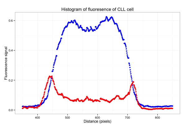
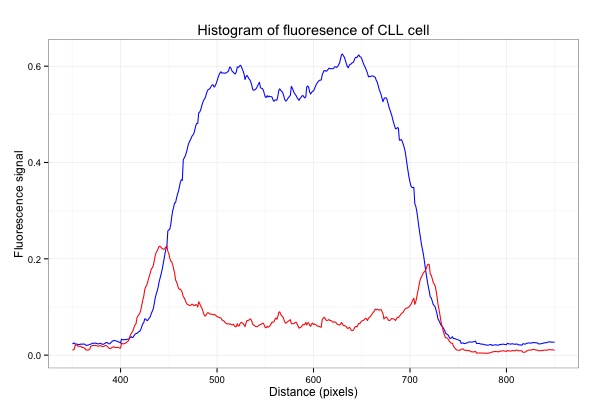
I've used EBImage to extract values and to generate this graph which shows the fluorescence of the pixels across the middle of the cell:


Here is the script with some plots that I generated along the way:

# EBImage - a Bioconductor package for analysing images
source("http://bioconductor.org/biocLite.R")
biocLite("EBImage")
library("EBImage")
library(ggplot2)

# the image is on Github
img <- readImage("https://raw.githubusercontent.com/brennanpincardiff/RforBiochemists/master/data/images/cllCell.jpg")
# the object created is a Large Image (24 Mb in this case!)

display(img)
# opens a window in a web browser and allows you to look at the image

print(img)
# shows some of the structure of the Large Image object.

dim(img)
# [1] 1024 1024    3   
# corresponds to x and y pixels of the image and then the number of colours for each pixel

# why do we want to do this?
# so that we can extract data out of the image and draw nice graphs. 
# to extract a value out of the Large Image use the imageData() function

# if you place the mouse over the image in the web browser, you see the name of the pixel. 

# we can extract the fluorescence value and plot the data
x <- imageData(img)[, 512, 3]

# this gives the values for colour 3 for the whole x line at the value of y = 512. 
# this is a list of 1024 numbers which can be plotted
plot(x)  

# the index at the bottom refers to the x values across the whole image. 


# using the web browser, I can choose the line across the middle of the cell
# extract a row of 100 pixels wide from left to right of the middle of the image.
# I chose to extract values from y pixel 425 to 545 which correspond to the middle of the cell

# colour 1
x10.col1 <- as.data.frame(imageData(img)[ ,425:525, 1])
plot(x10.col1$V5)  # plot one of the values
Plot one of the values (V5)

x10.col1$mean <- rowMeans(x10.col1[1:100])
plot(x10.col1$mean) # plot the mean
Plot the mean of 100 pixels
# colour 3
x10.col3 <- as.data.frame(imageData(img)[ ,425:525, 3])
x10.col3$mean <- rowMeans(x10.col3[1:100])
plot(x10.col3$mean, col = "blue")
lines(x10.col1$mean, col = "red")
Plot both colours using Base R

# assemble a data frame to allow us to use ggplot to plot the data..
m <- as.data.frame(x10.col1$mean)
m$col3 <- x10.col3$mean

# change the column names in the data frame
colnames(m) <- c("col1", "col3")

# make the basic ggplot object
p <- ggplot(data=m, aes(x=seq(1, length(col3)))) + 
     geom_line(aes(y = col3), colour = "blue") + 
     geom_line(aes(y = col1), colour = "red")
p  # show the plot
Plot both colours in ggplot2

# focus on just the cell
p <- ggplot(data=m, aes(x=seq(1, length(col3)))) + 
     geom_line(aes(y = col3), colour = "blue") + 
     geom_line(aes(y = col1), colour = "red") + 
     xlim(350,850) # focus on just the cell
p  # have a look
# gives Warning messages but these can be ignored.
Focus on the cell by limiting the x-axis.

# add some titles and a easy theme 
p <- p +  xlab("Distance (pixels)") +   #label x-axis
          ylab("Fluorescence signal") +    #label y-axis
          ggtitle("Histogram of fluoresence of CLL cell") +  #title
          theme_bw()     # a simple theme

p   # show the plot
Add titles and change the theme.
# plot points instead of lines...
q <- ggplot(data=m, aes(x=seq(1, length(col3)))) + 
  geom_point(aes(y = col3), colour = "blue") + 
  geom_point(aes(y = col1), colour = "red") + 
  xlim(350,850) +  
  xlab("Distance (pixels)") +   # label x-axis
  ylab("Fluorescence signal") +    # label y-axis
  ggtitle("Histogram of fluoresence of CLL cell") +  # add a title
  theme_bw()     # a simple theme
q   # show the plot

You have the plot at the top of the page....


Resources: 

Wednesday, 29 July 2015

Analysing some citation data in R....

Last week, I showed a graph that detailed the number of publications in my field of study: chronic lymphocytic leukemia - over 17,000 publications with over 4,000 between 2010 and 2014. This inspired me to ask the question of what papers, from 2010 to 2014 were the most cited papers in the field. What were the MUST READ papers?

To do this required me to download citation data and do some analysis. Downloading citation data is not difficult but it does take up a bit of internet time. You don't need to do it yourself to appreciate the graph that I have made or the list of papers that it generated. 

Here is the graph:


Here is the script to draw this graph:
START
# This data file has a list of the PubMed IDs, the year and the citation data 
data <- read.csv("http://science2therapy.com/data/cllCitation2010to2014_20150722.csv", header=T)

str(data)
cit <- data$cit

# not very useful but good practice to plot the data first...
plot(density(cit))
plot(density(cit), log='x')
hist(cit)

# not very useful in ggplot either
p <- ggplot(data=data,          # specify the data frame with data
            aes(x=cit)) +       # specify the x and y for the graph
  geom_bar(binwidth = 10)    # it's a bar plot

p   # show the plot

# so lots of the publications with relatively few citations. 

# Do some subsetting to identify highly cited papers. 
# http://www.statmethods.net/management/subset.html

# calculate the mean number of citations 
mean.cit <- mean(data$cit)   # 4.1 for this data set. 

# data frame of publications with no citations
newdata.zero <- subset(data, cit == 0)

# data frame of publications with one citation
newdata.one <- subset(data, cit == 1)

# make a data frame of publications with more than one citations upto the mean 
newdata.greater1 <- subset(data, cit > 1)
newdata.mean <- subset(newdata.greater1, cit < mean.cit)

# make a data frame of publications with more than the mean citations
# up to the mean squared
newdata.greatermean <- subset(data, cit > mean.cit)
newdata.meanSq <- subset(newdata.greatermean, cit < (mean.cit^2))

# make a data frame of publications with more than the mean squared citations
# up to the mean cubed
newdata.greatermeanSq <- subset(data, cit > (mean.cit^2))
newdata.SqtoCube <- subset(newdata.greatermeanSq, cit < (mean.cit^3)) 

# make a data frame of publications with more than the mean cubed citations
newdata.greaterCube <- subset(data, cit > (mean.cit^3))

# assemble these numbers into a vector
count<-c(nrow(newdata.zero), nrow(newdata.one), nrow(newdata.mean), 
         nrow(newdata.meanSq), nrow(newdata.SqtoCube), nrow(newdata.greaterCube))

# simple barplot
barplot(count)

# create a list of labels
lab=c("0","1","2-4","5-16","17-64", ">64")

# assemble a new data frame to plot with ggplot
df <- as.data.frame(count)
df$label <- lab
df$labfac <- factor(df$label, as.character(df$label))


# do a nice histogram of citation frequency in ggplot
p <- ggplot(data=df, aes(y=count)) + 
  geom_bar(aes(x=labfac), data=df, stat="identity") + 
  xlab("Number of citations") +   # label x-axis
  ylab("Number of Papers") +    # label y-axis
  ggtitle("Chronic Lymphocytic Leukemia Papers published 2010 to 2014") +  # add a title
  theme_bw() +      # a simple theme
  expand_limits(y=c(0,2000)) +   # customise the y-axis
  theme(axis.title.y = element_text(size = 14 )) + 
  theme(axis.title.x = element_text(size = 14 )) + 
  theme(axis.text = element_text(size = 12))

p    #show us the plot

END


Thoughts on the citation analysis


The average number of citations per paper was just over 4. 
Only 24 papers were cited more than 64 times. 

Here is a list of the 5 most highly cited papers from 2010 to 2014:

  1. Porter, et al 2011 N Engl J Med “Chimeric antigen receptor-modified T cells in chronic lymphoid leukemia.” Cited: 414 times 
  2. Stephens et al 2011 Cell “Massive genomic rearrangement acquired in a single catastrophic event during cancer development.” Cited: 333 times 
  3. Kalos et al 2011 Sci Transl Med “T cells with chimeric antigen receptors have potent antitumor effects and can establish memory in patients with advanced leukemia.” Cited: 287 times 
  4. Puente et al 2011 Nature “Whole-genome sequencing identifies recurrent mutations in chronic lymphocytic leukaemia.” Cited: 228 times 
  5. Grupp et al 2013 N Engl J Med “Chimeric antigen receptor-modified T cells for acute lymphoid leukemia.” Cited: 205 times 


Full list of the 24 papers is available as a PDF here


Tuesday, 21 July 2015

How many publications in your area of research?

The amount of scientific literature is daunting. There are over 17,000 papers published in my research area which is chronic lymphocytic leukemia. I wanted to graph this so here is what I did:

I did a PubMed search using "chronic lymphocytic leukaemia" or "chronic lymphocytic leukemia" or "CLL". When the search is made, there is a nice graph on the left hand side of the browser window - see the circle in the picture below. You can download a csv file of this data by pressing on "Download CSV".


If you import this CSV file into R, it looks a bit strange. The str(data) command gives you the following output:

> str(data)
'data.frame': 64 obs. of  1 variable:
 $ pubmed...chronic.lymphocytic.leukaemia.or.chronic.lymphocytic.leukemia.or.CLL: Factor w/ 57 levels "1","10","1001",..: 57 51 3 56 53 52 55 50 48 47 ...

This is because it has a line at the top of the file that R can't interpret properly. You need to open the file and delete the first line - a little bit of data wrangling. I did this in Excel.
I also did a search with (("chronic lymphocytic leukaemia" or "chronic lymphocytic leukemia" or "CLL")) AND REVIEW[Publication Type] which gave me 2,236 articles. I combined these two bits of data in Excel. I saved this as a csv file.

When I import this new file, the str(data) command gives this:

> str(data)
'data.frame': 63 obs. of  3 variables:
 $ year    : int  2015 2014 2013 2012 2011 2010 2009 2008 2007 2006 ...
 $ articles: int  725 1001 930 787 776 819 695 618 608 594 ...
 $ reviews : int  38 147 185 124 112 135 97 74 126 112 ...

This looks much more useful.

Here is the graph that I have made:


Here is the script for this:


# activate the required packages
library(ggplot2)
library(reshape2)
library(ggthemes)

# do search in pubmed on the web
# pubmed - "chronic lymphocytic leukaemia" or "chronic lymphocytic leukemia" or "CLL"
# get an option to download a csv file
# open the file and remove the top line to prevent an error 
# add other data if you want and change the column titles to something useful
setwd("/Users/paulbrennan/Documents/Work Documents/Staff & Collaborations/RforBiochemists/RforBiochemists/data")
data <- read.csv("cllPublicationsformatted.csv")

# reshape the data from wide to long format
data.melt <- melt(data, id.vars = "year", value.name = "pubs", variable.name = "pub.type")

# draw the graph
p <- ggplot(data.melt, aes(x=year, 
                           y= pubs, 
                           colour = factor(pub.type, labels = c("Articles", "Reviews")))) + 
# colour = factor and the labels allows us to customize the legend
    geom_line(size=1) +
    labs(color = "Publication Type") + # customizes the legend title
    scale_colour_manual(values=c("black","red")) +
    ylab("Number Publications") + # y-label
    xlab("Year") + # x-label
    ggtitle("Chronic Lymphocytic Leukaemia Publications by Year") +
    scale_x_continuous(breaks=c(1960,1970,1980,1990, 2000, 2010)) +
    theme_bw()

p <- p + theme(legend.position=c(0,1), # move to the top left
               legend.justification=c(0,1), # move it in a bit
               legend.text=element_text(size = 12), # increase size of text
               legend.title=element_text(size = 12)) # and the title
               
p <- p + theme(axis.title.y = element_text(size = 14 )) + 
         theme(axis.text = element_text(size = 12))

p # show the graph


N.B. You do get a warning:
Warning message:
In loop_apply(n, do.ply) :
  Removed 17 rows containing missing values (geom_path).

This is because there is more data for the articles than the reviews. Nothing to worry about. 

This resource helped me: https://rpubs.com/hughes/10012

Wednesday, 15 July 2015

A bar chart looking at the number of Athena SWAN awards...

Bar charts are commonly used. They are easy to understand. They allow us to present data is a visual way. Lots of people appreciate data visually and prefer pictures to numbers. I don't just analyse biological data. So here is an example of using ggplot to create a stacked bar chart to show the increase in Athena SWAN Awards over the last six years.

Here is the graph:


Here is the script:

# activate the required packages
library(ggplot2)
library(reshape2)
library(ggthemes)

# here is the data - gathered from various awards booklets
# and the ECU press release
years <- c("2009","2010","2011","2012","2013", "2014")
bronze <- c(19,  13, 25, 66, 135, 152)
silver <- c(16, 16, 14, 26, 40, 43)
gold <- c(0,1,0,2,4,0)

# create the data frame required for ggplot
swan.df <- as.data.frame(years)
swan.df$Bronze <- bronze
swan.df$Silver <- silver
swan.df$Gold <- gold

# reshape the data from long into short format
as.melt <- melt(swan.df, id.vars = "years", value.name = "number", variable.name = "Awards")

# make the first version of the plot
p <- ggplot(as.melt, aes(x=years, y=number, fill=Awards)) + 
     geom_bar(stat="identity") +  # this bit makes the barplot
     scale_fill_manual(values=c("brown", "grey", "yellow")) + # control the colours
     xlab("") + #no need for the "years" x-axis
     theme_few() # nice clean theme  

# I want to add a nice y-axis label
# and increase the size of the text
p <- p + ylab("Number of Awards") +
     theme(axis.title.y = element_text(size = 14 )) + 
     theme(axis.text = element_text(size = 12))

# make the legend a bit bigger and move it to top left 
p <- p + theme(legend.position=c(0,1), # moves it to the top left
               legend.justification=c(0,1), # moves it in a bit
               legend.text=element_text(size = 12), # increase the size of the title
               legend.title=element_text(size = 12)) # and the labels

# have a look at the bar chart
p

# save the graph....
p + ggsave("AthenaSWANawards09_14.pdf")

END of SCRIPT

Important resource: http://www.cookbook-r.com/Graphs/Bar_and_line_graphs_(ggplot2)/

Going beyond bar charts.

Bar charts are not very data rich. There is often a better way to show the data or a better way to do the experiment. As a student and post-doctoral fellow, I was encouraged to look to investigate relationships in more detail. For example, it's better to do a time course experiment or to investigating dose relationships - or both! These suggest a more detailed investigation of a biological system. This would be better plotted in other ways. For examples, see the protein assay graph and the LD50 graph.

Wednesday, 8 July 2015

Opening and plotting some flow cytometry data...

Edited: 20 October 2020. Access to these files have changed and Bioconductor has changed too. 

Bioconductor is a very valuable resource for biochemists, biologists and bioinformaticians using R. It contains over 1000 software packages for the opening, analysing and visualising biomedical and biological data. 

Today, I want to show how this can be used to open a file containing some flow cytometry data and how to generate a plot with the data. 

This is the plot, I am going to generate:


It uses the Bioconductor package flowCore. The how-to manual is here and the full reference manual is here. I'm just showing how to open and plot one file which is just a starting point for flow cytometry data. There is a longer example with more plots here

A full flow cytometry work flow will allow opening multiple files, normalising and detailed statistics. There is lots of other packages for flow cytometry on Bioconductor.  

I found this interesting: bioinformatics.ca, the home to all things bioinformatics in Canada. They ran a course in 2013 entitled Flow Cytometry Data Analysis using R (2013) and the material is available to view for free. 


Here is the script:

### START 
## ----download_from_Bioconductor-----------------------------------
# install BiocManager
# install.packages("BiocManager")
# BiocManager::install("flowCore")

library("flowCore")
library(ggplot2)


link <- "https://github.com/brennanpincardiff/R4Biochemists201/blob/master/data/cfse_data_20111028_Bay_d7/A01.fcs?raw=true"

download.file(url=link, destfile="file.fcs", mode="wb")
data <- flowCore::read.FCS("file.fcs", alter.names = TRUE)


#with colours indicating density
colfunc <- colorRampPalette(c("white", "lightblue", "green", "yellow", "red"))
# this colour palette can be changed to your taste 

vals <- as.data.frame(exprs(data))
ggplot(vals, aes(x=FSC.A, y=SSC.A)) +
    ylim(0, 500000) +
    xlim(0,5000000) +
    stat_density2d(geom="tile", aes(fill = ..density..), contour = FALSE) +
    scale_fill_gradientn(colours=colfunc(400)) + # gives the colour plot
    geom_density2d(colour="black", bins=5) # draws the lines inside


# there are lots of small pieces of debris. There is a blue cloud of cells too.  

# exclude debris using the filter package
vals_f <- dplyr::filter(vals, FSC.A>1000000)
# we still have 25,499 events. 

# repeat the plot
ggplot(vals_f, aes(x=FSC.A, y=SSC.A)) +
    ylim(0, 500000) +
    xlim(0,5000000) +
    stat_density2d(geom="tile", aes(fill = ..density..), contour = FALSE) +
    scale_fill_gradientn(colours=colfunc(400)) + # gives the colour plot
    geom_density2d(colour="black", bins=5) # draws the lines inside

=== END  ===


Friday, 3 July 2015

Map of our Training Day Delegates...

So I have decided to use R to make a map of the delegates that attended our R for Biochemists Training Day. This is partly Friday Fun. It also illustrates the feasibility of using R for drawing a map. Finally, it illustrates some useful things with ggplot:

  • a little bit about colours and overplotting
  • using data from different data frames with different layers of a plot
Here the final map:


The darker circles indicate that more people came from there. This is the "alpha" argument of the geom_point() function. 
As a scientist, I like the labels on the longitude and latitude labels on the axis. 


Here is the script including some of the pictures along the way:


# draw a map of the UK with R. 

library(maps)       # Provides functions that let us plot the maps
library(mapdata)    # Contains the hi-resolution points that mark out the countries.

# use the map() function which comes from the maps package
map('worldHires',
    c('UK', 'Ireland', 'Isle of Man','Isle of Wight', 'Wales:Anglesey'))
# very small map

# make it larger by limiting the x and y axis which corresponds to
# longitude and latitude
map('worldHires',
    c('UK'),
    xlim=c(-10,2), ylim=c(50,60))

# import delagate info
data <- read.csv("http://science2therapy.com/data/locations.csv")
points(data$longitude,data$latitude,col=2,pch=18)


# we can also do this in ggplot probably better...
library(ggplot2)

# use map_data()function to create a data.frame containing the map of the UK
uk<-map_data("worldHires", region = "UK")

# create the object m with the map in it. 
# we can make the map different colours
# see here for more about colours in R
# http://www.stat.columbia.edu/~tzheng/files/Rcolor.pdf
m <- ggplot() +
  geom_polygon(data=uk, 
               aes(x=long, y=lat, group=group),
               fill="gray88") +   # see link for a list of R colours
  scale_x_continuous(limits = c(-10,3)) +
  scale_y_continuous(limits =c(49,60.9))

# add the points on the plot telling us where the longitude and latitude of various places
# note the data is coming from a different data.frame to the map
m <- m +  geom_point(data=data, 
                aes(x=longitude, y=latitude), 
                alpha=0.5, colour="red", size = 5) 

# change the theme to make the map nicer
m <- m + theme_bw()

# add a title
m + ggtitle("Where the R for Biochemists delagates came from...")


END OF SCRIPT

Sources of advice and help: