Tuesday, 23 June 2015

My first cluster diagram

For our CLL proteomic manuscript we were asked to do some more statistical analysis (Proteomics-Based Strategies To Identify Proteins Relevant to Chronic Lymphocytic Leukemia Alsagaby et al, J. Proteome Res., 2014, 13 (11), pp 5051–5062).

The reviewer particularly recommended hierarchial clusteringFortunately, I had been learning how to use R, so I was able to learn how to do this relatively easy. This was why I had chosen to learn R.  

"The idea of a cluster diagrams is to build a hierarchy of clusters, showing relations between the individual members and merging clusters of data based on similarity." I learned this from a website that seems to have disappeared now.

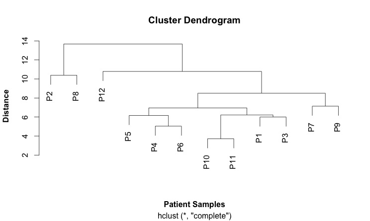
Cluster diagrams can be used to investigate the quality of your data and identify outliers in sets of data. They can also show patterns and identify groups of samples.

A key concept is a "distance metric" which is a measure of similarity. There are different measures of correlation. Two common ones are the Euclidean and the Pearson correlations. Euclidean distance looks at just the numbers while the Pearson correlation looks more at trends. This can give very different patterns. Other measures of distance include: maximum, Manhattan, Canberra, binary and Minkowski.

The first step is calculate a distance matrix using the dist() function.

Then you can use this matrix to do the clustering using the hclust() function.

Finally, you plots this: plot(hc).

This is my first cluster diagram:


Here is the script that generates it:

SCRIPT
# import the data
link <- ("https://raw.githubusercontent.com/brennanpincardiff/RforBiochemists/master/data/iTRAQPatientforCluster.csv")

data2 <- read.csv(link, header=TRUE)

attach(data2)  # attaching a data.frame means we can use the headings directly. 
head(data2)  # look at the top of the file. 

# first step is to calculate the distances using the dist() function. 
# various methods are possible - default is Euclidean. 
distances2 <- dist(rbind(P1, P2, P3, P4, P5, P6, P7, P8, P9, P10, P11, P12))
distances2
summary(distances2)

# make the cluster dendrogram object using the hclust() function
hc <- hclust(distances2)  

# plot the cluster dendrogram object using base graphics
plot(hc, xlab =expression(bold("Patient Samples")), ylab = expression(bold("Distance")))

detach(data2) # good practice to detach data after we're finished.


Thursday, 18 June 2015

Drawing a proteomic data volcano plot....

I really like this data produced by this study from Liverpool (Eagle et al (2015) Mol Cell Proteomics, 14, 933-945). It a proteomic study of two types of leukaemic cell. I have used it already to compare their protein list to some of our data. Today, I have used it to draw a volcano plot which shows the change in protein expression and the significance of the change (p value). These graphs are popular in genomic and proteomic studies. 

Here is the graph, drawn with ggplot:


Updated 22nd July 2021: The data should be available from the Mol Cell Proteomics but it's not there any more. The file is available on Github and this script links and downloads directly.

START
library(ggplot2)

link <- ("https://raw.githubusercontent.com/brennanpincardiff/RforBiochemists/master/data/mcp.M114.044479.csv")
data<-read.csv(link, header=TRUE)

##Identify the genes that have a p-value < 0.05
data$threshold = as.factor(data$P.Value < 0.05)

##Construct the plot object
g <- ggplot(data=data, 
            aes(x=Log2.Fold.Change, y =-log10(P.Value), 
            colour=threshold)) +
  geom_point(alpha=0.4, size=1.75) +
  xlim(c(-6, 6)) +
  xlab("log2 fold change") + ylab("-log10 p-value") +
  theme_bw() +
  theme(legend.position="none")

g
# The script gives a warning message: Removed 1 rows containing missing values (geom_point).

# but it still works....

Wednesday, 17 June 2015

Using ggplot to draw the LD50 graph

UPDATE: As of ggplot 2.0.0, released in Dec 2015, to use the geom_smooth() ggplot function, there is a need to put the method arguments (method.args = list()) into a list as detailed below.
As of 19th of Jan 2016, it means that the scripts here that use the geom_smooth() don't work. I will repair them all but it'll take a few days. Thanks to the commentors for sorting this out.


As mentioned previously, we do a lot of drug testing in our laboratory.
Here is the same data plotted with ggplot.
The experimental set up, done by a student in the lab, is as follows:
  • using some cells and add various concentrations of a novel drug
  • leave for 48 hours
  • then measure how many cells are dead
  • the experiment was done four times with the doses improved each time
Here is the graph and calculated LD50 - a measure of how good the drug is:


Here is the script:

# START of SCRIPT
library(ggplot2)

###  this is the data   ### 
# data from four experiments
conc <- c(5.00E-07, 1.00E-06, 1.00E-05, 
          5.00E-07, 1.00E-06, 5.00E-06, 1.00E-05, 2.00E-05, 
          5.00E-07, 1.00E-06, 2.50E-06, 5.00E-06, 1.00E-05, 
          5.00E-07, 1.00E-06, 2.50E-06, 5.00E-06, 1.00E-05)
dead.cells <- c(34.6, 47.7, 81.7, 
                37.6, 55.7, 89.1, 84.3, 85.2, 
                34.4, 46.1, 76.2, 84.3, 84.1, 
                24.5, 26.1, 60.6, 82.7, 87)

# transform the data to make it postive and put into a data frame for fitting 
data <- as.data.frame(conc)   # create the data frame
data$dead.cells <- dead.cells
data$nM <- data$conc * 1000000000
data$log.nM <- log10(data$nM) 

###  fit the data  ###
# make sure logconc remains positive, otherwise multiply to keep positive values
# (such as in this example where the iconc is multiplied by 1000

fit <- nls(dead.cells ~ bot+(top-bot)/(1+(log.nM/LD50)^slope),
           data = data,
           start=list(bot=20, top=95, LD50=3, slope=-12))
m <- coef(fit)
val <- format((10^m[3]),dig=4)

###  ggplot the results  ###
p <- ggplot(data=data,          # specify the data frame with data
            aes(x=nM, y=dead.cells)) +   # specify x and y
  geom_point() +          # make a scatter plot
  scale_x_log10(breaks = c(500, 1000, 2500, 5000, 10000, 20000))+
  xlab("Drug concentration (nM)") +   # label x-axis
  ylab("Dead cells (% of cells)") +    # label y-axis
  ggtitle("Drug Dose Response and LD50") +  # add a title
  theme_bw() +      # a simple theme
  expand_limits(y=c(20,100))   # customise the y-axis

# Add the line to graph using methods.args (New: Jan 2016)
p <- p +  geom_smooth(method = "nls",
                      method.args = list(formula = y ~ bot+(top-bot)/(1+( x / LD50)^slope), 
                                    start=list(bot=20, top=95, LD50=3, slope=-12)),
                      se = FALSE)

# Add the text with the LD50 to the graph. 
p <- p+ annotate(geom="text", x=7000, y= 60, label="LD50(nM): ",  color="red") +
   annotate(geom="text", x=9800, y= 60, label=val,  color="red")

p # show the plot

#END OF SCRIPT

Tuesday, 16 June 2015

Drawing the protein assay with ggplot

I have been persuaded by Steph Locke during todays meeting of the Cardiff R Users Group that I should use ggplot for all the plots during our R for Biochemist Training Day. For that reason, I have written the script below which uses ggplot to graph the protein assay:

# START of SCRIPT
library(ggplot2)

# Protein Concentrations
prot <- c(0.000, 0.016, 0.031, 0.063, 0.125, 0.250, 0.500, 1.000, 
          0.000, 0.016, 0.031, 0.063, 0.125, 0.250, 0.500, 1.000) 

# Absorbance from my protein assay
abs <- c(0.329, 0.352, 0.349, 0.379, 0.417, 0.491, 0.668, 0.956, 
         0.327, 0.341, 0.355, 0.383, 0.417, 0.446, 0.655, 0.905)

# Convert into data.frame to plot with ggplot
data <- as.data.frame(prot)
data$abs <- abs

#Calculate the line using the linear model function
line <- lm(abs~prot)

#Equation of a line y = mx + c
#In our case abs = slope * prot + intercept
# ukn.prot = (abs - intercept)/slope
int <- summary(line)$coefficients[1]
slope <- summary(line)$coefficients[2]

#now calculate some unknown protein concs from absorbances
#put the unknowns into a vector
abs.ukns <- c(0.554, 0.568, 0.705)

#rearrange the equation of the line to ukn.prot = (abs - intercept)/slope
prot.ukns <- (abs.ukns - int)/slope

# create the object with the graph in it. 
p <- ggplot(data=data,          # specify the data frame with data
        aes(x=prot, y=abs)) +   # specify the x and y for the graph
        geom_point() +          # make a scatter plot
        stat_smooth(method = "lm") +  # add a linear model line
        xlab("[Protein] (microg/ml)") +   # label x-axis
        ylab("Absorbance (570nm)") +    # label y-axis
        ggtitle("Protein Assay 20th April 2015") +  # add a title
        theme_bw() +      # a simple theme
        expand_limits(y=c(0.25,1)) +    # customise the y-axis
        annotate(geom="text", x=0.85, y= 0.6, label="Abs         Prot",  color="red")

#put the answers on the graph
for (i in 1:length(abs.ukns)){
  p <- p + annotate(geom="text", x = 0.8, y = (0.6 - i/20), label=abs.ukns[i])
  p <- p + annotate(geom="text", x = 0.92, y = (0.6 - i/20), label=round(prot.ukns[i], 3))
}

p # show us the graph...

# END OF SCRIPT

Tuesday, 9 June 2015

Are my fitted enzyme kinetics lines significantly different?

Updated: 14th March 2017 because of changes in the geom_smooth() requirements.

R is good at statistics. I've been learning how to calculate F ratios in R to allow me to compare the lines fitted using glucose hydrogenase wild type and H297F mutant data that we graphed up in the previous blog post.  I want to add the p-value to the plot:

Note the addition of the F ratio and the p-value (very small)


The question from the statistical point of view: is fitting two lines better than fitting just one.

  • Our null hypothesis says that one line fits all the data well. 
  • The alternative hypothesis says that two lines fits the data well.
The question from an biochemistry experimental point of view: does the mutant glucose dehydrogenase H297F have different properties to wild type. If the mutation has no effect on the enzyme kinetics, then one line should fit all the data well. If not then two lines should fit the line better. This test won't tell us which or how the lines are different, just that they are.

Key steps to answer this question:

  1. Fit one line to all the data  (fitTotal)
  2. Fit the two lines to the two separate sets of data (fitWT and fitH297F). 
  3. Extract the differences (deviance) between the data and the lines (aka sum of squares.)  
    1. SS.null <- fitTotal$m$deviance() 
    2. SS.alt <- fitWT$m$deviance() + fitH297F$m$deviance()
  4. Extract the degrees of freedom for null and alternative hypothesis
    1. df.null <- df.residual(fitTotal)
    2. df.alt <- df.residual(fitWT) + df.residual(fitH297F)
  5. Divide the deviance by the degrees of freedom which is this case is the number of samples less the number of lines we have drawn. This gives us the mean square - the average sum of squares.
    1. mean.squares.null <- SS.null/df.null
    2. mean.squares.alt <- SS.alt/df.alt
  6. The F-ratio is the mean square for the null hypothesis (one line fits all the data) divided by mean squares for the alternative hypothesis.
    1. Fratio <- mean.squares.null/mean.squares.alt
  7. I calculated the p value if you know the F-ratio and the degrees of freedom using the pf() function.
    1. p.val <- pf(Fratio, df.alt, df.null, log.p = TRUE)
  8. I added the F-ratio and the p-value to the ggplot using the annotate() function.


If the variation is the basically the same in both cases - no extra value from plotting two lines, then the F-ratio will be approximately one. The higher the F-ratio the better. The p-value corresponding to the F-ratio depends on the degrees of freedom. R can calculate this.

I've learned most of this from Andy Field's book who has, in my opinion, written the easiest to read statistics books. One or two parts even made me laugh and I didn't expect that. Lots of the material is available through his website. You can download his information about ANOVA and F-ratios here.

In case you hadn't guessed from the plots, the F-ratio is significant and the null hypothesis is unlikely to be correct. Two lines describe the data better than one line. Our enzyme kinetic values are different.

Here is the script that does the calculations:

# START OF SCRIPT
# compare two models. 
# need to do an ANOVA...

library(ggplot2)

library(ggthemes)

# data from Dr C Bennett, University of Bath
# Link to published data: http://www.jbc.org/content/285/44/33701.full
# and her thesis: http://opus.bath.ac.uk/27220/

Enz <- c("WT","WT","WT","WT","WT",
         "WT","WT","WT","WT","WT",
         "WT","WT","WT",
         "H297F","H297F","H297F",
         "H297F","H297F","H297F",
         "H297F","H297F")
S <- c(2.00, 1.00, 0.60, 0.50, 0.40, 
         0.30, 0.20, 0.10, 0.09, 0.08, 
         0.06, 0.04, 0.02, 
         0.05, 0.10, 0.20, 
         0.30, 0.40, 0.50, 
         1.00, 2.00)
v <- c(59.01, 58.29, 54.17, 51.82, 49.76, 
         45.15, 36.88, 26.10, 23.50, 22.26, 
         16.45, 13.67, 6.14, 
         11.8, 19.9, 30.3, 
         36.6, 40.2, 42.1, 
         47.8, 50.0)

# assemble the data into a data.frame
enzdata <- as.data.frame(Enz)
enzdata$S <- S
enzdata$v <- v

# fit all the data to one NLS...
MMcurve<-formula(v~Vmax*S/(Km+S))
fitTotal <- nls(MMcurve, enzdata, start=list(Vmax=50,Km=0.2), subset=)
# residual sum-of-square: 328   fitTotal$m$deviance()
# from here: https://stat.ethz.ch/pipermail/r-help/2010-August/249065.html
SS.null <- fitTotal$m$deviance()
# from here: http://stackoverflow.com/questions/21734248/how-to-return-only-the-degrees-of-freedom-from-a-summary-of-a-regression-in-r
df.null <- df.residual(fitTotal)

# split the data and fit WT and H297F data
WT <- subset(enzdata, Enz=="WT")
fitWT <- nls(MMcurve, WT, start=list(Vmax=50,Km=0.2))
# residual sum-of-square: 23.36  

H297F <- subset(enzdata, Enz=="H297F")
fitH297F <- nls(MMcurve, H297F, start=list(Vmax=50,Km=0.2))
# residual sum-of-square: 5.523
# add these together because they are one (alternative) model
SS.alt <- fitWT$m$deviance() + fitH297F$m$deviance()
df.alt <- df.residual(fitWT) + df.residual(fitH297F)

mean.squares.null <- SS.null/df.null
mean.squares.alt <- SS.alt/df.alt

# calculate the F-statistic
# http://stats.stackexchange.com/questions/12398/how-to-interpret-f-and-p-value-in-anova
Fratio <- mean.squares.null/mean.squares.alt

# use pf(q, df1, df2, ncp, lower.tail = TRUE, log.p = FALSE)
p.val <- pf(Fratio, df.alt, df.null, log.p = TRUE)
p.val <- format(p.val, dig=3)
           
# Now, draw the plot AND add the p-value using annotate()

ggplot(data=enzdata,         
       aes(x=S,            
           y=v,            
           colour = Enz)) +  
  geom_point() +            
  xlab("Substrate (mM)") +  
  ylab("Velocity (uM/min/mg.enzyme)") +    
  ggtitle("Glucose Dehydrogenase \n wild type and mutant") +  

  geom_smooth(method = "nls", 
              method.args = list(formula = y ~ Vmax * x / (Km + x), 
                start = list(Vmax = 50, Km = 0.2)),
             se = F, size = 0.5,
             data = subset(enzdata, Enz=="WT"))  +

  geom_smooth(method = "nls", 
                method.args = list(formula = y ~ Vmax * x / (Km + x), 
                                   start = list(Vmax = 50, Km = 0.2)),
                se = F, size = 0.5, 
              data = subset(enzdata, Enz=="H297F")) +
  theme_few() +

            annotate("text", x = 1.15, y = 25, label = "F ratio: ") +
            annotate("text", x = 1.4, y = 25, label = format(Fratio, dig=3)) +
            annotate("text", x = 1.15, y = 20, label = "P-value: ") +
            annotate("text", x = 1.5, y = 20, label = p.val)


# END OF SCRIPT

Monday, 8 June 2015

Plotting two enzyme plots with ggplot...

UPDATE: As of ggplot 2.0.0, released in Dec 2015, to use the geom_smooth() ggplot function, there is a need to put the method arguments (method.args = list()) into a list as detailed below. I have corrected this plot to include the new information and it works now.

ggplot2 is a powerful graphing package in R. It was created by Hadley Wickham, an expert in R. Books and websites are dedicated to ggplot2.

Most of my work has used base graphics but I'm trying to learn how to use ggplot2 and the syntax involved in controlling it.

Here is a script and some of the graphs made with ggplot2. I have used enzyme data supplied by Charlie Bennett from University of Bath who is attending the R for Biochemists Training Day.

This script is show with various graphs intermingled. The idea is show how the various parts of the script change the graphs.

I hope it's useful. I have learned a little more about ggplot preparing it.

# SCRIPT STARTS

library(ggplot2)
library(ggthemes)

# data from Dr C Bennett, University of Bath
# Link to published data: http://www.jbc.org/content/285/44/33701.full
# and her thesis: http://opus.bath.ac.uk/27220/

# This is the data
Enz <- c("WT","WT","WT","WT","WT",
         "WT","WT","WT","WT","WT",
         "WT","WT","WT",
         "H297F","H297F","H297F",
         "H297F","H297F","H297F",
         "H297F","H297F")
sub <- c(2.00, 1.00, 0.60, 0.50, 0.40, 
         0.30, 0.20, 0.10, 0.09, 0.08, 
         0.06, 0.04, 0.02, 
         0.05, 0.10, 0.20, 
         0.30, 0.40, 0.50, 
         1.00, 2.00)
vel <- c(59.01, 58.29, 54.17, 51.82, 49.76, 
         45.15, 36.88, 26.10, 23.50, 22.26, 
         16.45, 13.67, 6.14, 
         11.8, 19.9, 30.3, 
         36.6, 40.2, 42.1, 
         47.8, 50.0)

# assemble the data into a data.frame
enzdata <- as.data.frame(Enz)
enzdata$sub <- sub
enzdata$vel <- vel

# plot the data with ggplot
# most of the syntax seems relatively easy to understand...
ggplot(data=enzdata,         # give the ggplot() function the data
       aes(x=sub,            # data.frame col with values for x-axis
           y=vel,            # and the y-axis
           colour = Enz)) +  # colour by WT or H297F **NOTE the "+"
  geom_point() +             # key function that show points
  xlab("Substrate (mM)") +   # label x-axis
  ylab("Velocity (uM/min/mg.enzyme)") +    # label y-axis
  ggtitle("Glucose Dehydrogenase \n wild type and mutant") 


# so far, so good. 

# we can create an object with the plot in it... 
enz.plot <- ggplot(data=enzdata,         
                   aes(x=sub,            
                       y=vel,            
                       colour = Enz)) +  
            geom_point() +            
            xlab("Substrate (mM)") +  
            ylab("Velocity (uM/min/mg.enzyme)") +    
            ggtitle("Glucose Dehydrogenase \n wild type and mutant")  


# then we can apply a different theme to change the style of the plot. 
enz.plot + theme_bw()


# or 
enz.plot + theme_few()


# or change arguments in the geom_point() function to make the points larger
enz.plot + geom_point(size=5)


# finally, we can add the enzyme kinetic lines using the geom_smooth() function
enz.plot  + geom_smooth(method = "nls", 
              method.args = list(formula = y ~ Vmax * x / (Km + x), 
                                 start = list(Vmax = 50, Km = 0.2)),
                        se = F, size = 0.5, 
                        data = subset(enzdata, Enz=="WT")) +
            geom_smooth(method = "nls", 
              method.args = list(formula = y ~ Vmax * x / (Km + x), 
                                 start = list(Vmax = 50, Km = 0.2)),
                        se = F, size = 0.5, 
                        data = subset(enzdata, Enz=="H297F")) +
            theme_few()


# SCRIPT ENDS


The following sources were also useful:

Wednesday, 3 June 2015

Draw six enzymology graphs with ggplot...


Added March 2016:
The latest version of ggplot2 required a change in this script which has been added below. 

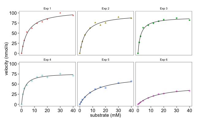
The plot with six separate enzymology lines on it looked a bit busy and difficult to appreciate. We made previous used base graphics to make six individual plots. Here Dean has used ggplot to make a nicer plot. 
First, we make an object containing the combined graph. It's a list. To learn more about data structures, please check out our earlier blog article

Then we use faceting to split the object into six separate graphs. 

Finally, we use the geom_smooth()function with the argument method = "nls" to add the lines. 

Here is the graph: 
Multi-panel enzymology data plotted with ggplot 

Is the ggplot graphic nicer than the base graphics plot? It's personal choice in large part.


Multi-panel enzymology data plotted with base graphics


Here is the script to make the multi panel plot with ggplot.

# The plot with the six lines is a bit busy. 
# Let's make a ggplot equivalent to the base R multiplot.
# Here we do it using faceting.
# To make the script free standing the reshaping code is included. 

library(reshape2)
library(ggplot2)
library (ggthemes)

# the data:
enzdata <- matrix(c(0, 17.36667, 31.97143, 52.68889, 61.95385, 74.2, 77.97143, 84.28, 99.91429, 93.66667, 
                    0, 15.7, 29.42286, 45.64, 62.60615, 75.78118, 69.88, 75.256, 89.59429, 86.84, 
                    0, 27.10667, 42.12, 63.48, 69.56, 74.26857, 79.44444, 83.29091, 87.1, 82.08571, 
                    0, 24.72, 39.07, 47.4, 57.928, 67.6, 71.35556, 67, 75.79375, 70.86667, 
                    0, 5.723636, 11.48, 17.697143, 28.813333, 37.567273, 42.483077, 40.68, 52.81, 56.92, 
                    0, 2.190476, 5.254545, 8.95, 15.628571, 20.8, 25.355556, 26.55, 32.44, 33.333333),
                  nrow = 10, ncol = 6)
no.Exp <- c("Exp 1", "Exp 2", "Exp 3", "Exp 4", "Exp 5", "Exp 6")
Sub <- c(0, 1, 2, 4, 8, 12, 16, 20, 30, 40)

enzdata <- as.data.frame(enzdata) # converted to a data.frame
colnames(enzdata) <- no.Exp # add column names
enzdata <- cbind(Sub, enzdata) # add the Substrate data
# melt the data from wide to long:
melted_data <- melt(enzdata, id.vars = "Sub", value.name = "v", variable.name = "Exp")

# the way ggplot draws colours depends on the required number of colours. The way it does it is just with equally spaced hues around the color wheel, starting from 15:
gg_color_hue <- function(n){
  hues = seq(15, 375, length = n + 1)
  hcl(h = hues, l = 65, c = 100)[1:n]
  }
  
# we have 6 experiments (so we want to create our own 6 colour "mini-palette")
cols <- gg_color_hue(6)  
# this gets the default ggplot colours when we want to plot 6 different variables.


# 1st, create an object with the ggplot 
# It has all the data simply as points, shaped and colour-coded by expt. of origin (as above). 
# We store it in an object called 'x':
x <- ggplot(data = melted_data, aes(x = Sub, y = v)) +
  geom_point(aes(colour = Exp, shape = Exp)) +
  theme_few() +
  ylab("velocity (nmol/s)") + xlab("substrate (mM)") +
  theme(axis.title.x = element_text(size = 15),
        axis.title.y = element_text(size = 15),
        axis.text.x = element_text(size = 15),
        axis.text.y = element_text(size = 15),
        plot.title = element_blank(),            # we don't want individual plot titles as the facet "strip" will give us this
        legend.position = "none",                # we don't want a legend either
        panel.border = element_rect(fill = NA, color = "darkgrey", size = 1.25, linetype = "solid"),
        axis.ticks = element_line(colour = 'darkgrey', size = 1.25, linetype = 'solid'))     # here, I just alter to colour and thickness of the plot outline and tick marks. You generally have to do this when faceting, as well as alter the text sizes (= element_text() in theme also)


This is what we have made so far

# Next, let's modify 'x' by faceting based on the Experiment Name, 
# We also specify that we want a panel 3 plots wide x 2 plots high.
# You can change this, obviously. Can also 'facet_grid' too:
x <- x + facet_wrap( ~ Exp, ncol = 3)


The facet_wrap() function turns it into this
# Finally, let's apply the Michaelis Menten fitting to our faceted data, adding the best fit line in each case:
x <- x + geom_smooth(method = "nls",                 
         method.args = list(formula = y ~ Vmax * x / (Km + x), 
                            start = list(Vmax = 50, Km = 2)),
                     se = F, colour = 'black', size = 0.5)  

# Finally, just call 'x' to show the plots:
x

# if you want to save it as a .pdf, just add + ggsave("GGPLOT_FACET_EnzKin.pdf"), when you call 'x'
x + ggsave("GGPLOT_FACET_EnzKin.pdf")