Showing posts with label pvalue. Show all posts

Friday, 11 September 2015

Downloading and manipulating published proteomic data...

Update: 1 July 2025 - so a lot has happened in 10 years. This includes people moving jobs, promotions and the reorganisation of data on published website. 

Aled was promoted to Professor at Cardiff University 

----

There are many ways to get data into R. I want to illustrate a method of downloading published data within R, opening the data (an Excel file) and then doing visualisations and manipulations. 

I have chosen a paper from Molecular and Cellular Proteomics which uses aptamers to detect multiple proteins in exosomes and cells. 

The data was generated by colleagues that were working in the School of Medicine at Cardiff University including the first author - Dr Jason Webber, a Prostate Cancer UK funded Research Fellow and senior author, Professor Aled Clayton, a Senior Lecturer in Cancer & Genetics at Velindre Hospital. Dr Tim Stone was key to the data analysis. The protein detection method is from a company called SomaLogic

The first step was downloading the file from the Molecular and Cellular Proteomics website. I used the download.file() function. This saves the file into your current directory. This was opened using the readxl package (by Hadley Wickham) using the read_excel() function. 

I drew some graphs as I explored and manipulated the data. These are interspersed with the script below.  The visualisations included boxplots and a cluster diagram. 

I wanted to draw a volcano plot which expresses the fold change against the significant of the change (p-value). I couldn't do that with the data supplied so I had to reverse the transformation and calculate the fold change again. 

Here is the volcano plot:
Comparison of changes in exosomes compared cells. Proteins over-expressed in exosomes are on the right. Proteins over-expressed in cells are on the left. 

The plot indicates that there are more proteins over-expressed in cells (on the left) compared to exosomes (on the right). 

Update: 1 July 2025 - orignally, I was able to download the data directly from the Molecular and Cellular Proteomics website. However, at some point, they reorganised their site and put all the data into a zip file. This means that downloading it requires multiple steps outside of R. To make this analysis more stand alone, I have down loaded the data from this zip file and uploaded the spreadsheet onto my Github site. This means that the script will download and analyse the data. 

Here is the script with some other plots along the way:

START
# pull down a file from the internet, do some analysis and draw a graph...
# choose Jason Webber's MCP Paper...
# the data can be downloaded using this link with give zip file. 
# It isn't necessary to do that for this script. 
# install if necessary:
# install.packages(c("ggplot2", "readxl")) 
library(ggplot2)
library(readxl)


# this is the link to the data
link <- "https://github.com/brennanpincardiff/RforBiochemists/raw/master/R_for_Biochemists_101/data/mcp.M113.032136-6.xlsx"

# the download.file() function downloads and saves the file with the name given
download.file(url=link,destfile="file.xlsx", mode="wb")

# then we can open the file and extract the data using the read_excel() function. 
data<- read_excel("file.xlsx")

View(data)

# plot the data - always an important first step!
boxplot(data[2:7], 
        las =2, # las = 2 turns the text around to show sample names
        ylab = expression(bold("expression")),
        main="Boxplot of expression data")  


Two types of sample - exosomes (n=3) and cells (n=3).

# do a cluster analysis to quality control the different groups
# convert to matrix first
data.m <- as.matrix(data[2:7])
dim(data.m)   # gives the dimensions of the matrix
# ans: 762   6

# calculate the distances using the dist() function. 
# various methods are possible - default is Euclidean. 
distances <- dist(data.m)
summary(distances) # have a look at the object

# make the cluster dendrogram object using the hclust() function
hc <- hclust(distances) 
# plot the cluster diagram
# some interesting groups in the data
plot(hc, 
     xlab =expression(bold("All Samples")), 
     ylab = expression(bold("Distance")))
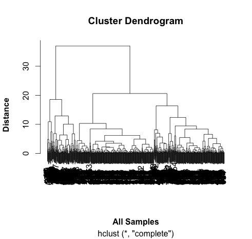


# ah, not what I intended. 
# it clustered the proteins NOT the samples. 

# transpose the data and try again...
data.m.t <- t(data.m)
dim(data.m.t)
# ans = 6  762 - so that has worked. 
# repeat cluter analysis

# calculate the distances using the dist() function. 
# various methods are possible - default is Euclidean. 
distances <- dist(data.m.t)
summary(distances)

# make the cluster dendrogram object using the hclust() function
hc <- hclust(distances) 
# plot the cluster diagram
# some interesting groups in the data
plot(hc, 
     xlab =expression(bold("All Samples")), 
     ylab = expression(bold("Distance")))
# replicates cluster together well. 


# the adjusted P value are in a column entiteld: BH - P.value
# this is a little awkward so rename this and Fold Change column:
colnames(data)[9] <- "P.Value"
colnames(data)[10] <- "Fold.Change"
plot(data$P.Value ~ data$Fold.Change)


# this works but we would like to turn it into a volcano plot 
# with log2 at the bottom and -p-value. 
# we can't log fold changes as half of them are negative numbers 
# we need to re-calculate the raw data
# reverse the log2 transformation. 
# mean the values & calculate fold change in decimal format (no +/-)
data$exo1 <- 2^data$exoRFU1
data$exo2 <- 2^data$exoRFU2
data$exo3 <- 2^data$exoRFU3
data$cell1 <- 2^data$cellRFU1
data$cell2 <- 2^data$cellRFU2
data$cell3 <- 2^data$cellRFU3

# calculate means of the replicates
data$exoMean <- rowMeans(data[,13:15])
data$cellMean <- rowMeans(data[,16:18])

# always good to visualise the data:
plot(log2(data$exoMean)~log2(data$cellMean))


# calculate fold change exo/cell
data$FoldChange <- data$exoMean/data$cellMean
plot(log2(data$FoldChange)) # transform for plotting


# make column in data.frame with transformed data
data$Log2.Fold.Change <- log2(data$FoldChange)

## Identify the genes that have a p-value < 0.05
data$threshold = as.factor(data$P.Value < 0.05)


## Construct the volcano plot object using ggplot
g <- ggplot(data=data, 
            aes(x=Log2.Fold.Change, y =-log10(P.Value), 
                colour=threshold)) +
  geom_point(alpha=0.4, size=1.75) +
  xlim(c(-6, 6)) +
  xlab("log2 fold change") + ylab("-log10 p-value") +
  theme_bw() +
  theme(legend.position="none") + 
  ggtitle("Volcano Plot comparing protein expression in exosomes vs cells ")  # add a title
  
g # show the plot 

END of script

So I think that the threshold of p<0.05 is too low for this volcano plot. It's relatively easy to change and would make a good exercise. Perhaps a threshold of p<0.00001 would be better. 


Useful resources (updated 1 July 2025)

Tuesday, 9 June 2015

Are my fitted enzyme kinetics lines significantly different?

Updated: 14th March 2017 because of changes in the geom_smooth() requirements.

R is good at statistics. I've been learning how to calculate F ratios in R to allow me to compare the lines fitted using glucose hydrogenase wild type and H297F mutant data that we graphed up in the previous blog post.  I want to add the p-value to the plot:

Note the addition of the F ratio and the p-value (very small)


The question from the statistical point of view: is fitting two lines better than fitting just one.

  • Our null hypothesis says that one line fits all the data well. 
  • The alternative hypothesis says that two lines fits the data well.
The question from an biochemistry experimental point of view: does the mutant glucose dehydrogenase H297F have different properties to wild type. If the mutation has no effect on the enzyme kinetics, then one line should fit all the data well. If not then two lines should fit the line better. This test won't tell us which or how the lines are different, just that they are.

Key steps to answer this question:

  1. Fit one line to all the data  (fitTotal)
  2. Fit the two lines to the two separate sets of data (fitWT and fitH297F). 
  3. Extract the differences (deviance) between the data and the lines (aka sum of squares.)  
    1. SS.null <- fitTotal$m$deviance() 
    2. SS.alt <- fitWT$m$deviance() + fitH297F$m$deviance()
  4. Extract the degrees of freedom for null and alternative hypothesis
    1. df.null <- df.residual(fitTotal)
    2. df.alt <- df.residual(fitWT) + df.residual(fitH297F)
  5. Divide the deviance by the degrees of freedom which is this case is the number of samples less the number of lines we have drawn. This gives us the mean square - the average sum of squares.
    1. mean.squares.null <- SS.null/df.null
    2. mean.squares.alt <- SS.alt/df.alt
  6. The F-ratio is the mean square for the null hypothesis (one line fits all the data) divided by mean squares for the alternative hypothesis.
    1. Fratio <- mean.squares.null/mean.squares.alt
  7. I calculated the p value if you know the F-ratio and the degrees of freedom using the pf() function.
    1. p.val <- pf(Fratio, df.alt, df.null, log.p = TRUE)
  8. I added the F-ratio and the p-value to the ggplot using the annotate() function.


If the variation is the basically the same in both cases - no extra value from plotting two lines, then the F-ratio will be approximately one. The higher the F-ratio the better. The p-value corresponding to the F-ratio depends on the degrees of freedom. R can calculate this.

I've learned most of this from Andy Field's book who has, in my opinion, written the easiest to read statistics books. One or two parts even made me laugh and I didn't expect that. Lots of the material is available through his website. You can download his information about ANOVA and F-ratios here.

In case you hadn't guessed from the plots, the F-ratio is significant and the null hypothesis is unlikely to be correct. Two lines describe the data better than one line. Our enzyme kinetic values are different.

Here is the script that does the calculations:

# START OF SCRIPT
# compare two models. 
# need to do an ANOVA...

library(ggplot2)

library(ggthemes)

# data from Dr C Bennett, University of Bath
# Link to published data: http://www.jbc.org/content/285/44/33701.full
# and her thesis: http://opus.bath.ac.uk/27220/

Enz <- c("WT","WT","WT","WT","WT",
         "WT","WT","WT","WT","WT",
         "WT","WT","WT",
         "H297F","H297F","H297F",
         "H297F","H297F","H297F",
         "H297F","H297F")
S <- c(2.00, 1.00, 0.60, 0.50, 0.40, 
         0.30, 0.20, 0.10, 0.09, 0.08, 
         0.06, 0.04, 0.02, 
         0.05, 0.10, 0.20, 
         0.30, 0.40, 0.50, 
         1.00, 2.00)
v <- c(59.01, 58.29, 54.17, 51.82, 49.76, 
         45.15, 36.88, 26.10, 23.50, 22.26, 
         16.45, 13.67, 6.14, 
         11.8, 19.9, 30.3, 
         36.6, 40.2, 42.1, 
         47.8, 50.0)

# assemble the data into a data.frame
enzdata <- as.data.frame(Enz)
enzdata$S <- S
enzdata$v <- v

# fit all the data to one NLS...
MMcurve<-formula(v~Vmax*S/(Km+S))
fitTotal <- nls(MMcurve, enzdata, start=list(Vmax=50,Km=0.2), subset=)
# residual sum-of-square: 328   fitTotal$m$deviance()
# from here: https://stat.ethz.ch/pipermail/r-help/2010-August/249065.html
SS.null <- fitTotal$m$deviance()
# from here: http://stackoverflow.com/questions/21734248/how-to-return-only-the-degrees-of-freedom-from-a-summary-of-a-regression-in-r
df.null <- df.residual(fitTotal)

# split the data and fit WT and H297F data
WT <- subset(enzdata, Enz=="WT")
fitWT <- nls(MMcurve, WT, start=list(Vmax=50,Km=0.2))
# residual sum-of-square: 23.36  

H297F <- subset(enzdata, Enz=="H297F")
fitH297F <- nls(MMcurve, H297F, start=list(Vmax=50,Km=0.2))
# residual sum-of-square: 5.523
# add these together because they are one (alternative) model
SS.alt <- fitWT$m$deviance() + fitH297F$m$deviance()
df.alt <- df.residual(fitWT) + df.residual(fitH297F)

mean.squares.null <- SS.null/df.null
mean.squares.alt <- SS.alt/df.alt

# calculate the F-statistic
# http://stats.stackexchange.com/questions/12398/how-to-interpret-f-and-p-value-in-anova
Fratio <- mean.squares.null/mean.squares.alt

# use pf(q, df1, df2, ncp, lower.tail = TRUE, log.p = FALSE)
p.val <- pf(Fratio, df.alt, df.null, log.p = TRUE)
p.val <- format(p.val, dig=3)
           
# Now, draw the plot AND add the p-value using annotate()

ggplot(data=enzdata,         
       aes(x=S,            
           y=v,            
           colour = Enz)) +  
  geom_point() +            
  xlab("Substrate (mM)") +  
  ylab("Velocity (uM/min/mg.enzyme)") +    
  ggtitle("Glucose Dehydrogenase \n wild type and mutant") +  

  geom_smooth(method = "nls", 
              method.args = list(formula = y ~ Vmax * x / (Km + x), 
                start = list(Vmax = 50, Km = 0.2)),
             se = F, size = 0.5,
             data = subset(enzdata, Enz=="WT"))  +

  geom_smooth(method = "nls", 
                method.args = list(formula = y ~ Vmax * x / (Km + x), 
                                   start = list(Vmax = 50, Km = 0.2)),
                se = F, size = 0.5, 
              data = subset(enzdata, Enz=="H297F")) +
  theme_few() +

            annotate("text", x = 1.15, y = 25, label = "F ratio: ") +
            annotate("text", x = 1.4, y = 25, label = format(Fratio, dig=3)) +
            annotate("text", x = 1.15, y = 20, label = "P-value: ") +
            annotate("text", x = 1.5, y = 20, label = p.val)


# END OF SCRIPT