Thursday, 28 May 2015

Using a for loop to compare data from multiple experiments

One of the key benefits of computer programming is allowing the programme to repeat steps (so you don't have to).
Dr Dean Hammond has written this script that illustrates how to use a for loop to plot data from six separate enzyme kinetic experiments to allow a comparison. It builds on the previous example of plotting enzymatic data.

The data is all contained in a matrix, a type of two dimensional data structure where all the data is of the same type.

Here is the output that is produced:


Here is the script that makes it:

# Following on from Prof. Beynon's example with enzymatic data... 
# For multiplotting 6 enzymology data-sets, using base R 
# Data from six experiments

no.Exp <- c("Exp 1","Exp 2", "Exp 3", "Exp 4","Exp 5", "Exp 6")

# Substrate concentrations:
Sub <- c(0, 1, 2, 4, 8, 12, 16, 20, 30, 40)

# Data in a matrix - 2D object with data of the same class (numeric)
enzdata <- matrix(c(0, 17.36667, 31.97143, 52.68889, 61.95385, 74.2, 77.97143, 84.28, 99.91429, 93.66667, 
                    0, 15.7, 29.42286, 45.64, 62.60615, 75.78118, 69.88, 75.256, 89.59429, 86.84, 
                    0, 27.10667, 42.12, 63.48, 69.56, 74.26857, 79.44444, 83.29091, 87.1, 82.08571, 
                    0, 24.72, 39.07, 47.4, 57.928, 67.6, 71.35556, 67, 75.79375, 70.86667, 
                    0, 5.723636, 11.48, 17.697143, 28.813333, 37.567273, 42.483077, 40.68, 52.81, 56.92, 
                    0, 2.190476, 5.254545, 8.95, 15.628571, 20.8, 25.355556, 26.55, 32.44, 33.333333),
                  nrow=10,
                  ncol=6)

# specify plotting parameters for our multiplot page:
par(mfrow = c(3, 2),  # 6 plots in a 2 column x 3 row format
    oma = c(1,1,1,1), # oma = outer margin in lines, of each plots (bottom, left, top, right)
    mar = c(3,3,2,1),  # mar = no. of lines to be specified on the four sides of each plot
    cex.main = 0.9,    # main text size
    las = 1)           # all axis labels horizontal


# here's a for loop 
# to plot the data for each enzymatic reaction (Expt), 
# get the values of Km and Vmax from the theoretical formula. 
# Then, build a theoretical line defining the best fit curve.
for(i in 1:length(no.Exp)){    # for every experiment - one col
    v <- enzdata[, i]          # get the velocity ('v') data
    data <- cbind(Sub, v)      # create a data-set for each expt  
    fit <- nls(v ~ Vmax * (Sub / (Km + Sub)),
               start = list(Vmax = 50, Km = 2))
    
    # write a title for each peptide plot, based on colnames: 
    title = paste(no.Exp[i])    # use exp name as a plot title
    
    SconcRange <- seq(0, 50, 0.1)
    theorLine <- predict(fit, list(Sub = SconcRange))
    
    # draw each plot, with points, 
    #applying the correct title adjusting font sizes accordingly:
    plot(Sub, v, main = title,
         col = 'red', pch = 16,
         cex.lab = 0.6, cex.axis = 0.8,
         xlab = NA, ylab = NA)      # omit drawing axis labels
    
    # add the theoretical lines: 
    lines(SconcRange, theorLine, lwd = 1.5, col = 'blue')
  }  # this curly bracket is the end of the for loop. 

# use mtext to add single x- and y-axis labels for all plots, close to the margin:
mtext("Velocity (nmol/s)", side = 2, las = 0, outer = TRUE, line = -1)
mtext("Substrate (mM)", side = 1, outer = TRUE, line = -0.5)


Wednesday, 27 May 2015

Exploring Data Structures...

I am preparing my slide for the R for Biochemists Training Day.
One of the key things to explain is the importance of objects in R.
Data is located in objects and there are a variety of data structures and data types.

I have written an R script to try to explore objects, particularly data structures.

I use three of the types of data structures regularly:

I create these objects using the assignment operator "<-" or functions like lm().

I  apply functions to these objects. For example plot()

I extract data from these functions using square brackets [] or $

Scripts and R Markdown files are available on Github

I have learned a lot from these sources:


# START of SCRIPT
# Exploring Data Structures

## objects are made up of various types. 
## I want to discuss objects that contain data

## Data goes into objects
### Use the assignment function "<-"
### Protein Concentrations
prot <- c(0.000, 0.016, 0.031, 0.063, 0.125, 0.250, 0.500, 1.000, 
          0.000, 0.016, 0.031, 0.063, 0.125, 0.250, 0.500, 1.000) 

### Absorbance from my protein assay
abs <- c(0.329, 0.352, 0.349, 0.379, 0.417, 0.491, 0.668, 0.956, 
         0.327, 0.341, 0.355, 0.383, 0.417, 0.446, 0.655, 0.905)
### these appear in the R-Studio environment as Values

## These objects are vectors - all the data elements must be the same type
### A vector is the simplist type of object
### can be numeric, character, logical, factors
class(prot)  #### numeric

### Some other types of vectors
protein <- "albumin"
class(protein) #### character

truth <- c(TRUE, FALSE, TRUE, TRUE)
class(truth) #### logical

### you can identify things inside the objects
prot[2]

### and parts of objects
prot[1:8]

### functions can be applied to whole objects (particularly arrays)
### the plot function puts the first element of each object against each other
plot(abs~prot)


# More Complicated structures
## <b>lists</b> are another type of object
## the lm() function makes an object called line which is a list. 
## lists contain a mixture of data types. 
line <- lm(abs~prot)
### the R-Studio environment says a "List of 12"

## there are various ways of getting information from this object 
## type the name of the object
line

## use the summary() function
summary(line)

## use the $ 
summary(line)$r.squared

### we used this to extract the r2
### we created the object r2 using the function summary()
r2 <- summary(line)$r.squared
### and the function round() - gives us three decimal points
r2 <- round(summary(line)$r.squared, 3)
r2
class(r2)
### from the list we have extracted a number. 

# <b>matrices</b> are two dimensional structures 
##  the data types are all the same

# <b>data frames</b> are two dimensional structures
##  contains different types of data

# often when we import data, it gets imported as a data frame.
## here is an example:
data <- read.csv("http://science2therapy.com/data/wellsDataSimp.csv")

## the R-Studio environment puts it in "data" and gives us some info

## Have a quick look at it
View(data)  # works in R-Studio
str(data)

## we have names of columns and we have the class of the data within the column
## note: Factors, num, int
data$Virus

# Simple plot from this data frame
plot(data[5:7])

## Another plot from this data frame
plot(data$P.Erk, data$S.phase.cnt)

## we can manipulate objects including data frames 
## which is the subject of the next tutorial.


Tuesday, 26 May 2015

R Markdown and html....

As part of developing the slides for R for Biochemists, I have been using R Markdown. This allows the inclusion and the execution of scripts within a Markdown document.

I have prepared some the Markdown file on Github and the converted html file is there too. 

Starting simply...

Then, here are three possible starting points for biochemists:
Here are the plots that are produced:

A protein assay

Some enzymatic data

A cell death curve

Plotting and fitting enzymology data...

Professor Rob Beynon put together this example using some enzymology data. The script creates a plot, fits the data and calculates Vmax and Km for the enzyme.

Wikipedia has some useful information if you want to know more about enzyme kinetics. The plots are named after the scientists that described them: Michaelis Menten, Lineweaver-BurkEadie-Hostee

Here's the plot:


Here is the script:

# As a biochemist, one of the first data types we play with is enzymology data. 
# Here is an example of some enzyme simple kinetic data
# Eight values for substrate concentration with corresponding enzyme velocities. 
# The goals are to plot the data, in different formats, and also, find the best fit values of Km and Vmax
# all of this is complete in base R, so no packages should be needed

# Entered as vectors 
S <- c(0,1,2,5,8,12,30,50)
v <- c(0,11.1,25.4,44.8,54.5,58.2,72.0,60.1)

# simple plot, rather ugly
plot (S,v)

#  A better plot: Michaelis Menten hyperbola
plot (S,v, 
      xlab="Subtrate (mM)", 
      ylab="Velocity (nmol/s)", 
      main="Michaelis-Menten", 
      pch=17, col="red")

# Tranform the data to plot a Lineweaver-Burk plot (1/v as a function of 1/S)
# This plot is not recommended becuase it distorts the error structure of the data
plot (1/S,1/v, 
      xlab="Subtrate (mM)", 
      ylab="Velocity (nmol/s)", 
      main="Lineweaver-Burk", 
      pch=17, col="blue", cex=1.5)

# Tranform the data to plot a Eadie-Hostee plot (v as a function of v/S)
plot (v,v/S, 
      xlab="velocity/Subtrate(nmol.s-1/mM)", 
      ylab="Velocity (nmol.s-1)", 
      main="Eadie-Hofstee", 
      pch=17, col="blue", cex=1.5)

# We can also build a simple data frame from (S,v) data
kinData <- data.frame(S,v)

# simple plot of the dataframe
plot (kinData)

# Store some colours as variables for later
c1 <- "red"
c2 <- "blue"

# More complex plot, adding axis labels, changing symbol and colour
# Simple Michaelis-Menten plot
plot (kinData, 
      xlab="Subtrate (mM)", 
      ylab="Velocity (nmol/s)", 
      pch=17, col=c1, cex=2)

# And this shows how simple it is to plot a Lineweaver-Burk plot 
# (1/v as a function of 1/S)
plot (1/kinData, 
      xlab="1/Subtrate (mM)", 
      ylab="1/Velocity (nmol/s)", 
      pch=17, col=c1, cex=2)

# Next step - how do we get the values of Km and Vmax?

# This is the theoretical formula
# "velocity = Vmax times S divided by (Km plus S)", stored in MMcurve
MMcurve<-formula(v~Vmax*S/(Km+S))

# nls is non-linear least squares optimiser.
# If you're not sure why a Michael-Menten equation is non-linear, ask
# (Hint: it is not because it is a curve when plotted!)

# start sets the initial guess - do not have to be very good
# should be possible to make reasonable guesses 
# from a quick inspection - this is why we visualise the data first
bestfit <- nls(MMcurve, kinData, start=list(Vmax=50,Km=2))

# Build a theoretical line defining the best fit curve
# First, make a finely detailed set of points between 0 and 50, at 0.1 intervals
# These will be the substrate concentrations that are used to calculate 
# the predicted velocities
SconcRange <- seq(0,50,0.1)

# Then, calculate the predicted velocities using the predict function
theorLine <- predict(bestfit,list(S=SconcRange))

# Best fit values of Km and Vmax obtained by coef function, stored in bestFitVals
bestFitVals <- coef(bestfit)

# Now plot the data, the best fit line, and put the best fit coefficients in the plot
plot (kinData, 
      xlab="Subtrate (mM)", 
      ylab="Velocity (nmol/s)", 
      title(main="Fitted MM data"), 
      pch=17, col=c2, cex=2)

# Draw the line
# lines() function adds to the existing plot as does points()
# here, we want a line of best fit, not points, so we use lines()
lines(SconcRange,theorLine,col=c1)

# Add text with the calculated values
# This is a fudge, there must be better ways, also adding errors on parameter values.

text(30,30, "Vmax=")
text(35,30,round(bestFitVals[1],2))
text(30,27, "Km=")
text(35,27,round(bestFitVals[2],2))

# END OF SCRIPT


Thursday, 21 May 2015

Comparing two lists of proteins....

Last year, we published a paper analysing the CLL proteome. It was entitled: Proteomics-Based Strategies To Identify Proteins Relevant to Chronic Lymphocytic Leukemia (Alsagaby et al, J. Proteome Res., 2014, 13 (11), pp 5051–5062). As part of this, we produced a list of 728 proteins which is available from the JPR website as an Excel file.

This year a group from Liverpool published a very nice paper analysing the CLL proteome (Eagle et al (2015) Mol Cell Proteomics, 14, 933-945). They identified 3521 proteins! Their list is available here.

So, I want to compare the two lists and I think R is a good tool to use.

Here are the steps in my workflow:

  1. Download the data - I did this with the web browser and put the files in the same folder. 
  2. Import both files into R. I used the new Excel importer from Hadley Wickham. Because of the layout of my data, I had to clean my data frame to make the data look better (see first script, below). 
  3. The Liverpool files was imported into R much more easily. 
  4. Check out both files to see how we can compare the lists - sadly we used different protein Accession numbering systems. We used the UniProt system while the Liverpool group used the Swiss Prot system. Fortunately, we both added the full names of the proteins. 
  5. Use the intersect() function to find the common words - NO OVERLAP!
  6. Trouble shoot - this seemed extremely unlikely so I searched for an abundant protein "Actin, cytoplasmic 2" using the grep() function (see script 2 below). This showed that it was present in both but that the strings were different length due to a "trailing white space". 
  7. Clean up with spaces with a custom function and apply to listJPR:
    1. trim.trailing <- function (x) sub("\\s+$", "", x)
    2. listJPR<-trim.trailing(listJPR)
  8. Now the intersect() function reveals 625 proteins - sounds much more reasonable. 
  9. Prepare a Venn Diagram
Here is the Venn Diagram:


Here are the scripts for all this:

Import the protein list from the JPR manuscript and clean it up (cleanJPRproteinList.R):


# Import the Excel spreadsheets from published JPR paper
# This is the URL: 
# http://pubs.acs.org/doi/suppl/10.1021/pr5002803/suppl_file/pr5002803_si_003.xlsx
# only has one sheet

# Going to try new readxl package:
install.packages("readxl")  # only necessary 1st time
library(readxl)

# would be good if I could get this directly from the webpage 
# but I need to use local file at the moment. 
data <- read_excel("pr5002803_si_003.xlsx")

# some need to cleaning of the files...
data2 <- data[4:731,2:6] #just the columns I need now
names <- c("Prot.no", "Id.prot","Ac.No", "Pep.Cnt", "Tot.Ion.Scr")
colnames(data2) <- names
rownames(data2) <- NULL #not necessary or useful

# this is now a list of 728 proteins with peptide count and total ion score
write.csv(data2, file = "jprProtList.csv")


Import the data, no overlap, use grep() to reveal a problem (twoProteinLists_grep.R):

dataMCP <- read_excel("mcp.M114.044479-2.xls")
dataJPR <- read.csv("jprProtList.csv")

listMCP <- dataMCP[,1]
listJPR <- as.character(dataJPR$Id.prot)

overlap <- intersect(listMCP, listJPR)
# Look for an abundant protein that should be present in both
# Actin - cytoplasmic 2
# find where it is and count the characters
i <- grep("Actin, cytoplasmic 2", listJPR)
nchar(listJPR[i])
# 21 characters...

i <- grep("Actin, cytoplasmic 2", listMCP)
nchar(listMCP[i])
# 20 characters...

# different number of characters!
# data from JPR paper has a space at the end.... arghh!


Import the data, eliminate trailing white space, measure overlap and draw Venn Diagram using Venn Diagram package (cleanProtListdrawVennDiag.R): 

dataMCP <- read_excel("mcp.M114.044479-2.xls")
dataJPR <- read.csv("jprProtList.csv")
# Id.prot has been imported as a factor

listMCP <- dataMCP[,1]
listJPR <- as.character(dataJPR$Id.prot) # convert to character

# get rid of trailing white space with this function
# from: http://stackoverflow.com/questions/2261079/how-to-trim-leading-and-trailing-whitespace-in-r#
trim.trailing <- function (x) sub("\\s+$", "", x)
listJPR<-trim.trailing(listJPR)

# http://stackoverflow.com/questions/17598134/compare-two-lists-in-r
#
overlap <- intersect(listMCP, listJPR)  # easy/useful - 625 proteins
MCP.unique <- setdiff(listMCP, listJPR) # in 1st NOT 2nd
JPR.unique <- setdiff(listJPR, listMCP)
full.list <- unique(c(listMCP,listJPR))

#package VennDiagram
install.packages("VennDiagram") # only necessary 1st time
library(VennDiagram)

#draw the Venn diagram using the venn.plot() function
grid.newpage()
venn.plot <- draw.pairwise.venn(area1 = length(listMCP),#no MCP set
                           area2 = length(listJPR),#no JPR set
                           cross.area = length(overlap),
                           c("MCP Data", "JPR Data"), scaled = TRUE,
                           fill = c("green", "blue"),
                           cex = 1.5,
                           cat.cex = 1.5,
                           cat.pos = c(320, 25),
                           cat.dist = .05) 


Friday, 15 May 2015

Plotting a 96 well plate data set...

UPDATE: 24th October 2020
I've changed the data source so this plots works now. 
The data is available through Github. 

====

One of the great things about R is the vast array of packages that are available. There are extra packages for statistical analysis, for graphical analysis and for lots of other things.

Two of the most widely used packages for graphical analysis are lattice and ggplot.

Today, I have written a script using both these packages to analyse data from a 96 well plate experiment. Graphing data allows data exploration. The data was supplied by Jim Caunt at the University of Bath. I worked with Jim when he was the Chair of the Signalling Theme Panel of the Biochemical Society. Sadly he is no longer with us. Thanks for the data Jim.

The experiment is performed with high content fluorescence microscopy and allows the measurement of different fluorochromes in the same wells (and cells). The fluorochromes used in this experiment correspond to expression of a viral transgene with a HA tag, a measurement of phospho-Erk and a measurement of cell entry into S-phase.

Here is three of the plots the script generates. The script is below.

I like this first plot which shows all the numbers against each other. It's nice to see the data together and look at patterns. This is drawn with the base graphics in R.


This plot is drawn with lattice. It shows the effect of FBS. Each dot represents an individual well. FCS causes an observable increase in cell proliferation in all cases as measured by the number of cells in S-phase (making DNA). The script below draws two other similar graphs coloured by PPase status of the host cell and the presence of the viruses.


This plot was drawn with ggplot. It shows the effect of the two viruses used in the experiment. Both viruses increase Erk phosphorylation to different extents. However, they don't seem to increase the number of cells in S-phase very much. ggplot allows linear modelling and confidence intervals as part of the plots which is nice.


Here is the script (on Github too): 

# Import the data
data <- read.csv("https://raw.githubusercontent.com/brennanpincardiff/RforBiochemists/master/data/wellsDataSimp.csv")

# Have a quick look at it
View(data)

# Simple plot
plot(data[5:7])

# Install and enable two graphics packages
install.packages("lattice")
install.packages("ggplot2")
library("lattice")
library("ggplot2")


# Plot the data in the lattice package first. 

#plot ppErk against Number of S-phase cells. 
# Colour the plots by presence of FBS (0 or 10%)
xyplot(data$S.phase.cnt ~ data$P.Erk,
       group=data$FBS,
       main="Number of S-phase cells Vs pErk staining",
       xlab ="Phospho-Erk",
       ylab = "S-phase cell count",
       auto.key=list(space="top", columns=2, 
                     title="FBS", cex.title=1))

# Colour the plots by presence of PPase in host cell
xyplot(data$S.phase.cnt ~ data$P.Erk,
       group=data$Host.cell,
       main="Number of S-phase cells Vs pErk staining",
       xlab ="Phospho-Erk",
       ylab = "S-phase cell count",
       auto.key=list(space="top", columns=2, 
                     title="Host Cell", cex.title=1))

# Colour the plots by presence of the virus (no virus = Ctl, Q61 = ras mutant, V600F = raf mutant)
xyplot(data$S.phase.cnt ~ data$P.Erk,
       group=data$Virus,
       main="Number of S-phase cells Vs pErk staining",
       xlab ="Phospho-Erk",
       ylab = "S-phase cell count",
       auto.key=list(space="top", columns=3, 
                     title="Virus", cex.title=1))


# plot wells data with ggplot
qplot(P.Erk, S.phase.cnt, data=data, geom=c("point", "smooth"), 
      method="lm", formula=y~x, color=Virus, 
      main="Number of S-phase cells Vs pErk staining", 
      xlab="ppErk", ylab="Number of S-phase cells")


Tuesday, 5 May 2015

Export a high resolution graph for publication

Most journals require high resolution images for publication. Portland Press - publishers connected with the Biochemical Society - "require BLACK AND WHITE figures (e.g. line diagrams, bar graphs etc.) as .tiff files at 600 dots per inch (dpi) or .eps files at 600 dpi."

Below is the code to create a graph that is appropriate for publication. The tiff file is very large and will probable need some compression. 

Code: 
### START of SCRIPT
# Publication quality graphs require 600dpi
dpi=600    #pixels per square inch
tiff("output.tif", width=6*dpi, height=5*dpi, res=dpi)
# the tiff() function creates the output file
# and adds information about size and resolution 

# data
prot <- c(0.000, 0.016, 0.031, 0.063, 0.125, 0.250, 0.500, 1.000, 0.000, 0.016, 0.031, 0.063, 0.125, 0.250, 0.500, 1.000) 
abs <- c(0.329, 0.352, 0.349, 0.379, 0.417, 0.491, 0.668, 0.956, 0.327, 0.341, 0.355, 0.383, 0.417, 0.446, 0.655, 0.905)

#draw the graph:
plot(abs~prot, 
     xlab = "[Protein] (microg/ml)",
     ylab = "Absorbance (570nm)",
     main = "Protein Assay")
line <- lm(abs~prot) # Calculate the line
abline(line) # Draw the line

r2 <- round(summary(line)$r.squared, 3)
mylabel = bquote(italic(R)^2 == .(format(r2, digits = 3)))
text(x = 0.2, y = 0.9, labels = mylabel)

dev.off()  #very important command 
# tells R that you are finished plotting
# otherwise your graph will not show up.
## END OF SCRIPT


This script generates TIFF files but similar commands are also available for PNG files, PDFs, SVGs and others. 

Check your like the file.
Will also work with combined figures. 
With PDFs you can adjust in other packages like Adobe Illustrator. 

Here is a list of resources that give me some good tips and info:

Controlling our graphs...

The styles of graphs in journals vary a lot and can be quite different from the default style encoded by R or by most data analysis packages. An essential part of learning to control a piece of analysis software is expressing the graphs in the format that your discipline and your journals like.

One of the things that varies a lot is whether your graph has a box or not. Boxes are presented by default in R and many other programmes. Removing the boxes leave floating axis which is not in the style of the journal either.

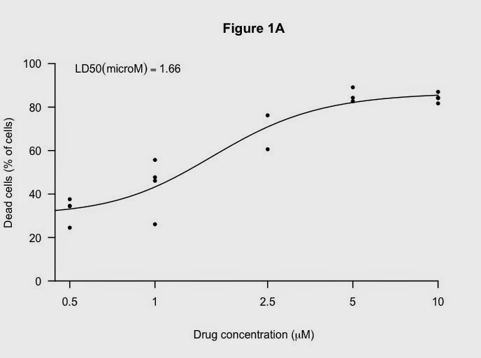
Working through some of these things using the data from the LD50 graph previously:

Here is the default graph:


From the default code:

plot(data$nM, data$dead.cells, 
    )

Make the x-axis log tranformed, add limits and change symbols:


Here is the code:

# Add log axis, x and y limits and change the symbols
plot(data$nM, data$dead.cells, 
     log="x", # makes it a log plot
     pch=20, # gives small black dots instead of empty circles
     xlim= c(500, 10000),
     ylim= c(0,100),
    ) 

Key next step is to suppress everything except the points. It looks a very odd:
Here is the code:
plot(data$nM, data$dead.cells, 
     log="x", 
     pch=20,
     xlim= c(500, 10000),
     ylim= c(0,100),
     axes=FALSE, # suppresses the titles on the axes
     ann=FALSE, suppresses the axes and the box  
  ) 


Now,  add back axis first:

Code:
axis(1, at=c(200, 500, 1000, 2500, 5000, 10000), # x-axis 
     lab=c("","0.5","1","2.5","5","10"), 
     lwd=2, # thicker lines
     pos=0)  # puts the x-axis at zero rather than floating 
axis(2, at=c(0, 20, 40, 60, 80,100), # y-axis
     lab=c("0", "20", "40", "60", "80", "100"), 
     lwd=2, 
     las=1) # turns the numbers so easier to read

Next, add titles (I like the Greek symbol in the x-axis):


Code:
title("Figure 1A", 
      xlab= expression(paste("Drug concentration (", mu, "M)")), 
      # not the word "micro"
      ylab= "Dead cells (% of cells)")

And a nice black fitted line:


Code:
# adds the fitted non-linear line 
lines(10^x,y, lty=1, lwd =2)

Finally, add the LD50 again:


using this code:
# add the LD50 in the legend which allows nice positioning. 
rp = vector('expression',1)
rp[1] = substitute(expression(LD50(microM) == MYVALUE), 
                   list(MYVALUE = format((10^m[3])/1000,dig=3)))[2]
legend('topleft', legend = rp, bty = 'n')


The full code for this script and the others mentioned in this blog are available on Github.

I used these resources to develop this script:

Graphical Output from R-Studio...

After generating my nice graphs, I want to share them with people. It's easy to do this with R-Studio: you can just Export the graphs. The key button is just above the graph and you have options of exporting as an Image or as PDF.

Here is the location of the button:

Very useful for sharing with bosses and collaborators. PDF files can be imported into other programmes like Adobe Illustrator for improving the layout, font, etc....