Sunday, 30 April 2017

Three maps of Namibia...

Two colleagues, Dr Mark Kelson and Dr David Gillipse, and I are going to Namibia as part of Project Phoenix. We are planning three days of R training. The materials are being developed and shared on Github as an open source teaching and learning resource.

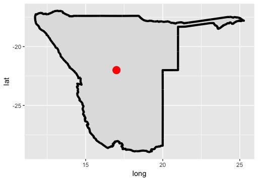
Before I travel, I'm trying to learn a little more about where I'm going. As a first step, I've been drawing some maps of Namibia. Here are some of the maps:

Colourful map made by library(maps) - Map 1 below.


Map of regions of Namibia made by library(sp) - map 2 below

Map made with library(ggplot2) - map 3 below
I like using ggplot2 but, of course, there is a lot of personal preference. My next step is to add some data to a map... 


## START SCRIPT

# exploring various ways to draw Namibia in R 
# three ways....

## MAP 1 with library(maps)
library(maps)       # Provides functions that let us plot the maps
library(mapdata)    # Contains the hi-resolution points that mark out the countries.

# https://cran.r-project.org/web/packages/maps/maps.pdf
# gives a nice outline
map('worldHires',
    c('Namibia'))
# add some context by adding more countries
map('worldHires',
    c('Namibia', 'South Africa', 'Botswana', 'Angola', 
      'Zambia', 'Zimbabwe', 'Mozambique'))

# show all of Africa
# map the world but limit by longitude and latitude
map('worldHires', 
    xlim=c(-20,60),  # longitude
    ylim=c(-35,40))  # latitude

# focus on countries in Southern Africa
map('worldHires', 
    xlim=c(-10,50), 
    ylim=c(-35,10)) 

# add colour and a title
map('worldHires', 
    xlim=c(-10,50), 
    ylim=c(-35,10),
    fill = TRUE,
    col = c("red", "palegreen", "lightblue", "orange", "pink"))
title(main = "Simple map of Southern Africa")
## MAP 2 with library(sp) and downloaded GADM data 
# this allows us to plot administrative regions inside Namibia
# https://www.students.ncl.ac.uk/keith.newman/r/maps-in-r-using-gadm
# http://biogeo.ucdavis.edu/data/gadm2.8/rds/NAM_adm1.rds

library(sp)

# download the file 
link <- "http://biogeo.ucdavis.edu/data/gadm2.8/rds/NAM_adm1.rds"
download.file(url=link, destfile="file.rda", mode="wb")
gadmNab <- readRDS("file.rda")  # special read file of format RDA

plot(gadmNab)    
# plot with colour filled in, title and label. 
plot(gadmNab, col = 'lightgrey', border = 'darkgrey')
title(main = "Map of admin regions inside Namibia")
points(17.0658, -22.5609,col=2,pch=18)
text(17, -22, "Windhoek")
## MAP 3 with library(ggplot2)
# the advantage is that we can add layers to our plot
# it gives us control
library(ggplot2)
# use map_data()function to create a data.frame containing the outline of Namibia
nab_map<-map_data("worldHires", region = "Namibia")

# create the object m with the map in it. 
# colour Namibia (grey)
m <- ggplot() +
  geom_polygon(data=nab_map,   # geom_polygon draw shape fill
               aes(x=long,     # longitude
                   y=lat,      # latitude
                   group=group),
               fill="gray88") 
m  # show the object

# modify the object to add a thick black line
m <- m + geom_path(data=nab_map,    # geom_path draw shape outline 
              aes(x=long, y=lat, group=group),
              colour="black",  # colour of line
              lwd = 1.5)       # thickness
m    # show it again


# add the points on the plot telling us where the longitude and latitude of Windhoek
# note the data is coming from a different data.frame to the map
location <- data.frame(c(17), c(-22), c("Windhoek"))
colnames(location) <- c("longitude", "latitude", "location")

# add a point with the location
m <- m +  geom_point(data=location, 
                     aes(x=longitude, y=latitude), 
                     colour="red", size = 5) 
m  # show the object

# add text at the same point
m <- m + geom_text(data = location, 
                   aes(x=longitude, 
                       y=latitude, 
                       label = location))  # label has the text

# change the theme to make the map nicer
m <- m + theme_bw()

# add a title
m + ggtitle("Map of Namibia in ggplot")
## END SCRIPT

# see here for more about colours in R
# http://www.stat.columbia.edu/~tzheng/files/Rcolor.pdf


Resources:


Thursday, 27 April 2017

Scraping and visualising global vaccination recommendations with R...

As part of my job, I'm required to check the TravelHealthPro website which contains information about the recommended vaccinations when visiting other countries. For example, for a visit to Namibia, TravelHealthPro advises that most visitors have vaccinations to:
  • Hepatitis A
  • Tetanus
  • Typhoid
When the Cardiff R User Group decided to discuss and work on web scraping, I decided to scrape the TravelHealthPro web site and prepare some maps with selected recommended vaccinations. 

Here are some of the world maps, I've prepared:


The script involved some webscraping, some data reformatting and then the visualisations. Here is all the R script involved in making these maps. It was originally prepared as separate scripts to keep it easier for me to understand but I have combined them all here in parts. 

For just the mapping part, it is possible to start halfway with a download from Github of the scraped data (as of April 26th, 2017). To do that start at Part 3.

Feedback welcome as always. 


# START SCRIPT
library("tools")  # uses the toTitleCase() function
library("rvest")  # tidyverse webscraping package
library("curl") 
library("RCurl")  # for downloading data from github
library("rworldmap")  # for the maps

## PART 1: scrape the list of countries from TravelPro Home page
# scrape the page.
# this is the URL
url <- c("http://travelhealthpro.org.uk/countries")

# readLines() is a base R function which allows reading html from pages
data <- readLines(url)
print(paste(url, "has just been scraped"))

# identify where the proteins names are on the scraped data
country_numbers <- grep("travelhealthpro.org.uk/country/", data)
# 317 long... sounds like a good length

# function for removing html tags
# based on http://stackoverflow.com/questions/17227294/removing-html-tags-from-a-string-in-r
extractCountry <- function(htmlString) {
  htmlString <- gsub("<.*?>", "", htmlString)
  htmlString <- gsub("\t", "", htmlString)
  return(htmlString)
}

extractCountry(data[country_numbers[4]])

# function for extracting the url for each country
extractCountryUrl <- function(htmlString) {
  htmlString <- gsub("\\t<li><a href=", "", htmlString)
  htmlString <- gsub("</a></li>", "", htmlString)
  htmlString <- gsub("\"", "", htmlString)
  htmlString <- gsub(">.*", "", htmlString)
  return(htmlString)
}
# test the function
extractCountryUrl(data[country_numbers[7]])

# loop through the character vector and create a vector of countries
# and a vectors of URLs
countryList <- NULL
countryUrls <- NULL
for(i in 1:length(country_numbers)){
  reqd_url <- extractCountryUrl(data[country_numbers[i]])
  country <- extractCountry(data[country_numbers[i]])
  countryList <- c(countryList, country)
  countryUrls <- c(countryUrls, reqd_url)
}

# I have a list of countries and a list of URLs
countryList # up to 276 looks ok - Zimbabwe should be last
# truncate at Zimbabwe
zimb <- grep("Zimbabwe", countryList)
countryList <- countryList[1:zimb]
countryUrls <- countryUrls[1:zimb]


## PART 2: with list of countries, extract vaccination info... 
# I am attempting to scrape vaccinations recommendations
# from a Travel Health Pro website on a particular country.
# the example here is travel health pro page about afghanistan
# this is the page
# http://travelhealthpro.org.uk/country/1/afghanistan#Vaccine_recommendations

# scraping the webpage is all in this function
extractVacs <- function(x){
  # scrape the page  
  web_content <- read_html(curl(x, handle = new_handle("useragent" = "Chrome")))
  # handle is required as extra data and curl package is required too 
  print(paste(x, "has just been scraped"))
  
  # extracting the data using pipes 
  vac_list_most <- web_content %>% 
    html_node(".accordion") %>%     # Note this is html_node - first one (Most Travellers)
    html_nodes(".accordion-item")  %>%
    html_node("p") %>%
    html_text(trim = FALSE)
  
  vac_list_some <- web_content %>% 
    html_nodes(".accordion") %>%     # Note this is html_nodes - all vaccinations!
    html_nodes(".accordion-item")  %>%
    html_node("p") %>%
    html_text(trim = FALSE)
  
  # using gsub to remove the spaces and the line brake symbol
  vac_list_most <- gsub("\n", "", vac_list_most)
  vac_list_most <- gsub("  ", "", vac_list_most)
  vac_list_some <- gsub("\n", "", vac_list_some)
  vac_list_some <- gsub("  ", "", vac_list_some)
  
  #substract vac_list_most from vac_list_some
  vac_list_some <- setdiff(vac_list_some, vac_list_most)
  
  countryName <- gsub("http://travelhealthpro.org.uk/country/", "", x)
  countryName <- gsub("[[:digit:]]+", "", countryName)
  countryName <- gsub("/", "", countryName)
  countryName <- toTitleCase(countryName)
  
  # make the list with country name and the two vaccinations lists...
  vac_list <- list(country = countryName, vac_most = vac_list_most, vac_some = vac_list_some)
  
  # this works and returns a list. 
  return(vac_list)
}

# test the code
vac_list_example <- extractVacs(countryUrls[2])
vac_list_example
# works

# for demo purposes - just scrape four 
output_demo <- lapply(countryUrls[7:10], extractVacs)

# to scrape all the countries, remove the hash tag and run the whole thing
# output <- lapply(countryUrls, extractVacs)

# it's a good plan to save this file so that it doesn't have to be scraped again
# save(output, file = "vaccinationList_scraped20170426")
# and save the country list 
# save(countryList, file = "countryList_scraped20170426")

## PART 3: If you don't want to scrape the data - download it...

link <- "https://raw.githubusercontent.com/brennanpincardiff/RforBiochemists/master/data/countryList_scraped20170426.rda"
download.file(url=link, destfile="file.rda", mode="wb")
countryList <- readRDS("file.rda")

link <- "https://raw.githubusercontent.com/brennanpincardiff/RforBiochemists/master/data/vaccinationList_scraped20170426.rda"
download.file(url=link, destfile="file.rda", mode="wb")
output <- readRDS("file.rda")

# add "Ivory Coast" to the country List for future binding into rworldmap
countryList <- c(countryList, "Ivory Coast")
# add a new element to list with Ivory Coast 
ivory <- output[grep("Ivory", output)]
ivory[[1]]$country <- c("Ivory Coast")
ivory[[1]]
output <- c(output, ivory[1])  # just one square bracket N.B.

# so we have a list of vaccinations and countries that is 277 long

# have a list of 277 with the vaccinations in...
# and looks good. 

# next step - turn these two objects into something to do a visualiation. 

## PART 4: Clean up vaccinations list

# get the whole unique list of vaccinations/drugs is not trivial
# inconsistent labelling on the site

vac_req_mostTrav <- unique(unlist(lapply(output, '[[', 2)))
# white space issue for Hepatitis A

vac_req_someTrav <- unique(unlist(lapply(output, '[[', 3)))
# trailing white space and capitalisation issues for TBE
# "Tick-Borne Encephalitis (TBE)"
# "Tick-Borne Encephalitis (TBE) "
# "Tick-borne encephalitis (TBE)"
# "Tick-borne encephalitis (TBE) " 


# apply toTitleCase and some gsubs in each element in output
for(i in 1:length(output)){
  output[[i]] <- lapply(output[[i]], toTitleCase)
  output[[i]]$country <- gsub("-", " ", output[[i]]$country)
  output[[i]]$vac_most <- gsub("Hepatitis a", "Hepatitis A", output[[i]]$vac_most)
  output[[i]]$vac_some <- gsub("Hepatitis a", "Hepatitis A", output[[i]]$vac_some)
  output[[i]]$vac_some <- gsub("Tick-Borne Encephalitis (TBE) ", 
                               "Tick-Borne Encephalitis (TBE)", 
                               output[[i]]$vac_some)
}
# toTitleCase will change Hepatitis A to Hepatitis a so change it back...


## PART 5: Pull out countries with vaccinations we're interested in...
# want a data frame with country in one column
# then I want a column entitled Hep A, Polio etc...

vac_df <- data.frame(countryList, stringsAsFactors = FALSE)
colnames(vac_df) <- c("country")

# go through each element in the list (lapply)
# use a function to see if the vaccination I want is required...

# example: Polio
polioStatus <- lapply(1:length(output), function(x){"Polio" %in% output[[x]]$vac_most})
vac_df$polio <- unlist(polioStatus)
vac_df$polio_val <- as.numeric(vac_df$polio)

# Yellow Fever
yellFevStatus <- lapply(1:length(output), function(x){"Yellow Fever" %in% output[[x]]$vac_most})
vac_df$yellFev <- unlist(yellFevStatus)
vac_df$yellFev_val <- as.numeric(vac_df$yellFev)

# Tick-Borne Encephalitis (TBE)
tbeStatus <- lapply(1:length(output), function(x){"Tick-Borne Encephalitis (TBE)" %in% output[[x]]$vac_some})
vac_df$tbe <- unlist(tbeStatus)
vac_df$tbe_val <- as.numeric(vac_df$tbe)


## PART 6: join the data into the countries in rworldmap package
#join to a coarse resolution map
spdf <- joinCountryData2Map(vac_df, joinCode="NAME", nameJoinColumn="country")

# 211 codes from your data successfully matched countries in the map
# 66 codes from your data failed to match with a country code in the map
# 32 codes from the map weren't represented in your data

# where polio vaccination is recommended to most travellers 
mapCountryData(spdf, nameColumnToPlot="polio_val",
               catMethod="fixedWidth",
               addLegend = FALSE,
               mapTitle = "Polio Vaccination Recommended")
text(0,-90, "Source: http://travelhealthpro.org.uk/")

# where yellow fever vaccination is recommended to most travellers 
mapCountryData(spdf, nameColumnToPlot="yellFev_val",
               catMethod="fixedWidth",
               addLegend = FALSE,
               mapTitle = "Yellow Fever Vaccination Recommended")
text(0,-90, "Source: http://travelhealthpro.org.uk/")

# where Tick-Borne Encephalitis vaccination is recommended to some travellers
mapCountryData(spdf, nameColumnToPlot="tbe_val",
               catMethod="fixedWidth",
               addLegend = FALSE,
               mapTitle = "Tick-Borne Encephalitis \nVaccination Recommended (some travellers)")
text(0,-90, "Source: http://travelhealthpro.org.uk/")

# zoom on Africa for Yellow Fever data
mapCountryData(spdf, nameColumnToPlot="yellFev_val",
               catMethod="fixedWidth",
               mapRegion = "Africa",
               addLegend = FALSE,
               mapTitle = "Yellow Fever Vaccination Recommended")
text(10,-35, "Source: http://travelhealthpro.org.uk/")
## END SCRIPT

Useful Resources and further reading


Monday, 6 March 2017

Exploring the chance of dying using the UK Life Tables

I am working towards creating a Men's Health Data Visualisation for the Battle of the Beards, an IT conference to be held in Cardiff at the end of March.

I was inspired by Professor David Spiegelhalter from the University of Cambridge. I heard him talk at Cardiff University. He has a blog about Uncertainty and this graph is inspired one of his blog posts. I've been reading his book entitled The Norm Chronicles (written with Michael Blastland) - all about risk, life and death.

My starting point for my exploration of Men's Health is a graph that can calculate my chance of dying this year. As my source, I'm using the UK Life Tables which have calculated the chance of dying between birthdays.

I became a bit more worried about dying as I got older and particularly when I became a father. My chance of dying at 47 is 1 in 390. However, I wanted to develop habits that would reduce this chance a little. More about that next time...


START

# I am preparing a session for the Battle of the Beards
# It's an IT conference with difference 
# Fight male suicide at “The Battle of the Beards”
# Talking tech & making a difference
# Cardiff | 29 March 2017
# http://battleofthebeards.info/

library(readxl)
library(ggplot2)

# my preparation involves exploring the UK National Life Tables
# these are available through the Office of National Statistics
# as an excel file from this page: 
# https://www.ons.gov.uk/peoplepopulationandcommunity/birthsdeathsandmarriages/lifeexpectancies/datasets/nationallifetablesunitedkingdomreferencetables
# the can be downloaded from here:
ons_url <- c("https://www.ons.gov.uk/file?uri=/peoplepopulationandcommunity/birthsdeathsandmarriages/lifeexpectancies/datasets/nationallifetablesunitedkingdomreferencetables/current/nltuk1315reg.xls")
# to guarantee undistrubed access, I've put the file on github 
github_url <- "https://raw.githubusercontent.com/brennanpincardiff/RforBiochemists/master/data/nltuk1315reg.xls"

# the download.file() function downloads and saves the file with the name given
download.file(url=ons_url,destfile="file.xls", mode="wb")
# if this doesn't work try replacing the url with the github_url
# then we can open the file and extract the data using the read_excel() function. 
data<- read_excel("file.xls", sheet = 5, skip = 6)

# need to remove four bottom rows - these are all blank. 
data <- data[1:101,]

colnames(data)

# x = age in years
# first set is males and second set is females
# mx is the central rate of mortality, defined as the number of deaths at age x last birthday in the three year period to which the National Life Table 
# relates divided by the average population at that age over the same period.

# qx is the mortality rate between age x and (x +1), that is the probability that a person aged x exact will die before reaching age (x +1).

# lx is the number of survivors to exact age x of 100,000 live births of the same sex who are assumed to be subject throughout their lives to the
# mortality rates experienced in the three year period to which the National Life Table relates.

# dx is the number dying between exact age x and (x +1) described similarly to lx, that is dx=lx-lx+1.

# ex is the average period expectation of life at exact age x, that is the average number of years that those aged x exact will live thereafter
# based on the mortality rates experienced in the three year period to which the National Life Table relates.

# to allow us to separate the male and female data, I am relabelling the column names

colnames(data) <- c("age", 
                    "m.mx", "m.qx", "m.lx", "m.dx", "m.ex",
                    "f.mx", "f.qx", "f.lx", "f.dx", "f.ex")


# the life table allow us to draw some interesting curves
# the first one I want to explore is my chance of dying this year. 

# qx is the key value. 
# the chance of my dying before my next birthday. 

# here is the graph in ggplot
ggplot(data = data,
       aes(x = age, y = m.qx)) +
  geom_point()


# The log 10 plots give an interesting pattern. 
# first shown to me by Professor David Spiegelhalter
# Here it is in my blog https://understandinguncertainty.org/what-your-effective-age
ggplot(data = data,
       aes(x = age, y = log10(m.qx))) +
  geom_point() 


# Another way to change the scale on the y-axis using scale_y_log10()
ggplot(data = data,
       aes(x = age, y = m.qx)) +
  geom_point() +
  scale_y_log10()


# let's make this look a bit nicer with lines, titles and a theme...
# make the object p
p <- ggplot(data = data,
            aes(x = age, y = m.qx)) +
     geom_line(colour = "red") +
     geom_point(colour = "red", size = 0.75) +
     ylab("Chance of dying") +
     xlab("Current Age") +
     ggtitle("Chance of Dying before next Birthday") + 
     scale_y_log10() +
     theme_bw()     

p   # show the object


# label on y axis is not the most useful, I think. 
# good learning point here on customising the y-axis label.
# added as arguments in the scale_y_log10()

p <- ggplot(data = data,
       aes(x = age, y = m.qx)) +
  geom_line(colour = "red") +
  geom_point(colour = "red", size = 0.75) +
  ylab("Chance of dying") +
  xlab("Current Age") +
  ggtitle("Chance of Men Dying before next Birthday") + 
  scale_y_log10(
    breaks = c(0.0001, 0.001, 0.01, 0.1, 0.5),  # where to put labels
    labels = c("1/10,000", "1/1000", "1/100", "1/10", "1/2")) +  # the labels 
  theme_bw() 

p  # show the object


# add source of the data
source <- paste("Source: Office of National Statistics\n filename: nltuk1315reg.xls\n accessed:", Sys.Date())
p + annotate("text",  x = 70, y = 0.0001, label=source, size=3)


# more info available from the Office of National Statistics here:
# https://www.ons.gov.uk/peoplepopulationandcommunity/birthsdeathsandmarriages/lifeexpectancies

Thursday, 2 March 2017

Using 'pipes' in R for easier reading code

The magrittr package allows us to write code using 'pipes'. The code is a little easier to read. Easier code to read is easier to share, document and use which appeals to me. I think it makes it more open and I'm a big fan of open science.

Using pipes avoids us piling up our functions on single lines and encourages me to layout my code in a more organised way.
Pipes allows space for documentation, explanations and comments.
I have used pipes to create this cluster diagram to illustrate the point:


Consider adding the use of pipes to your code to make it easier for others.


Here's is the script:

# START 
# download the data from github
library(RCurl)
x <- getURL("https://raw.githubusercontent.com/brennanpincardiff/RforBiochemists/master/data/microArrayData.tsv")
data <- read.table(text = x, header = TRUE, sep = "\t")

# when we have a workflow that we like there is a tendency to pile up our functions

# here is an example:
plot(hclust(dist(t(data[2:15]))))

# the introduction of the magrittr piping function into R..x
# allows us to do this in a way that make a work flow easier to view and easier to comment

# install.packages("magrittr") # if required
library(magrittr)
# https://cran.r-project.org/web/packages/magrittr/vignettes/magrittr.html

data[2:15] %>%   # subset the object (columns 2:15 of the dataframe)
  t() %>%        # transform it so that columns are rows
  dist() %>%     # calculate distance
  hclust() %>%   # do a hierarchical cluster
  plot()         # then plot the result. 

# this approach really makes life easier when we have arguments in our functions
# we can change the method for the dist() function
# and we can add a title and some colour with the plot() function
# using pipes, this looks like this:

data[2:15] %>%          # create a subset of object data (cols 2:15)
  t() %>%               # transform it so that columns are rows
  dist(method = "manhattan") %>%    # calc dist with manhattan meth
  hclust() %>%                      # do a hierarchial cluster
  plot(main="Cluster Diagram of Drug Treatments\n(2 Mar 2017)",     # add a title
       lwd=2, col="blue", cex = 1.1) # thick line & change colours  


# this code the other way looks like this:
plot(hclust(dist(t(data[2:15]), method = "manhattan")),
     main="Cluster Diagram of Drug Treatments\n(2 Mar 2017)", # add a title
     lwd=2, col="blue", cex = 1.1)

# it's a little bit difficult to separate the functions, objects and arguments in my opinion

# N.B. three key points to remember about using pipes:
# (1) brackets remain to allow us to identify functions()
# (2) the arguments go within the brackets - not the objects
# (3) objects are now 'piped' into the functions using %>%
# END

There are lots of blog posts about pipes and magrittr. Just search....

Hat tip to Steph Locke and Dave from the Cardiff R User group for encouraging me to use pipes.