Showing posts with label Namibia. Show all posts

Thursday, 8 June 2017

Making a Namibia choropleth

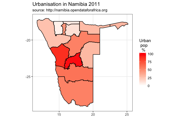
According to Wikipedia, a choropleth map uses differences in shading, colouring, or the placing of symbols within predefined areas to indicate the average values of a particular quantity in those areas. I thought it would be interesting to make one of these in R for Namibia. I'm going to Namibia on Saturday as part of Project Phoenix, a partnership project between Cardiff University and University of Namibia.

I have used some data about urbanisation in Namibia which I downloaded from the Open Data for Africa website. This data shows some nice variation across the regions of Namibia.

Here is an example of the what can be done:


Here is the code and maps made along the way:

START
## map urbanisation data onto Namibia administrative regions. 

## step 1: download the map data

## download the file...
library(sp) 
link <- "http://biogeo.ucdavis.edu/data/gadm2.8/rds/NAM_adm1.rds"
download.file(url=link, destfile="file.rda", mode="wb")
gadmNab <- readRDS("file.rda")

## step 2: simplify the level of detail...
library(rmapshaper)
gadmNabS <- ms_simplify(gadmNab, keep = 0.01)
plot(gadmNabS)


## step 3: turn it into a ggplot object and plot
library(broom)
library(gpclib)
library(ggplot2)
namMapsimple <- tidy(gadmNabS, region="NAME_1")
ggplot(data = namMapsimple,
       aes(x = long, y = lat, group = group)) + 
       geom_polygon(aes(fill = "red"))


# check region names
unique(namMapsimple$id)
# the exclamation mark before Karas will cause a problem. 
namMapsimple$id <- gsub("!", "", namMapsimple$id)
# check it worked
unique(namMapsimple$id)
# now no exclamation mark


## step 4: let's get our data and bind it...
# download the data about urbanisation
library(RCurl)
x <- getURL("https://raw.githubusercontent.com/brennanpincardiff/learnR/master/data/Namibia_region_urbanRural.csv")
data <- read.csv(text = x)
# exclude whole country
data_regions <- data[!data$region=="Namibia",]
# so extact 2011 data from the data_regions
data_regions2011 <- data_regions[data_regions$Date == 2011, ]
# just extract urban
data_regions2011_urban <- data_regions2011[data_regions2011$residence == "Urban",]
# change colnames so that we can merge by id...
data_col_names <- colnames(data_regions2011_urban)
data_col_names[1] <- c("id")
colnames(data_regions2011_urban) <- data_col_names

# bind the urbanisation data into map with merge
mapNabVals <- merge(namMapsimple, 
                    data_regions2011_urban,
                    by.y = 'id')

p <- ggplot() +     # sometimes don't add any aes...
     geom_polygon(data = mapNabVals,
                  aes(x = long, y = lat,
                  group = group,
                  fill = Value))
p


# plot the outlines of the administrative regions
p <- p + geom_path(data=namMapsimple, 
              aes(x=long, y=lat, group=group))
p


p <- p + scale_fill_gradient("Urban\n pop\n  %",
                      low = "white", high = "red",
                      limits=c(0, 100))
p


p <- p +   coord_map()  # plot with correct mercator projection
p


# add titles 
p <- p + labs(x = "",         # label x-axis
                y = "",  # label y-axis
                title = "Urbanisation in Namibia 2011",
                subtitle = "source: http://namibia.opendataforafrica.org")
  
p + theme_bw()


# maybe get rid of long, lat etc..

p <- p + theme_bw() +
  theme(panel.grid.minor=element_blank(), panel.grid.major=element_blank()) + 
  theme(axis.ticks = element_blank(), axis.text.x = element_blank(), axis.text.y = element_blank()) + 
  theme(panel.border = element_blank())
p # show the object


## add names of regions
library(rgeos)
# calculate centroids
trueCentroids = gCentroid(gadmNabS,byid=TRUE)
# make a data frame
name_df <- data.frame(gadmNab@data[,'NAME_1'])
centroids_df <- data.frame(trueCentroids)
name_df <- cbind(name_df, centroids_df)
colnames(name_df) <- c("region", "long", "lat")

# label the regions
p <- p + geom_text(data = name_df,
                     aes(label = region,
                         x = long,
                         y = lat), size = 2)
p


# change different colours
p + scale_fill_gradient("Urban\n population\n  %",
                        low = "white", high = "blue")


p + scale_fill_gradient("Urban\n pop\n  %",
                        low = "white", high = "green")


# If you want to save this... export or use the ggave() function
p + ggsave("Namibia_Urbanisation_Map_2011.pdf")

END


Resources:


Sunday, 30 April 2017

Three maps of Namibia...

Two colleagues, Dr Mark Kelson and Dr David Gillipse, and I are going to Namibia as part of Project Phoenix. We are planning three days of R training. The materials are being developed and shared on Github as an open source teaching and learning resource.

Before I travel, I'm trying to learn a little more about where I'm going. As a first step, I've been drawing some maps of Namibia. Here are some of the maps:

Colourful map made by library(maps) - Map 1 below.


Map of regions of Namibia made by library(sp) - map 2 below

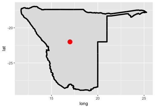
Map made with library(ggplot2) - map 3 below
I like using ggplot2 but, of course, there is a lot of personal preference. My next step is to add some data to a map... 


## START SCRIPT

# exploring various ways to draw Namibia in R 
# three ways....

## MAP 1 with library(maps)
library(maps)       # Provides functions that let us plot the maps
library(mapdata)    # Contains the hi-resolution points that mark out the countries.

# https://cran.r-project.org/web/packages/maps/maps.pdf
# gives a nice outline
map('worldHires',
    c('Namibia'))
# add some context by adding more countries
map('worldHires',
    c('Namibia', 'South Africa', 'Botswana', 'Angola', 
      'Zambia', 'Zimbabwe', 'Mozambique'))

# show all of Africa
# map the world but limit by longitude and latitude
map('worldHires', 
    xlim=c(-20,60),  # longitude
    ylim=c(-35,40))  # latitude

# focus on countries in Southern Africa
map('worldHires', 
    xlim=c(-10,50), 
    ylim=c(-35,10)) 

# add colour and a title
map('worldHires', 
    xlim=c(-10,50), 
    ylim=c(-35,10),
    fill = TRUE,
    col = c("red", "palegreen", "lightblue", "orange", "pink"))
title(main = "Simple map of Southern Africa")
## MAP 2 with library(sp) and downloaded GADM data 
# this allows us to plot administrative regions inside Namibia
# https://www.students.ncl.ac.uk/keith.newman/r/maps-in-r-using-gadm
# http://biogeo.ucdavis.edu/data/gadm2.8/rds/NAM_adm1.rds

library(sp)

# download the file 
link <- "http://biogeo.ucdavis.edu/data/gadm2.8/rds/NAM_adm1.rds"
download.file(url=link, destfile="file.rda", mode="wb")
gadmNab <- readRDS("file.rda")  # special read file of format RDA

plot(gadmNab)    
# plot with colour filled in, title and label. 
plot(gadmNab, col = 'lightgrey', border = 'darkgrey')
title(main = "Map of admin regions inside Namibia")
points(17.0658, -22.5609,col=2,pch=18)
text(17, -22, "Windhoek")
## MAP 3 with library(ggplot2)
# the advantage is that we can add layers to our plot
# it gives us control
library(ggplot2)
# use map_data()function to create a data.frame containing the outline of Namibia
nab_map<-map_data("worldHires", region = "Namibia")

# create the object m with the map in it. 
# colour Namibia (grey)
m <- ggplot() +
  geom_polygon(data=nab_map,   # geom_polygon draw shape fill
               aes(x=long,     # longitude
                   y=lat,      # latitude
                   group=group),
               fill="gray88") 
m  # show the object

# modify the object to add a thick black line
m <- m + geom_path(data=nab_map,    # geom_path draw shape outline 
              aes(x=long, y=lat, group=group),
              colour="black",  # colour of line
              lwd = 1.5)       # thickness
m    # show it again


# add the points on the plot telling us where the longitude and latitude of Windhoek
# note the data is coming from a different data.frame to the map
location <- data.frame(c(17), c(-22), c("Windhoek"))
colnames(location) <- c("longitude", "latitude", "location")

# add a point with the location
m <- m +  geom_point(data=location, 
                     aes(x=longitude, y=latitude), 
                     colour="red", size = 5) 
m  # show the object

# add text at the same point
m <- m + geom_text(data = location, 
                   aes(x=longitude, 
                       y=latitude, 
                       label = location))  # label has the text

# change the theme to make the map nicer
m <- m + theme_bw()

# add a title
m + ggtitle("Map of Namibia in ggplot")
## END SCRIPT

# see here for more about colours in R
# http://www.stat.columbia.edu/~tzheng/files/Rcolor.pdf


Resources: