Monday, 6 March 2017

Exploring the chance of dying using the UK Life Tables

I am working towards creating a Men's Health Data Visualisation for the Battle of the Beards, an IT conference to be held in Cardiff at the end of March.

I was inspired by Professor David Spiegelhalter from the University of Cambridge. I heard him talk at Cardiff University. He has a blog about Uncertainty and this graph is inspired one of his blog posts. I've been reading his book entitled The Norm Chronicles (written with Michael Blastland) - all about risk, life and death.

My starting point for my exploration of Men's Health is a graph that can calculate my chance of dying this year. As my source, I'm using the UK Life Tables which have calculated the chance of dying between birthdays.

I became a bit more worried about dying as I got older and particularly when I became a father. My chance of dying at 47 is 1 in 390. However, I wanted to develop habits that would reduce this chance a little. More about that next time...


START

# I am preparing a session for the Battle of the Beards
# It's an IT conference with difference 
# Fight male suicide at “The Battle of the Beards”
# Talking tech & making a difference
# Cardiff | 29 March 2017
# http://battleofthebeards.info/

library(readxl)
library(ggplot2)

# my preparation involves exploring the UK National Life Tables
# these are available through the Office of National Statistics
# as an excel file from this page: 
# https://www.ons.gov.uk/peoplepopulationandcommunity/birthsdeathsandmarriages/lifeexpectancies/datasets/nationallifetablesunitedkingdomreferencetables
# the can be downloaded from here:
ons_url <- c("https://www.ons.gov.uk/file?uri=/peoplepopulationandcommunity/birthsdeathsandmarriages/lifeexpectancies/datasets/nationallifetablesunitedkingdomreferencetables/current/nltuk1315reg.xls")
# to guarantee undistrubed access, I've put the file on github 
github_url <- "https://raw.githubusercontent.com/brennanpincardiff/RforBiochemists/master/data/nltuk1315reg.xls"

# the download.file() function downloads and saves the file with the name given
download.file(url=ons_url,destfile="file.xls", mode="wb")
# if this doesn't work try replacing the url with the github_url
# then we can open the file and extract the data using the read_excel() function. 
data<- read_excel("file.xls", sheet = 5, skip = 6)

# need to remove four bottom rows - these are all blank. 
data <- data[1:101,]

colnames(data)

# x = age in years
# first set is males and second set is females
# mx is the central rate of mortality, defined as the number of deaths at age x last birthday in the three year period to which the National Life Table 
# relates divided by the average population at that age over the same period.

# qx is the mortality rate between age x and (x +1), that is the probability that a person aged x exact will die before reaching age (x +1).

# lx is the number of survivors to exact age x of 100,000 live births of the same sex who are assumed to be subject throughout their lives to the
# mortality rates experienced in the three year period to which the National Life Table relates.

# dx is the number dying between exact age x and (x +1) described similarly to lx, that is dx=lx-lx+1.

# ex is the average period expectation of life at exact age x, that is the average number of years that those aged x exact will live thereafter
# based on the mortality rates experienced in the three year period to which the National Life Table relates.

# to allow us to separate the male and female data, I am relabelling the column names

colnames(data) <- c("age", 
                    "m.mx", "m.qx", "m.lx", "m.dx", "m.ex",
                    "f.mx", "f.qx", "f.lx", "f.dx", "f.ex")


# the life table allow us to draw some interesting curves
# the first one I want to explore is my chance of dying this year. 

# qx is the key value. 
# the chance of my dying before my next birthday. 

# here is the graph in ggplot
ggplot(data = data,
       aes(x = age, y = m.qx)) +
  geom_point()


# The log 10 plots give an interesting pattern. 
# first shown to me by Professor David Spiegelhalter
# Here it is in my blog https://understandinguncertainty.org/what-your-effective-age
ggplot(data = data,
       aes(x = age, y = log10(m.qx))) +
  geom_point() 


# Another way to change the scale on the y-axis using scale_y_log10()
ggplot(data = data,
       aes(x = age, y = m.qx)) +
  geom_point() +
  scale_y_log10()


# let's make this look a bit nicer with lines, titles and a theme...
# make the object p
p <- ggplot(data = data,
            aes(x = age, y = m.qx)) +
     geom_line(colour = "red") +
     geom_point(colour = "red", size = 0.75) +
     ylab("Chance of dying") +
     xlab("Current Age") +
     ggtitle("Chance of Dying before next Birthday") + 
     scale_y_log10() +
     theme_bw()     

p   # show the object


# label on y axis is not the most useful, I think. 
# good learning point here on customising the y-axis label.
# added as arguments in the scale_y_log10()

p <- ggplot(data = data,
       aes(x = age, y = m.qx)) +
  geom_line(colour = "red") +
  geom_point(colour = "red", size = 0.75) +
  ylab("Chance of dying") +
  xlab("Current Age") +
  ggtitle("Chance of Men Dying before next Birthday") + 
  scale_y_log10(
    breaks = c(0.0001, 0.001, 0.01, 0.1, 0.5),  # where to put labels
    labels = c("1/10,000", "1/1000", "1/100", "1/10", "1/2")) +  # the labels 
  theme_bw() 

p  # show the object


# add source of the data
source <- paste("Source: Office of National Statistics\n filename: nltuk1315reg.xls\n accessed:", Sys.Date())
p + annotate("text",  x = 70, y = 0.0001, label=source, size=3)


# more info available from the Office of National Statistics here:
# https://www.ons.gov.uk/peoplepopulationandcommunity/birthsdeathsandmarriages/lifeexpectancies

Thursday, 2 March 2017

Using 'pipes' in R for easier reading code

The magrittr package allows us to write code using 'pipes'. The code is a little easier to read. Easier code to read is easier to share, document and use which appeals to me. I think it makes it more open and I'm a big fan of open science.

Using pipes avoids us piling up our functions on single lines and encourages me to layout my code in a more organised way.
Pipes allows space for documentation, explanations and comments.
I have used pipes to create this cluster diagram to illustrate the point:


Consider adding the use of pipes to your code to make it easier for others.


Here's is the script:

# START 
# download the data from github
library(RCurl)
x <- getURL("https://raw.githubusercontent.com/brennanpincardiff/RforBiochemists/master/data/microArrayData.tsv")
data <- read.table(text = x, header = TRUE, sep = "\t")

# when we have a workflow that we like there is a tendency to pile up our functions

# here is an example:
plot(hclust(dist(t(data[2:15]))))

# the introduction of the magrittr piping function into R..x
# allows us to do this in a way that make a work flow easier to view and easier to comment

# install.packages("magrittr") # if required
library(magrittr)
# https://cran.r-project.org/web/packages/magrittr/vignettes/magrittr.html

data[2:15] %>%   # subset the object (columns 2:15 of the dataframe)
  t() %>%        # transform it so that columns are rows
  dist() %>%     # calculate distance
  hclust() %>%   # do a hierarchical cluster
  plot()         # then plot the result. 

# this approach really makes life easier when we have arguments in our functions
# we can change the method for the dist() function
# and we can add a title and some colour with the plot() function
# using pipes, this looks like this:

data[2:15] %>%          # create a subset of object data (cols 2:15)
  t() %>%               # transform it so that columns are rows
  dist(method = "manhattan") %>%    # calc dist with manhattan meth
  hclust() %>%                      # do a hierarchial cluster
  plot(main="Cluster Diagram of Drug Treatments\n(2 Mar 2017)",     # add a title
       lwd=2, col="blue", cex = 1.1) # thick line & change colours  


# this code the other way looks like this:
plot(hclust(dist(t(data[2:15]), method = "manhattan")),
     main="Cluster Diagram of Drug Treatments\n(2 Mar 2017)", # add a title
     lwd=2, col="blue", cex = 1.1)

# it's a little bit difficult to separate the functions, objects and arguments in my opinion

# N.B. three key points to remember about using pipes:
# (1) brackets remain to allow us to identify functions()
# (2) the arguments go within the brackets - not the objects
# (3) objects are now 'piped' into the functions using %>%
# END

There are lots of blog posts about pipes and magrittr. Just search....

Hat tip to Steph Locke and Dave from the Cardiff R User group for encouraging me to use pipes. 

Friday, 20 January 2017

Colouring my kinome phylogenetic tree...

I have been playing with the kinome phylogenetic tree that I made last week inspired by the paper in Science from Manning et al in 2002. The first thing I want to do is to add color to the lines. This has proved a bit more difficult than I had anticipated and was a steep learning curve. It reminds me that data visualisation is a real combination of art, science, coding, time and effort.

Here is a coloured kinome tree that I am kind of happy with for the moment. I think there is some improving still to do but it's nicer than the one coloured version I made before.


The code below uses a very manual approach to manipulating trees. There are various reasons for that and these include the fact that I want to make an unrooted tree. There are ways to manipulate trees using other packages including phytools and ggtree. However, I'm not able to get them to work well with unrooted trees. There is still more to learn....

Here is the code that I used to draw this and some of the trees that I made along the way:

START
library(ape)
library(RCurl)

# a tree was made using code in a previous blog post. 
# see here: http://rforbiochemists.blogspot.co.uk/2017/01/visualizing-kinome-in-r-simple-tree.html
# it's here on github
link <- "https://raw.githubusercontent.com/brennanpincardiff/RforBiochemists/master/phyloTrees/kinaseTree_20161221"

# this will download it into R. 
# using read.tree() from ape package
tree <- read.tree(file = link)

# this tree looks quite nice in my opinion and is the starting point of this blog 
plot(tree, "u", 
     use.edge.length = FALSE,
     show.tip.label = FALSE,
     edge.color = "red")
# but lacking colours for the groups and any labels...


# it seems more traditional to draw trees from left to right. 
plot(tree, 
     use.edge.length = FALSE,
     show.tip.label = FALSE,
     edge.color = "red")

# with some names... this is slow to draw due to the names 
plot(tree, 
     use.edge.length = FALSE,
     edge.color = "red",
     cex = 0.25)


# and you can't read the names because there are >500


# to customise this tree in a way we want we need to understand a little more about trees
# we can find out more about an object by writing the name
tree
# "Phylogenetic tree with 516 tips and 514 internal nodes"

# by using the class() function
class(tree)
# "phylo"

# or by using the str() structure function
str(tree) 
# "List of 4"
# this list includes $edge, $Nnode, $ tip.label and $edge.length
# the tree$tip.label includes family designation
tree$tip.label  # 516 of these

# from the Science paper, we have seven kinase families:
# kinase categories... TK, TKL, STE, CK1, AGC, CAMK, CMGC
# with the following colours
# "red", "green", "paleblue", "orange", "yellow", "purple", "pink", "green" 


# by using the grep()function on the tree$tip.label part of the object
# we can find the tip labels that include "TK/" - i.e. tyrosine kinases
grep("TK/", tree$tip.label)  # gives a list of numbers with "TK/" in tip label
length(grep("TK/", tree$tip.label))
# thus there are 94 tip labels with that are designated TK (not TKL tyrosine kinase like)

# make a vector for each tip.label called tipcol with black on all of these...
tipcol <- rep('black', length(tree$tip.label))

# make a vector with our list of kinase categories
kinaseCats <- c("TK/", "TKL", "STE", "CK1", "AGC", "CAMK", "CMGC", "RGC")

# make a vector of color we want:
colorsList <-c("red", "darkolivegreen3", "blue", "orange", "yellow", "purple", "pink", "green")

# replace colours where grep gives "TK" as red, etc in a loop
for(i in 1:length(kinaseCats)){
  tipcol[grep(kinaseCats[i], tree$tip.label)] <- colorsList[i]
}

# plot with edge length false to see nodes better
plot(tree, 
     use.edge.length = FALSE,
     tip.color=tipcol, 
     cex = 0.25)
# slow to draw due to text - a bit annoying!


Kinome tree with different coloured labels for different kinds of kinases. Tyrosine kinases are in red. 

# trees are made up of nodes and edges. 
# its possible to label nodes using nodelabels() function from ape package
nodelabels(cex=0.4)
# labels internal nodes. 
Internal nodes of the tree are labelled with the number

# the only way seems to identify the relevant nodes manually

# i.e. the nodes that include the kinase groups that we have coloured
# from the bottom
# for 1st "green" looks like node 574
# for "red" looks like node 607
# for 2nd "green" somethink like 701 but very difficult to see
# for "purple" most of 749 and also north of 726 but I can't read the number
# "blue" node 723
# "yellow" node 885, I think
# "pink" node 955, I think
#  not perfect but getting there....

# adding edge colors
# from 111 to 177 should be green
# from 178 to 364 should be red. 
# from 459 to 577 should be purple
# from 578 to 608 should be purple too
# from 641 to 733 should be blue
# from 735 to 850 approx should be yellow
# from 876 to 980 should be pink
# http://stackoverflow.com/questions/34089242/phylogenetic-tree-tip-color
# make a vector for each edge called edgecol with black on all of these...
edgecol <- rep('black', nrow(tree$edge))
edgecol[178:364] <- "red" # "TK/"
edgecol[111:177] <- "green" # "TKL" OR "RGC"
edgecol[641:733] <- "blue" # "STE"
edgecol[1003:1029] <- "orange" # "CK1"
edgecol[735:850] <- "yellow" # "AGC"
edgecol[459:577] <- "purple" # "CAMK"
edgecol[578:608] <- "purple" # "CAMK"
edgecol[876:980] <- "pink" # "CMGC"


plot(tree,
     use.edge.length = FALSE,
     tip.color=tipcol, 
     edge.color = edgecol,
     cex = 0.25)


Kinome Tree with text and branches coloured. 


plot(tree, "u",
     use.edge.length = FALSE,
     tip.color=tipcol, 
     edge.color = edgecol,
     cex = 0.25)


# plot.phylo() function from ape package allows rotation of tree. 
plot.phylo(tree, "u", 
           use.edge.length = FALSE,
           edge.color = edgecol,
           rotate.tree = -95,
           show.tip.label = FALSE)


# want to add some names at the ends of the branches
# try to find out some tip numbers using
tiplabels(cex=0.3)


# add labels to node 246, 105, 191 and 340
tree$tip.label[246] # "CaMK1d_Hsap_-CAMK/CAMK1"
tree$tip.label[105] # "EphA3_Hsap_-TK/Eph"
tree$tip.label[191] # "TGFbR1_Hsap_-TKL/STKR/Type1"
tree$tip.label[340] # "TNIK_Hsap_-STE/STE20/MSN"

# add these to a list
kinaseLabels <- c("IKKa","ErbB2", "MLK1", "PKCb", 
                  "CDK9", "CaMK1d_Hsap_-CAMK/CAMK1",
                  "EphA3_Hsap_-TK/Eph", "TGFbR1_Hsap_-TKL/STKR/Type1",
                  "TNIK_Hsap_-STE/STE20/MSN")

# extract tip.labels
tipLabels <- tree$tip.label

# find these in the alignment - they will be tip labels
labelNo <- NULL
for(i in 1:length(kinaseLabels)){
  labelNo <- c(labelNo, grep(kinaseLabels[i], tree$tip.label))
}
# generates a vector of 9 numbers. Some labels in two names. 

# make a vector of blank tiplabels
tipLabels_2 <-  rep('', length(tree$tip.label))

# add the labels we want to the vector...
for(i in 1:length(labelNo)){
  tipLabels_2[labelNo[i]] <- tipLabels[labelNo[i]]
}

# make a new tree
tree_fewLabels <- tree

# replace the tip labels with the shorter list.
tree_fewLabels$tip.label <- tipLabels_2

# remove "Hsap" 
tipLabels_2 <- gsub("Hsap", "", tipLabels_2)
tree_fewLabels$tip.label <- tipLabels_2

# plot.phylo() function from ape package allows rotation of tree. 
plot.phylo(tree_fewLabels, "u", 
           use.edge.length = FALSE,
           edge.color = edgecol,
           rotate.tree = -95,
           show.tip.label = TRUE,
           cex = 0.4)


# add a title and source
plot.phylo(tree_fewLabels, "u",
     main="Phylogenetic tree of human kinase domains",
     sub="source: www.kinase.com & Manning et al Science (2002) 398:1912-1934",
     rotate.tree = -95,
     use.edge.length = FALSE,
     edge.color = edgecol,
     show.tip.label = TRUE, font = 2,
     cex = 0.5)


# this looks quite good and is enough for today. 


Friday, 6 January 2017

Visualizing the kinome in R - a 'simple' tree...

A paper by Manning et al in Science in 2002 showed an phylogenetic tree of the kinases in the human genome. With the help of a beautiful poster and web resources by Cell Signaling Technologies, this visualisation has become a classic among researchers working on protein kinases.

It has been used in many ways and the paper itself has be very extensively cited.
Examples include:
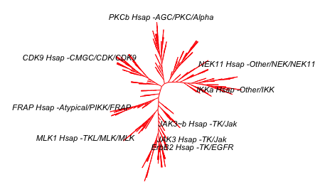
This blog post uses the sequences available on the protein kinase website (kinase.com) to create a tree using R. My hope is that this will be the first of few posts that will develop into being able to reproduce the visualisation from the Science and to render a similar image to that created by Cell Signaling Technology. This is really a key objective for me as I want to use this visualisation for my teaching.

If you are interested, please test the code and make comments. This is an ongoing project and I welcome feedback.

So here is the first version of the kinome phylogenetic tree:


I have made a more simple phylogenetic tree of the human proteins with the rel homology domain here which talks about the complexity of making trees.


Here is the script that makes this:
SCRIPT START

library(seqinr)  
library(msa)
library(ape)

# first version of generating a the kinome visualisation in R
# data is here: http://kinase.com/kinbase/FastaFiles/Human_kinase_domain.fasta
# in fasta format...
# need to extract the data into R... 
# need Biostrings package - downloaded as part of seqinr package

file <- c("http://kinase.com/kinbase/FastaFiles/Human_kinase_domain.fasta")

# step 1 is read in the FASTA files. 
kinases <- readAAStringSet(file, format = "fasta")
# that seems to work. 
kinases
# 516 sequences. 
# good.  

# step 2 do the multiple sequence alignment
kinaseAlign <- msa(kinases)  
# takes a bit of time!  - about 3.5 min on my computer...
# currently using default substitution matrix and CLUSTALW 
# creates an object with Formal class 'MsaAAMultipleAlignment' [package "msa"] with 6 slots

# step 3: convert Msa Alignment object into alignment for seqinr 
kinaseAlign2 <- msaConvert(kinaseAlign, type="seqinr::alignment")
class(kinaseAlign2) # it's an alignment
# worked 
# List of 4

# step 4: compute distance matrix - dist.alignment() function from the seqinr package:
d <- dist.alignment(kinaseAlign2, "identity")
# Class 'dist'

kinaseTree <- nj(d)  # from ape package, I think...
class(kinaseTree)
# class "phylo"
# List of 4

# good idea to save the tree locally... remove comment symbol
# write.tree(kinaseTree, file = "kinaseTree")
# to read back in:
# kinaseTree <- read.tree(file = "kinaseTree")

plot(kinaseTree, 
     main="Phylogenetic Tree of kinases")
# too difficult to read so remove the tip.labels which are the kinase names.

plot(kinaseTree, 
     main= "Phylogenetic Tree of kinases", 
     show.tip.label = FALSE)

plot(kinaseTree, 
     type = "unrooted", 
     main= "Phylogenetic Tree of kinases", 
     show.tip.label = FALSE)


# looks quite stylish a a little similar to visualisation in the Science paper
plot(kinaseTree, "u", 
     use.edge.length = FALSE,
     show.tip.label = FALSE)


# need to add colour
# argument is edge.color
plot(kinaseTree, "u", 
     use.edge.length = FALSE,
     show.tip.label = FALSE,
     edge.color = "red")


# want to add selected labels to give some orientation 
# extract tip.labels
tipLabels <- kinaseTree$tip.label

# add some labels we like to orient ourselves:
kinaseLabels <- c("IKKa","JAK3","ErbB2", 
                  "NEK11", "MLK1", "PKCb", 
                  "CDK9", "FRAP")

# find these in the alignment - they will be tip labels
labelNo <- NULL
for(i in 1:length(kinaseLabels)){
  labelNo <- c(labelNo, grep(kinaseLabels[i], kinaseTree$tip.label))
}
# generates a vector of 9 numbers. Some labels in two names. 

# make a vector of blank tiplabels
tipLabels_2 <-  rep('', length(kinaseTree$tip.label))

# add the labels we want to the vector...
for(i in 1:length(labelNo)){
  tipLabels_2[labelNo[i]] <- tipLabels[labelNo[i]]
}

# make a new tree
kinaseTree_fewLabels <- kinaseTree

# replace the tip labels with the shorter list.
kinaseTree_fewLabels$tip.label <- tipLabels_2

# make the plot with these
plot(kinaseTree_fewLabels, "u", 
     use.edge.length = FALSE,
     show.tip.label = TRUE,
     edge.color = "red",
     cex = 0.7)


# remove "Hsap" using gsub() function 
tipLabels_2 <- gsub("Hsap", "", tipLabels_2)
kinaseTree_fewLabels$tip.label <- tipLabels_2
plot(kinaseTree_fewLabels, "u", 
     use.edge.length = FALSE,
     show.tip.label = TRUE,
     edge.color = "red",
     cex = 0.7)


# add a title and source and you have the image at the top...
plot(kinaseTree_fewLabels, "u",
     main="Phylogenetic tree of human kinase domains",
     sub="source: www.kinase.com & Manning et al Science (2002) 398:1912-1934",
     use.edge.length = FALSE,
     show.tip.label = TRUE,
     edge.color = "red",
     cex = 0.7)

# this looks quite good and is enough for today.