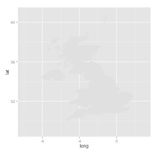
Here is the visualisation of the SQL Relay locations drawn with ggplot:
This script illustrates a few interesting things about ggplot:
- you can plot polygons using the geom_polygon() function - complex shapes like maps
- you can use different data.frames for different 'layers' in a plot
- you can sequentially add extra detail to your visualisation - this script uses:
SCRIPT START
# draw a map of the UK with R.
# https://www.students.ncl.ac.uk/keith.newman/r/maps-in-r
# install packages if necessary
library(maps) # Provides functions that let us plot the maps
library(mapdata) # Contains the hi-resolution maps.
library(ggmap) # finds longitude and latitude values
library(ggplot2) # high quality graphing
locs <- c("Nottingham England", "Reading England", "London England", "Bristol England", "Cardiff Wales", "Birmingham England")
locI <- c("N", "R", "L", "Br", "C", "Bi")
locCol <- c("darkgoldenrod1", "yellowgreen", "yellowgreen", "darkgoldenrod1", "blue", "tomato")
lonlat <- geocode(locs)
# draw a simple map of the United Kingdom
map('worldHires',
c('UK'),
xlim=c(-10,2), ylim=c(50,60))
# plot SQL Relay Locations info using base graphics
points(lonlat$lon,
lonlat$lat,
col= locCol,
pch=19,
cex = 1)
 |
| Map made with map() and base graphics |
# we can also do this in ggplot better...
# make a data.frame
data2 <- as.data.frame(locs)
# bind in longitude, latitude, colours and initials
data2 <- cbind(data2, lonlat, locCol, locI)
# use map_data() function to create a data.frame containing the map of the UK
uk<-map_data("worldHires", region = "UK")
# create the object m with the map using geom_polygon() function
# we can make the map different colours
# see here for more about colours in R
# http://www.stat.columbia.edu/~tzheng/files/Rcolor.pdf
m <- ggplot() +
geom_polygon(data=uk,
aes(x=long, y=lat, group=group),
fill="gray88") + # more about colours
scale_x_continuous(limits = c(-10,3)) +
scale_y_continuous(limits =c(49,60.9))
# add the points on the plot telling us where the longitude and latitude of various places
# N.B. the data is coming from a different data.frame to the map
# first add some black dots
m <- m + geom_point(data=data2,
aes(x=lon, y=lat),
colour="black",
size = 7)
# then some smaller coloured dots
m <- m + geom_point(data=data2,
aes(x=lon, y=lat),
colour=locCol,
size = 6)
# add the letters inside the circles
m <- m + geom_text(data = data2,
aes(x=lon, y=lat, label = locI, size = 4))
# change the theme to make the map nicer
m <- m + theme_bw()
# add a title
m <- m + ggtitle("SQL Relay Locations") +
theme(legend.position="none") # get rid of the legend
m # show the object
Final map was exported as an A5 PDF which looked nice.
Resources:


No comments:
Post a Comment
Comments and suggestions are welcome.