Monday, 26 October 2015

Exploring UN data on researchers...

Last Tuesday was World Statistics Day 2015 as declared by the United Nations. I took the opportunity to play with some of the data about the number of researchers around the globe and made a visualisation about them. The visualisation looks at the possible relationship between the number of researchers per 1000 population and the amount of money spent as a proportion of GDP. The style is inspired by Gapminder and the page by Professor Jennifer Bryan where the countries are sized by population and coloured by continent. 

Here is the visualisation:


To make this visualisation, I had to download data from the UN website about the number of researchers. The screen grab is here:
and here:

My understanding of the Terms and Conditions suggests that I'm allowed to put the data I downloaded onto Github which I have done to allow it to be downloaded within R.  The filename has the date and time of download so that I know when I did it. 

Here is the script I wrote while playing with the data and some graphs I made along the way.

The script illustrates one interesting feature of ggplot which is the ability to force a different data frame into an existing plotting object using the %+% command. I heard about %+% first from Steph Locke who runs the Cardiff R User Group and then from this Stack Overload question

Here is the script:

SCRIPT
# install these if necessary
library(dplyr)
library(ggplot2)
library(RCurl)

# who has the most researchers in the world?
# download the data
x <- getURL("https://raw.githubusercontent.com/brennanpincardiff/RforBiochemists/master/data/numberOfResearchersFTEUNdata_Export_20151019_214919785.csv")
data <- read.csv(text = x)

# extract the data for a particular year - this is a decision - 2011 in this case 
# lose some countries as they don't have 2011 data e.g. Australia and India
# option exists to change the year and run again...
year <- 2011
data <- subset(data, data$Time.Period == year) 

# rename United Kingdom, US, Rep of Korea and Venezuela
data$Reference.Area <- gsub("United Kingdom of Great Britain and Northern Ireland", "United Kingdom", data$Reference.Area)
data$Reference.Area <- gsub("United States of America", "United States", data$Reference.Area)
data$Reference.Area <- gsub("Republic of Korea", "Korea, Rep.", data$Reference.Area)
data$Reference.Area<- gsub("Venezuela (Bolivarian Republic of)", "Venezuela", data$Reference.Area)

# sort the data
data.sort <- data[order(-data$Observation.Value),]
data.sort$toPlot <- data.sort$Observation.Value

# plot the top 20 in a bar chart....
p <- ggplot(data.sort[1:20,], 
       aes(x = Reference.Area,
           y = toPlot)) +
  geom_bar(stat="identity") +
  ylab("Number of Researchers (FTE) ") +
  xlab("") +
  ggtitle(paste("Who has the most Researchers?", year)) +
  theme_bw() +
  theme(axis.text.x = element_text(angle=45, hjust=1))
p


# normalise to population
# get the data (it's on github)
x  <- getURL("https://raw.githubusercontent.com/datasets/population/master/data/population.csv")
pops <- read.csv(text = x)

# extract year = 2011 and countries that we have data from above.
pops <- subset(pops, pops$Year == year)

# join together the two data sets using full_join() function from dplyr
data.Join <- full_join(data, pops, by = c('Reference.Area'='Country.Name'))

# calculate Researchers per 1,000 population
data.Join$res.per.thou <- data.Join$Observation.Value/data.Join$Value*1000

# sort the data
data.Join.sort <- data.Join[order(-data.Join$res.per.thou),]
data.Join.sort$toPlot <- data.Join.sort$res.per.thou 

# this %+% command is useful. 
# It allows us to force a different data.frame into an existing ggplot graph object 
p1 <- p %+% data.Join.sort[1:20,]

# After doing that we need to change the title and the ylab. 
p1 + ylab("Researchers (FTE) per 1,000 population ") +
     ggtitle(paste("Who has the highest density of Researchers? ", year))  


# Explore the proportion of GDP spent on R&D?
x <- getURL("https://raw.githubusercontent.com/brennanpincardiff/RforBiochemists/master/data/grossDomesticExpR&D_GERD_percent_GDP_UNdata_Export_20151019_215514491.csv")
data.GDP <- read.csv(text = x)

# extract the 2011 data
data.GDP <- subset(data.GDP, data.GDP$Time.Period == year)

# rename United Kingdom, US, Rep of Korea and Venezuela
data.GDP$Reference.Area <- gsub("United Kingdom of Great Britain and Northern Ireland", "United Kingdom", data.GDP$Reference.Area)
data.GDP$Reference.Area <- gsub("United States of America", "United States", data.GDP$Reference.Area)
data.GDP$Reference.Area <- gsub("Republic of Korea", "Korea, Rep.", data.GDP$Reference.Area)
data$Reference.Area<- gsub("Venezuela (Bolivarian Republic of)", "Venezuela", data$Reference.Area)


# sort the data
data.GDP.sort <- data.GDP[order(-data.GDP$Observation.Value),]
data.GDP.sort$toPlot <- data.GDP.sort$Observation.Value

# again use %+% command is to force a different data.frameinto an existing ggplot graph object
p2 <- p %+% data.GDP.sort[1:20,]
# and give it the appropriate titles
p2 + ylab("Expenditure on R&D as a Percentage of GDP") +
  ggtitle(paste("Relative spending on R&D - ", year))  


# how do the two things relate?
data.Join.again <- full_join(data.Join, data.GDP, by = c('Reference.Area'='Reference.Area'))

p3 <- ggplot(data.Join.again, 
            aes(x = res.per.thou,
                y = Observation.Value.y,
                label = Reference.Area)) +
            geom_point(aes(size = sqrt(Value/pi)), pch = 21, show_guide = FALSE) +  # this give the bubbles
            ylab("Expenditure on R&D (Percentage of GDP)") +
            xlab("Researchers Per 1000 of the population") +
            ggtitle(paste("Who is serious about the knowledge Economy? ", year)) +
            theme_bw() + 
            scale_size_continuous(range=c(1,40))
p3 


# label selected circles
wanted <- c("Finland", "United States", "United Kingdom", "China", 
            "Denmark", "Israel", "Japan", "Iceland", "Singapore", 
            "France", "Russian Federation", "Korea, Rep.", "Norway")

labels <- NULL
for( i in 1:length(wanted)) { 
 labels<- rbind(labels, data.Join.again[data.Join.again$Reference.Area == wanted[i], ])
}

p3 + geom_text(data=labels,
              aes(x = res.per.thou,
                  y = Observation.Value.y,
                  label = Reference.Area),
              colour = "darkgrey",
              size = 5, hjust=1, vjust=-0.5)


# Colour by continent inspired by Gapminder
# Data adapted from http://www.stat.ubc.ca/~jenny/notOcto/STAT545A/examples/gapminder/data/gapminderCountryColors.txt
x <- getURL("https://raw.githubusercontent.com/brennanpincardiff/RforBiochemists/master/data/countryColors20151026")
countryColors <- read.csv(text = x)

data.Join.again2 <- full_join(data.Join.again, countryColors, by = c('Reference.Area'='country'))

p4 <- ggplot(data.Join.again2, 
             aes(x = res.per.thou,
                 y = Observation.Value.y,
                 label = Reference.Area, )) +
  geom_point(aes(size = sqrt(Value/pi)), pch = 21, show_guide = FALSE) +
  ylab("Expenditure on R&D (Percentage of GDP)") +
  xlab("Researchers Per 1000 of the population") +
  ggtitle(paste("Who is serious about the knowledge Economy?  ", year)) +
  theme_bw() + 
  scale_size_continuous(range=c(1,40))

p4 <- p4 + aes(fill = continent)

labels <- NULL
for( i in 1:length(wanted)) { 
  labels<- rbind(labels, data.Join.again2[data.Join.again2$Reference.Area == wanted[i], ])
}


p4 + geom_text(data=labels,
              aes(x = res.per.thou,
                  y = Observation.Value.y,
                  label = Reference.Area),
              colour = "black",
              size = 5, hjust=1, vjust=-0.5)


# the facet_wrap is interesting...
p4 + facet_wrap(~ continent)


Showing data from different years, captures different countries:

2012 Data - Lots of data not in the UN database

2010 data - now includes more African countries and India...

Useful link for some of this code: Prof Jennifer Bryan's pages about exploratory data analysis especially this one.


Tuesday, 13 October 2015

Mapping SQL Relay locations using ggplot...

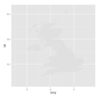
I may have planned to talk about too much in a one hour talk at SQL Relay. In terms of what I planned to show, I wanted to show a little bit of geomapping using ggplot.

Here is the visualisation of the SQL Relay locations drawn with ggplot:


This script illustrates a few interesting things about ggplot:
  • you can plot polygons using the geom_polygon() function - complex shapes like maps
  • you can use different data.frames for different 'layers' in a plot
  • you can sequentially add extra detail to your visualisation - this script uses:


SCRIPT START

# draw a map of the UK with R. 
# https://www.students.ncl.ac.uk/keith.newman/r/maps-in-r

# install packages if necessary

library(maps)       # Provides functions that let us plot the maps
library(mapdata)    # Contains the hi-resolution maps.
library(ggmap)      # finds longitude and latitude values
library(ggplot2)    # high quality graphing

locs <- c("Nottingham England", "Reading England", "London England", "Bristol England", "Cardiff Wales", "Birmingham England")
locI <- c("N", "R", "L", "Br", "C", "Bi")
locCol <- c("darkgoldenrod1", "yellowgreen", "yellowgreen", "darkgoldenrod1", "blue", "tomato")
lonlat <- geocode(locs)

# draw a simple map of the United Kingdom
map('worldHires',
    c('UK'),
    xlim=c(-10,2), ylim=c(50,60))
# plot SQL Relay Locations info using base graphics
points(lonlat$lon,
       lonlat$lat,
       col= locCol,
       pch=19,
       cex = 1)
Map made with map() and base graphics


# we can also do this in ggplot better...
# make a data.frame 
data2 <- as.data.frame(locs)

# bind in longitude, latitude, colours and initials
data2 <- cbind(data2, lonlat, locCol, locI)


# use map_data() function to create a data.frame containing the map of the UK
uk<-map_data("worldHires", region = "UK")

# create the object m with the map using geom_polygon() function 
# we can make the map different colours
# see here for more about colours in R
# http://www.stat.columbia.edu/~tzheng/files/Rcolor.pdf
m <- ggplot() +
            geom_polygon(data=uk, 
                  aes(x=long, y=lat, group=group),
                  fill="gray88") +   # more about colours
            scale_x_continuous(limits = c(-10,3)) +
            scale_y_continuous(limits =c(49,60.9))


# add the points on the plot telling us where the longitude and latitude of various places
# N.B. the data is coming from a different data.frame to the map
# first add some black dots
m <- m +  geom_point(data=data2, 
                     aes(x=lon, y=lat), 
                     colour="black",
                     size = 7) 

# then some smaller coloured dots
m <- m +  geom_point(data=data2, 
                aes(x=lon, y=lat), 
                colour=locCol,
                size = 6)


# add the letters inside the circles  
m <- m + geom_text(data = data2, 
                   aes(x=lon, y=lat, label = locI, size = 4))


# change the theme to make the map nicer
m <- m + theme_bw()


# add a title
m <- m + ggtitle("SQL Relay Locations") +
         theme(legend.position="none") # get rid of the legend

m # show the object


Final map was exported as an A5 PDF which looked nice.

Resources:

Monday, 12 October 2015

What do I tweet about? Not just R...

Here is another script for my talk entitled First steps in making visualisations using R as part of SQLRelay in Cardiff. It's about using R to make a word cloud or wordle.

Here is my word cloud which shows who and what I tweet about:
What I tweet about: too much bread and not enough work?
I downloaded my twitter archive with help from this link. The resulting .csv file is on Github so that it can be downloaded as part of this script.

Below is the script that I used to make the word cloud. It also shows how the word cloud developed - I removed various words that I didn't think were useful. I did this by using the text mining package - tm. I looked at word frequencies and removed the words I didn't like using the tm.map() function.

SCRIPT START:

# if required install.packages(c("wordcloud", "tm", "ggplot2", "RCurl"))

library("wordcloud")
library("tm")
library("ggplot2")
library("RCurl")

x <- getURL("https://raw.githubusercontent.com/brennanpincardiff/RforBiochemists/master/data/tweets.csv")

twts <- read.csv(text = x)

str(twts)
# it's a data.frame

text <- twts$text  # pull out the text... 
str(text)   # check the structure
# factor - no I dont' think that's quite what we want...

text <- as.character(twts$text)
str(text)
# so that worked and looks better 

# check a few of the entries...
text[1]
text[2]
text[10]


# defaults are not great - quite slow and probably too many words to be useful. 
# best to add a max.words modifier....
wordcloud(text, max.words = 35)


wordcloud(text, 
          max.words = 35,
          random.order=FALSE, 
          rot.per=0.35, 
          use.r.layout=FALSE, 
          colors=brewer.pal(8, "Dark2"))


Add some colour and get a nice layout...

# layout is random... 

# some interesting words here
# my name: brennanpcardiff
# some people I communicate with on twitter: amcunningham, drbillyo, drnostromo
# words like amp, just, the, think, well, day, now, nice, great, new

# good to do some processing....

# convert into a Corpus - a structure for organising text...
text.c <- Corpus(VectorSource(text))
text.c.p <- tm_map(text.c, content_transformer(tolower))
# remove stopwords
text.c.p <- tm_map(text.c.p, removeWords, stopwords("english"))
# get a list of Englisth stopwords....
stopwords(kind = "en")
length(stopwords(kind = "en"))

wordcloud(text.c.p, max.words = 35, colors=brewer.pal(8, "Dark2"))


Not quite what I wanted....


# so some words removed but leaving others... including smiley face. 
# remove some Punctuation
text.c.p <- tm_map(text.c.p, removePunctuation)

wordcloud(text.c.p, max.words = 35, colors=brewer.pal(8, "Dark2"))


# better... rstats has appeared - good to see. 
# not sure how useful day, the, can, well, like, http are....
# remove more words
text.c.p <- tm_map(text.c.p, removeWords, c("new", "the", "today", "can","just", "day", "amp", "http", "good", "great", "like", "nice", "well", "brennanpcardiff", "will", "now", "httpt", "get", "one"))

set.seed(501)
wordcloud(text.c.p, 
          max.words = 30,
          random.order=FALSE, 
          rot.per=0.35, 
          use.r.layout=FALSE, 
          colors=brewer.pal(8, "Dark2"))


# for more on word frequencies and a graph....... 

# create Document Term Matrix
dtm <- DocumentTermMatrix(text.c.p)
inspect(dtm)
dim(dtm)

# Plotting Word Frequencies
freq <- sort(colSums(as.matrix(dtm)), decreasing = TRUE)
head(freq, 14)

# make the data frame for ggplot
wf <- data.frame(word = names(freq), freq = freq)
head(wf,20)

wf.freq <- subset(wf, freq > 35) # data frame with abundant words - 23 words

p <-  ggplot(wf.freq, aes(word, freq)) + 
             geom_bar(stat="identity") +
             xlab("Frequent words") +   # label x-axis
             ylab("Frequency") +    # label y-axis
             ggtitle("Word Frequencies in my tweets") +
             theme_bw() +
             theme(axis.text.x = element_text(angle=45, hjust=1)) 

p  # show the object...


# make another wordle with the frequencies... gives the same plot...
set.seed(501)  # gives a reproducible plot...
wordcloud(names(freq), freq, max.words =30,
          random.order=FALSE, 
          rot.per=0.35, 
          use.r.layout=FALSE, 
          colors=brewer.pal(8, "Dark2"))


Helpful resources that I used:


Friday, 9 October 2015

Exploring diseases in Wales for SQL Relay...


I have prepared a script that I am going to use on the day. The script explores some data from the StatsWales website. One data file describes the percentage of people with various illnesses in Wales and another describes lifestyles.

I have downloaded the files as Excel files. These can be directly imported into R but I found it easier to change them in Excel first.
 In this case, I changed the data in the following ways:
  • by combining the two data sets
  • by removing the gender breakdown
  • by simplifying the column names
  • by simplifying the year names for the combined years

This kind of data munging can be done in R as well but I’m quicker doing it in Excel.

I have put the resulting Excel file ontoGithub so that it can be downloaded and imported into R.

As part of this script I make various graphs using R. The final part of the script makes these graphs:


The script I'll be using for my talk is below. I have included copies of some of graphs that are made along the way.
If you are attending my talk in SQL Relay, it's worth getting the script and trying it out on or before the day. You can cut and paste it from below. You can also get it from Github.

SCRIPT START

## This script is designed to illustrate some 'simple graphs' 
# Packages required
# install.packages("readxl", "ggplot2", "reshape2", "gridExtra") 

library(readxl)     # Excel file importer
library(ggplot2)    # high quality graph package
library(reshape2)   # for melting data frames
library(gridExtra)  # for laying out objects on a page

# this is the link to the data
link <- "https://raw.githubusercontent.com/brennanpincardiff/RforBiochemists/master/data/illnssLifeStyleGenderYeardReNames20151006.xlsx"

# the download.file() function downloads and saves the file with the name given
download.file(url=link, destfile="file.xlsx", mode="wb")

# then we can open the file and extract the data using the read_excel() function. 
data<- read_excel("file.xlsx")

# look how it turns up in the Global Environment

# have a look at the data
View(data)
# check the object
str(data)   # the structure of the object
# look at the column names
colnames(data)

# the titles
# [1] "year"                  "highBP"                "heartcondexBP"        "respIll"              
# [5] "mentIll"               "arthritis"             "diabetes"              "currTreated"          
# [9] "healthFairRpoor"       "smoker"                "alcoholConsAboveGuide" "alcoholConsBinge"     
# [13] "fruitVegGuide"         "activeon5"             "activeZero"            "overwgtObese"         
# [17] "obese" 


## Using the basic plot() function
# refer to the data within the data.frame
plot(data$year, data$mentIll)
plot(data$year, data$arthritis)
plot(data$year, data$smoker)

## improve one of the plots a little
plot(data$year, data$mentIll,
     xlab = "Year",
     ylab = "Mental Illness (% of Welsh Population)",
     pch = 15)

## pair() function useful to plot scatterplot matrices
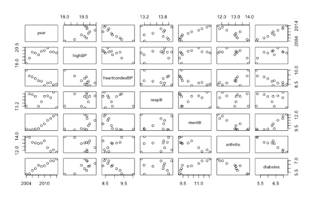
pairs(data[,1:7]) # shows the rate of change over 10 years
Useful visualisation using pairs() function


## I recommend the ggplot2 library 
p <- ggplot(data,                      # a data.frame with the data
            aes(x=year, y=mentIll)) +  # columns of the data.frame
            geom_point(colour = "red", size = 3) # type of plot 

# this creates an object called p
p # show the object


# modify the object to add a title and change the theme
p <- p + ylab("Mental Illness \n (% Welsh Population)") +
         xlab(" ") +
         theme_bw()
p # show the object again


# the options of how to customise this graph very varied
# there is some recognised good style but also a lot of preference
p <- p + theme(axis.title.y = element_text(size = 18 )) + 
         theme(axis.text = element_text(size = 20))
p # show the object again


## Let's make a bar chart
ggplot(data, aes(x=year, y=mentIll)) +
  geom_bar(stat="identity") +
  ylab("Mental Illness \n (% Welsh Population)")


# check out the bottom axis
# Looks very strange with the "2007.5"
# Why?
str(data$year)
# num [1:11] 2004 2005 2006 2007 2008 ...
mode(data$year)
# [1] "numeric"
# Because R has imported year as a number, adding 0.5 is allowed
# change to a character 
data$year <- as.character(data$year)

ggplot(data, aes(x=year, y=mentIll)) +  # data.frame & the data
  geom_bar(stat="identity") +           # different type of plot
  ylab("Mental Illness \n (% Welsh Population)")


A better graph with all the numbers included


## Look at a possible correlation
ggplot(data, 
       aes(x=diabetes, y=obese, label = year)) +
       geom_point(colour = "red", size = 5)
             
ggplot(data, 
       aes(x=diabetes, y=obese, label = year)) +
       geom_point(colour = "red", size = 5) +
       geom_text(size = 5, hjust=1, vjust=-0.5)

p <- ggplot(data, 
            aes(x=diabetes, y=obese, label = year)) +
            geom_point(colour = "red", size = 5) +
            geom_text(size = 5, hjust=1, vjust=-0.5) +
            ylab("Obesity (% of Welsh Pop") +
            xlab("Diabetes (% of Welsh Pop)") +
            theme_bw()

p <- p + theme(axis.title.y = element_text(size = 18 )) +
         theme(axis.title.x = element_text(size = 18 )) +
         theme(axis.text = element_text(size = 20))

p


# introducing facet
# draw six graphs of diseases over time...

# take a subset of data
data.sub <- data[1:7]

# rename the columns
colnames(data.sub) <- c("Year", "High BP", "Heart Conditions", "Respiratory Illness", "Mental Illness", "Arthritis", "Diabetes")

# melt the data from wide to long:
melted.data.sub <- melt(data.sub, id.var = "Year")
colnames(melted.data.sub) <- c("Year", "Illness", "Percent")

# make a plot
x <- ggplot(data = melted.data.sub, 
            aes(x=Year, y=Percent)) +
            geom_point(aes(colour = Illness, shape= Illness, size = 5)) +
            theme_bw() +
            theme(legend.position = "none") +
            ggtitle("Disease Burden in Wales over 10 years")
x    # look at the plot

Not very useful!


# break into facets
x <- x + facet_wrap(~ Illness, scales = "free", ncol=2) +
     ylab("Percent of Welsh Pop")

x  # show the plot
Nice set of graphs, I think. 

# save the plot
x + ggsave("DiseaseBurdenWales10years.pdf")


## Extra info on arranging plots on a single page
# make a new graph in the object g1
g1 <- ggplot(data,                      # a data.frame with the data
            aes(x=year, y=obese)) +     # columns of the data.frame
            geom_point(colour = "black", size = 5) + # type of plot
            ylab("Obesity (% of Welsh Pop") +
            xlab("") +
            theme_bw()
g1 <- g1 + theme(axis.title.y = element_text(size = 18 )) +
        theme(axis.title.x = element_text(size = 16 )) +
        theme(axis.text = element_text(size = 20))

# make another graph in the object g2
g2 <- ggplot(data,
            aes(x=year, y=diabetes)) +
            geom_point(colour = "blue", size = 5) +
            ylab("Diabetes (% of Welsh Pop") +
            xlab("") +
            theme_bw()
g2 <- g2 + theme(axis.title.y = element_text(size = 18 )) +
  theme(axis.title.x = element_text(size = 16 )) +
  theme(axis.text = element_text(size = 20))

# using a function from the gridExtra package...
# put the three graphs on the same graphical output. 
grid.arrange(g1, g2 ,p)
# makes the plot at the top of the blog

SCRIPT END

Useful resources: