Thursday 22 December 2016

Drawing a simple phylogenetic tree of the human rel homology domain family

Exploring protein structure and protein sequences by making phylogenetic trees is not trivial but can be interesting and informative. It can be a productive way of deepening our understanding of the proteins and the relationships between them.

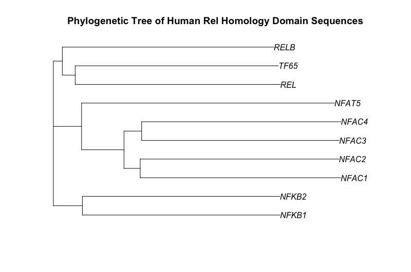
As a starting point for this blog post, I have chosen to draw a phylogenetic tree of the ten human proteins containing a rel homology DNA binding domain. This family includes the NF-kappaB family of transcription factors and the NFAT family of transcription factors. Both of these families change gene expression in the response to extracellular stimuli. The cytokine, tumor necrosis factor alpha (TNF), activates the NF-kappaB family of transcription factors. Stimulation of cells through antigen receptors, for example the T-cell receptor, activates the NFAT family of transcription factors.

Here is the phylogenetic tree that I have drawn:


It has been generated using the full length protein sequences which is an important point. The proteins are as follows (5 NF-kappaB family members & 5 NFAT family members):

As a biochemist, protein function is my area of interest and not phylogenetic analysis. The generation of phylogenetic trees has been the subject of many years of research and many books have been written about the topic. There is a book about how to do phylogenetic analysis in R. As such this blog post is just a very brief introduction to how to do this. The idea of this piece is to be inspiring (hopefully) not exhaustive.


The steps are as follows:
  1. Get the sequences into R. I’m using the package seqinr to extract protein sequences. The ways in which phylogenetics analysis is done is quite different depending on whether you are using DNA or protein sequences so it’s important to be aware of this.
  2. Perform a multiple sequence alignment. I’ve used the msa package. This process compares one sequence to another to another. There are different mathematical methods of doing this and different values that can be used within the different mathematical methods. The msa() function, by default, runs ClustalW with default parameters, one of the standard methods in biology. ClustalW has been around for many years. I first used it about 20 years ago when I did a short online course in bioinformatics. It can be used in my different tools including some web based interactive tools. The msa package also allows the use of the methods ClustalOmega or MUSCLE.
  3. Turn your alignment into a tree. This uses the alignment to calculate ‘distances’ between the proteins. The seqinr package has a method and the ape package is used too for neighbor-joining tree estimation. This is not a trivial matter as some changes between amino acids are more likely than others depending on the codon usage. Also some changes may lead a more dramatic change in function than others. Again, there are various algorithms.
  4. Draw your tree. This uses the ape package. For a small tree this is relatively simple but for larger trees there can be an artistic element to this. There are many options and a few are illustrated below.


Here is the script that I used to generate the tree above. There are other trees generated along the way...

SCRIPT START
### generating a phylogenetic tree of human Rel homology containing proteins

## packages required - may need downloading
# source("http://www.bioconductor.org/biocLite.R")
# biocLite("msa")

library(seqinr)  
library(msa)
library(ape)

### Get the sequences into R. 
# these are the accession numbers of the 10 proteins. 
# for these 10 proteins I found them manually by searching the Uniprot database
accNo <- c("AC=P19838 OR AC=Q00653 OR AC=Q01201 OR AC=Q04206 OR AC=Q04864 OR AC=O95644 OR AC=Q13469 OR AC=Q12968 OR AC=Q14934 OR AC=O94916")

# using the seqinr package
# From Chapter 4 of the seqinr handbook. 
# http://seqinr.r-forge.r-project.org/seqinr_3_1-5.pdf
### step 4.1 Choose a bank
choosebank()  # show's available data bases
mybank <- choosebank(bank = "swissprot")
str(mybank)
# UniProt Knowledgebase Release 2016_08 of 07-Sep-2016 Last Updated: Oct  4, 2016

### step 4.2 Make the query
mybank <- choosebank(bank = "swissprot")
rel_seq <- query("relSeq", accNo)
# N.B. protein info NOT returned in the same order as requested

# returns list object with six parts 
rel_seq$nelem # with 10 elements - thus 10 proteins
rel_seq$req  # gives the five necessary names

###  4.3 Extract sequences of interest
rel_seqs <- getSequence(rel_seq)
# check the names of the sequences
getName(rel_seq)

# it is necessary to put the sequences in fasta format
# for the multiple sequence alignment.
# useful to store them locally so that's what this does
write.fasta(sequences = rel_seqs, 
            names = getName(rel_seq),
            nbchar = 80, file.out = "relseqs")

### with sequences in a file we can open the file in the package msa

### read in Rel sequences from the file
mySeqs <- readAAStringSet("relseqs")   # from package Biostrings
length(mySeqs)
# 10 sequences... which is correct

### Perform a multiple sequence alignment
myAln <- msa(mySeqs)  
# this uses all the default settings and the CLUSTALW algorithm 
myAln
print(myAln, show="complete")

### Turn your alignment into a tree
# convert the alignment for the seqinr package
myAln2 <- msaConvert(myAln, type="seqinr::alignment")
# this object is a list object with 4 elements

# generate a distance matrix using seqinr package
d <- dist.alignment(myAln2, "identity")
# From the manual for the seqinr package
# This function computes a matrix of pairwise distances from aligned sequences
# using similarity (Fitch matrix, for protein sequences only) 

# have a look at the output
as.matrix(d)

# generate the tree with the ape package
# the nj() function allows neighbor-joining tree estimation
myTree <- nj(d)

# plot the tree
plot(myTree, main="Phylogenetic Tree of Human Rel Homology Domain Sequences")


# since all the species are human, 
# it might be easier to read without the "_HUMAN"
# with the sub() function
myAln2$nam <- sub("_HUMAN", "", myAln2$nam)

# pile up the functions to make a new tree
tr <- nj(dist.alignment(myAln2, "identity"))

# plot the new tree
plot(tr, main="Phylogenetic Tree of Human Rel Homology Domain Sequences")
# selected other ways to draw trees
# from http://ape-package.ird.fr/ape_screenshots.html

plot(tr, "c")
plot(tr, "u")   # unrooted tree 

plot(tr, "c", FALSE)  # ignores edge length
plot(tr, "u", FALSE)


plot(tr, "f", FALSE, cex = 0.5)
plot(tr,               # object with the tree information
     "u",              # unrooted - draws from the centre
     font = 2,         # makes font bold  
     edge.width = 2,   # makes thicker lines
     cex = 1.25,       # increase font size a little
     main = "Phylogenetic Tree of Human Rel Homology Domain Sequences")       


# looks quite stylish but I'm not sure about ignoring edge length
plot(tr, "u", 
     use.edge.length = FALSE, 
     font = 2, 
     edge.width = 2,
     main = "Phylogenetic Tree of Human Rel Homology Domain Sequences")


SCRIPT END


Resources and citations:


Tuesday 29 November 2016

Extracting an NFkappaB gene expression profile from published CLL gene expression data (Herishanu et al, Blood 2011)

Update: 18th October 2017 - Bioconductor is the place to get the Affymetrix annotation file.

This post is about exploring gene expression signatures. It was natural, for me, to start with the transcription factor, NFkappaB. On this blog, I have previously explored the principal component analysis of gene expression patterns from chronic lymphocytic leukaemia (CLL) cells published in Blood by Herishanu et al in 2011 - a key paper in this field.

In their paper, in Figure 5A, Herishanu et al focussed on a set of genes to investigate the gene signature for the transcription factor, NFkappaB. I found what they did very interesting and I wanted to reproduce their analysis using R and illustrate it here.

Here is my version of the heatmap, they showed in Figure 5A. My version has a little more information about the samples and the genes. The figures shows that the CLL cells from the lymph node (LN) have a higher NFkappaB gene signature is higher than the peripheral blood (PB) and the bone marrow (BM).

Heatmap showing the expression of selected NFkappaB regulated genes (listed on right) from CLL cells from peripheral blood (PB), bone marrow (BM) or lymph node (LN). Sample details on the bottom.
Here is the script I used to generate the data. To reproduce this, just cut and paste the script into R (or ideally R-Studio) and you should be able to generate the same figures.

START
# if required install packages
# install.packages("RCurl", "plyr", "heatmap3")

# the Affymetrix annotation file is located on Bioconductor
source("https://bioconductor.org/biocLite.R")
biocLite("hgu133plus2.db")   #installs the package
                   
# activate packages   
library(RCurl)     # to download data from internet
library(hgu133plus2.db)   # to link AffyIDs to gene names
library(plyr)   # to make a dataframe from a function
library(heatmap3) # one of many heatmap packages

# I want to extract the NF-kappaB gene profile and draw the first part of Figure 5. 
# I want to extract the values for a gene expression pattern
# need to extract it from the normalised data set.
# change colours to look more like the publication. 


# here is a link for all the normalised data from the paper (>50000 probes) 
x <- getURL("https://raw.githubusercontent.com/brennanpincardiff/RforBiochemists/master/data/herishanuMicroArrayDataNormalised.tsv")

# turn the data into a useful data.frame
data <- read.table(text = x, header = TRUE, sep = "\t")

# need to create a map that links AffyIDs to gene names
# http://bioconductor.org/packages/release/bioc/html/mygene.html
# U133 plus 2.0
# hgu133plus2.db

# https://www.bioconductor.org/help/workflows/annotation-data/
keytypes(hgu133plus2.db)

# SYMBOL is what we need

# map Affy IDs to Symbol
mapAffy_Symbol <- select(hgu133plus2.db, rownames(data), c("SYMBOL"))

# from Figure 5 there is a list of gene names
nfkb_genes <- c("RGS1", "CCND2", "NFKBIE", "CCL4", "CXCL13", "LTA", "CCL3", "BMEF1", "TNF", "CD83", "CXCL9", "BCL2A1", "DUSP2", "HEATR1", "CXCL10", "JUNB", "EBI2", "IL12B", "GADD45B", "EBI3", "ID2")

# test to see if we can find PROBEIDs which correspond to RGS1
mapAffy_Symbol[ which(mapAffy_Symbol$SYMBOL == "RGS1"),]
# works although there are more than one Affy ID per gene

# make a function to pull out probeID for a symbol
pullOutProbeID <- function(x){
  mapAffy_Symbol[ which(mapAffy_Symbol$SYMBOL == x),]
}

# use lapply to apply the function across the list of NFkB genes
lapply(nfkb_genes, pullOutProbeID)
# generates a list. 
# two of the list return nothing. 
# gene names have changed - I had to check the internet (GeneCards)
pullOutProbeID("NAMPT")  # BMEF1
pullOutProbeID("GPR183") # EBI2

# new list of NFkB genes with the two genes renamed. 
nfkb_genes2 <- c("RGS1", "CCND2", "NFKBIE", "CCL4", "CXCL13", "LTA", "CCL3", "NAMPT", "TNF", "CD83", "CXCL9", "BCL2A1", "DUSP2", "HEATR1", "CXCL10", "JUNB", "GPR183", "IL12B", "GADD45B", "EBI3", "ID2")


# this function from the package plyr

ldply will return a data frame
genesAsAffyID <- ldply(nfkb_genes2, pullOutProbeID)


# make a function to pull out GeneExpvalues for AffyID
pullOutGeneExpVal <- function(x){
  subset(data, rownames(data) == x)
}

# test the function
pullOutGeneExpVal("202988_s_at")
# works

# extract the expression values
expVals <- ldply(genesAsAffyID$PROBEID, pullOutGeneExpVal)
View(expVals)
# good, I have extracted the values. 

# turn data.frame into a matrix so that we can draw a heatmap
expVals.m <- as.matrix(expVals)
# give it useful row names
rownames(expVals.m) <- genesAsAffyID$SYMBOL

# lets draw a heatmap using default settings from base R
heatmap(expVals.m)


# LN (lymph node) segregates well but
# PB (periperal blood) and BM (bone marrow) are mixed up

# we would like this order of the columns
sampl.order <- c("PB.1", "PB.2", "PB.3", "PB.4", "PB.4.1", "PB.8", "PB.9", 
  "PB.10", "PB.11", "PB.12", "PB.13", "PB.13.1",  "PB.25", "PB.26",
  "BM.1", "BM.2", "BM.3", "BM.4", "BM.8", "BM.9", 
  "BM.10", "BM.11", "BM.12", "BM.13",  "BM.25", "BM.26",
  "LN.1", "LN.2", "LN.3", "LN.4", "LN.8", "LN.9", 
  "LN.10", "LN.11", "LN.12", "LN.13",  "LN.25", "LN.26")

# reorder the matrix
expVals.m.o <- expVals.m[ , sampl.order]

heatmap(expVals.m.o,
        Colv = NA)     # don't reorder columns


# heatmap3 can look quite good. 
heatmap3(expVals.m.o,
         Colv = NA, # don't reorder columns
         Rowv = NA) # don't reorder rows either


# add some useful titles to the heatmap
title( main = "NFkappaB Gene Signature \n Figure 5A",
       sub  = "Source: Herishanu et al, \n Blood 2011 117:563-574; doi:10.1182/blood-2010-05-284984",
       cex.main = 1.5,
       cex.sub = 0.75, font.sub = 3, col.sub = "red")

# add text to top to label PB, BM and LN
# https://stat.ethz.ch/R-manual/R-devel/library/graphics/html/text.html
add.expr=text(x = 10, y = 118, "PB", cex = 1.5)
add.expr=text(x = 15, y = 118, "BM", cex = 1.5)
add.expr=text(x = 20, y = 118, "LN", cex = 1.5)

# add lines to the top - called segments
# https://stat.ethz.ch/R-manual/R-devel/library/graphics/html/segments.html
segments(6.8, 113, 12.3, 113, col = "green", lwd = 4)
segments(12.7, 113, 17.3, 113, col = "red", lwd = 4)
segments(17.7, 113, 22.2, 113, col = "blue", lwd = 4)

# this looks quite nice and seems similar to Figure 5A
# and a very good point to stop on for today. 

END


These resources were useful:


Wednesday 12 October 2016

Exploring the UK Gender Pay Gap with R...


The gender pay gap in the UK may not of primary interest to some biochemists but the Biochemical Society is interested in gender equality and the majority of biochemistry undergraduates are female... Here is the Biochemical Society's policy statement and here is something relevant from their blog.

A report about the gender pay gap was tweeted about today by @UKParliament (it seems it was published last year). There is an Excel file that goes with the report.


Today, I've been using R to explore some of the data and I have written a script below to make these graphs - the first two graphs from the report.


The way the data is presented makes me uncomfortable with men being paid more represented as a positive percentage and women being paid more being expressed as a negative percentage. I feel sure there is a better way....

Still, the data is interesting....

Here is the script:
START
library(RCurl)
library(readxl)
library(ggplot2)
library(reshape2)
library(ggthemes)

# this is the link to the data
link <- "http://researchbriefings.files.parliament.uk/documents/SN07068/data-tables.xlsx"

# the download.file() function downloads and saves the file with the name given
download.file(url=link,destfile="file.xlsx", mode="wb")

# then we can open the file and extract the data using the read_excel() function. 
data <- read_excel("file.xlsx", skip=3, col_names=TRUE)

str(data)
# shows that Year is characters 
data[,1] <- as.numeric(data[,1])   # change to number
data <- data[1:22,]    # get rid of seven rows of NAs.
names <- colnames(data)
names[1] <- "Year"
names[2] <- "All_employees"
colnames(data) <- names  # make column names easier to use
data[,2:4] <- data[,2:4]*100   # Excel stores percents as decimals

# reshape the data from wide to long format
data.melt <- melt(data, id.vars = "Year")
colnames(data.melt) <- c("Year", "empType", "gendGap")


# draw the graph
p1 <- ggplot(data.melt, aes(x=Year, 
                           y= gendGap, 
                           colour = empType)) + 
  geom_point() +   # draw the points
  geom_line(size=1) +  # draw the lines
  labs(color = "Employment Type") + # customizes the legend title
  ylab("Gender Gap (%)") + # y-label
  ggtitle("Gender Pay Gap, UK, 1997-2015") +   # graph title
  ylim(-10,30) + 
  xlim(1995, 2015) +
  geom_hline(yintercept = 0) +  # nice line at zero
  theme_bw()

p1 <- p1 + theme(legend.text=element_text(size = 12), # increase size of text
               legend.title=element_text(size = 12)) # and title

p1 <- p1 + theme(axis.title.y = element_text(size = 14 )) + 
  theme(axis.text = element_text(size = 12))

p1 # show the graph


# maybe you prefer a different theme.
p1 + theme_hc()


# maybe without a legend but with labels on the lines:
p1 <- p1 + theme(legend.position="none") + 
  geom_text(data = data.melt[which(data.melt$Year == "2013"),],
               aes(label = empType),
               vjust = -2)
p1


# draw the second graph with the age data... 
data2 <- read_excel("file.xlsx", sheet=2, skip=3, col_names=TRUE)
View(data2)
str(data2)
data2 <- data2[1:8,]

# multiply numbers by 100 to give percentages
data2[,2:4] <- data2[,2:4]*100

names <- colnames(data2)
names[1] <- "Ages"
names[2] <- "All_employees"
colnames(data2) <- names
data2.type <- data2[3:8,]

data2.melt <- melt(data2.type, id.vars = "Ages")
colnames(data2.melt) <- c("Ages", "empType", "gendGap")

g <- ggplot(data = data2.melt[7:18,], aes (x = Ages, y = gendGap, fill = empType))  
g <- g + geom_bar(stat="identity", position="dodge", width = 0.75) +
  ylim(-11,20)  +
  ylab("Gender Gap (%)") + # y-label
  xlab("Age") + # x-label
  ggtitle("Gender Pay Gap by Age, April 2015") +
  labs(fill = "Employment Type") + # customizes the legend title
  theme_hc() +
  theme(legend.position=c(0,1), # move to the top left
        legend.justification=c(0,1.5)) # move it in a bit
g  # show the graph...


Monday 15 August 2016

A simple web scrape of protein interaction data from Uniprot...

There is a vast amount of biochemical, biological and molecular data available on the internet. Lots of it is free and some of it is well curated. It's useful to be able to 'scrape' data from good quality databases and web pages.

One of my favourite sources of molecular information is the Uniprot database. According to itself, it is "a comprehensive, high-quality and freely accessible resource of protein sequence and functional information".

A little while ago, I showed how to use R to draw a schematic of the receptor of the pro-inflammatory cytokine, TNFR1. This post shows how to scrape the list of interacting proteins from the Uniprot page in order to draw a graph of the number of experiments showing each interaction. 

For scraping the webpage, I use the xml version of the page and the base R function readLines(). There are more complex ways to download the page including packages and functions that will read in xml data. I wanted to start simply in the first instance...

Here is the graph: 


Here is the script:

# START
library(ggplot2)
# extract interaction data from the TNFR1 Uniprot page

# this is the URL for the TNFR1 Uniprot page
url <- c("http://www.uniprot.org/uniprot/P19438.xml")

# scrape a Uniprot page into R
# this readLines() function is a base R function which allows reading webpages
data <- readLines(url)
print(paste(url, "has just been scraped"))

# this readLines() function is a base R function which allows reading webpages
data <- readLines(url)
print(paste(url, "has just been scraped"))

# this function will clean up the data by removing the xml code
cleanXml <- function(x) {
  return(gsub("<.*?>", "", x))
}

# identify where the proteins names are on the scraped data
name.list <- grep("<name>", data)
name <- cleanXml(data[name.list[1]])

# identify where the interaction data lies on the scraped data
int.list <- grep("<comment type=\"interaction", data)
# 5 line numbers supplied in answer
# corresponds to five interactions on the Uniprot page...

# these are the details we want to extract:
features <- c("uniprot_id",    # 3 lines after returned number
              "uniprot_label", # 4 lines after returned number
              "uniprot_exp")   # 7 lines after returned number

# this function will extract the information from the scraped data
extInteractDataFromPage <- function(x){
  uniprot_id <- cleanXml(data[x + 3])
  uniprot_label <- cleanXml(data[x + 4])
  uniprot_exp <- cleanXml(data[x + 7])
  three.val <- c(uniprot_id, uniprot_label, uniprot_exp)
  return(three.val)
}

# use lapply() to apply the function to each interaction
output <- lapply(int.list, extInteractDataFromPage)
# generates a list of 5 proteins that interact with TNFR1

# to graph this using ggplot, we need to turn the list into a data.frame
output.1 <- as.data.frame(t(as.data.frame(output)))
str(output.1)
# but all the values are Factors so need to turn them into characters...
output.1$V1 <- as.character(output.1$V1)
output.1$V2 <- as.character(output.1$V2)
# ...and into numbers. 
output.1$V3 <- as.numeric(as.character(output.1$V3))
str(output.1) 
# looks better with characters (chr) and numbers (num)

# let's draw the graph with ggplot
g <- ggplot(output.1,         # this is the dataframe
            aes(x = V2,       # names of the proteins
                y = V3)) +    # number of experiments showing the interaction
  geom_bar(stat="identity") + # make a bar chart
  theme_bw()
g   # output the graph


# improve the labels
g <- g + xlab("") +
         ylab("Number of experiments") +  
         theme(axis.title.x = element_text(size = 16)) +
         theme(axis.title.y = element_text(size = 16)) +
         theme(axis.text.x = element_text(size = 16)) +
         theme(axis.text.y = element_text(size = 16))
g


# add a graph title and a source for the data
g <- g + ggtitle(paste("Interacting proteins for", name,"\n Source:", url))
g


g + coord_flip()  # turn the bar chart on it's side.