


One of the things that varies a lot is whether your graph has a box or not. Boxes are presented by default in R and many other programmes. Removing the boxes leave floating axis which is not in the style of the journal either.
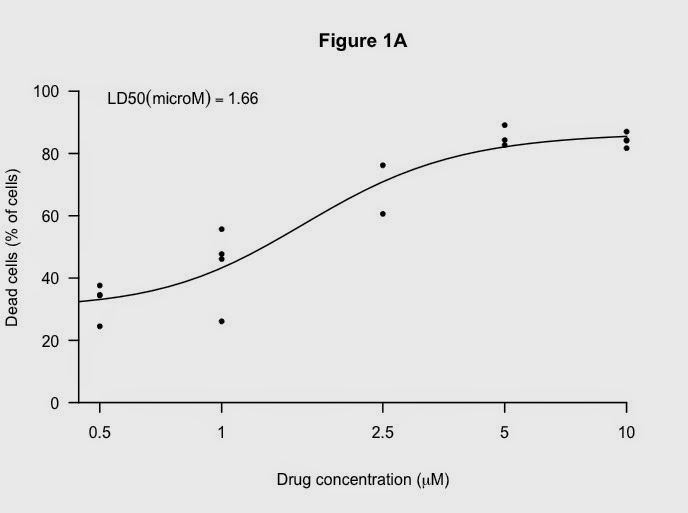
Working through some of these things using the data from the LD50 graph previously:
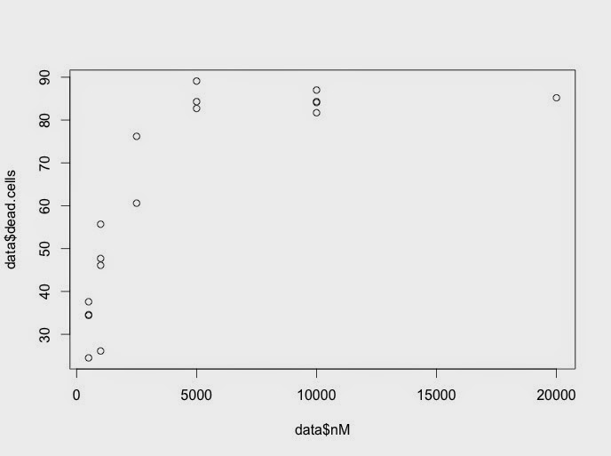
Here is the default graph:
From the default code:
)
Make the x-axis log tranformed, add limits and change symbols:

Here is the code:
plot(data$nM, data$dead.cells,
log="x", # makes it a log plot
pch=20, # gives small black dots instead of empty circles
xlim= c(500, 10000),
ylim= c(0,100),
)
Key next step is to suppress everything except the points. It looks a very odd:

plot(data$nM, data$dead.cells,
log="x",
pch=20,
xlim= c(500, 10000),
ylim= c(0,100),
axes=FALSE, # suppresses the titles on the axes
ann=FALSE, # suppresses the axes and the box
)
Now, add back axis first:

Code:
axis(1, at=c(200, 500, 1000, 2500, 5000, 10000), # x-axis
lab=c("","0.5","1","2.5","5","10"),
lwd=2, # thicker lines
pos=0) # puts the x-axis at zero rather than floating
axis(2, at=c(0, 20, 40, 60, 80,100), # y-axis
lab=c("0", "20", "40", "60", "80", "100"),
lwd=2,
las=1) # turns the numbers so easier to read
Next, add titles (I like the Greek symbol in the x-axis):

Code:
title("Figure 1A",
xlab= expression(paste("Drug concentration (", mu, "M)")),
# not the word "micro"
ylab= "Dead cells (% of cells)")
And a nice black fitted line:

Code:
# adds the fitted non-linear line
lines(10^x,y, lty=1, lwd =2)
Finally, add the LD50 again:
using this code:
# add the LD50 in the legend which allows nice positioning.
rp = vector('expression',1)
rp[1] = substitute(expression(LD50(microM) == MYVALUE),
list(MYVALUE = format((10^m[3])/1000,dig=3)))[2]
legend('topleft', legend = rp, bty = 'n')
The full code for this script and the others mentioned in this blog are available on Github.
I used these resources to develop this script:
http://www.carlislerainey.com/2012/12/17/controlling-axes-of-r-plots/
Adding micro to the R plot: http://stackoverflow.com/questions/6044800/adding-greek-character-to-axis-title
Getting the x-axis where I wanted it: http://stackoverflow.com/questions/19581721/changing-x-axis-position-in-r-barplot
Adding micro to the R plot: http://stackoverflow.com/questions/6044800/adding-greek-character-to-axis-title
Getting the x-axis where I wanted it: http://stackoverflow.com/questions/19581721/changing-x-axis-position-in-r-barplot
No comments:
Post a Comment
Comments and suggestions are welcome.