Thursday 30 September 2021

Data visualization with the programming language R - published.

Today, I published a piece in The Biochemist about data visualisation with R. I enjoyed writing the piece and it includes some of the code and blog posts that I have written here. 

The code I used to create the figures has all been uploaded on Github. To reproduce the figures you can cut and paste the code from there into a script window on R-Studio. 

Here is a list of pages with code for the figures. 

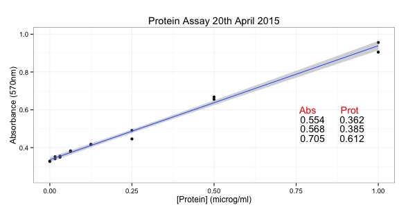
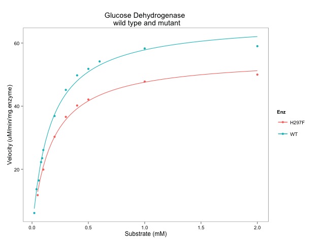
Figure 1 - R allows reproducible data visualisations. 


Figure 2 - Three most viewed data viz from this blog

Figure 3 - Tidy Tuesday data visualisations
  • Figure 3A - A volcanic activity time line inspired by @ijeamaka_a
  • Figure 3B - Illustrating the importance of numbers in password strength. Across a range of password types, inclusion of numbers increases password strength.
  • Figure 3C (Github only) - Showing the proportion of female culprits in Scooby Doo shows from 1960s to 2020s.
Figure 4 - Showcasing drawProteins (below)


There are lots more scripts on this blog. I hope you find it useful for learning R. 


Do reach out if you need any help or if some of the code doesn't work. Either comment here, contact me through Github or twitter: @brennanpcardiff


Friday 23 July 2021

Seems we'll all need more COVID vaccinations...

On Wednesday, July 20t0 2021, I saw this extended twitter feed by Dr CĂ©line Gounder that reviewed the data and concepts underpinning whether we will need more COVID vaccines. It's a super long thread that is available here through Threadreader too. The thread felt really important and showed lots of data. One of the figures that interested me most is this one from a Lancet paper:

It is a lovely violin plot that shows a decrease in virus neutralisation by variant of the current corona virus (SARS‑CoV‑2). My understanding is that blood samples were taken from various people who had received various vaccines. 

I was surprised when I looked at the paper because there was no figures in it. However, the figures are all in the Supplementary Material which you have to download as a PDF to read. The Supplementary Material also had a heart warming phrase: "All data (anonymised) and full R code to produce all figures and statistical analysis presented in this manuscript are freely-available online on Github: https://github.com/davidlvb/CrickUCLH-Legacy-VOCs-2021-05"

I was very happy to see the code and data available on Github and I forked the data to see if I could reproduce this violin plot. The short answer was yes. There were some minor challenges. I'm missing the text is at the top of the figure. However, I was able to reproduce the main body of the figure within about 20 minutes of engaging with the process. I was pleased.

Here is the graph I made which is a good reproduction of the one in the Twitter feed and Figure 1B in the supplementary data. Below is some simplified code extracted from the original code that is required to make the Figure 1B.

START
# making just Figure 1B - a violin plot

library(sp)
library(tidyverse)
library(khroma)

# download the data from my fork on Github
github_link <- "https://github.com/brennanpincardiff/Crick-UCLH-Legacy-VOCs-2021-05/blob/main/Crick_Legacy_2021-24-05_B-1-617-2_PUBLIC.Rda?raw=true"
load(url(github_link))

### from Lines 21 to 261 of original script

### Subset data for further analysis
studyData <- dtHashed %>% 
    filter(COVID_vaccStatus %in% c(1,2)) # Ignore individuals who are in seroconversion window following dose 1 and dose 2 of vaccine

### Set constants for various functions / plots
strainOrder <- c("Wuhan1", "D614G", "Kent", "SAfrica", "India2")
referenceIC50 <- 2^9.802672

dose2cohort <- studyData %>% filter(COVID_vaccStatus == 2,  sampleOrderInVaccStatus == 1)

########################################################################
#   Panel 1. Vaccine responses per strain following 2nd dose Pfizer    #
########################################################################

relevantData <- dose2cohort %>%
    pivot_longer(cols = ends_with("ic50"), names_to = "strain", values_to = "ic50")
relevantData$strain <- str_replace_all(relevantData$strain, pattern = "_ic50", replacement = "")
relevantData$strain <- fct_relevel(relevantData$strain, strainOrder)


outplot <- ggplot(relevantData, aes(x=strain, y=ic50, color = strain, label = sample_barcode)) + 
    scale_colour_muted() +
    geom_hline(yintercept = referenceIC50,linetype = 3 ) +
    geom_violin(trim=TRUE) + 
    scale_y_continuous(trans='log2', 
                       breaks=c(5, 10, 64, 256, 1024, 5120), 
                       labels=c("[0]", "[<40]", "64", "256", "1024", "[>2560]"),
                       minor_breaks=c(32, 128, 512, 2048)) +
    ylab(bquote('Virus Neutralisation, '~IC[50]~ '')) +
    geom_jitter(shape=20, position=position_jitter(0.2), alpha=0.3) + 
    stat_summary(fun=median, geom = "point", color="black",  shape=5, size=1, stroke=1) + 
    theme_bw(base_family = "Helvetica Neue Thin") +
    theme(legend.position="none")+
    theme(axis.text.x = element_text(angle = 45, hjust = 1, size=12)) + 
    theme(axis.text.y = element_text(size=12))  + 
    theme(
        panel.grid.major.x = element_blank(),
        panel.grid.minor.x = element_blank(),
        axis.title.y=element_text(size=15),
        axis.title.x=element_blank()
    )

outplot
## END of this SCRIPT


Useful resources

Thursday 21 January 2021

Programmatic visualization of UK SARS-CoV-2 spike protein variant

Building on my visualization of SARS-CoV-2 spike proteins,  this script provides a R script to allow you to draw a schematic of the corona virus S1 spike protein and the UK variant that has changes within the S1 protein. 

Here is the visualisation and below is the code to make it. 


START
# viz the changes of the UK variant in S1 spike protein....
library(drawProteins)
library(ggplot2)
library(tidyverse)

# download protein data from
# Uniprot link: https://www.uniprot.org/uniprot/P0DTC2
drawProteins::get_features("P0DTC2") -> spike_sars
drawProteins::feature_to_dataframe(spike_sars) -> spike_data

# pull out S1 chain... begins 13 ends: 685
spike_data %>%
    filter(begin > 12 & end < 686) -> s1_bot

# duplicate this and put order = 2
s1_top <- s1_bot
s1_top$order <- 2

# combine these two 
s1_both <- rbind(s1_top, s1_bot)

# draw canvas, chains & regions
draw_canvas(s1_both) -> p
p <- draw_chains(p, s1_both, labels = c("S1 protein", "B.1.1.7 variant"))
p <- draw_regions(p, s1_both)


# here are the details of the changes...

uk_variant <- tribble(
    ~type, ~description, ~begin, ~end, ~length, ~accession, ~entryName, ~taxid,
    ~order,
    "B.1.1.7", "deletion", 69, 70, 1, "P0DTC2","SPIKE_SARS2", 2697049, 1,
    "B.1.1.7", "deletion", 144, 144, 1, "P0DTC2","SPIKE_SARS2", 2697049, 1,
    "B.1.1.7", "substitution", 501, 501, 1, "P0DTC2","SPIKE_SARS2", 2697049, 1,
    "B.1.1.7", "substitution", 570, 570, 1, "P0DTC2","SPIKE_SARS2", 2697049, 1,   
    "B.1.1.7", "substitution", 681, 681, 1, "P0DTC2","SPIKE_SARS2", 2697049, 1,
    "B.1.1.7", "substitution", 716, 716, 1, "P0DTC2","SPIKE_SARS2", 2697049, 1,
    "B.1.1.7", "substitution", 982, 982, 1, "P0DTC2","SPIKE_SARS2", 2697049, 1,
    "B.1.1.7", "substitution", 1118, 1118, 1, "P0DTC2","SPIKE_SARS2", 2697049, 1,
)

# overlay information about the variants
p <- p + geom_point(data = filter(uk_variant, begin < 686),
                          aes(x = begin,
                              y = order+0.2, 
                              shape = description), size = 5)


# style the plot a bit...
p <- p + theme_bw(base_size = 14) + # white background
    theme(panel.grid.minor=element_blank(), 
          panel.grid.major=element_blank()) +
    theme(axis.ticks = element_blank(), 
          axis.text.y = element_blank()) +
    theme(panel.border = element_blank()) +
    theme(legend.position = "bottom")

p <- p + labs(title = "Schematic of SARS-CoV-2 S1 Protein and UK variant",
              subtitle = "Source: Uniprot (https://www.uniprot.org/uniprot/P0DTC2)")
p

END

I feel this could, and maybe will, be better but I'm stopping for now :-)

Some Resources

For more help, bug reports or to suggest features

Saturday 16 January 2021

Programmatic visualization of SARS-CoV-2 Spike Protein

The SARS-CoV-2 Spike protein and its variants are very important at the moment. I thought it would be interesting to showcase using my Bioconductor package drawProteins to programmatically draw a visualization of the Spike protein. This helped me understand a little more about the protein too. 

The data for making the visualization is from Uniprot: https://www.uniprot.org/uniprot/P0DTC2

Here is the visualisation and below is the code to make it. 


START

library(drawProteins)

library(ggplot2)

library(tidyverse)


# Uniprot link: https://www.uniprot.org/uniprot/P0DTC2

drawProteins::get_features("P0DTC2") -> spike_sars

drawProteins::feature_to_dataframe(spike_sars) -> spike_data


# From the Uniprot entry, it say that the Spike protein

# is made as a single protein and then processed into 

# S1 and S2 protein. 

# thus the Uniprot entry has multiple chains


# Processing Uniprot data to create different proteins

# pull out full length chain

spike_data %>% 

    filter(begin < 685 & end == 1273) -> spike_data_1

# want this at the top... 

spike_data_1$order = 3


# pull out S1 chain... begins 13 ends: 685

spike_data %>%

    filter(begin < 685 & end < 686) -> spike_data_2

# want this next... 

spike_data_2$order = 2


# pull out S2 chain...  begins 686; ends: 1273

spike_data %>%

    filter(begin > 685 & end < 1274) -> spike_data_3

# want this at the bottom

spike_data_3$order = 1


# combine all back for plotting

spike_data_o <- rbind(spike_data_1, spike_data_2, spike_data_3)


# pull out names for chains

spike_data_o %>%

    filter(type == "CHAIN") -> chains

chain_names <- c(chains$description[1:3], "")


# draw canvas and chains...

draw_canvas(spike_data_o) -> p

p <- draw_chains(p, spike_data_o,

                 labels = chain_names) 


# add regions to S1 and S2

p <- draw_regions(p, spike_data_o)


p <- p + theme_bw(base_size = 14) + # white background

    theme(panel.grid.minor=element_blank(), 

          panel.grid.major=element_blank()) +

    theme(axis.ticks = element_blank(), 

          axis.text.y = element_blank()) +

    theme(panel.border = element_blank()) +

    theme(legend.position = "bottom")


p <- p + labs(title = "Schematic of SARS-CoV-2 Spike Protein",

    subtitle = "Source: Uniprot (https://www.uniprot.org/uniprot/P0DTC2")

p

END


Some Resources

For more help, bug reports or to suggest features


Monday 18 May 2020

Volcano time line by Tidy Tuesday...

We've been exploring the Tidy Tuesday datasets at our CaRdiff UseR group. It is good to look at a different types of data and the inspiration on Twitter. I tried to create a time line of volcano eruptions but it was a complete mess. Then I found this data visualisation by @ijeamaka_a which inspired me.

––

She very helpfully shared her code through Github so I was able to have a play with her code and use it to make some plots for other parts of the world and time frames.

Here is an example of a plot I have made which has eruptions in Indonesia between 1250 and 2020 with a volcano explosion index greater than 2.


Using this script it is possible to explore other places that have lots of earthquakes like Japan. This is a nice map of the volcanos in Japan.


START
## Inspiration from https://twitter.com/ijeamaka_a/status/1260660823229214724/photo/1
## https://github.com/Ijeamakaanyene/data_visualizations/blob/master/scripts/2020_10_volcanos.Rmd

library(dplyr)
library(tidyr)
library(ggplot2)

# download the data
volcano = readr::read_csv('https://raw.githubusercontent.com/rfordatascience/tidytuesday/master/data/2020/2020-05-12/volcano.csv')
eruptions = readr::read_csv('https://raw.githubusercontent.com/rfordatascience/tidytuesday/master/data/2020/2020-05-12/eruptions.csv')

# exploring the data a bit
## check countries with most eruptions...
erupt_by_country = left_join(eruptions, select(volcano, volcano_number, country, subregion),
    by = c("volcano_number"="volcano_number")) %>%
    group_by(country) %>%
    count(sort = TRUE)  
head(erupt_by_country)

## what size eruptions are most common...
count_erupt_size = left_join(eruptions, select(volcano, volcano_number, country, subregion),
    by = c("volcano_number"="volcano_number")) %>%
    group_by(vei) %>%
    count(sort = TRUE)  
## vei not available for lots of eruptions - historical I guess...
count_erupt_size

# create the bound data_set
all_eruptions_merged = left_join(eruptions, select(volcano, volcano_number, 
    country, subregion),
    by = c("volcano_number"="volcano_number")) %>%
    mutate(combo_year = as.numeric(paste(start_year, start_month, sep = ".")))

# allow some customization
## add your country, start year and end year
## and size of eruption from 1 to 7 or zero to see all.
my_country <- "Indonesia"
my_start_year <- 1250
my_end_year <- 2020
size <- 2

# filter merged data set...
eruptions_merged = all_eruptions_merged %>%
    filter(country == my_country) %>%
    filter(is.na(vei) == FALSE) %>%
    filter(start_year > my_start_year) %>%
    filter(start_year < my_end_year) %>%
    filter(vei > size)

# Using for loop to create data needed to plot a geom_polygon
volcano_polygon_list = list()
years = unlist(eruptions_merged$combo_year)
volcano_ids = unlist(eruptions_merged$volcano_number)
veis = unlist(eruptions_merged$vei)

## There is most likely a better way of doing this.. but I cannot think of it!
## so for this to work on a wider than 20 year window we need to 
## change the value for making the pyramid
## 0.25 is approx 1% of the number of decades
pyr_size <- (my_end_year - my_start_year)/100
for(i in 1:length(years)){
    volcano_polygon_df = data.frame(
        x = c(years[i], years[i] + pyr_size, years[i] + pyr_size*2),
        y = c(0, veis[i], 0),
        t = rep(volcano_ids[i], 3)
    )
    volcano_polygon_list[[i]] = volcano_polygon_df
}

# Converting into df and adding subregion information
volcano_polygon_df = volcano_polygon_list %>%
    bind_rows() %>%
    left_join(., select(eruptions_merged, volcano_number, subregion),
        by = c("t" = "volcano_number"))

# create the plot
volcano_timeline = ggplot() +
    geom_polygon(data = volcano_polygon_df, aes(x = x, y = y, group = t, fill = subregion),
        alpha = 0.75, colour = "black") +
    geom_segment(aes(y = 0, yend = 0, x = my_start_year, xend = my_end_year), 
        size = 1,
        colour = "black",
        arrow = arrow()) +
    scale_x_continuous(limits = c(my_start_year, my_end_year),
        expand = c(0.005, 0.005)) +
    scale_y_continuous(expand = c(0, 0))
    

## add titles - based on the values put in...
volcano_timeline <-  volcano_timeline +
    labs(y = "Explosion Index", x = NULL, fill = NULL,
    title = paste0("Volcanic Activity Timeline (vei>", size, ") ",
        my_start_year, " to ", my_end_year, " within ", my_country),
        subtitle = "Each triangle's height represents the erruptions volcanic explosion index.",
        caption = paste0("Source: The Smithsonian Institution\n",
            "Visualization: Paul Brennan | @brennanpcardiff  adapted from Ijeamaka Anyene | @ijeamaka_a"))

## brown colour theme...
volcano_timeline + theme_bw() + 
    ## separate out the colour scale to allow a change to this 
    scale_fill_manual(values = rcartocolor::carto_pal(n = 7, name = "BrwnYl")) 

## Teal Green colour theme give the plot below...
volcano_timeline + theme_bw() +
    ## separate out the colour scale to allow a change to this 
    scale_fill_manual(values = rcartocolor::carto_pal(n = 7, name = "TealGrn")) 


END

Resources

Thursday 30 April 2020

Exploring Phantom ticket prices with Tidy Tuesday...

Not biological data but an interesting Tidy Tuesday data set.

It is about Broadway Shows. Here is a plot that shows that the Phantom of the Opera seems to have become relative cheaper in a more diverse market.


START
# a script for Tidy Tuesday and Tidy Thursday at CaRdiff UseR group 
# 30 April 2020

library(tidyverse)
# pull in the data
grosses <- readr::read_csv('https://raw.githubusercontent.com/rfordatascience/tidytuesday/master/data/2020/2020-04-28/grosses.csv', guess_max = 40000)

# How many unique shows...
length(unique(grosses$show))
# 1122

# inspration from here: https://github.com/teunbrand/tidytuesdayscripts/blob/master/scripts/2020_04_28_Broadway_Grosses.R
# and image from here: https://twitter.com/TeunvandenBrand/status/1255253561535074306/photo/1

# first make basic graph = average ticket prices over time...

ggplot(grosses, aes(week_ending, avg_ticket_price)) +
    geom_point(alpha = 0.25)
# $500 shows depresses the axis a bit...

grosses %>%
    filter(avg_ticket_price > 400) -> expensive
# this show is Springsteen on Broadway at $500!!!
# can exclude by limiting the y-axis

# filter for the Phantom
grosses %>%
    filter(show == "The Phantom of the Opera") %>%
    ggplot(aes(week_ending, avg_ticket_price, colour=pct_capacity)) +
    geom_point() +
    geom_smooth() + 
    labs(x = "",
        y = "Average Ticket Price ($)", 
        title = "Phantom of the Opera",
        subtitle = "Data from Playbill via Tidy Tuesday") 

# why does the show seem very expensive for some weeks rather than others

grosses %>%
    filter(show == "Mamma Mia!") %>%
    ggplot(aes(week_ending, avg_ticket_price, colour=pct_capacity)) +
    geom_point() +
    geom_smooth() + 
    labs(x = "",
        y = "Average Ticket Price ($)", 
        title = "Phantom of the Opera",
        subtitle = "Data from Playbill via Tidy Tuesday") 


# how does Phantom of the Opera compare to the others?
# make one plot first
plot <- ggplot(grosses, aes(week_ending, avg_ticket_price)) +
    geom_point(alpha = 0.25, size = 0.5) + ylim(0,300)

# filter Phantom
grosses %>%
    filter(show == "The Phantom of the Opera") -> p_of_op

# add to the first plot...
plot2 <- plot +
    geom_point(data = p_of_op, aes(week_ending, avg_ticket_price),
        colour = "red") 

# show with titles
plot2 + theme_bw() +
    labs(x = "",
        y = "Average Ticket Price ($)", 
        title = "Phantom of the Opera (red): relatively cleaper in a more diverse market",
        subtitle = "More expensive some weeks!\nData from Playbill via Tidy Tuesday")


END


Resources:

Thursday 23 April 2020

Analysing an ELISA standard curve...

As part of R for Biochemists 101, the training programme created for the Biochemical Society, one of the participants, Abigail Byford (a British Heart Foundation 4-year PhD student from Leeds Institute of Cardiovascular and Metabolic Medicine) shared some of her data.  She performed an ELISA for human chorionic gonadotropin (hCG) - a pregnancy hormone.

An ELISA generated colour that is read using a 96 well plate spectrophotometer that measures absorbance at a specific wavelength.

This script illustrates working with 96 well plate data, working with a standard curve and calculating unknowns.


--- START ---
library(readxl)
library(ggplot2)
library(dplyr)

# import data from Excel file no Github
# this comes straight from the spectrophotometer
link <- "https://github.com/brennanpincardiff/RforBiochemists/raw/master/data/hCG_absorbances.xlsx"

download.file(url=link, destfile="hCG_absorbances.xlsx", mode="wb")

hcg_file <- read_xlsx("hCG_absorbances.xlsx")

wavelength <- hcg_file[17,2]
days <- hcg_file[5,2]
# Excel stores the number of days since Jan-0-1900
# https://stackoverflow.com/questions/25158969/read-xlsx-reading-dates-wrong-if-non-date-in-column
# adding days to a date:
# https://stackoverflow.com/questions/10322035/r-adding-days-to-a-date
date <- as.Date("1900-01-01") + as.numeric(days) - 2
a

# this allows us a first look at the file...
# there is lots of metadata at the top which we don't need right now..

# we can skip at least the first 23 rows

abs_data <- read_xlsx("hCG_absorbances.xlsx", skip = 23)

# standard curve values are:
hcg <- c(5, 50, 200, 500, 1000, 5, 50, 200, 500, 1000)

# these correspond to A to E in columns 1 and 2
# we can pull these out with subsetting [rows, colums]
abs_data[1:5,2]  # gives first set of standards

# using c() and unlist() will turn these into a vector
abs_std <- c(unlist(abs_data[1:5,2]), unlist(abs_data[1:5,3]))

# plot the data
plot(abs_std~hcg)


# create the dataframe
stand_curve <- data.frame(hcg, abs_std)

# draw the graph...
ggplot(stand_curve, aes(x = hcg, y = abs_std))+
    geom_point() +
    geom_smooth()
# line begins to top out at high absorbance - assay limitation


# plot and make the linear plot with just the first three values
# where hcg is less than 250
# here is the data...
stand_curve %>%
    filter(hcg<250) %>%
    ggplot(aes(x = hcg, y = abs_std)) +
    geom_point() +
    stat_smooth(method = "lm", formula = y~x) +  
    xlab("hCG") +  
    ylab(paste("Absorbance", as.character(wavelength))) +    
    ggtitle(paste("hCG Standard Curve \n", date)) 


stand_curve <- filter(stand_curve, hcg<250)
line <- lm(stand_curve$abs_std ~ stand_curve$hcg)

# extract intercept and slope from our line object
int <- line$coefficients[1]
slope <- line$coefficients[2]

# now calculate the unknowns 
# R will calculate the whole data frame for us
# and put it into another data frame. 
# abs_data[,2:11] - subsets the numbers we want. 
# round() reduces the number of decimal points. 
hCG_Ukns <- round((abs_data[,2:11] - int)/slope, 1)

hCG_Ukns
# some of the unknowns are below the lowest standard but hey...
--- END ---


Resources