


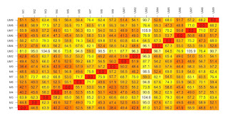
Five most popular plots
 |
Drawing a proteomic data volcano plot.... |
 |
Counting and identifying stained cells step by step |
 |
Visualising some CLL proteomic data for VizBi2016 |
 |
A bubble plot to explore UN data on researchers... |
 |
Principal Component Analysis with published CLL gene expression data (Herishanu et al, Blood 2011) |
Protein Schematics and phylogenetic trees
 |
Drawing NFkappaB protein schematics with ggplot2.. |
 |
Domain structure of a protein |


Maps
 |
Scraping and visualising global vaccination recommendations with R... |
 |
Making a Namibia choropleth |
 |
Mapping SQL Relay locations using ggplot... |
Other data visualisations

 |
| Wordle showing what I tweet about |
 |
| Visualizing a distance matrix |
 |
| Disease Burden in Wales - faceted ggplot for SQL Relay |
 |
| Plotting the values from a microscope picture of a leukaemia cell |
 |
| Athena SWAN stacked barchart |


 |
| Facetted enzyme kinetics plots in ggplot |
 |
| Venn Diagram of Protein Lists |


 |
| Volcano plot of exosome proteomic data |
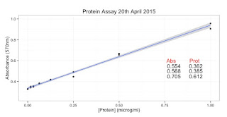 |
| Protein Assay plotted with ggplot |
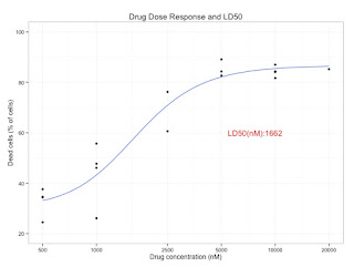 |
| Cell death curve plotted with ggplot |
No comments:
Post a Comment
Comments and suggestions are welcome.