


The key steps are:
- Get the data into R using read_excel() function from the readxl package
- Draw the first visualisation - a simple box plot

- Calculate the distances between the samples
- Draw a visualisation of the distance matrix

- Cluster the samples and then draw a visualisation of the sample cluster

- Finally, using the data from the paper, I have drawn a volcano plot.


Here is the script to do that....
START OF SCRIPT
# writing my first script for VizBi
# download and visualising the MCP CLL proteomics data
library(ggplot2)
library(readxl)
# I've decided that I would like to make CLL proteomics the first data set for the VizBi tutorials
# I've done some myself but the largest data set currently publically available is from the Liverpool group
# Reference: http://www.mcponline.org/content/14/4/933.full
# http://www.mcponline.org/content/suppl/2015/02/02/M114.044479.DC1/mcp.M114.044479-2.xls
link <- "http://www.mcponline.org/content/suppl/2015/02/02/M114.044479.DC1/mcp.M114.044479-2.xls"
# the download.file() function downloads and saves the file with the name given
download.file(url=link,destfile="file.xls", mode="wb")
# then we can open the file and extract the data using the read_excel() function.
data <- read_excel("file.xls")
# so the data is in R now in an object called "data'.
# The object "data" consists of 3521 observations of 24 variables.
# we can look at the data
View(data)
# it's made up of protein names, accession numbers, 18 samples and some statistics
# we can check the structure
str(data)
# this tells us about the types of data that make up each column.
# the fist thing we are going to do is make and visualise a distance matrix.
# columns 3 to 21 are the data.
# we can check this:
head(data[3:20]) # shows the first six rows of data
colnames(data[3:20]) # shows the column names.
# this seems correct.
# plot the data - always an important first step!
boxplot(data[3:20],
las =2, # las = 2 turns the text around to show sample names
ylab = expression(bold("expression")),
main="Boxplot of expression data")
# we can only calculate distances in a matrix where all the values are the same mode - e.g numbers
# convert data frame (data) into a matrix
# only want a subset of the data - the data from the samples.
data.m <- as.matrix(data[3:20])
# transpose the data because a distance matrix works in rows
data.m.t <- t(data.m)
# calculate the distances and put the calculations into an object called distances
distances <- dist(data.m.t)
# convert this distances object into a matrix.
distances.m <- data.matrix(distances)
# you can look at this object.
View(distances.m)
# we can extract the size of the object and the titles
dim <- ncol(distances.m)
names <- row.names(distances.m)
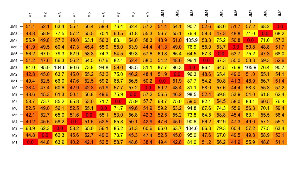
# now to create the visualisation of the difference matrix.
# first the coloured boxes
image(1:dim, 1:dim, distances.m, axes = FALSE, xlab = "", ylab = "")
# now label the axis
axis(3, 1:dim, names, cex.axis = 0.8, las=3)
axis(2, 1:dim, names, cex.axis = 0.8, las=1)
# add the values of the differences
text(expand.grid(1:18, 1:18), sprintf("%0.1f", distances.m), cex=1)
# look at this there is lots of variation between the samples....
# export this image as a tiff file with width of 1000 seems to work well.
# some of the other formats don't work as well.
# to make the cluster dendrogram object using the hclust() function
hc <- hclust(distances)
# plot the cluster diagram
# some interesting groups in the data
plot(hc,
xlab =expression(bold("All Samples")),
ylab = expression(bold("Distance")))
# interestingly the mutated and unmutated samples don't group together
# there are smaller clusters within the data
# this indicates that there is variation in the data set that is not explained by that grouping.
# we can draw a volcano plat because they have calculated the log 2 fold change and the p-value
colnames(data) <- make.names(colnames(data)) # gets rid of the spaces in the column names.
data$threshold = as.factor(data$P.Value < 0.05)
##Construct the plot object
g <- ggplot(data=data,
aes(x=Log2.Fold.Change, y =-log10(P.Value),
colour=threshold)) +
geom_point(alpha=0.4, size=1.75) +
xlim(c(-6, 6)) +
xlab("log2 fold change") + ylab("-log10 p-value") +
theme_bw() +
theme(legend.position="none")
g # shows us the object - the graph
END OF SCRIPT