Tuesday, 31 October 2017

Chance of dying for males and females using the UK Life Tables

I am currently answering comments to R for Biochemists 101 - online training that I've created for the Biochemical Society. One of the participants asked about overlaying the different chances of dying for male and females inspired by the blog piece Exploring the chance of dying using the UK Life Tables.

As is often the case in R, there is a quick and simple answer which works ok if the data is very self explanatory. However, it's difficult to draw a legend.

There is also a better way that builds on the strengths of ggplot2 but it requires reformatting the data. I've used the melt() function from the reshape package.

Here is the graph made with the better answer:


The code below also shows the quick way...

START
library(readxl)
library(ggplot2)

# The UK National Life Tables
# these are available through the Office of National Statistics
# as an excel file from this page:
# https://www.ons.gov.uk/peoplepopulationandcommunity/birthsdeathsandmarriages/lifeexpectancies/datasets/nationallifetablesunitedkingdomreferencetables
# the can be downloaded from here:
ons_url <- c("https://www.ons.gov.uk/file?uri=/peoplepopulationandcommunity/birthsdeathsandmarriages/lifeexpectancies/datasets/nationallifetablesunitedkingdomreferencetables/current/nltuk1315reg.xls")
# to guarantee undistrubed access, I've put the file on github
github_url <- "https://raw.githubusercontent.com/brennanpincardiff/RforBiochemists/master/data/nltuk1315reg.xls"

# the download.file() function downloads and saves the file with the name given
download.file(url=ons_url,destfile="file.xls", mode="wb")
# if this doesn't work try replacing the url with the github_url
# then we can open the file and extract the data using the read_excel() function.
data<- read_excel("file.xls", sheet = 5, skip = 6)

# need to remove four bottom rows - these are all blank.
data <- data[1:101,]

colnames(data)

# x = age in years
# first set is males and second set is females
# mx is the central rate of mortality, defined as the number of deaths at age x last birthday in the three year period to which the National Life Table
# relates divided by the average population at that age over the same period.

# qx is the mortality rate between age x and (x +1), that is the probability that a person aged x exact will die before reaching age (x +1).

# to allow us to separate the male and female data, I am relabelling the column names

colnames(data) <- c("age",
                    "m.mx", "m.qx", "m.lx", "m.dx", "m.ex",
                    "f.mx", "f.qx", "f.lx", "f.dx", "f.ex")


# the life table allow us to draw some interesting curves
# the first one I want to explore is my chance of dying this year.

# qx is the key value.
# the chance of my dying before my next birthday.

# the ending point from the previous graph
# from http://rforbiochemists.blogspot.co.uk/2017/03/exploring-chance-of-dying-using-uk-life.html

p <- ggplot(data = data,
       aes(x = age, y = m.qx)) +
  geom_line(colour = "red") +
  geom_point(colour = "red", size = 0.75) +
  ylab("Chance of dying") +
  xlab("Current Age") +
  ggtitle("Chance of Men Dying before next Birthday") +
  scale_y_log10(
    breaks = c(0.0001, 0.001, 0.01, 0.1, 0.5),  # where to put labels
    labels = c("1/10,000", "1/1000", "1/100", "1/10", "1/2")) +  # the labels
  theme_bw()

# show the object
p


# quick way
# add geom_line() and geom_point() with more data
p +
  geom_line(data = data,
                aes(x = age, y = f.qx),
                colour = "blue") +
  geom_point(data = data,
             aes(x = age, y = f.qx),
             colour = "blue", size = 0.75) +
  # and change title
ggtitle("Chance of Dying before next Birthday")


# However, it's really difficult to add a proper legend

# Longer way - reformat the data into 'long' format
# using melt() function from reshape() package

library(reshape2)
# subset the columns we want - just three
data_s <- data.frame(cbind(data$age, data$m.qx, data$f.qx))
# rename columns
colnames(data_s) <- c("age", "male", "female")

# create new object with melt in long format
data_long <- melt(data_s, id.vars = "age")
# rename columns...
colnames(data_long) <- c("age", "gender", "chance_die")

# now draw the object
# using the colour aesthetics
# you get a legend automatically.
ggplot(data = data_long,
       aes(x = age,
           y = chance_die,
           colour = gender)) +
  geom_line() +
  geom_point() +
  ylab("Chance of dying") +
  xlab("Current Age") +
  ggtitle("Chance of Dying before next Birthday") +
  scale_y_log10(
    breaks = c(0.0001, 0.001, 0.01, 0.1, 0.5),
    labels = c("1/10,000", "1/1000", "1/100", "1/10", "1/2")) + 
  theme_bw()

END of SCRIPT

Resources

Tuesday, 15 August 2017

Drawing NFkappaB protein schematics with ggplot2..

Update (2 Nov 2017): This still works but has been simplified with drawProteins package. See this blog page for the better example.

I've been busy with work and preparing materials for our R for Biochemists 101 online training course for the Biochemical Society. The materials are being tested now and the course should be available in October 2017. Then I had a short holiday...

So, it's taken a little longer than I hoped but here is the code to draw protein schematics with ggplot2. The schematic shows protein schematics of the five human NF-kappaB proteins. Here is the visualisation:


The code uses my drawProteins package which is on Github. This can be installed using the function install_github() from the package devtools. The required syntax is devtools::install_github("brennanpincardiff/drawProteins")

I've gone through the code step by step. It's quite long and I am planning to create some more functions that will shorten the code.

Here is the step by step code that uses drawProteins and ggplot2 to create a protein schematic visualisation.  The ggplots along the way are shown too. To see the plots best requires a plot window of about 900 pixels.

# START
# working with rel proteins as I have been studying these for 10 year
# using ggplot2 to draw the plots.
# proteins are aligned to the N-termini
# alternative alignment options would be worth considering

library(httr)
# devtools::install_github("brennanpincardiff/drawProteins")
library(drawProteins)
library(ggplot2)

# Uniprot accession numbers of five human NF-kappaB family members
proteins_acc <- c("Q04206 Q01201 Q04864 P19838 Q00653")

# accession numbers need to be combined with "%2C" for Uniprot API
proteins_acc_url <- gsub(" ", "%2C", proteins_acc)

# this is the baseurl for a multiple features query
baseurl <- "https://www.ebi.ac.uk/proteins/api/features?offset=0&size=100&accession="

# make url to GET features for multiple accession numbers
url <- paste0(baseurl, proteins_acc_url)

# basic function is GET() which accesses the API
# accept_json() argument gives a JSON object
prots_feat <- GET(url,
                  accept_json())

status_code(prots_feat)  # returns a 200 - good

# extract content() - gives a list with length = number of acc no
prots_feat_red <- httr::content(prots_feat)


################
# loop to work through the API object and convert to data.frame
# probably there is a better way to do this
features_total_plot <- NULL
for(i in 1:length(prots_feat_red)){
  # the extract_feat_acc() function takes features into a data.frame
  features_temp <- drawProteins::extract_feat_acc(prots_feat_red[[i]])
  features_temp$order <- i  # this order is needed for plotting later
  features_total_plot <- rbind(features_total_plot, features_temp)
}

# look at the data.frame
View(features_total_plot)  # 319 observations


### use ggplot2::geom_rect to draw moleucles
### in this script each type of feature is drawn separately.

## step 1: set up the canvas in ggplot (no data added)
# want to put text on the left in the area of negative numbers
plot_start <- -max(features_total_plot$end)*0.2

# need it to be longer than the longest molecule plus a bit...
plot_end <- max(features_total_plot$end) + max(features_total_plot$end)*0.1

p <- ggplot() +
  ylim(0.5, max(features_total_plot$order)+0.5) +
  xlim(plot_start, plot_end)
p # show the object


## step 2: draw the CHAINS in grey (narrower)
p <- p + geom_rect(data= features_total_plot[features_total_plot$type == "CHAIN",],
                   mapping=aes(xmin=begin,
                               xmax=end,
                               ymin=order-0.2,
                               ymax=order+0.2),
                   colour = "black",
                   fill = "grey")
p


## step 3: annotate with names
p <- p +  annotate("text", x = -10, y = features_total_plot$order,
                   label = features_total_plot$entryName,
                   hjust = 1,
                   size = 4)
# check the object
p


## step 4: plot domains fill by description
p <- p + geom_rect(data= features_total_plot[features_total_plot$type == "DOMAIN",],
                   mapping=aes(xmin=begin,
                               xmax=end,
                               ymin=order-0.25,
                               ymax=order+0.25,
                               fill=description))
p


# label domains with descriptions
feat_domain <- features_total_plot[features_total_plot$type == "DOMAIN", ]
p <- p + geom_label(data = feat_domain,
                    aes(x = begin + (end-begin)/2,
                        y = order,
                        label = description))
p
# this works well with geom_label()


## step 5 plot motifs fill by description
p <- p + geom_rect(data= features_total_plot[features_total_plot$type == "MOTIF",],
                   mapping=aes(xmin=begin,
                               xmax=end,
                               ymin=order-0.25,
                               ymax=order+0.25,
                               fill=description))

p
# not going to label these as they're in the description and they are small


## step 6 plot repeats fill by description
p <- p + geom_rect(data= features_total_plot[features_total_plot$type == "REPEAT",],
                   mapping=aes(xmin=begin,
                               xmax=end,
                               ymin=order-0.25,
                               ymax=order+0.25),
                   fill = "lightblue")
p


# label repeats (for this they are ANK but remove digits)
p <- p + geom_text(data = features_total_plot[features_total_plot$type == "REPEAT",],
                    aes(x = begin + (end-begin)/2,
                        y = order,
                        label = gsub("\\d", "", description)),
                   size =2)
p


# add titles
p <- p + labs(x = "Amino acid number",         # label x-axis
              y = "",  # label y-axis
              title = "Schematic of five human NF-kappaB proteins",
              subtitle = "circles = phosphorylation sites\nRHD: Rel Homology Domain\nsource:Uniprot")
p


# white background and remove y-axis
p <- p + theme_bw() +  # white background
         theme(panel.grid.minor=element_blank(),
         panel.grid.major=element_blank()) +
         theme(axis.ticks = element_blank(),
               axis.text.y = element_blank()) +
         theme(panel.border = element_blank())
p


# add phosphorlation sites
# extract info about sites using phospho_site_info() function
phospho_sites <- drawProteins::phospho_site_info(features_total_plot)

# draw phosphorylation sites on the protein with geom_point()
p <- p + geom_point(data = phospho_sites,
               aes(x = begin,
                   y = order+0.25),
               shape = 21,
               colour = "black",
               fill = "yellow", size = 4, stroke = 1)

# to see it properly you need to zoom...

# I have to admit that I am pleased with this diagram.
# The colours are better, the labels seem to work.

p + ggsave("five_human_nfkappab_proteins_20170814.pdf")
# END


The output looks best as a PDF, I think so that's why I've saved it.
There are lots of options for altering text size and the like.
I am still working on visualising protein schematics in R so if you have feedback, it would be most welcome.


Resources

Wednesday, 28 June 2017

Using the Uniprot API to illustrate protein domains...

Update (2nd Nov 2017): I've updated the drawProteins package and it's  totally using ggplot so this script doesn't work. For more details see this blog post, please.

I'm a member of the Cardiff R User group and we're using R to explore APIs - application programming interfaces which allow R to access data. I chose the explore the API that allows me to download data from Uniprot, "a comprehensive, high-quality and freely accessible resource of protein sequence and functional information".

Tomorrow, we have our show and tell about what we have learned about using APIs with R. So in preparation and inspired by Stef Locke, the lead organiser for the Cardiff R User group, I have now created my first R package. The R package, called drawProteins, uses the API output to create a schematic protein domains.

Here are two examples of the output. The first is a schematic of a single protein using Base R plotting (script below). The second example is a schematic of three proteins generated using ggplot2 (script in a little while).


Here is the script to plot a schematic of the transcription factor p65 (top panel):

SCRIPT START
# OK so I have to write some kind of a script to use the new 
# Uniprot API
# This is R-UserGroup homework for Thursday....

# references: https://www.ebi.ac.uk/proteins/api/doc/#!/proteins/search
# references: https://academic.oup.com/nar/article-lookup/doi/10.1093/nar/gkx237

# needs the package httr
# install.packages("httr")
library(httr)

# my package with functions for extracting and graphing
# might require: install.packages("devtools")
devtools::install_github("brennanpincardiff/drawProteins")
library(drawProteins)

# so I want to use the Protein API 
uniprot_acc <- c("Q04206")  # change this for your fav protein

# Get UniProt entry by accession 
acc_uniprot_url <- c("https://www.ebi.ac.uk/proteins/api/proteins?accession=")

comb_acc_api <- paste0(acc_uniprot_url, uniprot_acc)

# basic function is GET() which accesses the API
# requires internet access
protein <- GET(comb_acc_api,
           accept_json())

status_code(protein)  # returns a 200 means it worked

# use content() function from httr to give us a list 
protein_json <- content(protein) # gives a Large list
# with 14 primary parts and lots of bits inside

# function from my package to extract names of protein
names <- drawProteins::extract_names(protein_json)

# I like a visualistion so I want to draw the features of this molecule
# https://www.ebi.ac.uk/proteins/api/features?offset=0&size=100&accession=Q04206

# Get features 
feat_api_url <- c("https://www.ebi.ac.uk/proteins/api/features?offset=0&size=100&accession=")

comb_acc_api <- paste0(feat_api_url, uniprot_acc)

# basic function is GET() which accesses the API
prot_feat <- GET(comb_acc_api,
           accept_json())

status_code(prot_feat)  # returns a 200. 

# so to process this into a data.frame
prot_feat %>%
  content() %>%
  flatten() %>%
  drawProteins::extract_feat_acc() -> 
  features

# clean up for plotting
# focus on those that we want to plot...
features_plot <- features[features$length > 0, ]  
features_plot <- features_plot[complete.cases(features_plot),]
features_plot <- features_plot[features_plot$type!= "CONFLICT",]

# add colours 
library(randomcoloR)   # might need install
colours <- distinctColorPalette(nrow(features_plot)-1)
features_plot$col <- c("white", colours)

# now draw this...  with BaseR
# here is a function that does that....
drawProteins::draw_mol_horiz(names, features_plot)

# add phosphorylation sites
# get sites first. 
features %>%
  drawProteins::phospho_site_info() %>%
  drawProteins::draw_phosphosites(5, "yellow")  # 5 circle radius
text(250,0, "Yellow circles = phosphorylation sites", cex=0.8)

SCRIPT END

Resources

Thursday, 8 June 2017

Making a Namibia choropleth

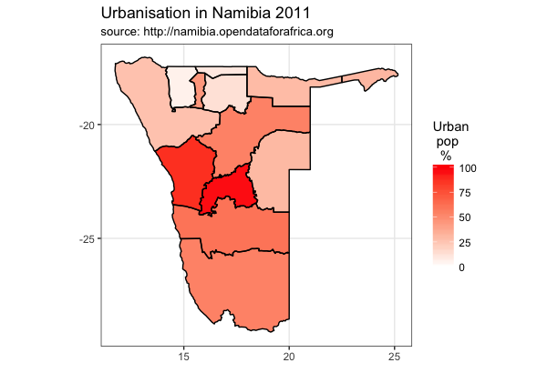
According to Wikipedia, a choropleth map uses differences in shading, colouring, or the placing of symbols within predefined areas to indicate the average values of a particular quantity in those areas. I thought it would be interesting to make one of these in R for Namibia. I'm going to Namibia on Saturday as part of Project Phoenix, a partnership project between Cardiff University and University of Namibia.

I have used some data about urbanisation in Namibia which I downloaded from the Open Data for Africa website. This data shows some nice variation across the regions of Namibia.

Here is an example of the what can be done:


Here is the code and maps made along the way:

START
## map urbanisation data onto Namibia administrative regions. 

## step 1: download the map data

## download the file...
library(sp) 
link <- "http://biogeo.ucdavis.edu/data/gadm2.8/rds/NAM_adm1.rds"
download.file(url=link, destfile="file.rda", mode="wb")
gadmNab <- readRDS("file.rda")

## step 2: simplify the level of detail...
library(rmapshaper)
gadmNabS <- ms_simplify(gadmNab, keep = 0.01)
plot(gadmNabS)


## step 3: turn it into a ggplot object and plot
library(broom)
library(gpclib)
library(ggplot2)
namMapsimple <- tidy(gadmNabS, region="NAME_1")
ggplot(data = namMapsimple,
       aes(x = long, y = lat, group = group)) + 
       geom_polygon(aes(fill = "red"))


# check region names
unique(namMapsimple$id)
# the exclamation mark before Karas will cause a problem. 
namMapsimple$id <- gsub("!", "", namMapsimple$id)
# check it worked
unique(namMapsimple$id)
# now no exclamation mark


## step 4: let's get our data and bind it...
# download the data about urbanisation
library(RCurl)
x <- getURL("https://raw.githubusercontent.com/brennanpincardiff/learnR/master/data/Namibia_region_urbanRural.csv")
data <- read.csv(text = x)
# exclude whole country
data_regions <- data[!data$region=="Namibia",]
# so extact 2011 data from the data_regions
data_regions2011 <- data_regions[data_regions$Date == 2011, ]
# just extract urban
data_regions2011_urban <- data_regions2011[data_regions2011$residence == "Urban",]
# change colnames so that we can merge by id...
data_col_names <- colnames(data_regions2011_urban)
data_col_names[1] <- c("id")
colnames(data_regions2011_urban) <- data_col_names

# bind the urbanisation data into map with merge
mapNabVals <- merge(namMapsimple, 
                    data_regions2011_urban,
                    by.y = 'id')

p <- ggplot() +     # sometimes don't add any aes...
     geom_polygon(data = mapNabVals,
                  aes(x = long, y = lat,
                  group = group,
                  fill = Value))
p


# plot the outlines of the administrative regions
p <- p + geom_path(data=namMapsimple, 
              aes(x=long, y=lat, group=group))
p


p <- p + scale_fill_gradient("Urban\n pop\n  %",
                      low = "white", high = "red",
                      limits=c(0, 100))
p


p <- p +   coord_map()  # plot with correct mercator projection
p


# add titles 
p <- p + labs(x = "",         # label x-axis
                y = "",  # label y-axis
                title = "Urbanisation in Namibia 2011",
                subtitle = "source: http://namibia.opendataforafrica.org")
  
p + theme_bw()


# maybe get rid of long, lat etc..

p <- p + theme_bw() +
  theme(panel.grid.minor=element_blank(), panel.grid.major=element_blank()) + 
  theme(axis.ticks = element_blank(), axis.text.x = element_blank(), axis.text.y = element_blank()) + 
  theme(panel.border = element_blank())
p # show the object


## add names of regions
library(rgeos)
# calculate centroids
trueCentroids = gCentroid(gadmNabS,byid=TRUE)
# make a data frame
name_df <- data.frame(gadmNab@data[,'NAME_1'])
centroids_df <- data.frame(trueCentroids)
name_df <- cbind(name_df, centroids_df)
colnames(name_df) <- c("region", "long", "lat")

# label the regions
p <- p + geom_text(data = name_df,
                     aes(label = region,
                         x = long,
                         y = lat), size = 2)
p


# change different colours
p + scale_fill_gradient("Urban\n population\n  %",
                        low = "white", high = "blue")


p + scale_fill_gradient("Urban\n pop\n  %",
                        low = "white", high = "green")


# If you want to save this... export or use the ggave() function
p + ggsave("Namibia_Urbanisation_Map_2011.pdf")

END


Resources: