


I am giving a talk entitled First steps in making visualisations using R as part of SQLRelay in Cardiff on Wednesday.
I have prepared a script that I am going to use on the day. The script explores some data from the StatsWales
website. One data file describes the percentage of people with various illnesses in Wales and another describes lifestyles.
I have downloaded the files as Excel files.
These can be directly imported into R but I found it easier to change them
in Excel first.
- by combining the two data sets
- by removing the gender breakdown
- by simplifying the column names
- by simplifying the year names for the combined years
This kind of data munging can be done in R
as well but I’m quicker doing it in Excel.
I have put the resulting Excel file ontoGithub so that it can be downloaded and imported into R.
As part of this script I make various graphs using R. The final part of the script makes these graphs:

The script I'll be using for my talk is below. I have included copies of some of graphs that are made along the way.
If you are attending my talk in SQL Relay, it's worth getting the script and trying it out on or before the day. You can cut and paste it from below. You can also get it from Github.
SCRIPT START
## This script is designed to illustrate some 'simple graphs'
# Packages required
# install.packages("readxl", "ggplot2", "reshape2", "gridExtra")
library(readxl) # Excel file importer
library(ggplot2) # high quality graph package
library(reshape2) # for melting data frames
library(gridExtra) # for laying out objects on a page
# this is the link to the data
link <- "https://raw.githubusercontent.com/brennanpincardiff/RforBiochemists/master/data/illnssLifeStyleGenderYeardReNames20151006.xlsx"
# the download.file() function downloads and saves the file with the name given
download.file(url=link, destfile="file.xlsx", mode="wb")
# then we can open the file and extract the data using the read_excel() function.
data<- read_excel("file.xlsx")
# look how it turns up in the Global Environment
# have a look at the data
View(data)
# check the object
str(data) # the structure of the object
# look at the column names
colnames(data)
# the titles
# [1] "year" "highBP" "heartcondexBP" "respIll"
# [5] "mentIll" "arthritis" "diabetes" "currTreated"
# [9] "healthFairRpoor" "smoker" "alcoholConsAboveGuide" "alcoholConsBinge"
# [13] "fruitVegGuide" "activeon5" "activeZero" "overwgtObese"
# [17] "obese"
## Using the basic plot() function
# refer to the data within the data.frame
plot(data$year, data$mentIll)
plot(data$year, data$arthritis)
plot(data$year, data$smoker)
## improve one of the plots a little
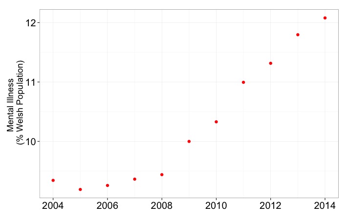
plot(data$year, data$mentIll,
xlab = "Year",
ylab = "Mental Illness (% of Welsh Population)",
pch = 15)
## pair() function useful to plot scatterplot matrices
pairs(data[,1:7]) # shows the rate of change over 10 years
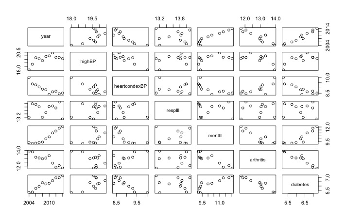 |
| Useful visualisation using pairs() function |
## I recommend the ggplot2 library
p <- ggplot(data, # a data.frame with the data
aes(x=year, y=mentIll)) + # columns of the data.frame
geom_point(colour = "red", size = 3) # type of plot
# this creates an object called p
p # show the object

# modify the object to add a title and change the theme
p <- p + ylab("Mental Illness \n (% Welsh Population)") +
xlab(" ") +
theme_bw()
p # show the object again

# the options of how to customise this graph very varied
# there is some recognised good style but also a lot of preference
p <- p + theme(axis.title.y = element_text(size = 18 )) +
theme(axis.text = element_text(size = 20))
p # show the object again
## Let's make a bar chart
ggplot(data, aes(x=year, y=mentIll)) +
geom_bar(stat="identity") +
ylab("Mental Illness \n (% Welsh Population)")

# check out the bottom axis
# Looks very strange with the "2007.5"
# Why?
str(data$year)
# num [1:11] 2004 2005 2006 2007 2008 ...
mode(data$year)
# [1] "numeric"
# Because R has imported year as a number, adding 0.5 is allowed
# change to a character
data$year <- as.character(data$year)
ggplot(data, aes(x=year, y=mentIll)) + # data.frame & the data
geom_bar(stat="identity") + # different type of plot
ylab("Mental Illness \n (% Welsh Population)")
 |
| A better graph with all the numbers included |
## Look at a possible correlation
ggplot(data,
aes(x=diabetes, y=obese, label = year)) +
geom_point(colour = "red", size = 5)
ggplot(data,
aes(x=diabetes, y=obese, label = year)) +
geom_point(colour = "red", size = 5) +
geom_text(size = 5, hjust=1, vjust=-0.5)
p <- ggplot(data,
aes(x=diabetes, y=obese, label = year)) +
geom_point(colour = "red", size = 5) +
geom_text(size = 5, hjust=1, vjust=-0.5) +
ylab("Obesity (% of Welsh Pop") +
xlab("Diabetes (% of Welsh Pop)") +
theme_bw()
p <- p + theme(axis.title.y = element_text(size = 18 )) +
theme(axis.title.x = element_text(size = 18 )) +
theme(axis.text = element_text(size = 20))
p

# introducing facet
# draw six graphs of diseases over time...
# take a subset of data
data.sub <- data[1:7]
# rename the columns
colnames(data.sub) <- c("Year", "High BP", "Heart Conditions", "Respiratory Illness", "Mental Illness", "Arthritis", "Diabetes")
# melt the data from wide to long:
melted.data.sub <- melt(data.sub, id.var = "Year")
colnames(melted.data.sub) <- c("Year", "Illness", "Percent")
# make a plot
x <- ggplot(data = melted.data.sub,
aes(x=Year, y=Percent)) +
geom_point(aes(colour = Illness, shape= Illness, size = 5)) +
theme_bw() +
theme(legend.position = "none") +
ggtitle("Disease Burden in Wales over 10 years")
x # look at the plot
 |
| Not very useful! |
# break into facets
x <- x + facet_wrap(~ Illness, scales = "free", ncol=2) +
ylab("Percent of Welsh Pop")
x # show the plot
 |
| Nice set of graphs, I think. |
# save the plot
x + ggsave("DiseaseBurdenWales10years.pdf")
## Extra info on arranging plots on a single page
# make a new graph in the object g1
g1 <- ggplot(data, # a data.frame with the data
aes(x=year, y=obese)) + # columns of the data.frame
geom_point(colour = "black", size = 5) + # type of plot
ylab("Obesity (% of Welsh Pop") +
xlab("") +
theme_bw()
g1 <- g1 + theme(axis.title.y = element_text(size = 18 )) +
theme(axis.title.x = element_text(size = 16 )) +
theme(axis.text = element_text(size = 20))
# make another graph in the object g2
g2 <- ggplot(data,
aes(x=year, y=diabetes)) +
geom_point(colour = "blue", size = 5) +
ylab("Diabetes (% of Welsh Pop") +
xlab("") +
theme_bw()
g2 <- g2 + theme(axis.title.y = element_text(size = 18 )) +
theme(axis.title.x = element_text(size = 16 )) +
theme(axis.text = element_text(size = 20))
# using a function from the gridExtra package...
# put the three graphs on the same graphical output.
grid.arrange(g1, g2 ,p)
# makes the plot at the top of the blog
SCRIPT END
Useful resources:
- ggplot home page and documentation - VERY USEFUL with lots of examples.
- R Cookbook - useful site about ggplot
- R-Bloggers - lots of interesting blogs about ggplot
- Quick-R - very readable site - not just ggplot lots about base graphs too.
And it was a great talk! Thanks for giving your time!
ReplyDelete